The design of everyday things
Design critique of an everyday object
The world is evolving at a very fast rate and so are human beings. Over the years, the human brain capability has increased upto a greater extent. Our brains are capable of things which we cannot even imagine. We are now living in an era that our ancestors had barely even dreamt of. Over the few decades, we have seen a lot of advancements in technology. Our daily life requirements are fulfilled by man-made devices like Cars, Cycles, TV sets, Air Conditioners, Water pumps and what not. Even with such advancements in technology, there are several factors that are looked down upon. Such factors include usability, cognition, user experience and human psychology.
In this story I’m going to walk you through a badly designed everyday object which has got the basics wrong. So grab some snacks, sit back and relax.
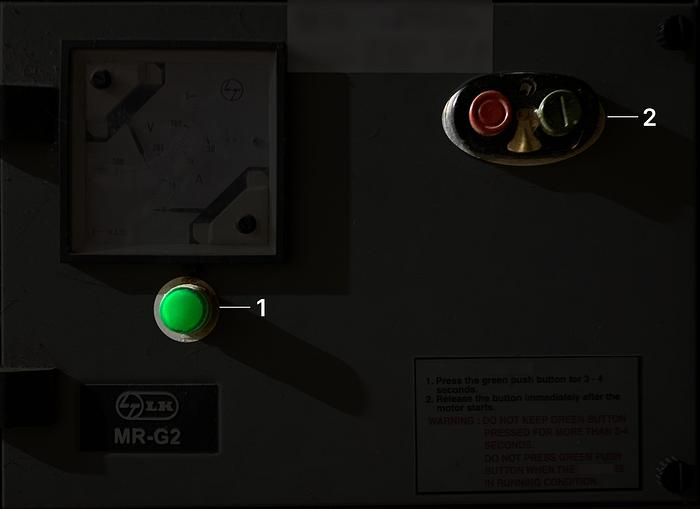
Below is an image of an everyday object, what do you guys think it is?

Well, for the people who guessed it wrong, let me answer. It is a switch for a submerged water pump. What was your first impression when you first saw the object. Did you think of it as some industrial equipment that is used for a complex machinery ? Let me know your answers in the comments.
Now let’s get straight to the point. What is wrong with this switch?
1- Cognitive Load
2- Unusual conceptual model
3- Shape and hierarchy of components
4- Poor system status
5- Poor user feedback
Cognitive Load and Unusual Conceptual Model:
We use so many switches in our regular life but in our case, the switch for the pump is fitted into a big board accompanied by a meter that shows the voltage, current readings, a strict instruction to operate the pump and a light that indicates the status of the pump. This kind of setup guarantees to overwhelm the user.
The instruction on the switch clearly says not to press the “Green” switch for more than 3–4 seconds, also it says not to press it when the pump is in start condition. The instruction specifically points out the “Green” switch.
In my testing, most of the users pressed the status indicator thinking of it as a button.

The intended button is the “Dark Green” button in the second (2nd) block as shown in the above image. But most of the users pressed the first (1st) block which turned out to be the status indicator. As it did not give any feedback, the users tried pressing it multiple times. At last, they gave up and finally called for help.
Conventional motors operate on a different conceptual model and usually require a simple switch mechanism to operate. So, when we design something unusual with an unconventional conceptual model, it is going to cost us usability and a steep learning curve.
Shape and Hierarchy of Components:
Most of the users pressed the status indicator thinking, it is a button that needs to be pressed in order to turn on the water pump. This happened because:
1- The status indicator has also been given the shape of the buttons which makes the user think of it as a button.
2- The “Green” colour used on the indicator stands out more than the one used on the actual button.
Poor User Feedback:

1-The instruction clearly says that, in order to turn on the pump, we need to press the green button for 3–4 seconds. When the exact thing was done by the users, there was a electricity crackling sound heard which again left the users in a worried state.
2-When the button was just pressed hard, the pump started but the success and failure of pressing the button made the same click sound which did not communicate whether it was a success or a failure.
3-Even when the pump was started successfully, the users did not get a feedback from the pump as it is submerged in the ground and makes very negligible noise while operating.
All these problems altogether put a lot of strain on the user’s memory just to interpret the status.
Poor System Status:
After some errors, trials and with help, the users were able to operate the motor switch. But the problem arises yet again.

1-When the switch is turned on, the status indicator light glows but there is a very less difference when it is off and when it is on.
2-During the day time, due to the natural light source this difference is not visible.
3-There is only a slight change in the reading of current in the meter. This kind of status does not take into account the users who are not technically literate.
What did this poorly designed pump switch cost?
1-It cost the usability of the control. Users hesitated to use the pump switch because due to wrong operation, the pump was once damaged.
2-A simple switch involves rocket science to turn it on. So it also cost a steep learning curve to the user. But once the user learnt it, there were no issues.
3-It also put a lot of mental strain to the user due to it’s poor system status and feedback.
Note: The pump switch was new and was free from faults at the very first place.
I really appreciate you for your valuable time. I hope you have learnt something new from this story. I would love to get your invaluable feedback and keep improving my informational stories.
If you really liked it , do follow for more on UX/UI. Thank you…
My Socials
2-LinkedIn
3-Behance
4-Dribbble

