Member-only story
Case study: How I used OOUX to redesign Taco Bell’s online menu in a day
How to use OOUX to make sense of the mess and quickly make a difference on an existing site, by a quick discovery round and retrofitting existing assets.

I recently earned my certification as an Object-Oriented UX professional and I made this presentation, originally in Mural, as part of hosting a Lunch & Learn session for my UX colleagues at InformedXP.
Object-Oriented UX, also known as OOUX, is a UX process that unwraps complexity by way of focusing on navigation elements as easy-to-recognize nouns, in keeping with how brains learn and work. Ideally, this practice is done as part of a pre-development discovery phase, but that does not mean that you can’t benefit from OOUX on something that already exists. OOUX practices are very flexible and can fit into any phase or timeline.
In the following example, I take an existing site, apply OOUX techniques to one page, and propose user experience enhancements based on my findings.
Discovery
Since this was a Lunch & Learn presentation, I was looking for a lunch-related theme to explain OOUX. It’s not that difficult to find a food-related website that could use some OOUX magic. For this presentation, I chose @TacoBell as a project to break down and build back up. Why? Here’s my story:
When I have a Taco Bell craving, that craving does NOT last very long for me, a few minutes at most before I come back to my senses. One day recently, I was craving the usual 3 Taco Supreme combo that I would get at the drive-thru before the pandemic.
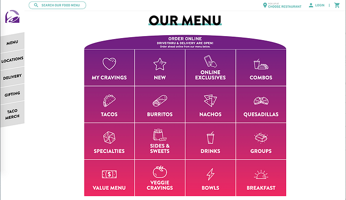
Let’s just say the online experience is more cumbersome than the drive-thru experience. First, this is Taco Bell’s menu page:

I like the colors and icons, but it’s not easy to find my usual combo, first I went to “My Cravings” since that was in the top left. This is what I see:

