How I simplified ordering home-cooked meals with a subscription-centric app — a product design case study
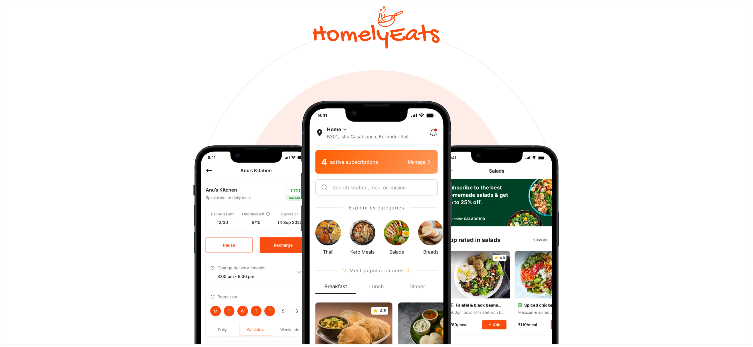
Modern life has become a hustle. The struggle gets real when you’re a working professional or student living away from home. Work’s piling up and you have no space or time to cook your meals. Mom’s cooking is a major miss and you’re craving comforting home-cooked meals.
Take-out and junk food become the usual go-to, whether starving, lazy or caught up in the daily grind. But that guilt? It’s real — overspending and binging on junk.
So you rely on a local tiffin service. But, let’s face it— Quality’s a gamble. Oil’s swimming in every dish. Portions are a mystery. And kitchen hygiene, what’s that?😶
These were the issues that plagued me when I moved to a new city for my college internship. They lingered in the back of my mind until I finally decided to do something about it.
I know time’s precious, so if you’re into quick summaries without the full read — here’s a quick rundown for you.👇🏻
🔍 Diving deep into the problem
Starting with primary research, I explored the challenges users faced — something I experienced and heard my friends complain about. To gain deeper insight, I hopped on a 1:1 call with some of my friends living away from home including my sister who was away for college.

Here are the key topics I covered during our discussion:
- What are their living conditions and how do they manage their daily meals?
- How often do they order food from restaurants or delivery services?
- If they use a tiffin service or have a cook, are they satisfied with it? If not, what problems do they face?
- What are their preferences for daily meals?
With the inputs I got from the 1:1 calls, I ran a user survey with open-ended questions via Google form, to gather additional data.

After gathering insights from over 35 responses, I concluded the primary research and these were my key observations:
1. The Target Audience
The results show that the majority of users are aged 18–39, and are working professionals or students, with a few being health-conscious individuals prioritizing nutritional value. Hence, I narrowed my target audience to —
- Working professionals
- Student
- Health-Conscious Individuals
2. User Insights: Needs and Concerns

After having a better understanding of the user’s pain points, I questioned why these issues persist with many tiffin services and home-cooked meal delivery apps.
To grasp the current market and explore potential solutions, I did a competitive analysis. I examined similar apps, studying their user flows, features, and approaches. The goal was to identify gaps and user pain points in existing apps to find potential areas for improvement.

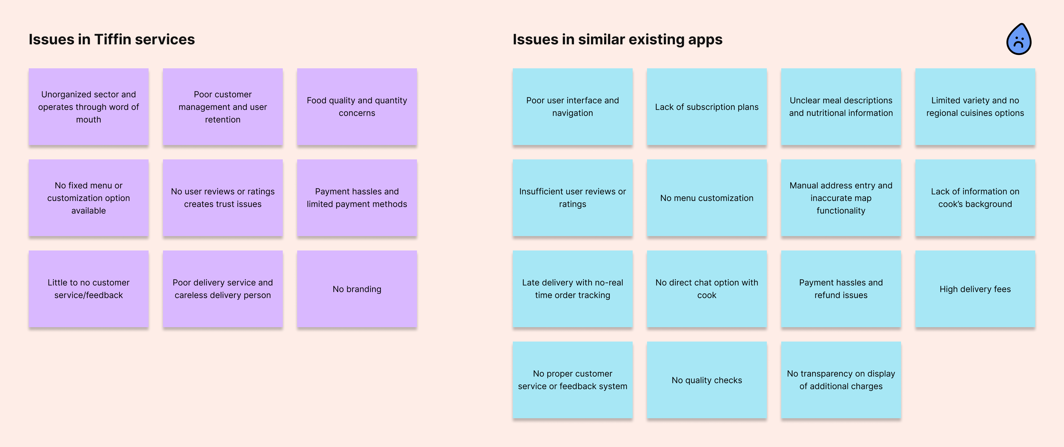
Through competitive analysis, I collected insights on tiffin services and existing similar apps, identifying significant pain points within them. These were the most prominent —
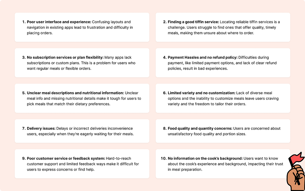
Summarizing user frustrations and pain points based on the insights gathered from the research:
To better empathize with users, I examined the identified pain points and created the following personas:

After spotting the user goals and frustrations and analyzing the existing market of similar apps, I had a specific goal in mind for this project.
🎯 The Goal
Designing a mobile app that makes ordering delicious and healthy home-cooked meals easier, allowing the user to choose the right meal at reasonable prices with flexible subscription plans.
✨ Introducing HomelyEats
HomelyEats is a subscription-centric home-cooked meal delivery app streamlining the process for meal plan subscribers to effortlessly purchase and manage their daily cravings.


In an ideal setup, the application would have two interfaces — one for the home cooks and the other for customers.
However, in this case study, I’ve only covered the customer-side interface while considering all the possible constraints that would apply to the home cook side.
🛑 Design constraints
Before delving into the visual design, I had to set a few design constraints to reduce complexity.
- Time-based meal options: The kitchen can set time ranges for their menus to ensure efficient logistics and manage varied preferences.
Ex: Breakfast: 6:30 am — 10:00 am, Lunch: 12:00 pm — 3:00 pm, etc. - Subscription Plans & flexibility:
• One meal per kitchen equates to one subscription plan.
• Advance notice of at least 8 hours is needed to customize/skip a meal to allow the kitchen staff ample time for adjustments. - Localized delivery: The partner kitchens handle nearby deliveries for customers within 1 to 2 km, ensuring fast service and control over the process. To expand the reach to more distant areas, an external delivery service will be employed. They efficiently handle distant deliveries, for a delivery fee.
💡 Crafting the Experience: Ideation & Wireframing
Once my end goal was set, I envisioned the user experience and brainstormed features for each step. Using the MoSCoW Framework, I prioritized features to meet user needs and developed a comprehensive user flow for the entire application.
Once the user flow was mapped out, I dove into creating wireframes and sketched some initial screens. Opting for the pen-and-paper method allowed me to make quick iterations.

🎨 Let’s dive into visuals

This was hands down the most exciting part of the entire process. I started with setting up the style guides.
As this was a food-related app, I decided to go with a shade of Orange as it is a blend of red and yellow and is believed to stimulate the appetite, making food appear more appealing and appetizing.

🚀 The Onboarding
Onboarding is like a friendly guide, showing users around, making things easy, and keeping them hooked. To set the pace right for the users and make them feel right at home while using this app, I’ve used warm-toned illustrations inspired by the familiar aesthetics of Indian homes and Indian food.🏡✨
- Users have the option to explore the app as a guest which reduces barriers to entry and encourages initial engagement, potentially leading to higher user retention and conversion rates.

🔐 Auth and Account setup
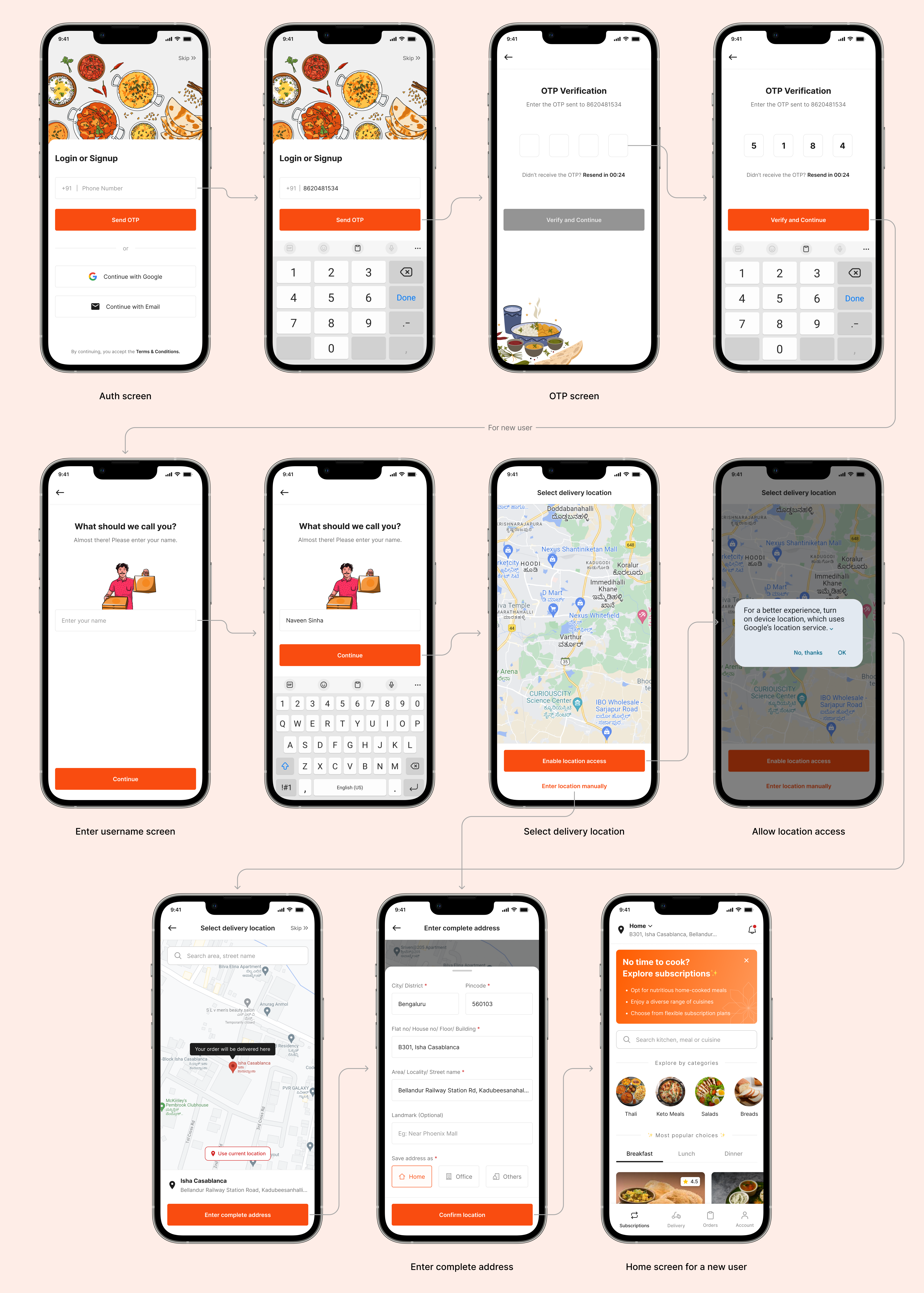
While designing the authentication flow, I focussed on simplicity and user-friendly navigation.
- Users can log in or sign up using their phone number/Google account or email, and then verify it by entering the OTP. A first-time user needs to enter their name to complete the profile.
- The next step involves granting access to the location. Asking complete address upfront could be a potential point for drop-off. Instead, a rough GPS location will be used to display nearby kitchens, enhancing the experience. The complete address will be requested when the user places an order.
🏡 Homepage
When designing one of the most crucial screens of this app — The Homepage, I focused on laying out all the information in a way to avoid monotony, keeping the design visually interesting and engaging for users.
To address the challenge of decision fatigue caused by numerous meal options, I organized the meal plans into different categories, making it easy for users to navigate and find what they need.
I integrated various filters based on meal categories, top-rated meals, meal types(breakfast, lunch, snacks, and dinner), etc, to facilitate the decision-making process, offering users a convenient way to narrow their choices.
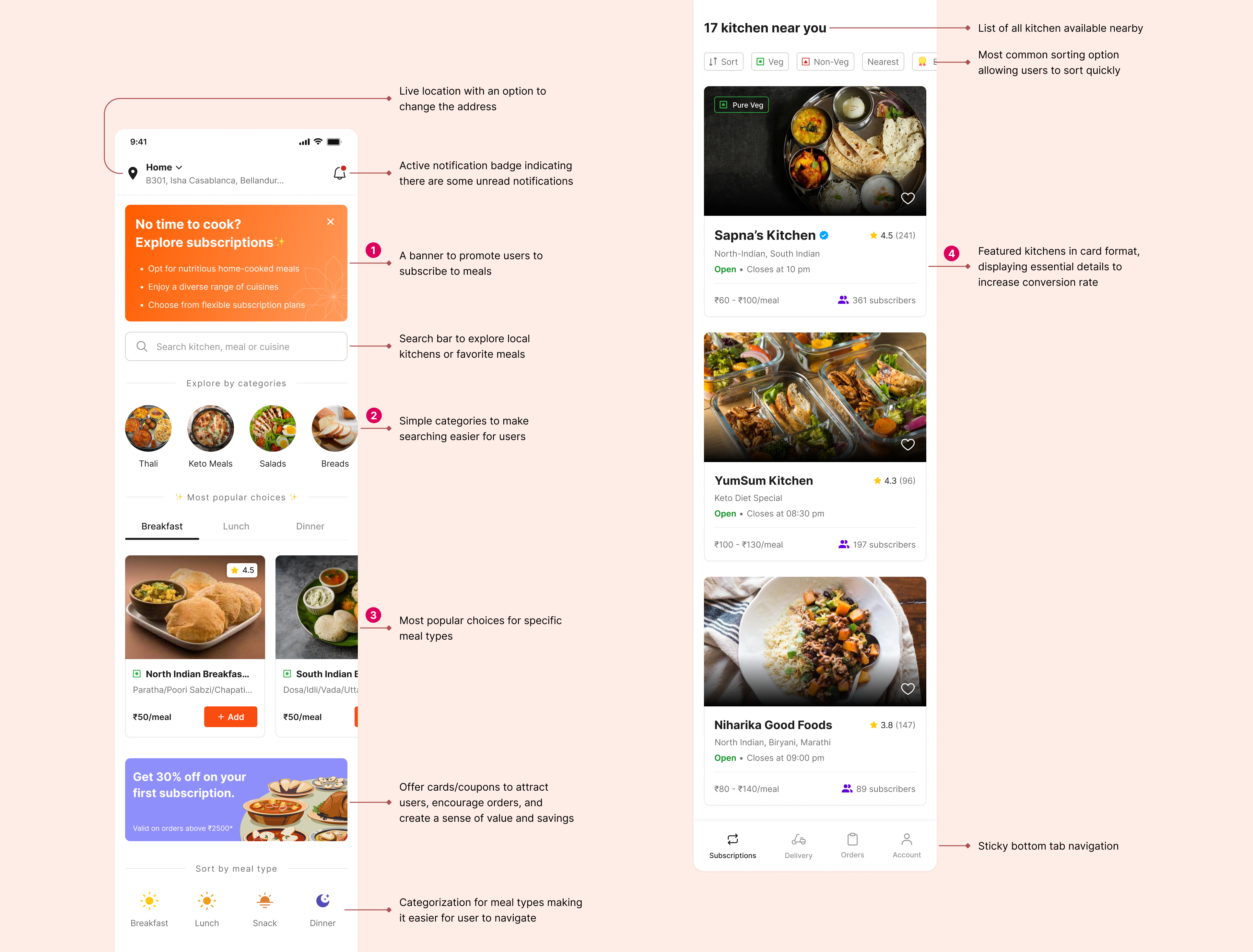
Let’s explore a few elements I’ve used on the homepage.


🍲 The Kitchen page
During competitive analysis, I noted that the restaurant/kitchen listing page for almost every food-delivery app looks similar in layout and information architecture. I did not want to trouble the user with learning a new model, so I followed Jakob’s Law here.
Users spend most of their time on other sites. This means that users prefer your site to work the same way as all the other sites they already know.
— Jakob’s Law
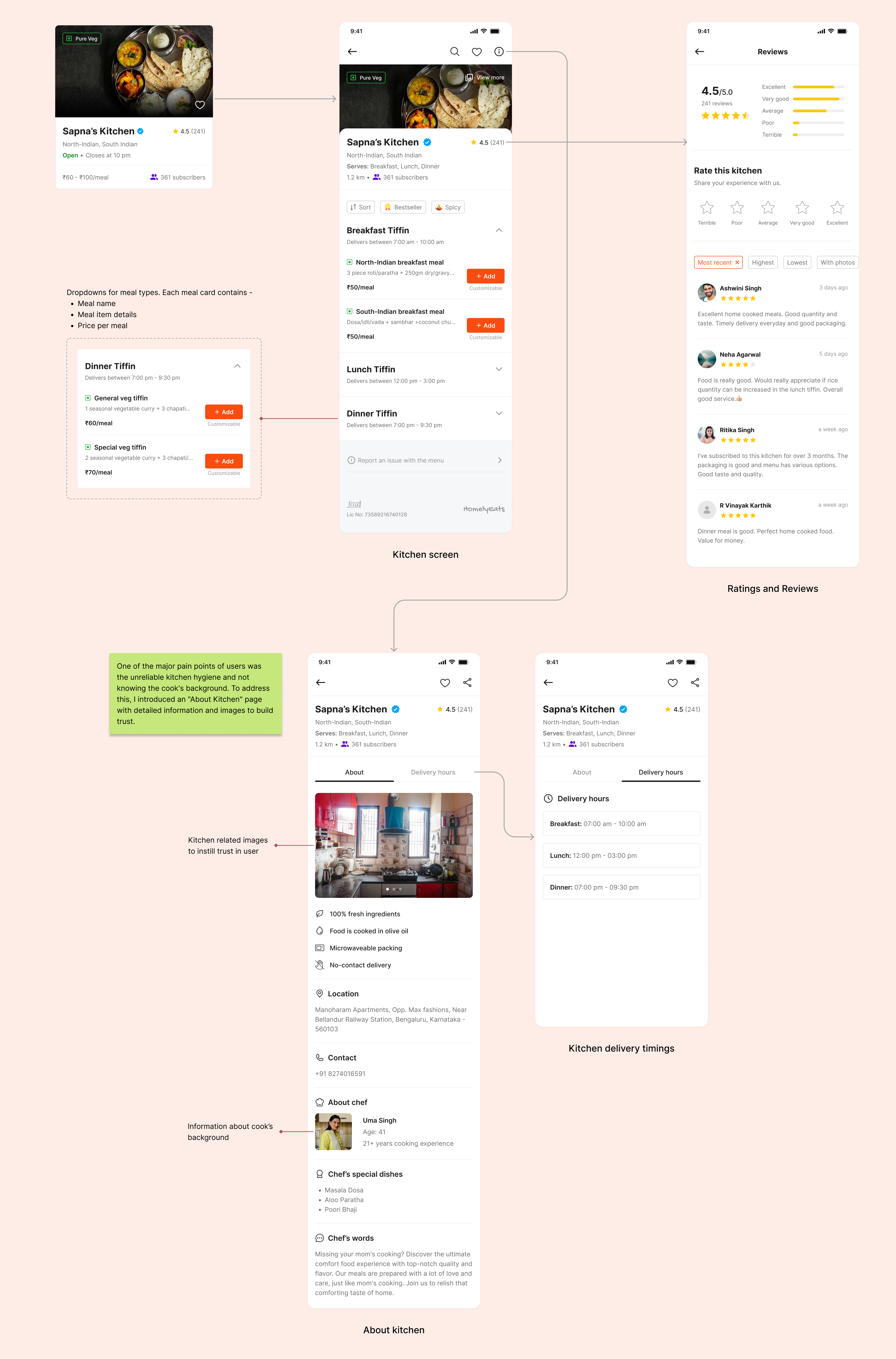
🍽️ Subscribing to a meal
The product’s primary objective is to convert users to subscribers. Thus, the user flow of subscribing to a meal is quite simple and easy for users to understand. My main focus was to reduce cognitive load, keep the purchase process simple, and establish trust through transparent communication with the user.

🧾 My orders
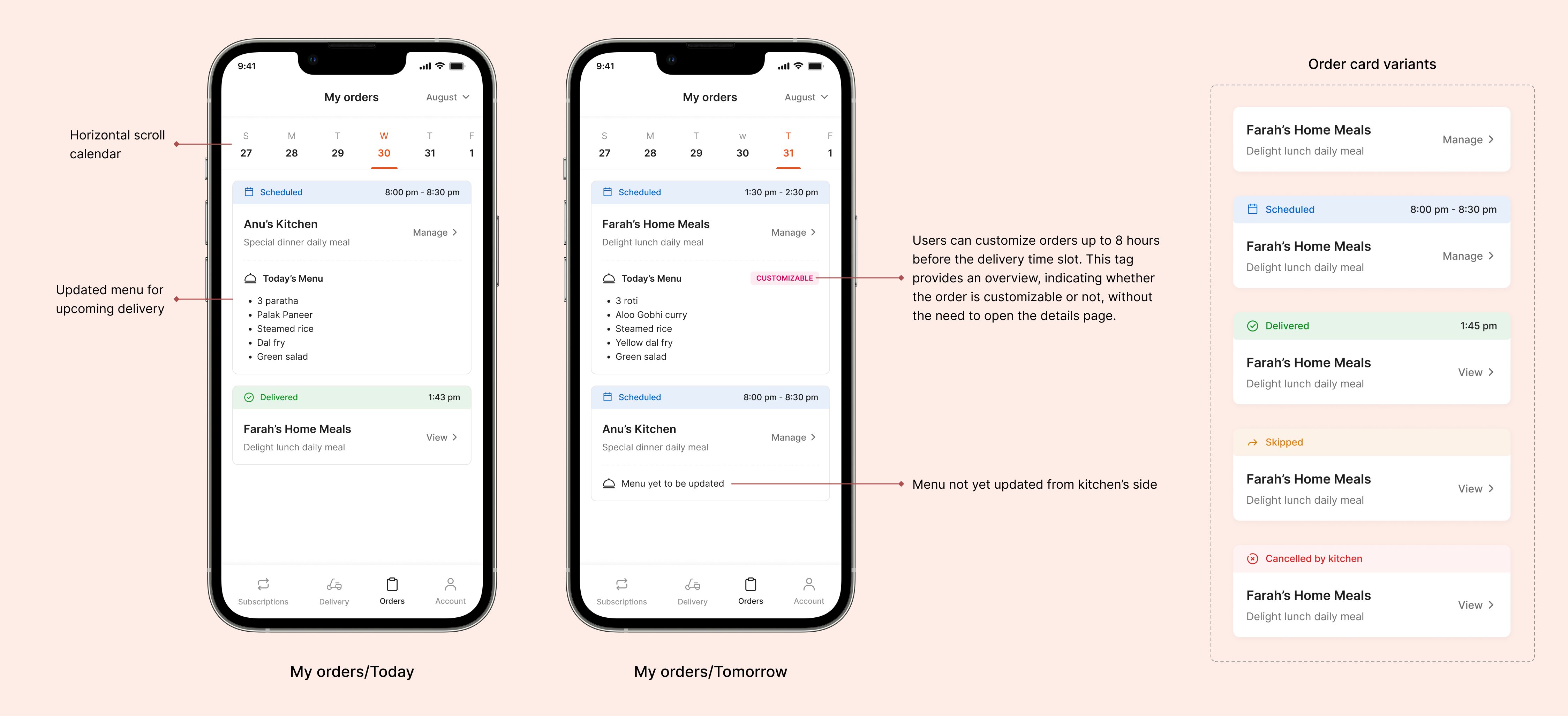
Every order inside “My orders” corresponds to a single meal delivery. Once the user subscribes to a meal, orders are created in advance for the entire period of the subscription plan. From this screen users can manage their orders (customize, skip, add instructions — cooking and delivery).
One-time orders are also listed on this page. More on that later. 😀
I have incorporated a horizontal calendar for easy navigation, and created various order card variants representing different statuses, providing a clear overview of daily meal deliveries.
The order can be in one of five different states —
- Indeterminate: Represents future orders with no current status assigned.
- Scheduled: Indicates upcoming orders with nearby dates, featuring either updated or yet-to-be-updated menus.
- Delivered: Marks orders that have been successfully delivered to the user.
- Skipped: Denotes orders that the user voluntarily chose to skip for a particular day.
- Canceled by kitchen: Indicates orders canceled by the kitchen for specific reasons on that particular day.
🥗 Customizing an upcoming order — Adding extra items
Users can update their upcoming orders by adding extra items and making instant payments.
Orders are customizable 8 hours before the delivery time slot. Assuming there are more than 8 hours left till the delivery, let’s see how to add a little extra to your upcoming orders —

⏩ Skipping an order
While creating a subscription, the user gets a limited number of flex days which they can use to pause their subscription or skip an order from the subscription plan.
Flex days allow you to pause or skip meal deliveries in your subscription. After reaching a limit, more pauses/skips are available at the start of your new subscription period. The subscription period extends for each paused/skipped day, adjusting the expiry date accordingly.

🍱 My Subscriptions: Viewing and Managing
Users want to easily see and handle their subscriptions. All subscription plans are in one convenient spot, split into active and past subscriptions. This screen is accessible from the homepage banner and the “My Account” screen.
I’ve used various card variants that represent different statuses of the subscription plan. This ensures users have a clear overview of their subscription’s current state.
Here are the details of each status —
- Default: This state represents a currently active subscription.
- Paused till *date*: Indicates that the user has voluntarily paused their subscription, with a specific date mentioned for when it will resume.
- Expires in n days: Shows the number of days remaining until the subscription expires. Users can keep track of when their subscription will end.
- Canceled on *date*: This state shows that the user voluntarily canceled the subscription on a particular date for specific reasons. It is visible in the past subscriptions section.
- Expired: Indicates that the subscription plan has concluded, with the balance and the number of deliveries depleted. To continue this subscription, users must recharge again. This state is visible in the past subscriptions section.

🙌🏻 Manage subscription page
The primary function of this page was to make it easy for the user to manage their subscription plans.
I have designed it in a way that provides clear insights to the user some crucial information like remaining balance, deliveries left, and flex days and expiry date. Plus, they can recharge, pause, or cancel their subscription right from this screen. All information is presented in a format that’s easy for users to navigate, with minimal cognitive load.

💰 Recharging a plan
Users can prolong their subscription by recharging it before it expires. Simply topping up the plan with additional balance will extend its duration. Any new preferences selected will come into effect once the current subscription balance is used up.
This ensures a continuous and uninterrupted service for users who choose to extend their subscription ahead of its expiration.

⏸ Pausing a subscription plan
Putting a subscription on hold is a significant action that users might consider. To initiate a brief pause, the user requires flex days. Upon selecting the pause option, the initial screen displays information regarding the remaining flex days and the corresponding details. The subscription automatically extends by the duration of the pause.

❌ Cancelling a subscription plan
To offer users flexibility, I have included a cancellation feature for the subscription plans. Before canceling, users are prompted to select reasons for feedback. This straightforward cancellation process enhances transparent communication, establishing trust and ensuring users are informed about their available choices.
Empowering users with the ability to cancel a subscription grants them control over their accounts and the services they receive.

🛵 One-time order delivery flow
Integrating a one-time order delivery option in the app enhances user experience by providing flexibility for occasional users and addressing special occasions without a recurring commitment. This feature supports trial usage, adjusts to changing preferences, and engages a wider user base. By addressing seasonal needs, it creates an additional income source, providing a competitive edge and encouraging user loyalty.

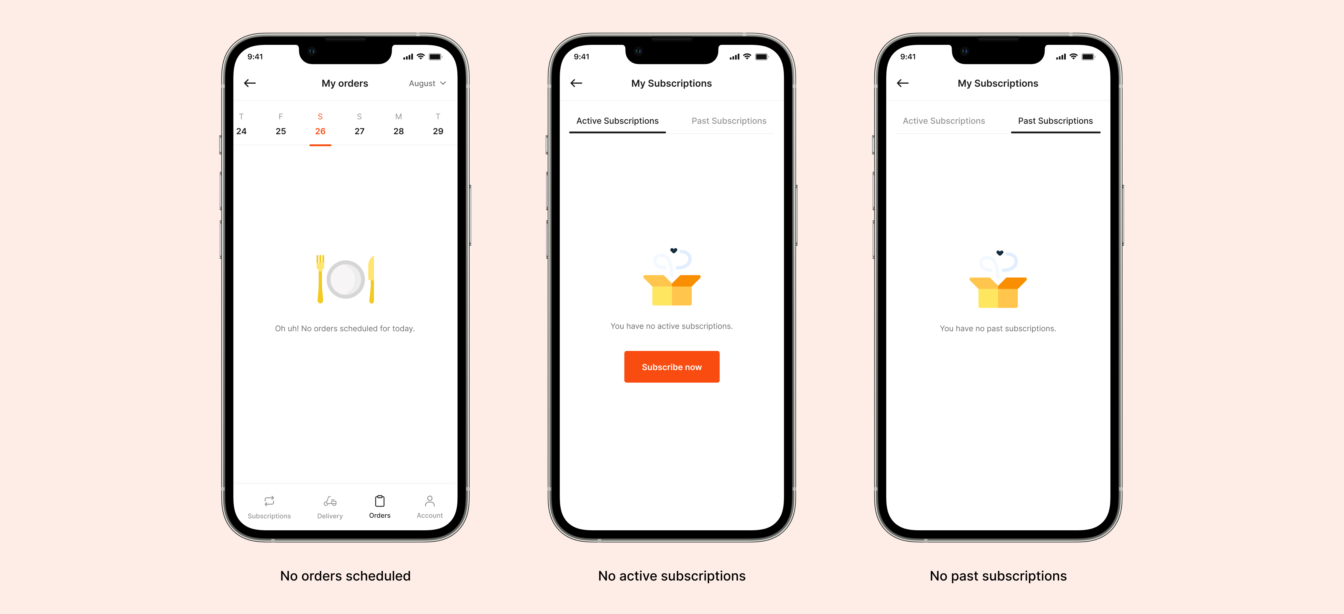
Including a few mandatory empty state screens —
Ready to interact with the app? Check out the prototype! 🚀
🎁 Aaanddd that’s a wrap!
Big thanks for sticking around till the end of this case study — it means the world! Hope you had a blast reading it. I sure did while putting it together!
📚What did I learn?
- Gained a deeper understanding of user needs and preferences and learned how to think from the user and the business angle.
- I’ve discovered the critical role of a well-crafted user flow, impactful UX writing, and effective visual cues in shaping the user experience.
- Working on the various use cases has helped me improve my visual design and problem-solving skills.


