How I redesigned Alphashine’s landing page to dominate the car detailing market

As part of the Design Studio Simulator at 10kDesigners (a product design cohort), I had to redesign a one pager website for a startup. From a pool of 30+ diverse startup briefs, I chose to go ahead with Alphashine: An on demand car detailing & services marketplace app.
But why Alphashine?
Simply put, I love cars. Plus, being based in the same city, Toronto, I saw an opportunity to gain a deeper understanding of the local car detailing market.
Here’s the final design if you don’t feel like scrolling 🙃

About Alphashine

Alphashine is a subscription-based, vertically integrated platform that is changing the way people use car detailing services. They offer a comprehensive range of services, from interior and exterior detailing to ceramic coating and wax finishes — all accessible through their convenient mobile app.
🔍Identifying the problems
Right from the start, several areas for improvement were evident:
- Lack of Premium Feel: The website doesn’t really give off the luxury vibe Alphashine promises. The design, fonts, and colours don’t make it feel high-end, which can make customers doubt the premium service they offer.

- Trust Issues: The site is missing essential trust-building elements like genuine customer reviews and high-quality images of detailed cars.

- Inconsistencies: The site feels a bit all over the place. Different sections use different colour schemes and styles, making it look unprofessional.

📝Research & Exploration
- Looking up ‘Car Detailing Toronto’ on Google brings up a bunch of companies with basic, template-style websites. Alphashine, on the other hand, has a big branding advantage. Their logo is top-notch, with a premium look in black and white.

- The competitors’ websites are pretty basic, focusing mainly on the services rather than branding. It seems like they’ve all figured out the secret: Google reviews reign supreme, and they’re capitalizing on them.

- The testimonials on the current website lack authenticity and trustworthiness, appearing artificial and fabricated. Given their prominent position in the top search results, they could greatly benefit from showcasing genuine Google reviews.

- They took some incredible car photos to promote their brand, but never fully capitalized on them. These photos could be a great resource for their imagery needs.

- Alphashine has a few unique selling points that they’re not emphasizing enough:
Exclusive mobile app sets them apart from competitors
Convenient booking options: Online or through the app
Flexible monthly subscriptions available
Commitment to sustainability: Incorporating eco-friendly measures
🔬Getting into the details
I began by creating a mood board to establish the design direction I aimed to achieve. Rather than solely focusing on car visuals, I sought diverse elements integral to website design, including hero sections, pricing modules, grid layouts, carousels, and testimonials.

Given Alphashine’s positioning as a luxury car detailing service with a mobile app, I aimed for a website design that exuded both premium and tech-forward vibes. After exploring various typefaces and colour palettes, I landed on this selection:

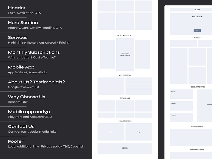
After gathering inspiration and establishing a brand identity, I had a clear vision for the flow of my landing page. Here are some initial snippets showcasing the structure, layout, and information architecture:
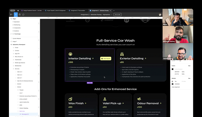
Taking critical feedback is a superpower️⚡
As designers, we are always a bit skeptical to ask for feedback on our designs. Common misconception, but Critique ≠ Criticizing. Big thanks to Abhinav & Jayneil for reviewing & giving actionable feedback on my project.
🎊Visuals Unveiled: The Most Exciting Chapter!
Here’s a section wise breakdown of each section 🔨
If you’re short on time, jump directly into the Figma prototype 👉 Click here


Bonus! Here are some design snippets that didn’t make the final cut:

My project was also showcased on 10kDesigner’s Demo Day series. Feel free to check it out here 👉 Youtube
Learning outcomes 📝
If you are not progressing you're regressing. With each project I tackle, I strive to learn something new and apply those lessons to the next one.
- Probably the first time that I made use of bento grids. It can adapt to almost any type of content + it’s so much easy to consume. Great resource for inspiration 👉 bentogrids.com
- The future is AI and it is here to stay. ChatGPT became my go-to content writer, and I relied on it heavily to polish the content at every stage.
- Crafting style guides and utilizing components really turbocharged my design workflow! Plus, I experimented with the HSB colour system for the first time — definitely a game changer once you get the hang of it.
- Documentation is just as crucial as the design itself. I made sure to jot down notes at every step, making it a breeze to revisit and understand my design choices later on.
And that’s a wrap! I hope you’ve enjoyed this case study as much as I’ve enjoyed working on it! I’m thankful to the mentors (Rishika & Ahaan) and peers at 10kDesigners for their invaluable feedback and support. Their assistance was vital in bringing this project to life.
Feel free to connect with me on LinkedIn for questions, suggestions, or potential collaborations. Currently exploring Product Design roles and excited to craft something amazing together!
