PRODUCT DESIGN
How I designed & coded Subtle, a gorgeous simple calculator with contextual reveal at its heart?
My journey as I endeavored to design, test, and code a beautiful, minimal, and simple calculator experience.

Digital calculators have intrigued me ever since I became a designer. I found most of the available ‘free’ calculators to be functionally performant but visually boring and cluttered. Furthermore, the hideous AD banners that most of them have made it even worse.
An Inner Itch 😣
When I realized that my bias was not strictly visual I started to deep dive into the anatomy of modern digital calculators. Many of the UX decisions made in a typical digital mobile calculator did not sit well with me and I wasn’t convinced that this is the best we could do.
Competitive Study
I tried many digital calculators and discovered a common pattern of UX decision-making at work which helped me flesh out the conceptual model of a Modern-day digital calculator. I also discovered many innovative calculators that dared to do things differently. Here are a few.

The Conceptual Model of a Modern Digital Calculator 🤔
A conceptual model is a set of hard-to-break user-learned rules that heavily informs and constrains the design decisions when shaping a product.
Users become familiar with a conceptual model with repeated usage and these subconsciously-learned patterns become expectations which further become rules (or constraints) for future designers to follow when designing usable and intuitive experiences.
The design decisions taken today by the pioneering creators of a widely adopted product become rules (a conceptual model) of tomorrow for product creators to abide by.
Unlike physical calculators, digital ones have fewer constraints which allow a change in some of the rules in favor of a better usability than just be limited by the remnants of the past decisions.

Rule 1
Numeric Keypads always start with ‘7-8-9’ numeric keypad in calculators.
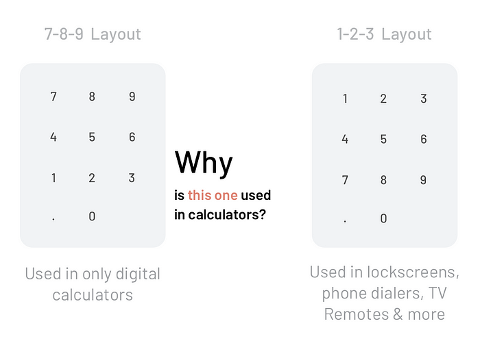
When Bell Labs began exploring keypad layouts in the late 1950s they contacted all of the leading calculator manufacturers to find out why they had chosen to put low numbers at the bottom and high numbers at the top rather than the other way around. The answer, apparently, was a big shrug. It turns out that decision was largely arbitrary: no one had done any research about which layout was most convenient for users. Still, when it came time to place a numeric keypad on a computer keyboard, the calculator model with 7–8–9 at the top prevailed.
Source: ABCNews
😮 So it happened arbitrarily and now it continues because familiarity runs the show.
Rule 2
Clear & Backspace are always at the top.
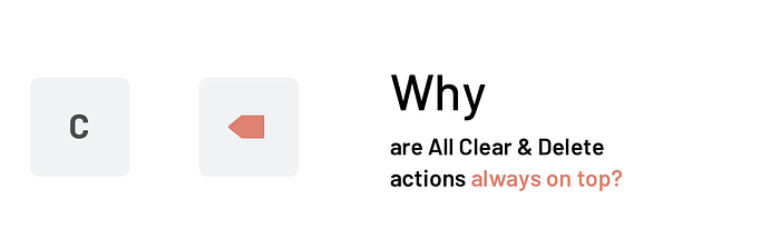
Clear key is a mandatory click at the end of any calculation to make way for the next one making it more important than the ‘Equals’ key (for calculators with the instant result)
Rule 3
‘Equals’ operator is always on the bottom and highlighted.

Physical operators rightly had an ‘equals’ operator in the bottom as the user always needed to push it to get the answer. It was an essential click until today when most digital calculators show the result instantly as one types in the numbers. This makes the ‘equals’ operator technically unnecessary.
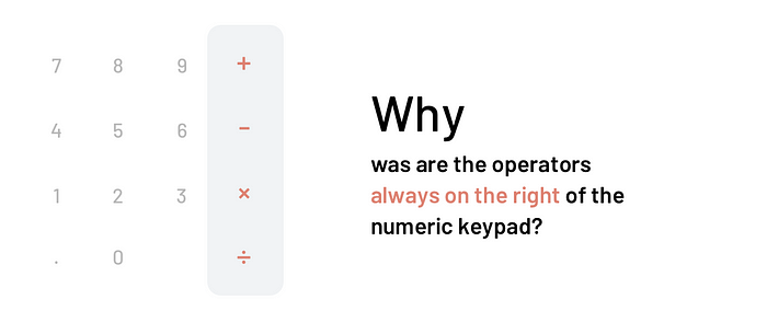
Rule 4
Mathematical operators are always on the right and in a fixed order.
The 4 basic operators — addition, subtraction, division & multiplication — are always on the right of the numeric keypad.
Key Learning
Familiarity is the driving factor for pushing forward a historical conceptual model developed due to either mechanical limitations of the device at the time or arbitrary choices made by select individuals.
The core value of familiarity is that it flattens the learning curve immensely making the product instantly usable. However, it also obstructs innovation and new models of interaction.
How might we create a simple, intuitive, accessible, and beautiful calculator experience that is free from the irrelevant remnants of the past?
My Hypothesis 🧐
I understood that I had some strong opinions which needed validation. So, I listed them down as hypotheses.

Divergent Exploration
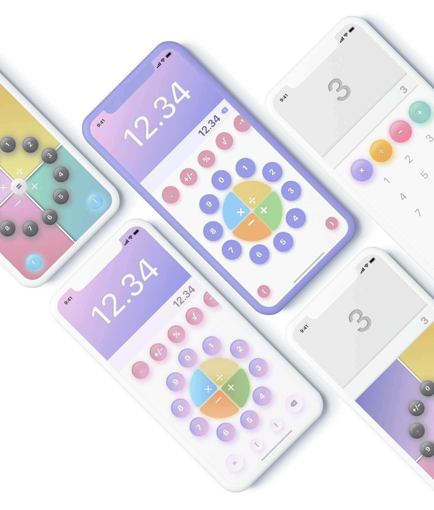
I aimed to understand the significance of familiarity in usability for the users. Hence, I tried many crazy layouts! After many unique sketches and weird layouts later, I was left with these 4 explorations.

I suspected that users may not be comfortable with such a drastic change in layout but I chose to experiment with the radial layout (last one) and test their comfort zone with completely unfamiliar interfaces.
Convergent Exploration
I created many high fidelity convergent explorations for the selected direction with the goal of making a ‘seemingly’ finished product so users can focus on the functionality without developing the bias of work-in-progress. My biggest concern was the speed of typing in this new layout.
An Interesting Find 🤩
😅 I did not create a clickable prototype here as I was fairly convinced this will change drastically. I intentionally made it playful in an effort to gauge if a pleasing UI can convince the users into believing that they like it. I tested it with 5 non-designer friends.
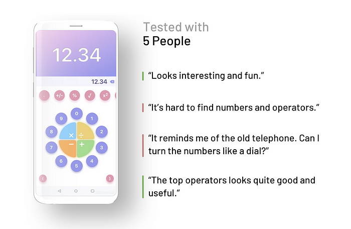
Aha… It was evident that it was not intuitive and too unfamiliar to use. Time to play by the rules.
4 out of the 5 hinted in some ways that the top horizontally scrollable operators were a quite useful and interesting concept.
The Design Principles 😎
It was evident that changing the keypad too much was disorienting the users leading to slow typing speeds. Based on my competitive analysis and experiencing testee’s comments, I was ripe to lay out some core design principles which would inform many design decisions.
- Contextual Reveal
Things should be revealed only when they are contextually relevant and everything else should be hidden. - Lucid Communication
Different states of elements should be clearly communicated like an active, inactive, and transitioning (when clicked) state of a button. - Delightful Motion
Movement of elements should be calm yet confident to create a sense of trust with the user. - Minimal Design
The presence of elements on the interface should be justified in any given moment.
The New Direction 🙃
With the hypotheses and learnings from my previous test, charged by my newfound design principles, I made many convergent explorations.

Coding the App 🔥
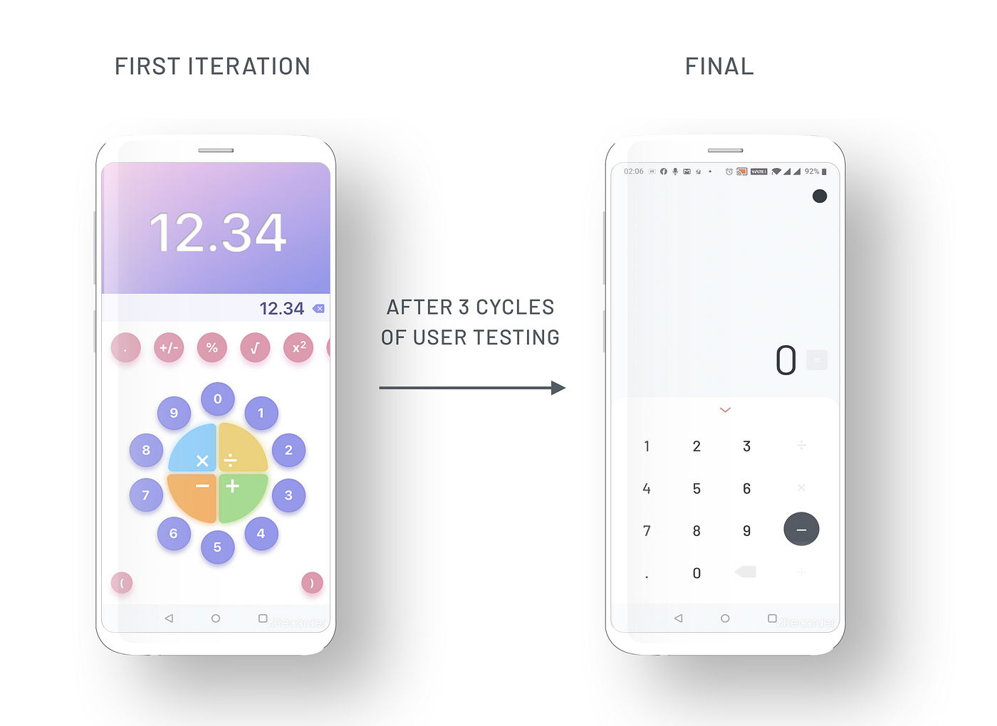
I had to test the 1–2–3 numeric keypad and a completely new placement of the basic operators which requires a functioning prototype for reliable testing and hence, I decided to code it out. Since I came from a no-coding background I spent the next 2 months learning XML, Java, Android Lifecycle, and a bunch of other necessary stuff like a 9-patch image and more. Below, is the built app that I tested with people.
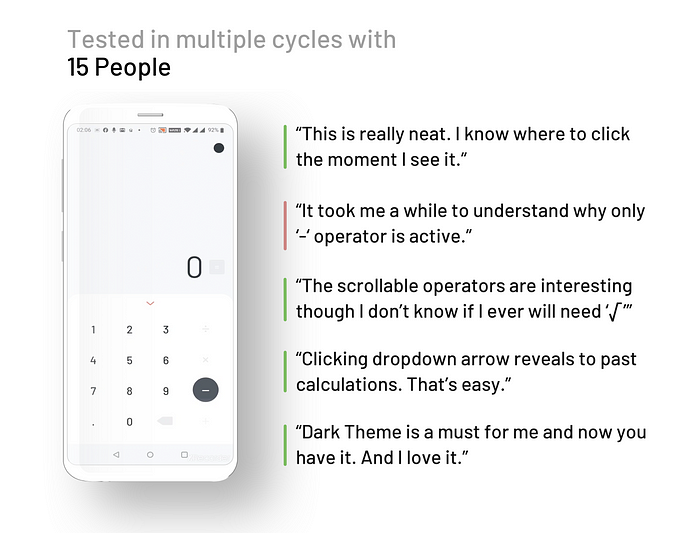
User Testing Continues… 🤓
It was so much fun to see users try out something that I had coded myself! I tested it out with many designer friends as well as less tech-savvy individuals to get balanced feedback.

I conducted multiple testing cycles with minor changes as per the feedback to validate findings on the go.
A Quick Detour 😉
I was briefly serious about implementing and testing the following concept but since it required a conscious effort to pull-up the tray to use extra operators. So I dropped it.

Surprising Findings 😯
There were many big and small learnings and insights gathered by testing the prototype. The following are the key findings that informed the design direction deeply.
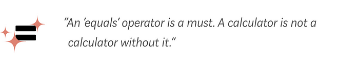
‘Equals’ cannot be omitted
Though technically unnecessary ‘=’ button provides the user with a sense of emotional closure and satisfaction by clicking on it at the end of every calculation. However, I decided to abstain from giving it the unparalleled significance and importance in today’s calculator interfaces.
Basic Operators cannot be played with
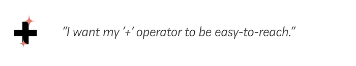
People have been ‘too’ used to the basic operators — addition, subtraction, division & multiplication. Touch this and the user goes hulk! Other less used operators can be tinkered with but these 4 seem to be untouchable if we want high adoption of the product.
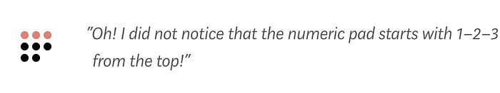
The 1–2–3 numeric Keypad can work
Most of the users did not notice any difference in the keypad. After using for a while, only one user came back with a feeling that it’s a little odd but easier to use. It seems like 1–2–3 numeric keypads can work well.
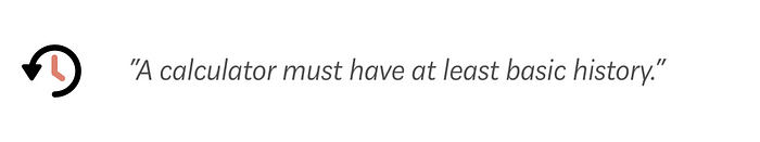
Storing past calculations is important for many
Interestingly, many testers hinted that they consider a calculator ‘complete’ when it stores past calculations. It is a basic product expectation if they are to ditch there custom calculator and download one from the App Store.
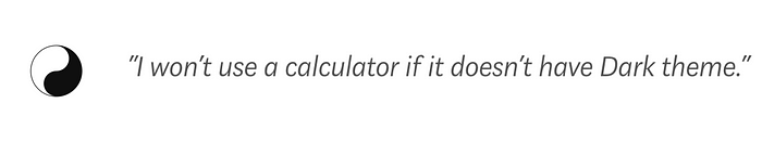
Users are addicted to dark theme
It was evident that the dark theme is a strong expectation of many testers. It’s easy on the eyes and subjectively more pleasing to look at.
Balancing between Innovation & Familiarity 😣
The findings and insights pointed the design towards a more classic design of a calculator hinting towards ‘playing by the rules’. I realized the significance of familiarity and how it drives adoption and had to come at a compromise.
I felt that with right balance between familiarity and innovation adoption can be maximised while staying true to its design principles and intent.
So, I took the following key decisions:
- The basic mathematical operators will be in the expected place on the keypad (right to the numeric keypad) but it can be vertically scrollable to extend access to more operators.
- 1–2–3 numeric keypad will incorporate the backspace key on the bottom right for easy accessibility and long-pressing on it can clear everything.
- The ‘equals’ operator will be out of the main keypad and on the top right, next to the input expression. This would allow users to click it but also hint at the lower importance of the operator.
The Compelling Calculator 🥳
After some rounds of testing, I was able to reach a point where most of my testers were positive to adopt this new calculator. The following version incorporates all the findings, and feedback from the testing and packages it into a compelling product.

This version sat pre-dominantly well with my testers with the majority felt positive towards adopting it. That's when I thought I should get it out on Google Play Store.
User Emotion with Different Testing versions
This graph clearly illustrates how usability and user emotion go hand-in-hand. With user testing, I was able to remove many deal-breaker usability issues and create a unique yet appreciably familiar product with a low-learning curve that people seem more open to adopting.

Let’s see how it does in the real world! I am quite thrilled and optimistic. 😁
Kudos on making it this far. Hope you enjoyed this case study as much as I loved putting it together. ❤️❤️
Try the Subtle Calculator here

