How good is your shopping cart experience?
A mobile e-commerce case study
Customers crave simplicity. With more and more users shopping on smartphones, convenience is becoming a must for consumers. It's necessary to have an experience that not only follows the best practices for e-commerce user experience but is also optimized for the capabilities and constraints of mobile devices.
Overcomplicating the check-out process can result in cart abandonment and loss in conversion. According to the Baymard Institute, the average online shopping cart abandonment rate is 69.8%. Simplifying the checkout process isn’t just something consumers desire — they demand it.
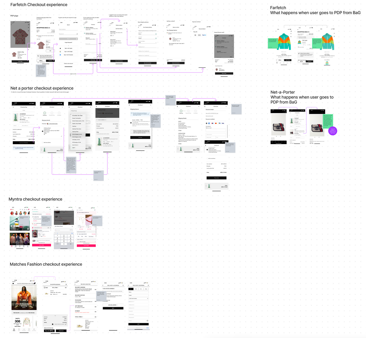
The Design and Product team at Ounass spent quite a bit of time benchmarking checkout experiences across various e-commerce sites. Through our research, we observed common patterns and created a checklist of must-haves. It also allowed us to experiment with how we can innovate and come up with a user-friendly experience.
The shopping Cart
Would normally consist of items and a total summary of how much those items will cost. However is that enough for the user to continue with the checkout process? As per Baymard, the top reasons for cart abandonment highlighted were:
- Extra costs too high (shipping, tax, fees)
- The site wanted me to create an account
- I didn’t trust the site with my credit card information
- I couldn’t see/calculate the total order cost up-front
- The return policy wasn’t satisfactory
What are we doing at Ounass?

The users can access the shopping cart from the navigation tab bar by clicking on the bag icon. The structure for the shopping cart is broken into 2 experiences, one for logged-in users, and the other for guest users. The UI interface for both is exactly the same with one difference which is for guest users we are giving them the option to create an account or log in (not mandatory).
The structure is as follows:
- Header: title and access to need help.
- 2 tabs below the header, giving users access to switch quickly between their cart and wishlist.
- Product cards: items the user added to their bag.
- Ability to add a gift message
- Ability to add a coupon code
- Ability to apply store credit (this component is visible only if the user has store credits)
- Ability to sign up for our loyalty program or use it to claim points
- A component explaining various installment payment plans
- Total cart summary
- Various payment methods are defined by their respective brand icons
- And a USP highlighting a free 30-day return policy.
What % of users continue from shopping cart to checkout on Ounass?
By observing the behavior of the users who engage with the shopping cart page, our data showed that x% of the users leave the shopping cart to engage with other pages in the app. We identified the majority of the users would navigate to the Product Display Page, most of them would visit their Wishlist, and the rest of the users were exiting the bag session by visiting other pages via the navigation tab bar. So how do you increase that y% that engages with the shopping cart to navigate to purchase?

Based on the competitor benchmarking we noticed a pattern with none to few exit points on the bag page. This led us to create a hypothesis if we can limit the number of exit points from the shopping cart, we can increase the number of sessions from the shopping cart to the checkout page (FTC will go through bag>shipping>payment>order review, returning customers will go through Bag>order review). Thus the increased number of sessions on the checkout funnel can impact our overall conversion rate in a positive way. In order to validate this hypothesis, we decided to run an A/B test.
A/B test rules

Control group:
These users will see the checkout as is.
Test Group:
These users will see a new shopping cart with exit points removed. The exit points we decided to remove are the navigation tab bar and the wishlist tab. The entry point to the shopping cart will still remain the same, which is the bag icon in the navigation bar. But instead of showing an interaction where the page just appears, we decided to treat the bag page as a bottom sheet, meaning every time you click on the bag icon, the page will slide from the bottom.
How did we monitor the A/B test?
Our goal for the project was to increase the bag-to-checkout session ratio from x% to y%. We defined the test group and control group funnel (see below) to make sure we set the right tracking requirements.

How did the A/B test perform?
The test was monitored for 2 months. To begin with, 20% of all the users (10% TG, 10% CG) were allocated to this test. We chose a conservative number as we wanted to make sure the test doesn’t impact our checkout negatively. In the first week, we noticed that the test group was performing slightly better than our control group. This gave us a little confidence and we increased the segment from 20% to 50% and continued to monitor the results. Over the next few days, the control group started to perform better than the test group. Please note: in terms of % of the difference between the two it wasn’t very significant. By the end of the 2nd week, we increased the segment to be exposed to 100% of all the users. By the end of the 2 months, the results continued to show the control group was performing slightly better than the test group.
What conclusion do we draw from this?
Our original hypothesis was that because multiple exit points are present on the shopping cart page, they act as distractions for the user to navigate away rather than continue with their checkout. After carefully analyzing the results however it showed us that exit points don’t make an impact on the user’s intention to checkout. But this could be because of multiple reasons, one for example as a luxury shopping platform, where the average basket size is not that high if you compare it to a lifestyle e-commerce platform the user motivation for checkout is completely different, or that users want the freedom to be able to navigate freely without restricting their actions.
How do we compare with the Baymards standard for Shopping carts?
While going through the checklist there are three points we noticed we are missing in our shopping cart experience
- Shipping costs.
- Delivery SLA per item.
- Ability to edit size directly from the shopping cart page.
It would be interesting to see whether iterating the shopping cart to have the 3 features above would make an impact on the user's motivation to checkout. Stay tuned, and we will share a case study soon with our findings!


