How can we use the color theory wheel in web design?

How can we use the color theory wheel in web design?
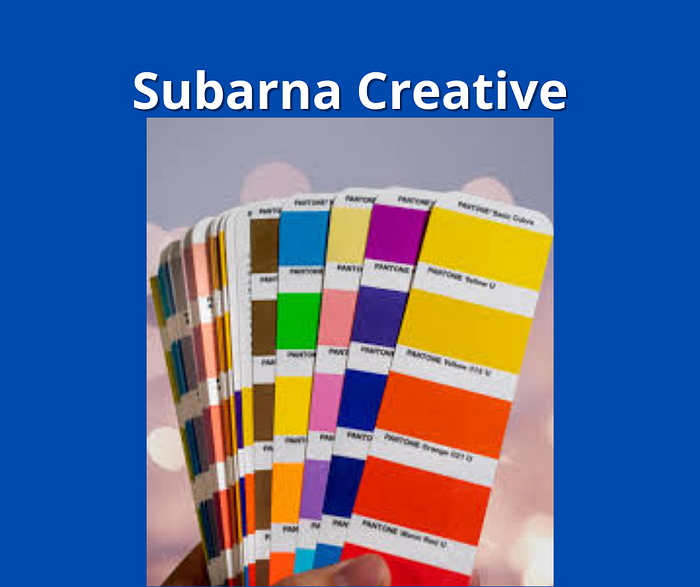
The knowledge of color theory is a must-know for every artist. Every color has its own meaning. When we use one color with another color then the first color also gets affected. Sometimes the second color highlights the first color, sometimes it subdues the effect.
The color wheel organizes all this information. We will take a quick look at what the color wheel is. Then we will discover the practices to leverage the most out of it.
How to pick the perfect color using a color wheel?
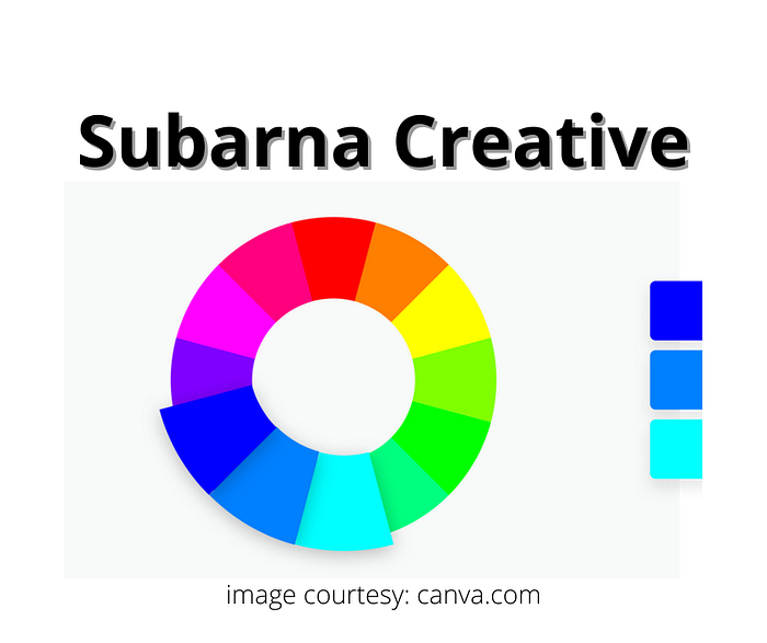
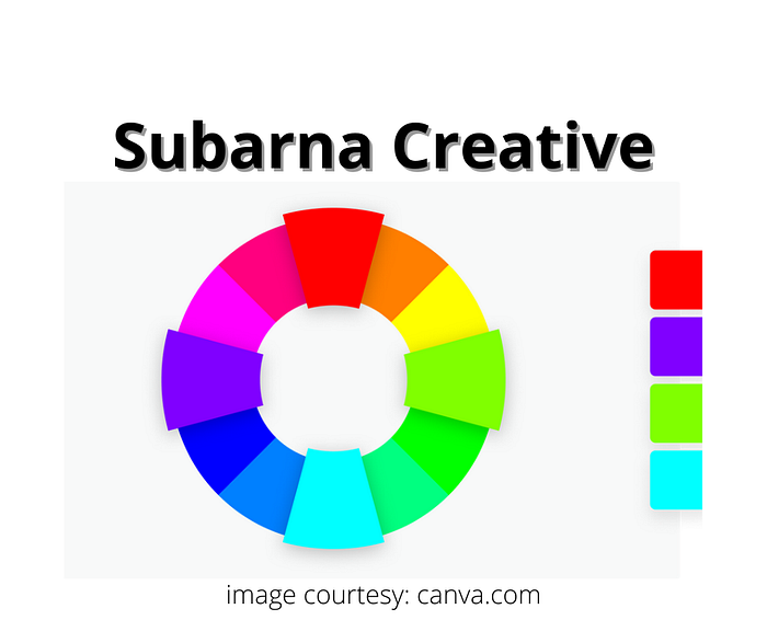
In the color wheel, there are twelve colors. We can divide them into three groups:

Primary colors:
There are three primary colors — red, green, and blue. We can never form these colors by mixing other colors. Rather, we derive the secondary and tertiary colors by mixing with each other.
Secondary colors:
There are three secondary colors — green, orange, and purple. We mix primary colors to form secondary colors.
Yellow + Blue = Green
Red + Yellow = Orange
Blue + Red = Purple
Tertiary colors:
There are six tertiary colors — yellow-orange, red-orange, red-purple, blue-purple, blue-green, red-violet, and yellow-orange. We mix a primary color with a secondary color to form a tertiary color.
For instance, we blue (primary) and green (secondary) to form blue-green (tertiary).
This is the reason why tertiary colors have such names as yellow-orange. We mix yellow and orange to form yellow-orange and so on.
Color harmony
As artists, we want to use colors that appeal to the viewer.

What happens when we choose the wrong color palette?
Our art may be too bland to even look.
The art may produce a too vibrant effect on the brain.
In both cases, our art conveys no information because no one wants to look at it.
If we are making logos for companies then such wrong color palettes will not appeal to customers. If we work for the marketing teams, then we will get unimpressed leads.
Our brand identity and revenues will suffer. This is why we should choose the best color palette.
Tips to choose your color palette
We will apply these formulae to the color wheel.
Tip#1. Analogous colors
Use a color wheel of 12 colors. Any three consecutive colors form the analogous colors. Out of these three colors, you could choose any one color to dominate. Since the three colors are similar, they together create a pleasant effect.
Ex. yellow, green, and, yellow-green.
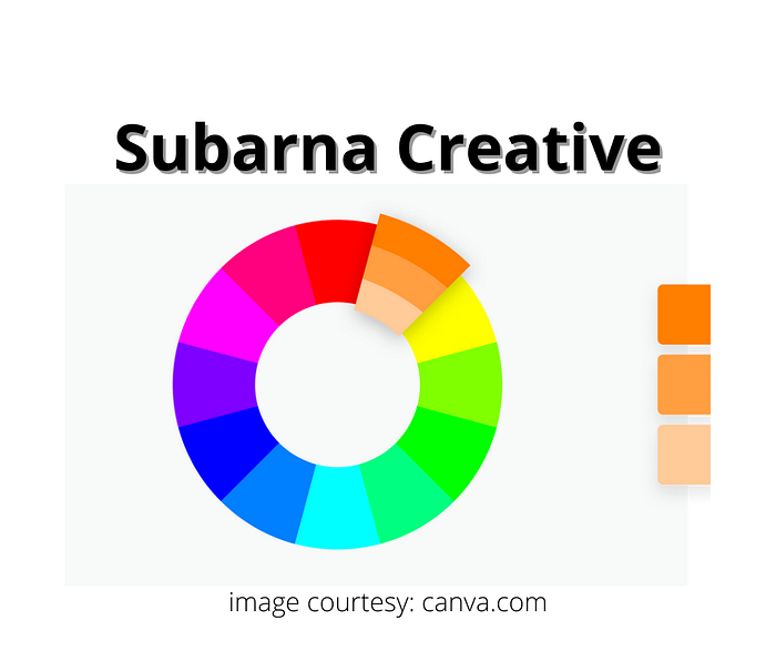
Tip #2. Complementary colors
Any two colors opposite to each other in the color wheel form complementary colors.
They create a contrast. The effect is vibrant but stable. The viewer loves to look at the piece of art.
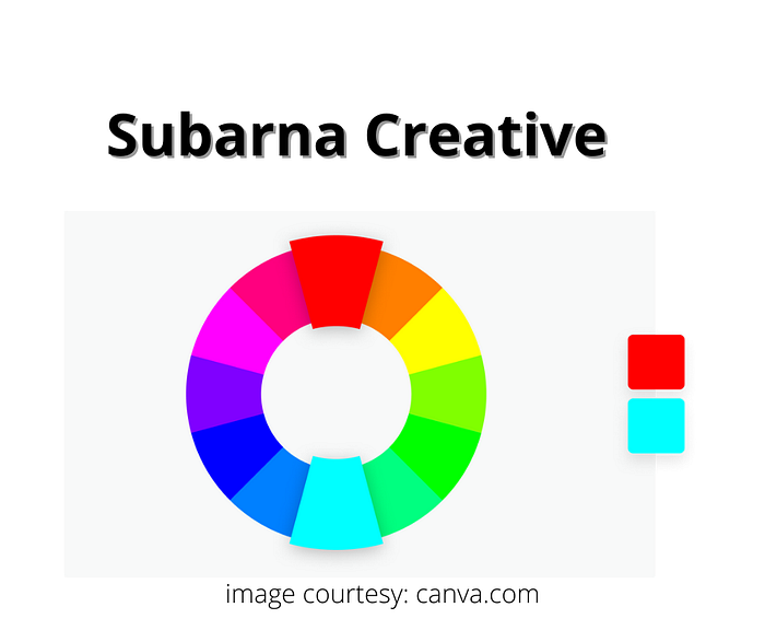
You do not have to choose any one color to dominate over the other. While one color forms a more backdrop, the other stands out as its contrast. All this happens on its own when you choose complementary colors.
Tip #3. Triad colors
You could use any three equidistant colors on the color wheel. Since the colors are equidistant on the color wheel, they can give stability. At the same time, they also have a vibrance.
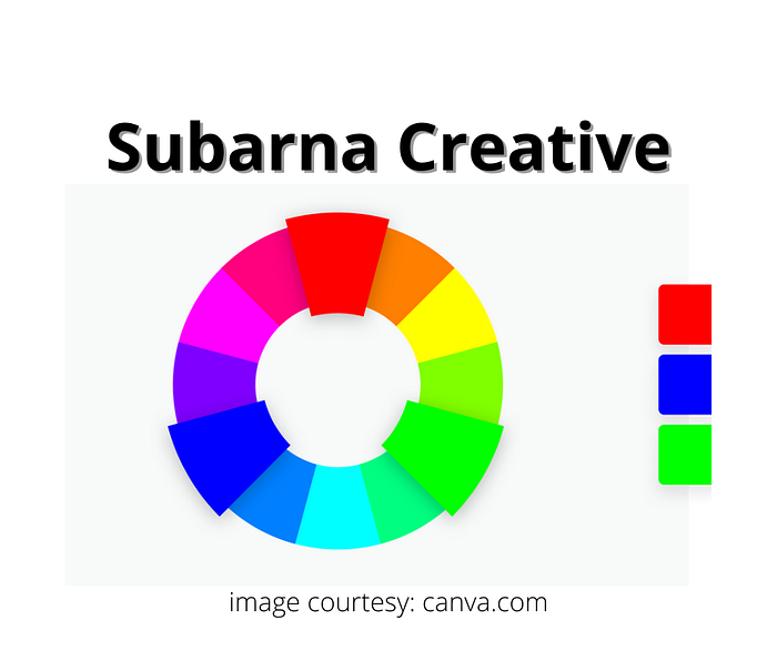
Choose any one of the three colors to dominate. Let it set the mood while the other two colors will create the contrast.
Tip #4. Tetradic colors
Use four evenly spaced colors on the 12 color wheel. One color will dominate and the others will create balance.
Tip #5. Monochrome
Monochrome involves choosing only one color for the entire art. Crazy as it might seem, we often use it to depict nature.
When you use only one color, you are free to use different shades and textures of that color.
Monochrome art demands maximum imagination because the effect of light, shape, and texture depicts the message.
Example of monochromatic painting: sea waves.
Conclusion
Colors have a lot to communicate. Wise use of colors can make an artist successful. Hence, artists have to build their color palettes on the basis of the message they want to communicate. The knowledge of color theory and the color wheel are indispensable.
If you want all my colour theory blogs then click here.
Follow me on Medium.
Email me at subarnacreative@gmail.com.

