Hinge: an app "designed to be deleted".
And how it helps build meaningful relationships.

Dating apps are online platforms for finding your dating partners(romantic sometimes). While these apps are gaining more popularity, the competitive landscape is also expanding.
The beginning of online dating goes back to 2009 with the launch of Grindr, an online dating app designed specifically for the LGBTQ+ community.
Tinder was launched in 2012, perhaps the most well-known dating app. How Tinder function is quite interesting; it shows one profile card at a time to the user; they have to swipe right to show their interest and left if they're not interested in the profile and move to the next profile card. This creates a flow state and makes the user keep swiping right and left. In most cases, initially, users tend to take time to make the decision but after a few cards, swiping right and left becomes a split-second decision. The competitor bumble also follows the same gamified approach. This game-like effect keeps the user hooked to the application and keeps swiping until they hit their daily free-like limit.
But is it necessary to keep the user hooked in this case?
Is it a bad hook or a good hook?
Creating a hook while the user wants to find the right one and delete the app is unethical. People swipe so fast that the swipes don't have any significance or meaning.

Today we'll see an online dating app, Hinge, that follows a different strategy and will primarily focus on the areas that make the app stand differently in the market, which makes it unique. We will understand the user-centred approach of this company.
Building products gets tricky when it relates to sensitive topics like emotional well-being.

Hinge focuses on people building meaningful relationships, finding the right one, and then deleting the app. Yes, you read that right! We will read more about the app's "designed to be deleted" part.
They promote meaningful relationships; the recent feature also allows users to add their relationship goals from the app. Value is the core of the company, and they mean it.


Hinge as a whole is an app that promotes relationships, discouraging split-second judgment.
As soon as you open the Hinge, the first thing you will see is the app telling you that it is "designed to be deleted." Why would an app be intended to be deleted? The sentence "designed to be deleted" implies that the app is designed so the user can find the right match, build something meaningful, and delete the app. They mean it.
I was surprised as I moved forward into the app. I noticed multiple design decisions following the designed to be deleted principle.
One of them was not having the option for sending media. But why? If that's the case, why am I referring to this app as a user-centred dating app? Whenever the conversation went dead, and I could not send media to break the ice, I also used to get annoyed by this. My matches and I used to share a common topic: "it is annoying that you can't insert media here," The subsequent texts used to be like, "yeah, do you wanna switch."

Hinge wants their user to switch the platform.
I made my account solely to see if my this hypothesis is true or not,
It is common for many people to struggle to communicate while texting, more when they don't magically/luckily land on some shared topic. Often, an ongoing conversation becomes dead, followed by the pressure of initiating the conversation again.
I found out people used to get annoyed about not having the option to send media, and then they switched to another platform like Instagram. But what's so great about switching platforms?
Social media platforms allow users to post stories. They can be a helpful tool for starting conversations with other users because they will enable you to share short, visual updates. Other users can also interact with them, which helps encourage engagement and facilitate conversation.
On other platforms, the users are likelier to keep talking and build something meaningful(not necessarily romantic) because having a conversation is easier there. Moreover, you can always reply to their story to restart the conversation and keep it going.

Hinge is making every effort to help users build meaningful relationships, helping them delete the app.
Talking about the app
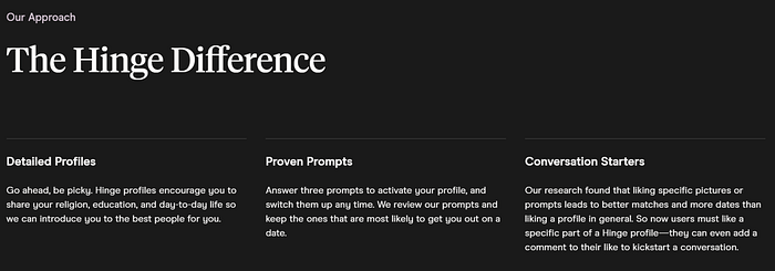
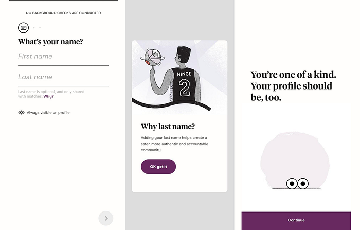
The first step is the account setup process. One might find it long. Still, it encourages people to make detailed profiles and add their religious beliefs, education, hometown, political leaning, etc. In contrast, Hinge promotes a detailed profile, but it does not force its user to enter all the details; users can prefer not to say or hide the information from other users. Detailed profiles help the other person to make the right decision, and the likes received are more meaningful.
Initiating conversations can be hard sometimes. The presence of dating apps in the market also enables "best pickup lines 2022" sites to exist. On the other hand, Hinge came up with a fascinating thing to break the ice. No need to talk about the weather to keep the conversation happening. Users must answer three prompts to activate their profile, which are displayed on the user's profile. Other users can see these prompts, like them, and leave a comment. This also helps the potential matches to find common ground and ice-breaking topics to initiate the conversation.
The profile liking part of this app is different from other apps. User does not just swipe right and left here like other dating apps. The likes are more meaningful here. Users have to select the part of the profile they liked and can add a comment with the like. Adding a comment with the like increases the chance of healthy matches. The comment gives the user an idea about their potential match and can see what part of the profile they have liked and left a comment on.
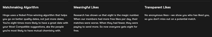
This process minimizes nonmeaningful likes and gives users the time to reconsider if they are really into the profile. Giving limited likes to the user also makes them make more meaningful choices.
Once you receive a like, you can see the profile of the person who has liked you; you can match with them if you liked their profile — no need to find that person by matching every profile with a blurred photo.
Hinge allows users to see the profiles of people who have liked them; they can match with them and move to the following profile. In the basic version, the app only shows the most recent like, and the user can move to the other one only after they match or unmatch the top profile.
The app learns your type and shows you those profiles that fit you.
There is also the option to add video and audio prompts; this makes the app environment more human, and the profiles feel more natural.
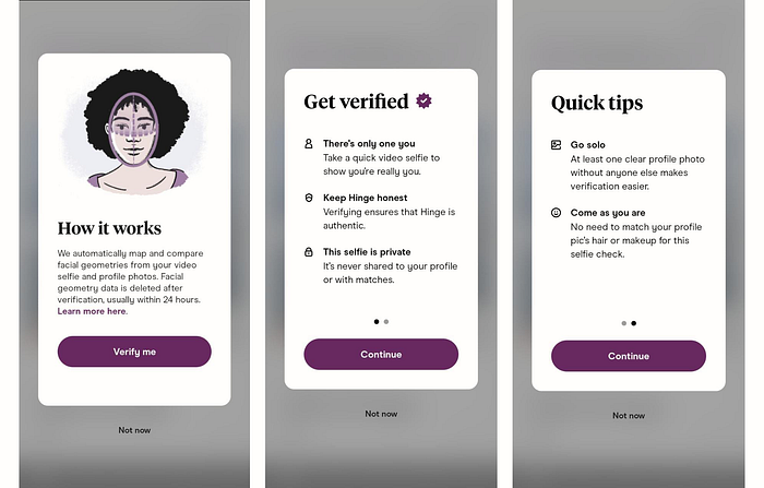
Hinge cares about people's privacy; features like having the option to keep some things hidden in the profile, showing users how their account verifying process works, and usually deleting the data within 24 hours support this.
Hinge learns about the user's choice by analyzing their likes and the data user provides them so that it can show the profile cards of the people who are more likely to match with the user.
The language and writing used throughout the app give the user a comfortable experience. Also, it aligns with their values. The same values can also be seen on Hinge'ss website page.

This reflects the ethics of their work; They want you to use this app just as long as needed and then delete it.

