Heuristic Evaluation of Zomato — Consumer App.
Zomato is a food delivery app based out of India. Since this is an amazing product with good design. I have done a small heuristic evaluation of the app. This is a really good way to test your product without testing it with the user and it saves a lot of time.
There are 10 heuristics in total and I have labeled it, whether this is good or bad. Scroll down and find out.

Visibility of system status — BAD

- Not much difference between the hero image & title and the restaurant card. Looks very similar, in the beginning, when the screen loaded.
- I thought it was a restaurant. I was searching for the title of the page, but couldn’t find it in first sight.
The Icons as camouflaged in the image. Difficult to spot them.

For a moment I thought that the cross icon would delete the location. Bad placement. It made me curious that, if I clicked on the cross, will it delete the address or close the screen?
Match between the system and real-world — GOOD

Veg, Non-Veg indication — You can find this in the actual restaurant menu also
Supports local language — This is the language they use in their daily life, which makes it more comfortable for them while using it.
Delightful animation — When you get the total bill and someone tells you that you will get some discount on the bill, it makes you really happy. In the same way, the confetti also does the same… Yay! you got a discount.
User control and freedom — Good

I’m able to see my cart even though switched to dining. When gives me full control that whichever page I’m I can place my order.
Even if I’m searching for something — it shows two tabs. 1 for dining and the other for delivery no matter if you are in the delivery tab or dining tab. Like I did for Pizza.
It can be like — I want to order a pizza or I want to see which restaurant I want to order a pizza.
Consistency and standards — GOOD
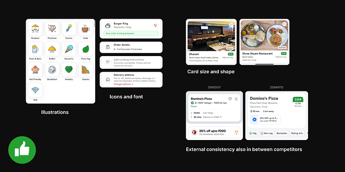
The icons, the fonts, the colors, and the illustrations are consistent all across the app. Even if I switch from delivery to dining or others.
The card designs are also consistent. Whether its small or big cards
External consistency can also be seen, if compared to its direct competitor — Swiggy.
Error prevention — BAD (But only one issue found)
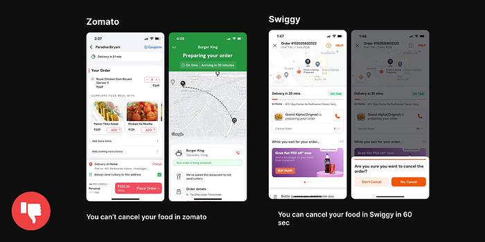
I wanted to see whether I can cancel the order or not. But no you can’t.
In swiggy, they have the option to cancel an order within 60 sec, to avoid error prevention. Suppose I added something that I don’t want to. I can cancel the entire order immediately. If I have ordered something I don’t want by mistake.
Recognition vs Recall — GOOD
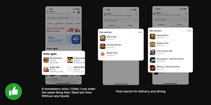
Order again feature. If I feel like ordering the same dish I had last week because it was good. Instead of recalling the restaurant name and exact dish, it shows my previous orders on the home page. Upfront.
Past searches in both delivery and dining. Records all your entries, would be really helpful if someone asks for restaurant recommendations for dining.
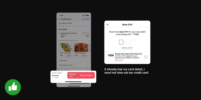
It already has my card detail, I need not take out my credit card from my wallet and enter the card number. I only need to enter the CVV for security purposes.
Flexibility and efficiency of use — GOOD
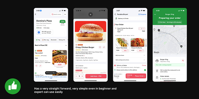
Has very straightforward, and very simple even beginners and experts can use it easily.
Aesthetic and minimal Design — BAD
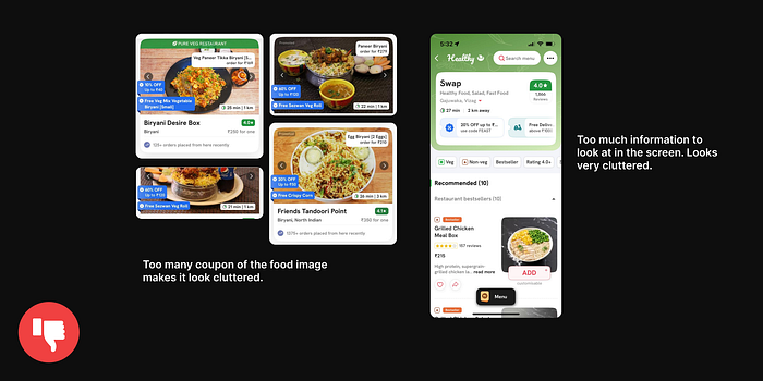
- Big images of food with too many coupons for the food image make it look cluttered.
- No breathing space on the screen.
- In the other screenshot, there are too many things highlighted. If I’m looking for any information, I have to look for it for a while and find what I need.
Help users recognize diagnose and recover from errors — GOOD
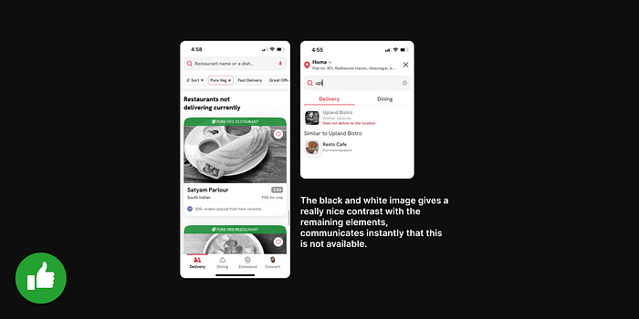
Does not deliver to this location — In red color and black and white image. Without even reading the text, I understand that this food item or restaurant is not available right now.
Help and documentation — GOOD
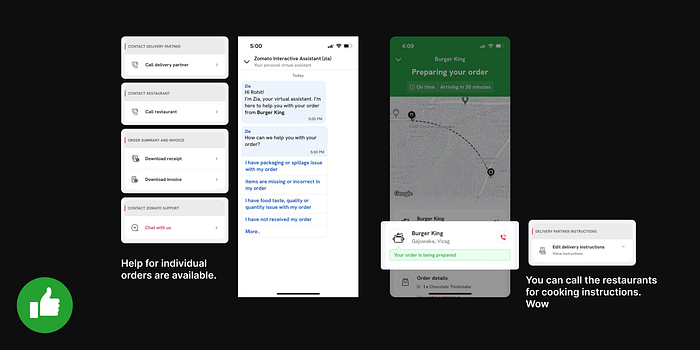
Chat help for individual orders is available. You can also call the restaurant for cooking instructions when the order is being prepared.
Thanks for reading. Hope you guys like it and learned something new from it.
Don’t forget to give 50 claps on this article.

