Heuristic evaluation: a walkthrough guide
How to evaluate interface design with usability heuristics.
Introduction
It’s important to test a design with the people who’ll use it.
But we don’t have to pretend that users are the only people who can find issues with a product.
As designers, we can fall back on established design guidelines when we need to do a quick check against best practices.
Think of these guidelines like standing on the shoulders of giants: other designers and researchers have spent years finding out what works and what doesn’t. And now you can use their tried-and-tested methods to carry out a self-guided heuristic evaluation of any product or system.
What is a heuristic evaluation?
‘“A heuristic evaluation is a method for identifying design problems in a user interface. Evaluators judge the design against a set of guidelines (called heuristics) that make systems easy to use.”— Nielsen Norman Group
Heuristic evaluations have a lot going for them: they’re low cost, require no planning and can be used at any stage of a product’s development — from the earliest hand-drawn wireframes through to high-fidelity prototypes (see below) and years after release.

Which method to use?
There are different methods of heuristic evaluation, including Schneiderman’s Eight Golden Rules of Interface Design and Norman’s Seven Fundamental Design Principles.
In this article, we’re going to focus on the most widely used evaluation method in the field of usability and UX design: Nielson’s 10 Usability Heuristics for Interface Design.
It’s worth noting that a lot of the same principles crop up across different usability frameworks, such as consistency, shortcuts, feedback, user control and error prevention/handling.
Nielsen’s original heuristics were were devised in the 90s, and they’ve been updated over the years. But they’re as relevant today as when they first came out. Why? Because they’re based on psychology, not technology. And good usability is all about how an interface meets our psychological needs from consistency and control to feedback and flexibility. So the principles that made a computer system usable in 1994 still apply in 2024.
That means you can apply heuristic evaluation to websites, mobile apps, spatial computing (AR/VR), voice-controlled AI assistants — any situation where users interface with a product.
The walkthrough: evaluating a prototype
I’ve designed a mid-fidelity prototype for a fictional holiday booking app, with eight screens (see below). I now want to do a quick check against best practice UI design guidelines to find issues and areas to improve.

Let’s see how the prototype stacks up against Nielsen’s usability heuristics:
- Visibility of System Status
- Match Between the System and the Real World
- User Control and Freedom
- Consistency and Standards
- Error Prevention
- Recognition Rather than Recall
- Flexibility and Efficiency of Use
- Aesthetic and Minimalist Design
- Help Users Recognize, Diagnose, and Recover from Errors
- Help and Documentation
1. Visibility of System Status
Systems should keep users informed of what’s happening, using timely feedback. This lets the user know the system state has changed.
Result
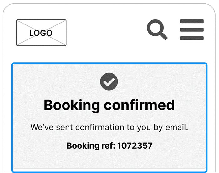
- The prototype indicates that the system state has changed in some areas.
- For example, on the final screen there’s prominent feedback that the booking is confirmed (see below).
- The feedback presents a clear visual hierarchy and shared boundary to group elements and make the messaging distinct.
Recommendation
Add more feedback, such as progress indicators, to inform users that results are loading or payment is processing.
2. Match Between System and the Real World
Systems should use language and concepts that are familiar to users. Your design should feature common, everyday words and avoid jargon, acronyms and technical terms that are inaccessible.
Results
- Headings are written in plain language (‘Find your holiday’)
- Button text is clear and direct (‘Continue’ or ‘Pay now’)
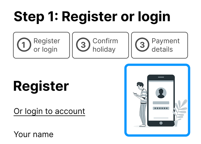
- Images represent concepts like logging in (see below), signifying visually to users how to use the design
- Cards naturally map to how physical cards might be organised in the real world
Recommendation
An obvious feature to add on future iterations of a holiday booking app would be maps to provide literal mapping between a destination and its location.
3. User Control and Freedom
Users make mistakes, so it’s useful to include an ‘emergency exit’ for them to undo or start again. This means cancel, clear and reset controls are important.
- The prototype follows this heuristic, for example the results screen affords a reset option (see below), including an appropriate signifier icon.
- The design also includes back buttons on most screens to undo / reverse actions.
- However, no thought has yet been given to quickly closing elements like cards or menus.

Recommendation
Add a ‘Close’ or ‘X’ button when cards are open displaying more information.
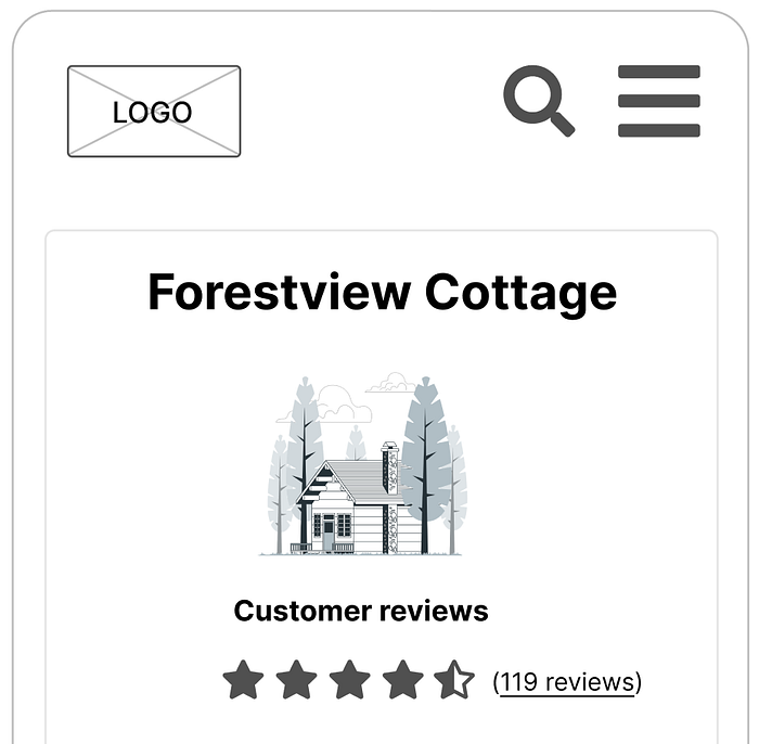
4. Consistency and Standards
Users shouldn’t have to worry about whether different words or actions mean the same thing.
Results
- The prototype follows good practice internal and external conventions, meaning it will be familiar to users and easier to use (Jakob’s Law)
- The prototype controls look and work consistently across the design, for example all back buttons use the same design, as do continue buttons (internal consistency).
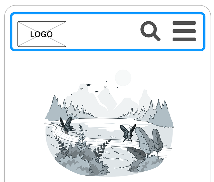
- The header (see below) follows conventional design patterns, with the logo top-left while the search and navigation use standard icon signifiers like the magnifying glass and hamburger menu (external consistency).
Recommendation
Continue following conventions and standards consistently when it comes to the high-fidelity design — for example, use typeface and colours consistently across the prototype.
5. Error Prevention
Good design prevents errors arising from slips and mistakes.
Results
- The prototype prevents user error by using a mix of logical and physical constraints.
- For example, payment fields (see below) would be constrained by the type and number of characters that can be entered.
- Buttons are not too close to each other, reducing the risk of a user slipping and pressing ‘back’ instead of ‘continue’.

Recommendation
When developing a functional prototype, add warning messages requiring confirmation (friction) to prevent users accidentally committing destructive actions such as deleting their account or clearing an entire booking.
6. Recognition Rather than Recall
Systems shouldn’t force the user to remember information from one screen to another. You can reduce cognitive load by the system ‘remembering’ information users have already entered — then reminding them of it.
Results
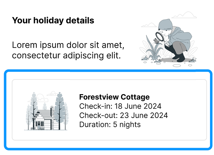
- The prototype follows this heuristic by repeating chunks of booking information as a recurring pattern.
- This allows the user to recognise this information during the booking transaction steps (see below), i.e. they don’t have to remember the dates they entered previously.
- However, when searching for holidays the initial preferences users entered aren’t displayed — meaning they would have to recall it while browsing options.
Recommendation
In a future iteration display ‘You searched for…’ information on the search results screen. This uses extra space by is a worthwhile trade-off.
7. Flexibility and Efficiency of Use
Expert users can benefit from hidden shortcuts, unseen by novices. This allows a product or system to cater to different types of user.
Results
- The prototype does not include any hidden shortcuts.
- While every user is a ‘novice’ for a brand new app, over time returning customers would benefit from hidden and advanced options.
- The app could be launched as a minimum viable product (MVP) with basic functionality, but future iterations should add a login button shortcut on the home screen at a minimum.
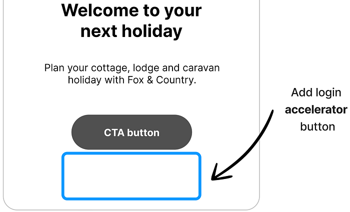
Recommendation
Give experienced customers the option to login earlier as an accelerator. Content could also be personalised for them (maybe suggested holidays based on past bookings) with advanced options to customise their holiday.
8. Aesthetic and Minimalist Design
Interfaces shouldn’t contain unnecessary information, as this competes with important information for the user’s attention.
Results
- The prototype aims for a clean, simple and minimal design aesthetic (see below).
- Every element of the interface serves a purpose — an essential focus when designing for smaller screens.
- The minimalist design reduces cognitive load, giving users the information they need first and hiding less important information behind menus — the principle of progressive disclosure.
Recommendation
Ensure that the design retains a minimalist aesthetic when moving into the high-fidelity phase. Make sure any extra requirements that add complexity to the interface justify the trade-off of simplicity.
9. Help Users Recognise, Diagnose, and Recover from Errors
Good design includes clear and helpful error messages when users experience a problem, for example inputting incorrect login details.
Results
- The prototype isn’t advanced enough for users to enter data into login or payment fields.
- That means that while the design includes error prevention in theory, we’re unable to test its error handling (through messages to the user).
- We are now reaching the limits of how a semi-static mid-fidelity prototype can be evaluated.
Recommendation
Add enough functionality and interactivity to test the visibility, proximity and efficiency of error messages in future iterations.
10. Help and Documentation
Ideally systems should not require additional explanation, however it may be necessary to include documentation to help users complete tasks.
Results
- As this is an early design, there is no help documentation available for users, for example frequently asked questions (FAQs) resources.
- However, a prototype at any stage of development could signify where users could go to find help, such as a link in the navigation menu
- This omission can easily be fixed in the next iteration, even if there’s no actual help information behind it yet.
Recommendation
In future, create more advanced prototypes that test the discoverability of help and support information.
Conclusion and recommendations
You can see that it’s relatively easy to quickly evaluate a design against well-established usability guidelines.
In practically no time at all, we’ve found that a lot of UI design good practices are being followed — but there are plenty of areas for improvement.
Here are the recommendations we identified for each heuristic:
- Visibility of System Status — Add more feedback to alert users to system changes, such as loading and processing indicators
- Match Between the System and the Real World — Add maps to holiday destinations to show a match between the app and the real world
- User Control and Freedom — Add a ‘Close’ or ‘X’ button on cards so users can exit and undo actions
- Consistency and Standards — Continue following familiar conventions when it comes to the high-fidelity design
- Error Prevention — Add friction to prevent users accidentally committing destructive actions such as deleting their account or clearing an entire booking
- Recognition Rather than Recall — Add ‘You searched for…’ information on the search results screen so users don’t have to remember it
- Flexibility and Efficiency of Use — Allow experienced app users to the login earlier as an accelerator, offer advanced customisation options and consider personalising content for individual users
- Aesthetic and Minimalist Design — Ensure the design retains a minimalist aesthetic when moving into the high-fidelity phase
- Help Users Recognize, Diagnose, and Recover from Errors — Add enough functionality and interactivity to test the visibility, proximity and efficiency of error messages in future iterations
- Help and Documentation — Add links to help information to test the discoverability of support content
Final thoughts
It’s important to remember that heuristics are only guidelines. They’re principles, not unbreakable laws. If you have justification for going against a heuristic, you can do it.
For example, introducing a new or unfamiliar design pattern violates the ‘Consistency and Standards’ heuristic. But if it’s on-brand for you to differentiate yourself from a competitor in a disruptive way, then an unconventional interface may make sense.
However, for every justified design decision that flies in the face of usability heuristics there are probably 100 where designers/stakeholders just want to do things differently without a valid reason.
I’ll leave you with these wise words…
“The best designers sometimes disregard the principles of design. When they do so, however, there is usually some compensating merit attained at the cost of the violation. Unless you are certain of doing as well, it is best to abide by the principles.” — William Strunk
Sources
Batterbee, I. (2024) Don Norman’s seven fundamental design principles. Available at: https://uxdesign.cc/ux-psychology-principles-seven-fundamental-design-principles-39c420a05f84
Benaida, M. (2023) ‘Developing and extending usability heuristics evaluation for user interface design via AHP’, Soft Computing, 27(14), pp. 9693–9707. Available at: https://doi.org/10.1007/s00500-022-07803-4
Moran, K. and Gordon, K. (2024) How to conduct a heuristic evaluation. Available at: https://www.nngroup.com/articles/how-to-conduct-a-heuristic-evaluation
Nielsen, J. (2024) 10 Usability heuristics for user interface design. Available at: https://www.nngroup.com/articles/ten-usability-heuristics/
Norman, D.A. (2013) The design of everyday things. 2nd edn. New York: Basic Books.
Wong, E. (2024) Shneiderman’s eight golden rules will help you design better interfaces. Available at: https://www.interaction-design.org/literature/article/shneiderman-s-eight-golden-rules-will-help-you-design-better-interfaces
About the author
Andrew Tipp is a lead content designer and digital UX professional. He works in local government for Suffolk County Council, where he manages a content design team. You can follow him on Medium and connect on LinkedIn.

