Heartbroken Isn’t Easy but It Will Fine: Redesign Diceritain (Peer Counseling Company)
The most hard time for people with broken hearts is how to survive and get support from people around them. This story begins with a girl named Davv. She and her boyfriend broke up after 2 years together. Her boyfriend cheated on her with his college friend. When she found out, she was really sad, and felt like the world just fell down. That moment was the hardest time for her. After a week full of tears, she realized that she couldn’t do this anymore. So, she decided to look for people that could support her and help her find herself again and be alive.
She found a website that provides counseling with counselors that are the same age as her, the website is Diceritain. Diceritain is a peer counseling community for students in Indonesia.
What is the Problem?…
It is her first time to access this website, she wants to know what product could solve her problem. But, when she accesses Diceitain’s website, she finds something that annoys her. Here some pain points that she got when using Diceritain:
- I should go back to the top to see what they offer to me
- How could I trust this website?
- Home page just explaining who they are
- I couldn’t find their products if I did screening read
- I should out from website to booking session
Because her problem should be done as soon as possible, let’s help her to find solutions to those problems using design system methodology. I should make sure that another user feels the same way as Davv feels so I decided to interview 3 people.
After I interviewed them I got key insight as bellow
- Usually, users come for counseling or self-development purposes.
- It’s always calming if users can decided to put their trust for the first sight
- It’s always a headache to get much information that is unnecessary because it’s wasting time
- Many step to booking session is make users frustration
To help I come up with solutions, I should emphatize the problem and end up got these questions:
- How might we easily access the navigation menu as fast as possible?
- How might we trust Diceritain just through screening reading?
- How might we provide information about Diceritain with just one scroll?
- How might we provide a booking session through the website?
That leads to the solution I proposes:
The Solution Is
I introduce the new Diceritain design: The personalized peer counseling companion. I offer 3 value proposition for fellow :
Effortless.
Create a new Diceritain easily and swiftly
Personalized.
Get yourself reminded of your propose based on your goal to get counsellor
Intelligent.
Save your time to booking session
Ideate
Once I had a clear idea of our users and their needs, I was able to ideate on a final user flows, here user flow when use Diceritain’s website
Our goal is to recreate a user interface Diceritain’s website using the solutions that I found after defining problems. I was focusing on pages like user flow explained.
Prototype
We created low-fi wireframes, followed by hi-fi with Figma, so we can test out our idea
Fixed, simple, and organized navigation help user to save their time and avoiding too much choices on navigation
Interaction information makes the design live and users know what they should do. Button consistency avoiding confusion.
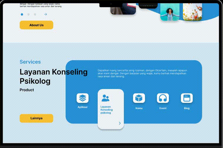
Product highlight is important to get new customer and as branding who we truly are as a business company
Users trustness on the first sight is a big step, so I put statistic data on top of home page.
Effortless move when booking session is the main part of my redesign of this web.
The End of Davv’s Grief
I’m so satisfied with this result, but I should test the design to get insight for users. But, the positive side I hope Davv can get over her ex-boyfriend as soon as possible after counseling at Diceritain.
End quote for Davv
“What is meant for you will not pass you by I promise — the right things will come and stay”

