iSimplify Presentations
Have you heard of the squint test?
It takes 2 seconds to decide what matters on your presentation slide

We all love good presentations and we want to make a difference. A good design is human-centric. You do not have to be a designer or a visual thinker to experience and create good presentation designs. Think of a good presentation design like a beautifully stacked bookcase where you can easily identify each and every book with minimal effort. It gives you a satisfying image of what to expect.
Unfortunately, I, like many others, experienced presentations that bored me to death. Because we do not wish that upon anyone else, when we create presentations, we try to create or recreate the best design possible. However, we often find ourselves in a position where we do not know what to put in our slides. Our presentations are our currency; i.e., reputation and image. That’s why good presentation designs are as important as they’ve ever been but even more important these days
Now that we all agree that good presentations design is important, how do we make sure we’ve created the right design?
I love a good feedback. I want to impress people and create something engaging and meaningful. I’ve asked myself this question many times, “how do I make sure I created the right design for my presentation?”. I’ve tried dry runs and asking for feedback from other people until … I stumbled upon a tactic that can help me test out my presentation design by myself.
If you are new to the world of presentation design, you might want to make yourself familiar with this tactic. It’s a valuable guide to viewing your presentations through the audience eyes.
Apparently, before you ship your presentation for the audience to see it, all you have to do is: squint. Literally! and that is, folks, what we call The Squint Test
Sounds silly for something to be associated with the word TEST, doesn’t it? It is actually an effective tactic widely used in UX design. Bear with me while I explain what it means and how you can use it to build the best possible presentation design, maybe ever.
- - -
The content of this article is based on my personal experience and years of practice. I believe everyone is capable of using these guidelines to create better presentations.
- - -
The right question to ask now is, how do I perform the Squint Test to create better presentations?
The test is quite literal — present your design on a screen, pretend that you lost your glasses, then squint your eyes. What you’re going to see is a distorted image.
Oxymoron, isn’t it? The purpose of this exercise is to make everything on your presentation blurry except for few elements that you are able to point out. Surprisingly, those elements are what really matters on your presentation.
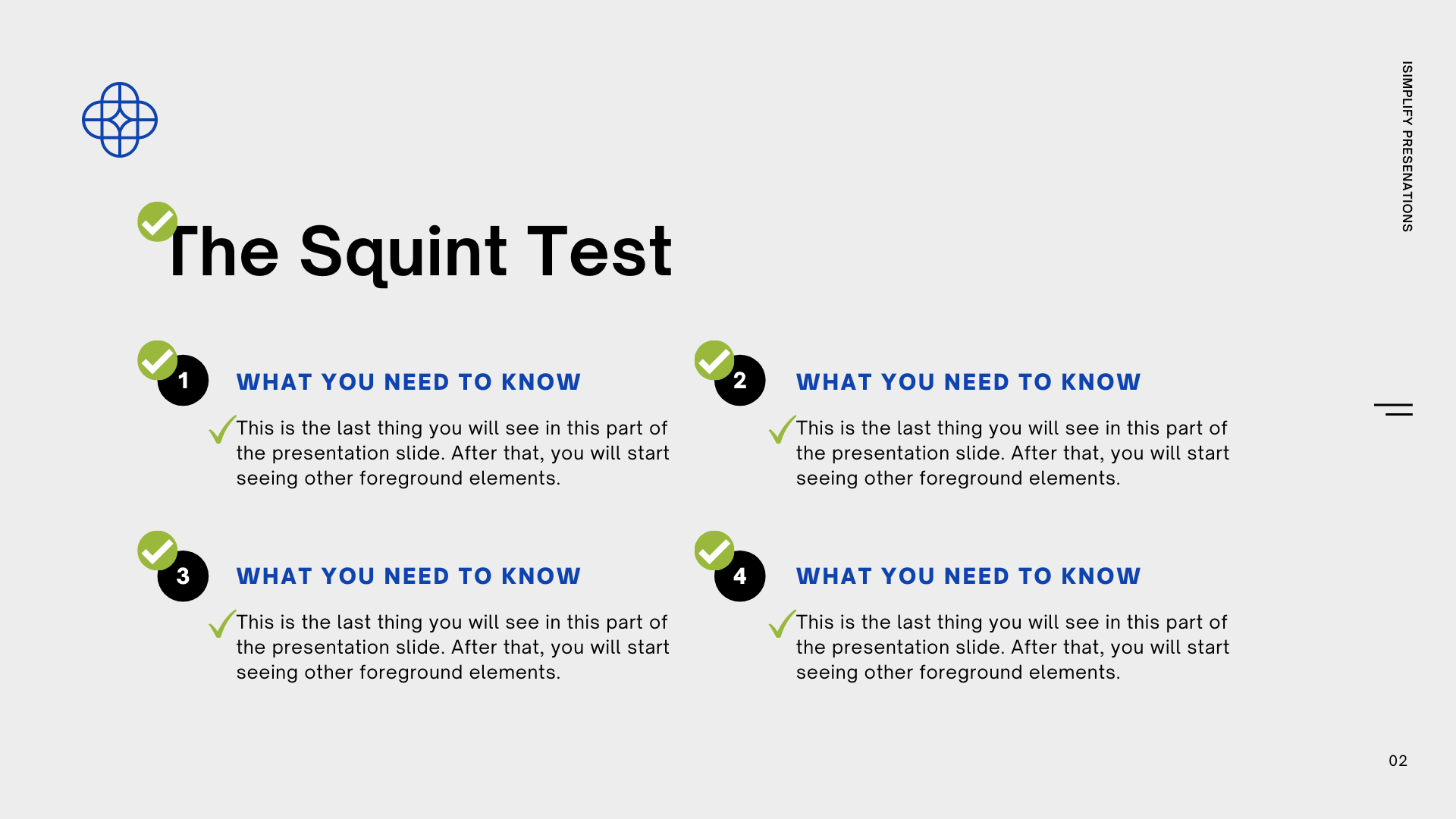
Let’s put things into perspective of how this works. Look at this simple slide below with your eyes wide open for only few seconds. Now, slightly squint your eyes and compare what you saw now with what you saw the first time when your eyes where wide open.

What are the elements that jump at you first? Are they the ones I marked below with a check mark? Everything that came into the foreground is what your audience will see first when they look at your slide for the first time.

What does the Squint Test do to your vision?
The distorted vision created by the test makes it very easy for you to point out the things that your audience will see first and perhaps the order by which they will see them. It will also highlight the elements that are intended to stay in the background.
When people look at your slide for the first time, the first thing their brain does is determine what matters (figure) and what doesn’t (ground). It starts to make sense of the visual cues and builds associations and relationships based on the placement and proximity of the presentation elements. Hence, the test makes you process the elements and the negative space around them revealing a visual hierarchy which eventually determines what we see first, second, and last.
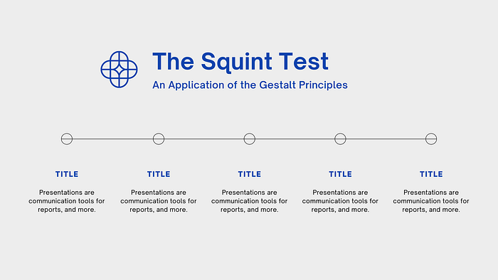
Spend just a few seconds looking at the slide below and note down a couple of elements that you see first. I don’t know about you but the title definitely jumped at me.

Again, slightly close your eyes and look at the same design above to practice the squint test. Notice the order by which you saw the elements on the design.
What’s even more interesting about this particular design, is that you start to see the elements on the slide in a specific order. The design creates what we call a “visual hierarchy”. It is a very powerful tactic because you can control what your audience can see at first then decide the order by which they see the other elements, creating a seamless and beautiful flow. This could help you ensure that you get the desired outcome and that the appropriate calls-to-action are clear.
Kate Strachnyi simplified that idea in the following design in her LinkedIn post by creating a simple yet practical visual hierarchy that you can replicate to any of your presentation designs. Take a look at the visual below, then squint your eyes.

What is the role of negative space in the Squint Test?
First, what is negative space?
Negative space has long been the building block of good designs. We do not only think in terms of the elements we design, but essentially of the white space around them. Look at the example below and squint your eyes. What is the first thing you see? A black triangle!

Our brains are exceptionally good at filling that negative space and creating something whole and meaningful. These visuals were once viral and the internet went crazy all over them. In reality, this is based on the figure-ground relationship of the Gestalt principles — which is one of the most important principles behind any meaningful design.
My goal here is not to teach you about the Gestalt Principles. There is a lot of great content online that I recommend you read through such as the article below by Cameron Chapman. The goal here is to show you that understanding these principles is fundamental in making your presentation design work and to show you how it works.
Then, what is the significance of negative space and the Gestalt Principles in the squint test and presentation design?
Let’s get the jargon out of the way…
Gestalt (form, shape in German) is a group of principles that think the world around us is perceived as a whole, not as small elements and components. Everything is seen as a part of a bigger whole and a much more complex system. As explained by Eleana Gkogka in her Medium article,
The Gestalt principles attempt to describe how people perceive visual elements when certain conditions apply.
In many ways, the squint test is a simple tactic that you can use as a checklist to determine if your presentation design satisfies the correct application of the Gestalt Principles. In his Medium article, Jonathan Beer talks about how these principles can not only guide but also “take the guesswork out of design”.
Learning to incorporate them can significantly improve the audience experience and interaction with your presentation. And let me tell you, they are quite easy to incorporate into just any presentation. The result is a much more elevated presentation with a seamless flow of information.
Going back to the squint test, if your presentation contains a lot of elements, doing the squint test will help you understand your negative space better and will highlight the elements that should stay and the ones that should go. It will also highlight the existence or the lack of clear visual relationships on your design. Using the squint test to determine that is a great tool that can come in handy any time in the design process.
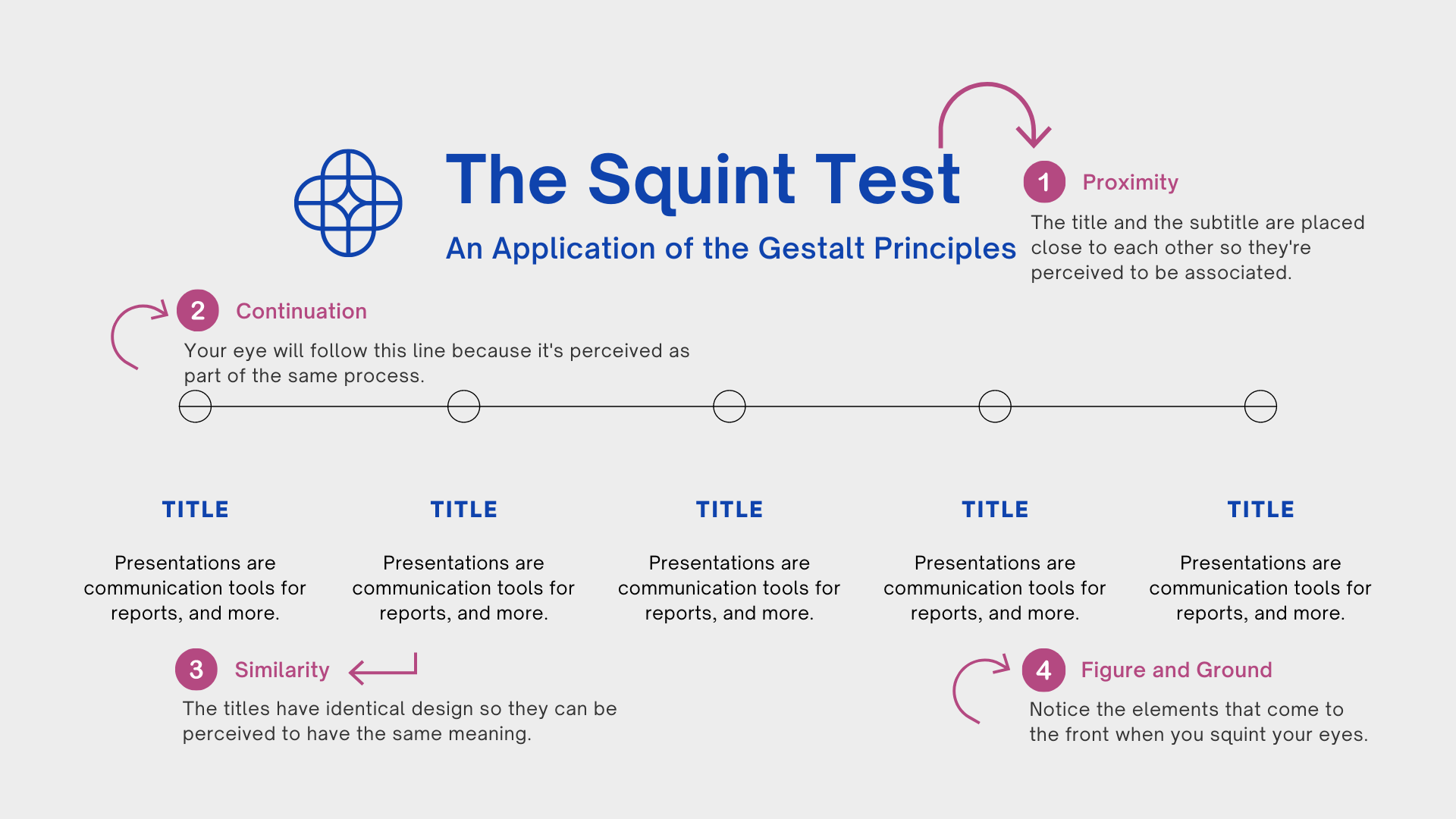
To appreciate the Gestalt principles, take a look at this presentation slide
Notice in the slide below how we used some of the Gestalt principles to create a better presentation design: proximity, continuation, similarity and figure-ground.
Learn more about mastering visual communication through presentations following Gestalt principles in this article.
Why is the Squint Test important?
Because we are so attached to our work and design, we’ve lost sense of what our eyes would hit first when we look at them. What would our audience see first when they get the first glimpse?
Naturally, when you blur your vision, you remove the clutter and noise from your slide. It’s a simple tactic to better understand your design and get an outsider perspective. It is a good trick to keep in your pocket to assess the design, structure and flow of information in your presentations to determine the efficacy of the layout and visual hierarchy. It is not meant to replace any of the techniques to evaluate the design but a quick gut check never hurt anyone.
What’s next?
The next time someone asks you if you like their presentation, ask them to squint first. Remember, always create something worth squinting for.
Follow me on LinkedIn, Instagram and Facebook for more stories on remarkable presentations.

