Guide to using color harmony
Designers tap into color harmony to craft experiences, forge brand identities, and boost accessibility. This cool concept is all about colors playing nice together, not just looking good. It’s super key since it has an influence on how we see stuff, our feelings, and how well things work.
This article aims to explain the various color harmonies and their uses.
1. Monochromatic Colors
This color harmony uses a single hue and playing around with its variations. We see this in its various tints where white mixes in, in its shades that come from black’s addition, and in its tones which involve a bit of grey.

Monochromatic colors are also abundant in nature. For example, see the following image.

Many brands also use this color harmony. For example, check out the Starbucks logo.

2. Analogous Colors
Colors side by side on the color wheel are what we call analogous colors. They tend to go together pretty and make designs that feel calm and cozy.
We see analogous colors hanging out together outside all the time so our eyes have gotten used to liking them a bunch. They just work better for us than colors that you don’t spot together usually.

Nature also provides us with the beauty of analogous colors. The image below shows how abundant this color harmony is in nature.

Brands have also found inspiration from analogous colors. For example, see your mastercard logo.

3. Complementary Colors
Complementary colors lie opposite each other on the color wheel. When these colors are used together, they display high contrast and bold, vibrant looks, especially at full saturation.
Using complementary colors in design schemes creates a really vibrant and attractive effect. It’s all down to how certain cone cells in our eyes pick up on various light colors. If you gaze at a solid color for sometime and then switch your view to a plain white surface, you will catch a glimpse of a faint afterimage in a contrasting, or complementary, shade.

Nature uses a whole lot of complementary colors. For example, check the following image of a tulip garden.

Brands have also found inspiration from complementary colors. For example, see the FedEx logo.

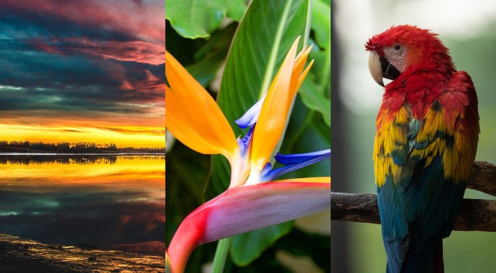
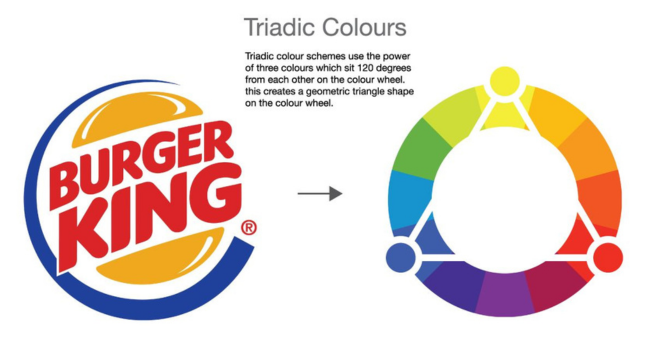
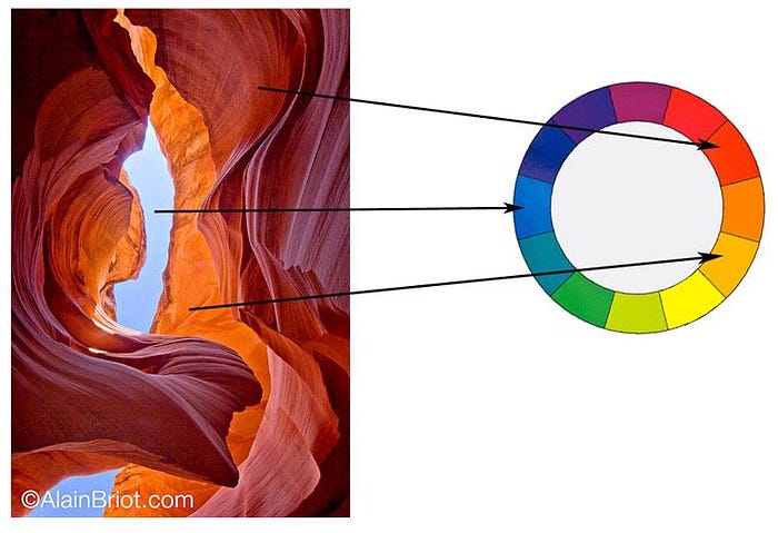
4. Triadic Colors
Artists often go for triadic color schemes since they blend three hues spaced equally on the color wheel. You get a bold visual contrast with this setup, but it still keeps things harmonious and the hues stay vibrant. This makes one shade dominating, and the other pair chime in as highlights.

Nature also provides us with the beauty of triadic colors. The image below shows how often this color harmony is found in nature.
This color harmony is also present in Burger King logo and other brand logos.
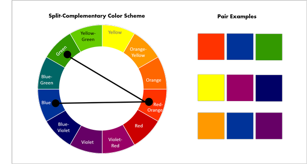
5. Split-Complementary Colors
In a split complementary color setup, you choose a main color and pair it with the two hues right next to its opposite (complementary) on the color circle. This way, you get that sharp contrast you’d get from complementary colors, but the entire color collection feels playful and balanced. It’s perfect when you want your design to pop without being too much for people’s eyes.
Split-complementary colors in nature:
Many brands also use this color harmony. For example, check out this Taco Bell logo.

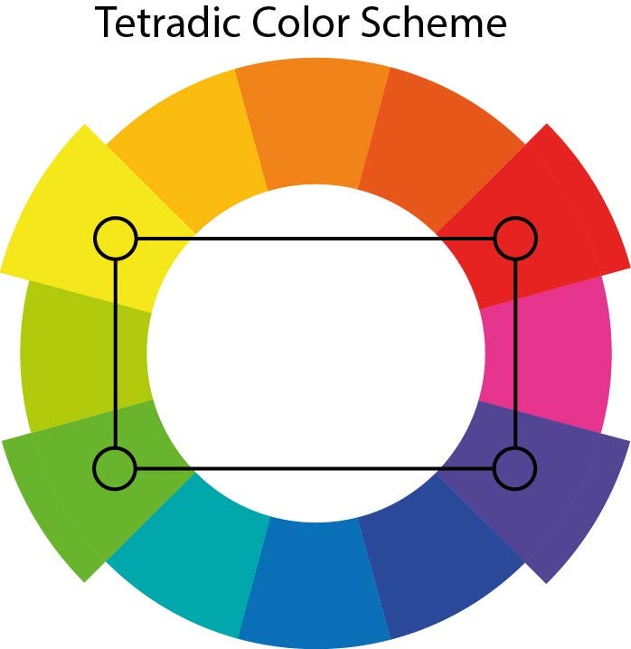
6. Tetradic (Double Complementary)
The “tetradic’’ color scheme, also referred to as double-complementary, involves the selection of four distinct hues. This approach pairs these colors into two complementary sets. The result is a rich and opulent blend of colors that offers a wide array of creative possibilities.
This color harmony technique creates a vibrant palette that can be both striking and versatile. By balancing two pairs of complementary colors, it provides designers with numerous options for creating dynamic and eye-catching compositions.
Tetradic color harmony from nature:

This color harmony has been used by many brands, check the following image.

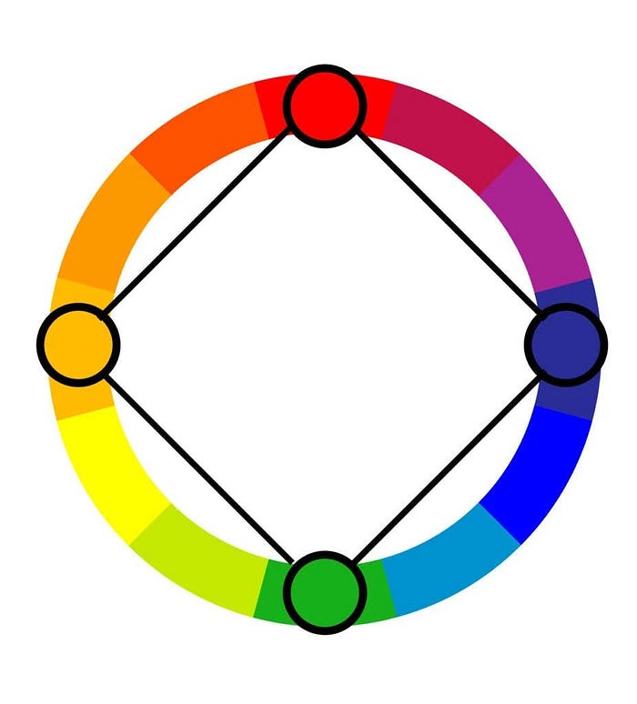
7. Square Color Harmony
The square color harmony technique selects a quartet of hues strategically positioned on the color wheel to form a square shape. This approach yields a color scheme that strikes a balance between stability and diversity, offering a harmonious blend while maintaining visual contrast.
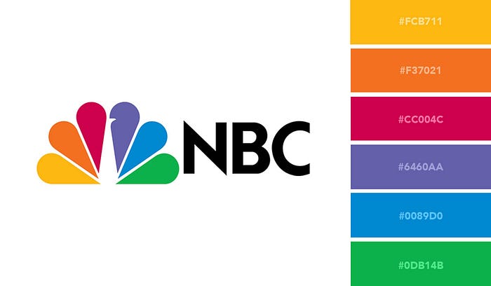
Many brands also utilise this color harmony. For example, check the following NBC logo
