Gradients and how to use them correctly in your UI design

For quite a long time, gradients have been one of the main trends in UI design. But what are gradients and how do they look? What are the differences between linear gradients, radial gradients, angular gradients, etc.? These are just some of the questions that will be answered in this article. After reading it, you’ll know how to use gradients in your UI design.
Hi, my name is Vadim, I’am UX/UI Designer. In my posts I usually write about ux/ui and design related topics(sometimes personal life struggles). Today we will discuss interesting topic — about gradients and how you can use them in your User Interface.
Gradient refers to the gradual transition from one color to another color or multiple colors. In today’s UI Design, they’re highly popular (Today is 2021, I am not sure when you will find this post, but I am being held hostage by Czech beer. HELP ME!). They can produce spectacular looks when paired with a great, vivid shadow. I’ll explain why we use gradients, show you how to create them, and show you how to choose colors for them and give you a little kiss at the end ❤️
Let’s go, kids

If you look around you right now, you’ll notice that practically everything is a gradient. In fact, in a regular setting, hardly anything has a solid color. Everything becomes a gradient when light enters the field of view. The only solid color you probably encounter is your ex’s soul, but that is the story for another blog post.
What is gradient scientifically?
Gradient, in mathematics, is a differential operator applied to a three-dimensional vector-valued function to yield a vector whose three components are the partial derivatives of the function concerning its three variables. The symbol for gradient is ∇.[1]

What is gradient in human language?
Image results for Gradient in UI Gradients, also known as color transitions, are a gradual blending from one color to another color (or, if you’re in a colorful mood, from one color to another color to another color — gradients aren’t limited to two shades).[2]

So, why is this significant? Applying gradients can bring our designs closer to reality — in other words, make them more realistic. They (together with shadows) are an excellent method to give UI Design more dimension and probably a more intuitive experience. Please, don’t use gradient every time; we should use it only as a tool to achieve our goals, don’t forget about design logic.

Don’t forget about the purpose of your design and the overall concept. To say that a gradation button is simply better would be a lie because the correct answer is “it depends!”. But since we have an article about gradients, let’s say that a button with a gradient is better and move on.
Another reason to use gradients
Gradients provide designers with artistic freedom aside from the obvious explanation (they look good). The number of gradients you can make is practically limitless. You may create a magnificent, unique effect by combining two colors. Gradient elements stand out from the rest of the design, which can help with hierarchy development.


Solid colors stand out, but so can gradients. Hex codes and HSL values aren’t exactly memorable. With so many companies out there, many colors have already been grabbed. Therefore a gradient may just help the brand stand out.

Gradient types
Two or more colors are required to create a gradient. You may use a number of gradient types in combination with them to produce unique effects. You may also move the handles outside of the form for a more delicate transition or “drag” each color along the gradient to change its location.
Linear gradient
It’s a straightforward, linear change in color between two or more hues.
Radial gradient
An ellipse forms a radial gradient with one color in the centre and the other on either side. It’s commonly used to create the impression of depth to flat things. When used on an oval in the correct location, it can have some interesting results.

Angular/conic gradient
Because of its geometry, an angular gradient (also known as a conic gradient) is similar to a radial gradient. Color stops are placed around the circle using an angular gradient; it’s a fairly uncommon UI Design option. It may appear unique, but it also appears intrusive and foreign.

Mesh gradients
Mesh gradients are multi-color combinations that are quite abstract. They’re difficult to make on your own, but you can get them for free from several generators on the internet. They’re still nearly non-existent in genuine items, so experiment with them or be careful not to misuse them.
Choosing colors for gradients
You can make a gradient with any color combination, but some guidelines must be followed when selecting hues for gradients.
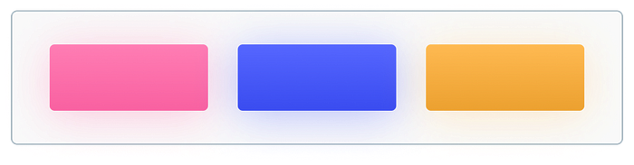
Use colors with similar hues to create smooth gradients
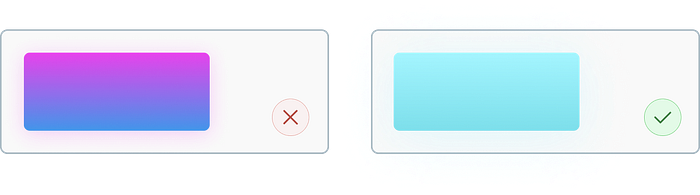
Always aim for a smooth gradient, which means that the transition between hues isn’t too abrupt, as shown on the left.
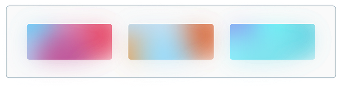
Avoid greyish colors in the center
The ugly grey areas in the middle are another reason to avoid “sharp” transitions. Here’s something to consider:
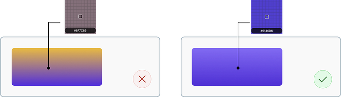
When it comes to gradients, it should be possible to discern whether they are good or bad. Gradients with a rapid shift between colors are immediately unappealing. The best way to build a gradient is to start with two colors that are the same and then increase the hue value of one of them by 20 or 25.
Related colors
Try to choose colors close to each other on the color wheel or use logical color patterns (we will discuss them later in the next post).
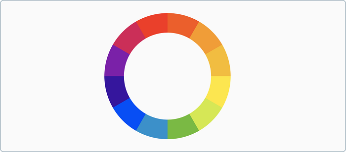
Image teaser
Too many gradients = cognitive overload
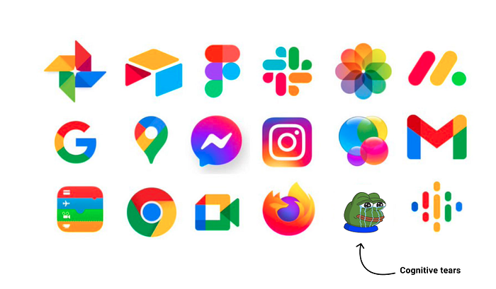
These apps have these icons for various reasons, one of which is to attract the user’s attention. Gradients, as I previously stated, make items stand out from the crowd. As you can see from the examples above, if everything stands out, nothing stands out. The colors are the same way. While a disorganized jumble of bright gradients would seem beautiful, it would be extremely disturbing.
References
[1]https://www.britannica.com/science/gradient-mathematics
[2]https://99designs.com/blog/trends/gradient-design-trend/
That’s all for today
Have a nice day