From a design concept to winning at European Design Awards—a case study
How we created a new corporate website and what challenges we faced along the way

Introduction
Red Collar’s new website embodies company values that have remained the same over the past decade: combining state-of-the-art technologies, logic, and aesthetics in every project. The team is becoming bigger; we master new skills and new lines of work. When Red Collar turned 10 last year, we decided it was time for a significant change.
Concept creation
It began with two consequent design jam sessions. Our designers did their homework: everyone showed up with a draft of the website design. That’s how we managed to take off fast and immediately started elaborating on ideas.
One of the designs that were created for the first jam session:
The final concept
We settled on several key elements that we’d use for the new website:
- 3D
- B&W color scheme
- Our custom-made font


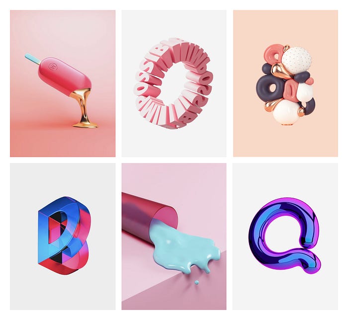
3D design
We wanted the 3D models to look iridescent, like they were made of metal.


Donuts, alien hands, CSS Design Awards, and unicorns—those are the things we associate with our brand, and we wanted the website to feature them all.

Here’s what our 3D artist has to say on this:
“I vividly remember how I was creating the alien head. The process required many hours of work and several iterations of different forms and materials. I drew my inspiration from the references provided by designers to try and make something unusual and still faceless”.
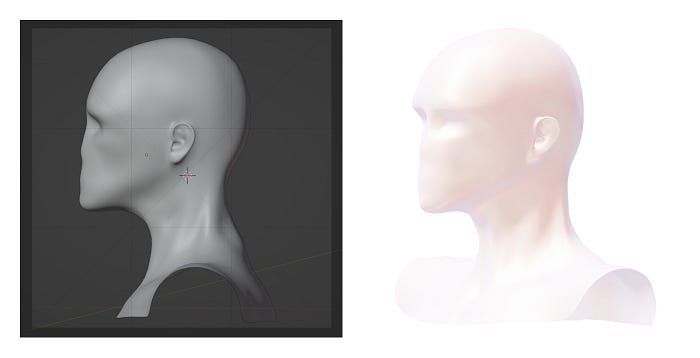
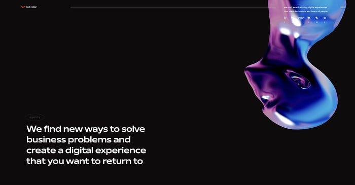
The skull model at the background of the contact section was a straightforward association with the text there. Though it seems that email communication has been here forever, we wanted to highlight that it’s not dead, and we’re still using it.
The skull modeling took the 3D designer quite some time, as she needed to keep the balance between the number of polygons and the smoothness of the model. We needed a high-quality and detailed image of the character — and low weight of the model altogether.

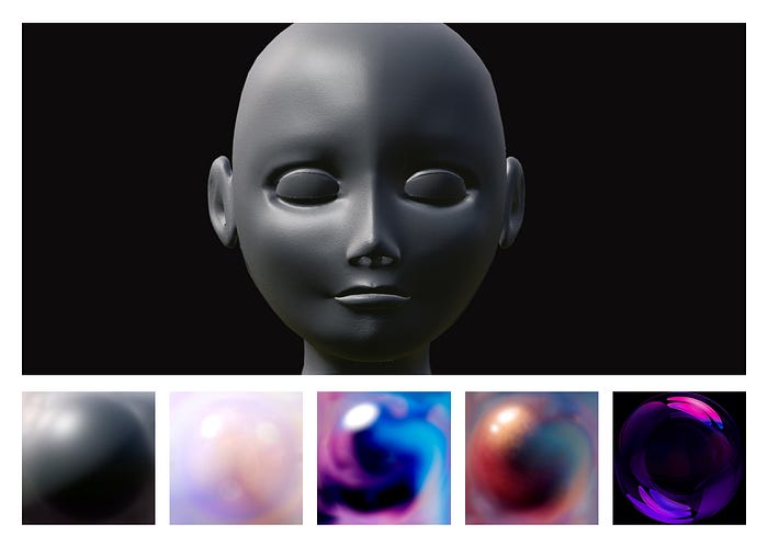
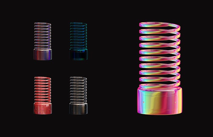
We thoroughly selected materials for the 3D models. To check if the material was suitable for both the white and black backgrounds, we developed a test website, where we uploaded MatCap spheres to see how the materials would behave.
We used MatCaps for the models on the final website as well, to minimize the weight load.
Emotional user experience
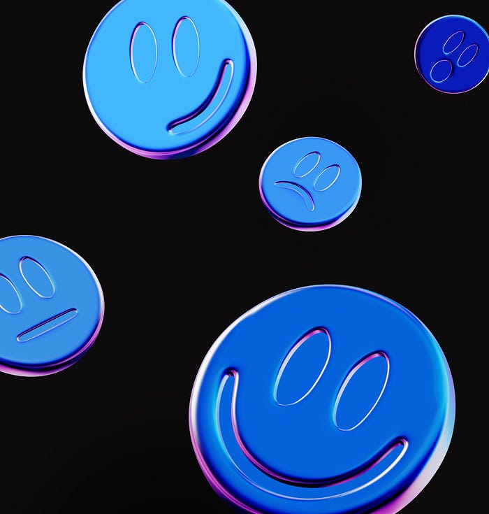
We were looking for a visual solution that would help us emphasize our signature style — solid and emotional UX. Following that idea, we developed a pack of five dynamic smiling faces (or maybe they’re pills?). They appear here and there across the pages, rotate, fly around — and you can play with them using your mouse cursor. Also, they’re pretty tricky to catch — when a face turns, it changes its expression and material. We settled on glass, plastic, and metal with colorful flecks.
Search for the ideal material
We were looking for the perfect combination of material and form. For example, when designing the 3D Webby model for the awards page, we sorted through several materials before picking up the final one.
Implementing the 3D models
The main challenge for our creative frontend developer was to implement over twenty 3D models with custom shaders onto the website. For this, we took various measures:
- We created our own 3D model format — .rc3. It allowed us to compress the models without the quality loss.
- In addition, along with Three.js, we’ve used a custom framework. It allowed us to optimize the development process and use the memory more efficiently, letting us add and remove 3D objects at ease.
Adding some humor
We wanted to convey our spirit and to keep the informal tone across the visual communication — so we sprinkled the website with humor, once again using 3D.
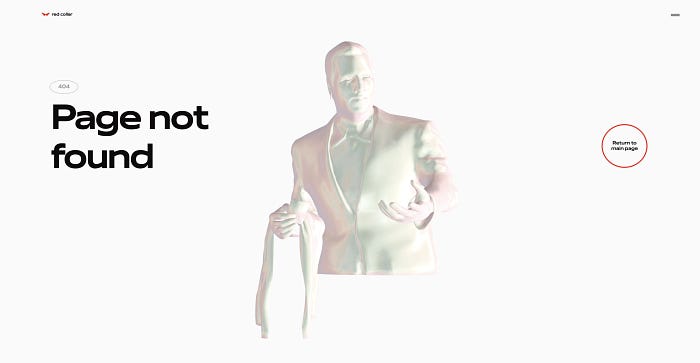
Our 404 page shows how much we love memes. If users stumble upon the Page Not Found error, they get to see the iconic confused Travolta from the Pulp Fiction.
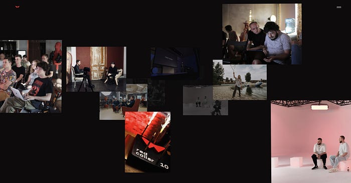
‘We are talking’
That is the name we gave to the storytelling section with the ‘flying’ photos. This solution doesn’t just showcase the team, but also makes it easy for us to choose and upload new content.
We aimed for authenticity — apart from professional and carefully coordinated photos, there are ones that have been taken with a smartphone to share working processes and vivid emotions.
Reuse
The site’s a big story that we managed to scale. Metal, plastic, and ‘rustling’ textures are highly versatile, we continue to reuse them in communication design. The same goes for 3Ds: donuts and smiling faces appear across our social media channels, presentations, and event posters.


The outcome
- In 2021 the project was awarded by European Design Awards and Red Dot Awards.
- The custom framework and the 3D model format that we’ve invented came pretty handy in other projects.

