From Frustration to Convenience: A Redesign of Card Removal and Talabat Pay Experience

Disclaimer
This is a personal project. I was in no way associated with Talabat at the time of working on this project.
Storytime: How I Discovered the Problem Statement
Last month, in Dubai, I found myself in need of food. My culinary skills were, to put it kindly, lacking. So, I turned to the Talabat app, making food ordering a breeze with my saved card details. They don’t even ask for OTP when I had to order food!
As the weeks passed, the ease of ordering became my downfall. I was gaining unwanted weight due to my frequent indulgence. That’s when a clever idea struck me: what if I removed my card details from the app? This way, I’d need to manually enter them for every order, introducing a bit of friction to my food cravings.
Smart as I am (yes, I’m speaking about myself in the third person), I attempted to remove my card details. Unfortunately, it wasn’t as straightforward as I’d hoped. I had to ask my friend working at Talabat for help.

This experience got me thinking — why was this process so needlessly complicated? Was I the only one facing this issue, or did others share my frustration? This pondering led me to consider it as an interesting problem statement, which is why you’re reading this article.
Initial problem statement based on my experience :
Problem statement — I’m not able to find where to remove my card details.
Redefined Problem statement
Problem statement — Users of the Talabat app encounter difficulties when attempting to remove their card details, leading to a suboptimal user experience
Initial thoughts on the redefined problem statement :
- Why do people want to remove card details?
- What does the current interaction look like?
- What are the other variables affecting this flow
- Why is it hard to users to remove their card details?
- Is there a need for this problem to be solved?
- What is the psyche when it comes to users and their interaction with card details?
- How are the competitors solving this problem?
- How do I know if this is an actual problem?
- Just because I faced the problem doesn’t mean it’s exactly valid as I want to remind myself I’m designing for the user and I’m not the user.
Analyzing the Card Removal Experience


- Visibility and Accessibility: The current design of the Talabat Pay feature makes it challenging for users to find and access their payment cards. Placing it under “Talabat Pay” doesn’t clearly indicate the presence of card management options.
- Equal Emphasis on Features: The “Talabat Pay” screen presents three options — Top-up, Cards, and More — with equal prominence. However, these features may not be of equal importance to users, potentially leading to confusion.
- Avoiding Premature Solutions: While changing the term “Talabat Pay” to “Payments” may seem like a straightforward solution, it’s essential to avoid rushing into fixes without a comprehensive understanding of the problem statement.
- Complex Card Removal Process: To remove a card, the user must click on “Edit,” minimize the card, select the “Delete” option, and then confirm the deletion. This multi-step process can cause unnecessary confusion and frustration for users seeking to remove their card details, potentially leading to a less-than-ideal user experience.
Note for the reader — By the way, I was conducting this analysis using an iPhone. Now, you might be wondering why I’m sharing this detail. But, just like Steve Jobs used to say, stay tuned, and you’ll see how it all fits together.
Secondary Research
With my initial analysis in place, I delved into secondary research. This step aimed to gain a deeper understanding of the problem statement. I sought to uncover why users might want to remove their card details, explore how competitors handle this, and investigate whether other users had faced similar challenges. This research would provide valuable insights for refining the user experience
Potential reasons on why people would want to remove their card from an app/website -
- Payment Change: Switching to different payment methods.
- Security: Users worry about card security online.
- Unauthorized Use: Preventing unauthorized transactions.
- Expense Control: Managing spending.
- Privacy Worries: Concerns about data collection.
- Device Switch: Changing to a new device.
- Account Closure: Closing app accounts.
- Multiple Accounts: Managing various payment methods.
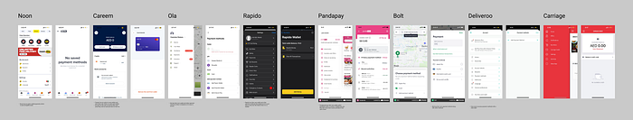
Competitive Analysis
To comprehensively assess the landscape, I divided my competitive analysis into two distinct categories:
- Apps with Integrated Payment Features: These are apps like Talabat that offer their own payment feature alongside conventional methods like card payments.
- Apps with Conventional Payment Methods Only: These apps rely solely on traditional payment methods such as cash transactions, distinct from Talabat’s multifaceted approach.
Insights from Competitive analysis
Category 1 (Apps with Their Own Pay and Card Features):
- Simplified payment and card management features.
- Clear instructions for users with enhanced usability.
Category 2 (Apps with Card Payment Only):
- Streamlined user journeys.
- Straightforward processes and clear copy, contributing to a user-friendly experience.
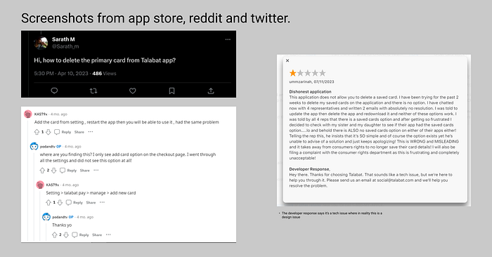
Exploring Social Media and App/Play Store Reviews
I conducted extensive research on Reddit, Twitter, Facebook, as well as app stores like Google Play and Apple App Store to uncover issues related to card removal. The main insights from these are:
- Reports of unauthorized purchases from their card.
- Security concerns and compromised bank accounts.
- Difficulty in finding and deleting saved cards.
- Negative feedback and low ratings due to limited card management.
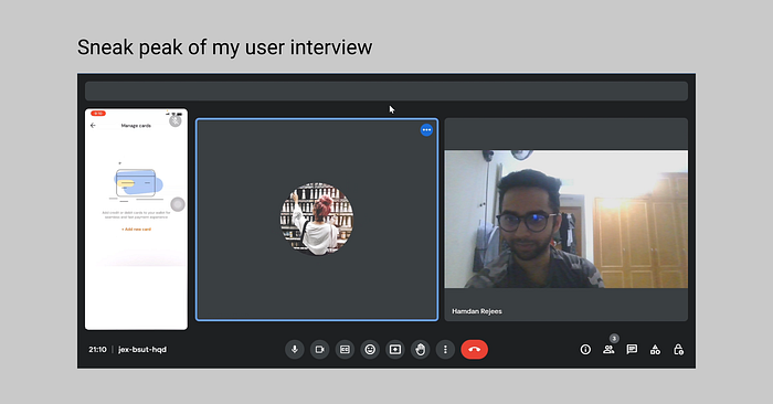
Primary research
While I gained valuable insights from my secondary research, I embarked on primary research to delve even deeper into the problem statement. This approach aimed to uncover additional insights that might not have surfaced through secondary sources, providing a more comprehensive understanding of the issue
Target users for the interview
Due to Talabat’s diverse user base, I aimed to capture a wide range of perspectives and experiences in my research
- Target Users: Diverse range of Talabat customers, including frequent and occasional users.
- Interview Method: Conducted 14 interviews, comprising both in-person and remote sessions.
- User Demographics: Captured insights from users across different age groups (20–30, 30–40, and 40+).
- Geographic Coverage: Included users from various regions, such as the UAE, Muscat, and Kuwait.
- Payment Method — Participants who use card payments for their orders
Objectives of Primary Research
My main methods of primary research are user interviews and usability testing.
User Interviews Objective: Conduct interviews to explore user behavior, motivations, and challenges related to card payments and removal on Talabat.
Usability Testing Objective: Observe and analyze how users interact with the Talabat app to improve card removal experiences.
If you’re interested in the interview questions, you can access them by clicking here. I opted for brevity to keep the content concise.
The unexpected revelation
As I conducted my user interviews, everything seemed to be proceeding smoothly. However, it was during my conversation with the first participant, who happened to be using an Android device, that things took an unexpected turn. Removing their card from the Talabat app was a breeze for them. This revelation left me intrigued.
Now, remember when I mentioned that I was using an iPhone? Well, here’s the twist: I soon realized that there were different user experiences for iPhone and Android users, which completely took me by surprise.
This realization struck me like a lightning bolt. Why were the designs divergent? Couldn’t they be uniform? Were these differences due to technical limitations?
Even though Android users seemed to have a smoother experience, there were still some lingering issues. To delve deeper into this, I decided to compare screenshots and analyze the disparities between the iPhone and Android versions of the app

Key insights based on the comparison between IOS and Android in the above flow are:
- Android users have an option called saved cards which is not present for IOS users
- Android users have 2 ways of removing their card (settings and by tapping on talabat pay) whereas IOS users have only 1 way (talabat pay)
- Android users face an issue where there’s a button saying “Go to wallet,” which is confusing. Instead, users expect to see their saved cards when they click on “Saved Cards.”
Insights from primary research
User Behavior and Card Saving:
- Users tend to save card details on trustworthy apps that they frequently use, while they are reluctant to save their cards on less trustworthy or infrequently used apps.
Card Removal Triggers:
- Users want to remove cards if they plan to no longer use the app or reduce the frequency in which they will use the app.
- Card removal may occur due to fraud concerns or data breaches.
- Expired cards need to be removed from the app.
- Users may remove cards after the offer for that specific card expires.
Usability and Accessibility:
- Users struggle to find and manage their cards in the app’s interface.
- Both Android and iOS users encounter difficulties accessing card management.
- The term “Talabat Pay” is confusing for most users.
- Some users expect to find card management under the “Account” section.
- A few users felt like they had to go to Google or contact customer service to remove their card.
Understanding Talabat Pay:
- Most users have not heard of Talabat Pay.
- Users who have heard of it often misunderstand its purpose.
- Some users first become aware of the “Talabat Pay” feature when they experience problems with orders not being delivered. This prompts them to reach out to customer service for assistance. During these interactions, they discover that Talabat Pay serves as a digital wallet, as refunds are processed through this feature.
- Some users confuse it with a rewards or points system.
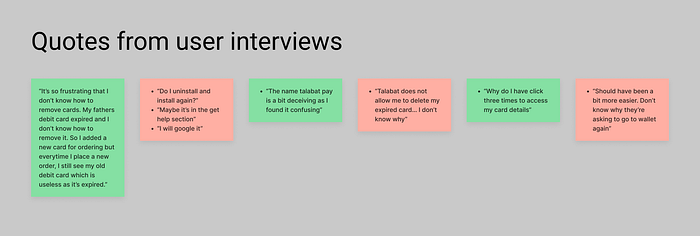
Before we move into the next section, here are a few quotes from my participants during the interview
Understanding the business perspective
One crucial insight emerged from my primary research — many users weren’t aware of Talabat Pay. From a user’s standpoint, this discovery raised the question of why Talabat needed such a feature in the first place.
As I delved into the business side of things, I found myself pondering not only Talabat but also other companies like Rapido and Careem, which have their own payment systems. To find answers, I scoured online resources, but they couldn’t provide a satisfactory explanation. This led me to tap into my professional network and seek insights from product managers at top companies.
Here are the key business insights I uncovered, both from online research and conversations with product managers, about why companies implement their own payment systems:
Retention and Engagement: Talabat Pay and similar systems aim to keep users engaged by offering a wallet feature. Users who maintain funds in their wallet are more likely to return for future transactions.
Cost Efficiency: Wallets help companies reduce transaction costs. Adding money to a wallet often incurs lower payment gateway fees compared to individual card transactions.
Diversifying Revenue: Wallet services enable companies to diversify their revenue streams. Partnerships with financial institutions can lead to additional revenue through customer card payments.
Fee Reduction: Wallets can lower interchange and transaction fees, benefiting the company’s financials.
User Incentives: Wallet systems provide users with incentives such as convenient payments and rewards.
Simplified Transactions: Some companies use wallet adoption to simplify money movement within their ecosystem, incorporating P2P transfer features.
Strategic Collaborations: Wallets can facilitate partnerships with banks, unlocking collaborative opportunities and financial benefits.
Competitive Edge: In a crowded market, unique payment methods like Talabat Pay differentiate a company, attracting new users
While users may not fully understand Talabat Pay, it’s crucial for me as a designer to include these business insights as they shed light on its significance in the larger context.
Final Problems Based on Insights from All Sources
- Improving Card Removal Experience -
- Users encounter difficulties when attempting to remove their saved cards within the app.
- The current process is confusing and inefficient, leading to user frustration.
- The goal is to redesign the card removal experience to simplify card removal, enhancing overall usability and user satisfaction.
2) Increasing Discoverability and Redesigning UI for Talabat Pay:
- Many users are unaware of the purpose and benefits of Talabat Pay.
- There’s confusion regarding its function, with some users mistaking it for a rewards or points system.
- Some users discover it by accident, such as when they receive refunds for failed orders.
- The objective is to increase discoverability and redesign the UI of Talabat Pay to clarify its function and highlight its benefits, such as digital wallet.
User Metrics
I’ve chosen to prioritize user metrics for the first problem as it appears to be the more significant challenge in this context. While the second problem is still important, my primary focus for this project is on improving the card removal experience, which I believe will have a more substantial impact on user satisfaction and usability
- Task Completion Rate: This metric will measure the effectiveness of card removal, showcasing the improvement in user-friendliness. A higher completion rate indicates a more user-friendly process.
- Task Time Taken: We’ll monitor the time users spend on card removal to assess efficiency. If the process becomes quicker after the redesign, it signifies improved usability.
- Error Prevention Rate: Our goal is to reduce common errors during card removal. A decrease in errors reflects a user-centric design that minimizes mistakes.
Solution space
I’ve explored several solutions to tackle this problem, but to keep things concise and focused, I’ll discuss the top two solutions.
Solution for improving the card removal experience
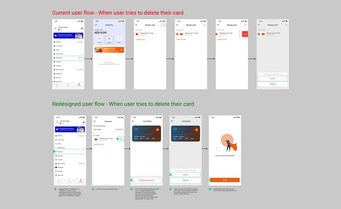
- In the current (before) flow, users had to click on talabat pay to access cards which is confusing to the user as they don’t expect to see cards under talabat pay (based on primary research). Also, The user needs to perform 6 taps to delete their card
- In the redesigned flow, I’ve changed the term “Talabat pay” to “Payments” as this would be easily understood by the users and most of the competitors used similar terms in the flows. In this redesigned flow, the user has to perform only 4 taps to delete his cards
Solution for increasing discoverability for talabat pay
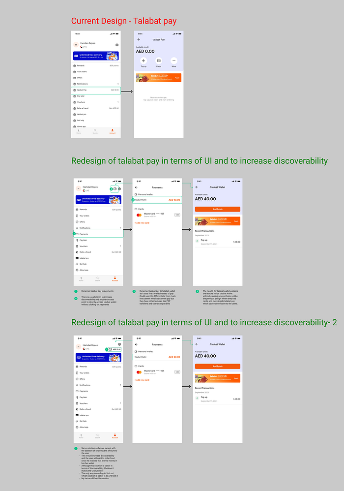
- In the current (before) design, the user clicks on talabat and sees options such as top-up, cards and more indicating equal importance of each feature from a visual standpoint
- In the redesign, I’ve changed talabat pay to payments as I’ve explained the reason in the previous solution. However if you notice the second screen more closely, I’ve renamed talabat pay into talabat wallet because talabat pay acts like a wallet. Users get refunds in the the form of credit and they can pay using their wallet. This is not the only reason why I made the decision of renaming it to the talabat wallet.
- If you look at the competitors like Careem, they also have careem pay which might make a good reason to name it talabat pay. However the features are different for both careem pay and talabat pay.
- In talabat pay, the user can either get refunds in the wallet or top-up from his bank account whereas in careem, the user can do all the things talabat pay offers but also there’s features like paying bills, P2P transfers and lot more due to which it makes sense for careem to have their payment feature named careem pay.
- To increase discoverability, I’ve come up with two solutions.
- Solution 1: We introduce a wallet icon prominently at the top of the account screen. However, this solution relies solely on visual cues, and it might not be compelling enough to encourage users to click on it.
- Solution 2: Similar to the first solution, we prominently display the wallet icon at the top of the account screen. But in addition, users can also view the balance of their remaining funds in the wallet. This approach aims to remind users of their available funds and encourage them to utilize the wallet for their transactions
- The effectiveness of these solutions will be determined through testing to identify which one offers a more user-friendly and intuitive experience.
Additional solution — Redesigning the ADCBxTalabat reference number
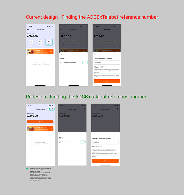
Context — The user can get 35% back on talabat pay (now named talabat wallet in my design) when the user applies for the ADCB credit card (look at the golden banner). When user clicks on the banner, they go to the ADCB app
- In the current (before design), there is a more option which takes a lot of space and when user can click on it, they can see the adcbxtalabat credit card reference number
- I believe the reference number shouldn’t be in the talabat app as the users have to come back to the app from the adcb app which is a bad experience but then again I don’t have the data and resources necessary to understand what is the real need for the reference number in the first place. I’ve redesigned the solution assuming that the reference number has to be in the talabat pay (talabat wallet) screen.
- In the redesign, I’ve placed the reference number inside the small info icon which takes far little space compared to the previous design.
- Is this best solution? Absolutely not but I believe this is a better solution in terms of UI compared to the former.
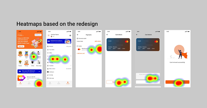
Usability Testing Insights
I conducted usability testing for the redesigned card removal flow using the Maze tool. Users navigated through the redesigned flow and attempted the task of card removal to provide valuable insights
- Task Completion Rate: Testing showed a significant increase in successful card removals with the redesigned flow. While exact numbers are unavailable, qualitative feedback indicates improved task completion rates.
- Task Completion Time: Users completed the card removal task more quickly using the redesigned flow, although specific time data is not available.
- Error Prevention Rate: The redesign effectively reduced errors and obstacles during card removal, enhancing the overall user experience.
- User Feedback: Qualitative feedback from usability testing participants highlighted the intuitiveness and error-resistant nature of the redesigned process
Conclusion: Promising Redesign
Based on the observed metrics and insights, my redesign shows promise as an improvement over the previous design. Users demonstrated higher task success rates, accomplished tasks more efficiently, and encountered fewer errors during testing.
To comprehensively evaluate the redesign’s impact, it is essential to consider the following:
- Confirmation of Effectiveness: Determining whether the redesign consistently delivers its intended benefits over time.
- Identification of Unforeseen Challenges: Uncovering any unanticipated issues or complexities that may surface as users engage with the redesigned system in real-world scenarios.
- Continuous Refinement: Ongoing refinement of the design based on real-time user feedback and evolving user requirements.
“Before I conclude with my lessons learned, let’s take a behind-the-scenes peek. What you’ve seen so far are the polished final designs, akin to what you encounter on social media — everyone’s highlight reel, showcasing the star moments while the everyday work often remains hidden. How did this case study take on an inspirational tone?

Lessons learned
- The Power of Iteration: Through this project, I gained a profound appreciation for the iterative design process not just in design but even when writing this article. It emphasized the significance of continuously refining and evolving a solution to achieve better outcomes.
- Importance of Primary Research: My experience reinforced the value of primary research. While secondary research provides valuable insights, nothing can replace direct user engagement to uncover nuanced user behaviors and needs.
- Personal Project Impact: Working on a personal project has proven to be an invaluable learning experience. It allowed me to explore, experiment, and make mistakes without the constraints of a formal setting.
- Art of User Research: I honed my user research skills, learning to create an atmosphere that fosters genuine conversations with users rather than just conducting interviews. This approach encourages users to share insights organically, leading to richer findings.
If you’ve made it this far, your attention span is commendable!
Kudos to you for making it this far and thank you sincerely for investing your time in reading this article.
I’m currently open to opportunities as a Product Designer. Do reach out to me on LinkedIn or Email for any feedback, discussions or collaborations, I’d be more than happy to have a chat with you!

