Form labels: the long and short of it
Forms are one of the most common ways in which users send information to an application. They are ubiquitous in modern user interfaces- every time a user logs in, replies to a message, or selects an option, they are using a form.
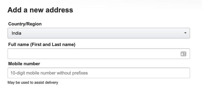
Forms are made up of fields. There are many kinds of form fields like text boxes, dropdown menus, and checkboxes, for example. Each form field also (usually) has a distinct label attached to it, a piece of text placed above or next to the field, the drafting of which falls within the UX writer's purview. It is this small piece of text that is the subject of this essay.
Clear, Concise, Consistent
Newbies to the profession often read about the 3Cs of UX writing (it could be 5 Cs sometimes, or more depending on where on the web you’re reading). These are usually guidelines on what makes good writing for UX summed up using words that begin with a ‘C,’ the most common of which is ‘concise.’ Undoubtedly, this ‘C’ applies to form labels as well.
Starting as a UX writer meant that I was focused on making the copy I wrote concise. I battled endlessly to cut out unnecessary words, often ending up with copy that sounded arcane and stilted, and then had to work to retrace my steps or begin afresh. The problem was especially marked when it came to form labels. There was one instance where I needed users to choose if a feature they were creating would be included in plans by default and I ended up zeroing in on the mysterious-sounding label “Default Plan Availability”.
This got me thinking. Were there situations where the conciseness rule could be overruled? Would it not be better in some cases for form labels to be longer and even conversational in nature — asking questions or making full-length statements to get responses from the user? I read up on the topic, gave it some serious thought, and spoke to colleagues about this. This here is a summary of my findings. I’m hoping that this will be interesting to UX writers who are new to the field and spark a conversation among those already seasoned.

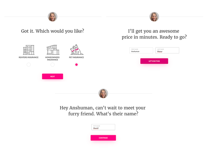
Conversational labels would make user interfaces more human
Imagine booking a train ticket at a travel agency. The agent you’re dealing with will probably ask you questions like “Where would you like to board the train?” or “Which train would you prefer — the 3:30 or the 6:20?” in place of terse one-word questions like “Destination?” or “Select train” respectively. By mimicking human interaction patterns, we attempt to put users at ease and consequently improve their experience using the application.


Conversational form labels help with accessibility
Are you designing an application for users who are not at ease with technology? Conversational forms can help. Certain demographic groups, such as the elderly, who are not very conversant with modern-day applications may find forms challenging. By modeling form labels as questions or complete sentences, you can help such users draw on their existing knowledge of human interaction to complete their task.

Conversational labels could address privacy concerns straight away
Submitting data always makes people edgy, especially when they don’t know what will be done with that data. By drafting longer labels that encapsulates why that piece of information is needed, we can help users evaluate how they feel about giving away that information.

Privacy is only one of the concerns that users interacting with a form may have. Other concerns or questions may need addressing. This brings us to the larger question of…
Conversational labels can be users’ first source of help
Imagine users filling out a form. When they arrive at a field, they first read the label to understand what to input. Then they read the helper text. This is the small piece of explanatory text that is positioned below the field, or that appears when the user hovers over a help icon. If they are still unsure, they probably reach for the help button before calling somebody, or worse, abandoning the form.
It’s probably safe to assume that a good experience is when users are not confused at any point in their journey. They are probably trying to get the job done as fast as possible and want to read as little as possible before providing their input. Can longer, more descriptive form labels help with this? If it enables the user to fill in the form by just reading the label, then yes.
The standard practice currently is to shorten the label to just a word or two and use helper text to fill gaps in the user’s understanding. But if the label name itself is of no particular significance, would it not be better to use it to bear some of the semantic load so that users would not need to look at the helper text at all? This would definitely make them more efficient, especially if the concept behind the field is complex.
Conversational labels are ideal for conversational forms
More and more products are choosing to present forms using a series of screens, especially for onboarding users. This approach has several advantages. For one thing, users can now focus on one part of the form at a time and it doesn’t overwhelm them; and users can get instant feedback from each part of the form before moving on (as opposed to scrolling up and down to find which field they need to redo). Conversational form labels should work very well with these kinds of forms because they more closely mimic human interaction by asking one question at a time.
A word of caution
Conversational form labels are not suitable everywhere. There are situations where label names are better suited. Ask yourself the following questions and see if you answer yes to any of them:
- Is the field name important? Is it referenced anywhere else in the application?
- Is this form a part of a larger, standardized experience? Does your organization have a style guide that prescribes how form labels should be? Would conversational labels adhere to the application’s overall voice?
- Is screen space a concern? Are you designing for a smaller screen like a mobile phone? Would the longer text eat into screen real estate?
- Is the form very long? Would it be tedious for a user to read these long conversational labels for each question? Would it make their experience less pleasurable?
- Is the user a power user who is completely familiar with the domain? Would they know the cryptic field names intimately? Would they signify something special to them?
- Is the application you are designing of a formal nature? Will users use it to perform critical functions where time is of the essence? Will users need to fill the same form repeatedly?
If you answered ‘yes’ to any question above, you might have guessed that conversational form labels are probably not for your particular situation.
So, here’s what I realized. Conciseness is not a panacea when it comes to writing copy for forms but neither are conversational forms. They are merely tools in our toolbox. The real panacea is empathy with the user.
References
- Many of the leads for the conversational UI samples were from Kinneret Yifrah’s work on writing microcopy for older adults.
- Vitaly Friedman’s write-up on privacy in web forms for Smashing Magazine was a big help. In particular, his list of privacy concerns listed in order of severity according to users was insightful.
- Kinneret Yifrah’s article on guiding microcopy in forms reaffirmed my idea that the conciseness rule could be overridden when more help was required.

