Fonts for all: Cracking the code to accessible typography in UI design
We all have spent a few seconds or two hours simply deciding on font style for our Word document or a game-changing presentation (looking at you Product Managers), not like James Cameron, who used the Papyrus font for their international blockbuster Avatar logo and no one stopped them…
But when it comes to choosing the perfect font for your digital product it requires careful attention to detail. It’s not just about making things look pretty; it’s about ensuring that every user, from tech-savvy Gen Z to grandparents, can read and enjoy your content without wanting to throw it out of their lives.
And, when dealing with a diverse user base, we can’t just pick a font because it’s trendy or we like it. We have to consider the properties (which never come across our mind) of the typeface to find a legible and accessible font for our user and business needs. Millions of people face difficulty accessing digital services because of sensory, physical, and cultural limitations. For example, a font with very small or narrow openings in letters like ‘c’, ‘e’, or ‘a’ can be difficult to distinguish, especially for users with low vision or dyslexia.
While analysing any font we also need to consider the business requirements for example, suppose your product involves anything money-related and has an international presence. In that case, it’s better to check whether the chosen font has all the legible currency glyphs (letters) or not.
But fear not, We’re here to guide you through the nitty-gritty of UI typography, exploring the overlooked factors that separate the good from the great.
Aperture

In typography Aperture refers to the opening or space through which light passes within a letterform, like the openings in the curves of “c”, “e”, “o”, and “a”. These openings can vary in size, from wide and open to narrow and almost closed, and their degree of openness plays a crucial role in both readability and legibility of the text.
Open Aperture: Letters with generous openings allow for more light and space to enter the letterform, ensuring that characters remain distinct and easily recognizable, even when text is compressed or viewed on lower-resolution screens.
Close Aperture: On smaller font sizes or when text is displayed on screens with lower resolutions, letters with a lack of space within the letterform can lead to confusion where users can perceive letters like “a”, “8” or “e” similar this is because lack of open space within letters can make them appear more cramped and harder to distinguish, leading to potential legibility issues.
Stress & Contrast

In typography, “stress” refers to the direction of the thin parts of letters compared to the thick parts. If the thin parts are aligned vertically, it’s called vertical stress, which is common in modern fonts. If they are diagonal, it’s called diagonal stress, typical in classic fonts.

“Contrast” in typography means the difference in thickness between the thin and thick parts of a letter. High-contrast fonts have a big difference in thickness, making them look more elegant, while low-contrast fonts have similar thicknesses, giving a simpler, more modern appearance.
How a font’s stress and contrast are designed affects how it looks and feels. Diagonal stress with high contrast gives a classic and formal look, great for traditional printing. Vertical stress with low contrast looks cleaner and more modern, often used in digital designs for its simplicity and ease of reading.
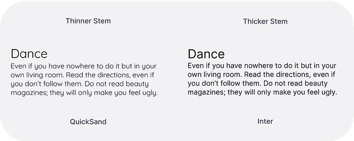
Thicker Stem

The stem is the main, usually vertical stroke of a letterform. For better usability, the stem of the regular-weight font should be thick enough so that it will be visible in low font size and screen resolution.
Optimal stem thickness ensures that letters are clear and distinct, enhancing readability, especially in small font sizes or low-contrast environments. Letters with too thin or too thick stems may be challenging to recognise, leading to reduced legibility.
Tabular & Proportional Numerals
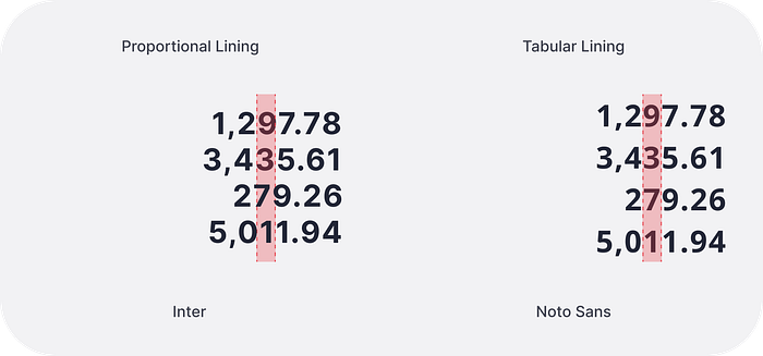
Every numeral or figure comes in two major flavours.
Proportional Lining Numerals, where characters have varying widths, are designed to be easily readable and recognizable, especially in continuous text. The combination of consistent height, varying widths, and familiar shapes enhances the overall legibility of proportional lining numerals, making them easier to read and understand within a body of text.
Tabular Lining Numeral, where each character has the same width, can enhance readability when presenting data in tables or aligning numbers' columns. This consistent width of numerals makes it easier for users to scan and compare information. they’re sometimes referred to as monospaced numerals.
In short, if numerals will appear as part of the text — such as address information in corporate identity, or quantities and measurements in marketing collateral — go with proportional figures. And banking and finance products where we have to present the amount or numbers in the table and lists tabular figures would be good options.
In conclusion, the process of selecting the ideal inclusive typeface for a digital product used by diverse users is complex. By carefully considering small characteristics of typeface such as aperture, mirroring, stress and contrast, stem thickness, and numeral styling designers can craft interfaces which are readability, usability, as well as cultural inclusivity.
Even the Author of the renowned book “The Complete Manual of Typography: A Guide to Setting Perfect Type” James Felici quote
The beauty of type lies in its utility; prettiness without readability serves neither the author nor the reader.
References
Contrast — Fonts Knowledge — Google Fonts
Designing for Readability: A Guide to Web Typography | Toptal®
Design is never done. | Making Reading Easier with Lexend
Introducing accessibility in typography — Fonts Knowledge — Google Fonts
Guide to 10 font characteristics and their use in design | by Yevgen Sadko | Medium