Member-only story
Figma quick trick: negative spacing in auto layout
Hello, fellow Figma enjoyers.
Today I’m going to tell you about another trick that everyone seems to know, except me. But this time I will show you 2 ways to do the trick, so grab a 2 for 1 deal!
Quick update — in the latest Figma release, they have finally added the support of the negative spacing, along with a ton of other awesome improvements 😻
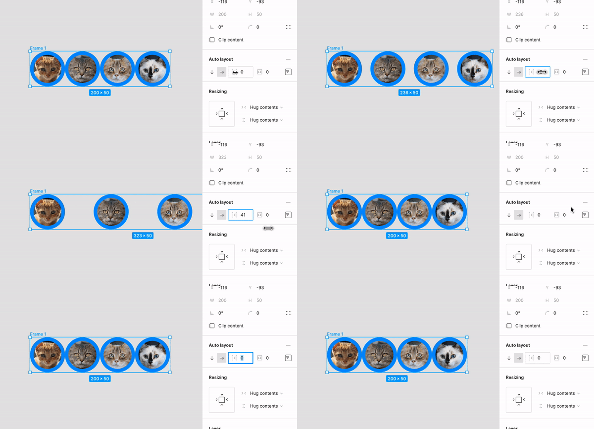
Have you ever found yourself in a situation where you would need an array of overlapping UI elements? Perhaps, to show the profile pictures in a group chat or something? Setting a negative spacing value for the Auto layout would be really handy in a case like this. Unfortunately, Figma does not support this at the time that I’m writing this article.

But fear not, there are a few workarounds for this sort of stuff.
What’s the Space Between?
The first trick was originally demonstrated by the almighty Rogie King.
To achieve the desired effect, just follow these simple steps:
- in Auto layout settings, click the alignment and padding icon
- select the Space between option
- resize the frame to your liking
- enjoy your overlapping…

