Figma quick trick: components with customisable contents.

Hi everyone,
Maybe I’m just super slow for not discovering this little trick that I’m about to show you earlier, but I’ll share it anyway. I hope it will help someone like me to bring more structure and consistency to their design files.
I beg you, do not detach the instance 🙏
If you’re like me, you’ve probably tried creating components for things like forms and dialogs to bring more consistency to your designs, however, it wasn’t really as smooth as you’d hoped. Forms and dialogs have various contents.
You’re lucky if the only variation in your case is the copy. Text can be overridden without breaking the link to the original component. But what should you do if you need to put something custom inside of the container?
I need to make a confession. In such cases, I would often click the nasty “Detach instance” button and modify what used to be an instance of a component. You can only imagine how many inconsistent designs I’ve accumulated over the time that I’ve been designing.
In some other cases, I would wrap an instance in a frame and put the content on top. But that would totally ruin the nice auto-layout configuration. And the layer structure would be just a mess.

Instance swapping saves the day 🚀
Alright, if you’ve understood the trick that I’m about to show you from the title of this section it means that you are a designer I should really look up to.
For everyone else, who is still intrigued, please enjoy the reading.
First things first — let’s take that “Content Placeholder” frame from the original component and make it a component of its own. Then put an instance of this placeholder component inside of the original Dialog component.

Now go ahead, publish this beautiful component and add an instance of it to where you need to use it.
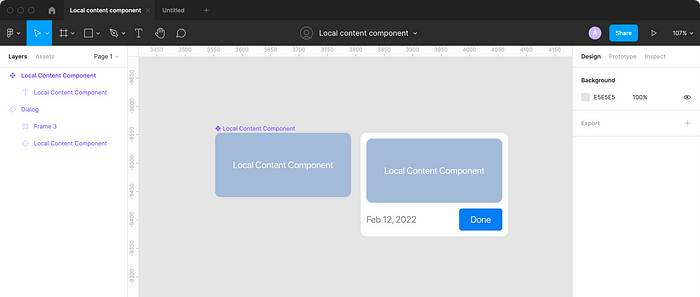
Now let’s design actual content that we want to put inside of the Dialog instance and make it a local component.
You should end up with something like this.

Now comes the most exciting part.
In the left part of your screen inside of the Layers panel, expand your Dialog instance and select the Content placeholder instance.
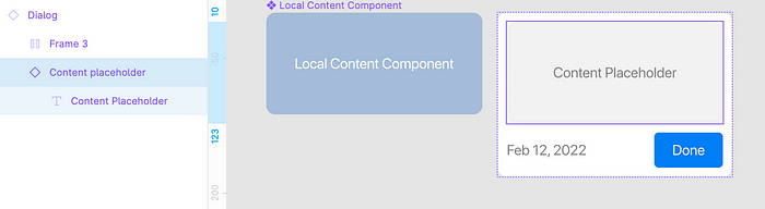
Now, in the right part of your screen inside of the Design panel, click where it says “Content placeholder” (or whatever is the name of your placeholder component).
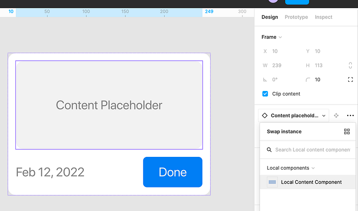
You will see a drop-down that allows you to replace this particular instance with any other component, even when it’s inside of another component instance. Pretty cool right?
Make sure you are viewing the “Local components” section. There you should see your local content component. Click it.
Viola! You have your custom content inside of the container component instance without breaking the link and detaching the instance!
Did you find this article useful? Let me know in the comments!

