UX Design Case Study
Enhancing luggage website experience with UX design for desktop & mobile
This case study details the process of redesigning a gear shopping website, focusing on product discovery, intuitive filtering and user-friendly experience.

Role: UX Designer  |  Duration: 6 Months
Guidance: Shardul Vichare (Sr. UX Designer)
🗨️ Summary
Okay, Backpacks… not exactly a thrilling subject, right? But FGear is out to change the game. They’re shaking up the scene with budget-friendly, fashionable gear, and it’s working. They rock the bestseller lists on Amazon and Flipkart [1], and the press seems to dig them, but their website… that’s another story.
It’s time for a serious glow-up, and that’s where I come in.
🎒 First, about the brand…
FGear isn’t dad’s dusty old luggage company. It was started by an engineer and a fashion designer, which pretty much explains their whole vibe. It is a private company based in Bengaluru and has a revenue of $6.8 million. They have won awards, and seem to genuinely care about quality at a good price.
🙌🏼 Let’s get started!
Before we break down the specifics of this case study, let’s get a handle on the overall UX design process. Here’s the roadmap I followed to take this project from start to finish:
🪜 Design Stages
For a successful project, rather than just jumping to the solution, one must take an iterative approach. From defining a project till designing and testing its an iterative process.
For illustrative purposes, I am linearly presenting these stages; however, the process was iterative:

STAGE 1: Defining the Project
🧐 Problem Statement
How can we make shopping for F Gear bags online just as satisfying as owning one?
💡 Project Vision
We’re envisioning a website that seamlessly reflects the F Gear brand’s energy and spirit. An intuitive and frictionless experience that makes browsing and buying their awesome bags a genuine pleasure, from the moment you land on the homepage to checkout.
📝 Project Objective
The F Gear e-commerce website lacks some features and lacks its brand language. Customers experience more pain and confusion when using the brand’s website. The following points will be the focus:
- Redesigning the website to be more user-friendly and intuitive.
- Simplifying the checkout process to reduce cart abandonment.
- Search functionality that actually finds what you need.
- Upgrade product pages to properly showcase their gear.
- Introduce features that elevate the whole experience.
🫥 Need of improvement
This isn’t just about looking pretty (although that’s part of it). F Gear has a unique voice that’s totally missing online. A refreshed design is essential to improve the user experience and increase sales.
📊 Project KPIs
Change for the sake of change isn’t good design.
A Key Performance Indicator is a measurable value that demonstrates how effectively the website is achieving key business objectives. To ensure the success of this redesign, FGear will prioritize these metrics:
- How far users make it through the buying process
- Overall engagement, are people sticking around or bailing quickly?
- And of course, is this generating more revenue for FGear?

STAGE 2 : Validation- 👀 Heuristic Evaluations
Okay, time to be brutally honest. FGear’s current website needs some serious help. I’m not talking about a few bad colors, there are fundamental design issues stopping users from having a smooth experience. Did you know heuristic evaluation can sniff out a massive 30% to 50% of usability issues?
To get specific, I ran their site through a heuristic evaluation. It’s a fancy way of saying I used industry standard principles to score the site on things like:
- Is it clear what’s going on? (Can users figure out where they are and what they can do?)
- Does it feel familiar? (Are design patterns used in a way that makes sense?)
- Is it forgiving? (Can users easily undo or recover from mistakes?)
😅 Let’s just say the results weren’t pretty. I put together a full report (with screenshots!), but here are some highlights, I mean, lowlights:

👉 Detailed Heuristics Analysis: Click Here
So, what’s next?
Fixing the basics is priority one, but we’re not just making the site functional.
Up next: Research! Because if we don’t know what real shoppers want and what the market is doing, this redesign could still flop.

STAGE 3 : Research
🔍 Secondary Research
Before talking to real people, I needed a lay of the land. Turns out, the luggage market is booming! Here’s what jumped out:
- People want style, not just suitcases. Backpacks especially are becoming fashion statements. FGear is on the right track with this.
- Online shopping is where it’s at. Convenience is king, so a clunky website is a dealbreaker. [2][3]
- Competition is fierce. There are TONS of brands, many with slick websites. We need to make FGear stand out from the crowd. [4]
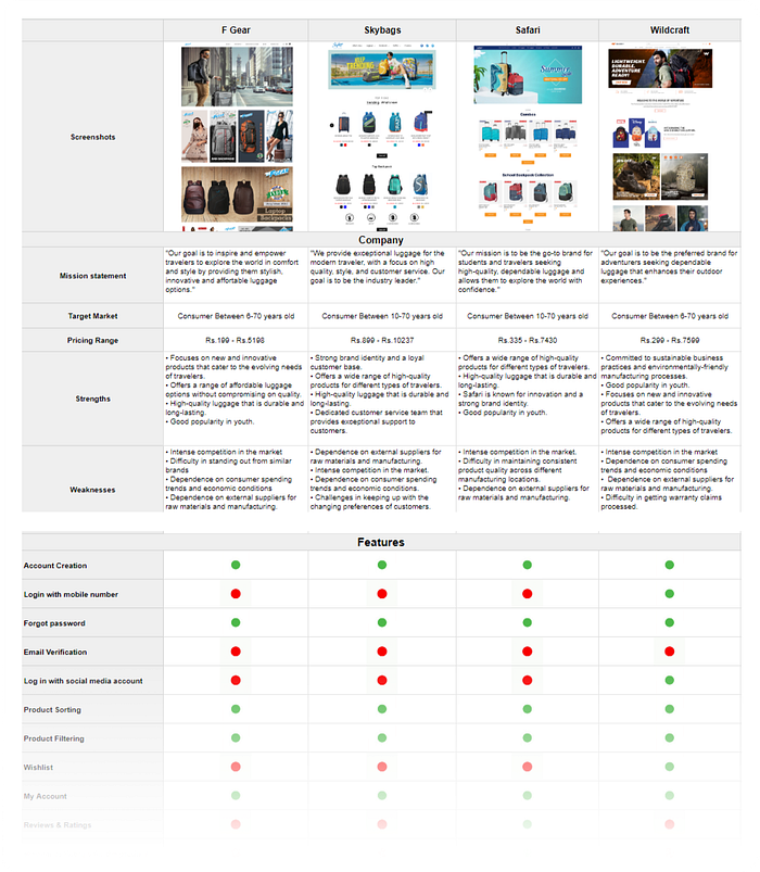
✅ Competitive Analysis
Speaking of the competition… I spent some quality time on their websites. Think of it like scoping out the rival stores at the mall.🕵🏼
Here’s the takeaway:
- Some brands do visuals really well. Gorgeous photos, cool styling… but are their bags actually any good? FGear needs to strike that balance.
- Others nail the practical stuff. Filters, clear specs, easy returns. Sometimes the boring things matter most.
- FGear is… somewhere in the middle. They’re not terrible, but they’re not leading the pack either. That’s an opportunity!

👥 Provisional Persona
Okay, time to get hypothetical for a moment. Since I didn’t have a ton of real user data yet, I sketched out a “provisional persona”. Think of it like a profile of FGear’s ideal customer:
This isn’t set in stone, but it helps me keep a specific person in mind as we move on…

📞 User Research Interviews
The real deal! I found a handful of folks who fit our persona. Here’s what stood out:
“You can’t always predict quality just by looking at pictures in online shopping. The brand’s website is a good resource to help judge quality, and I also like to read customer reviews before making a purchase.” — Padmaja, 33
“I prefer value for money luggage having good quality. Customer service is essential for me.” — Mandar, 45
“I mostly shop from aggregator websites like Amazon and Myntra for convenience, but when I have a coupon for a specific brand, I’ll buy from their own website to save money.” — Sankalp, 30
“Brand websites can be unreliable, often displaying inaccurate inventory information. It’s frustrating to add items to your cart only to discover they’re out of stock at checkout. Additionally, their delivery services often aren’t as fast as those offered by Flipkart and Amazon.” — Shalaka, 24
👉 User Interview Audio Recordings: Click Here

👉 User Interview Documentation:
👤 User Persona & Empathy Map
All this info helped me refine the persona, making it way more realistic. Now I have a clear picture of who we’re designing for their habits, frustrations, and what makes them tick.

To go even deeper, I created an empathy map. This showed me not just what our user does, but how they feel while trying to find the perfect backpack. Super valuable stuff!

🚶️ User Journey
Finally, I mapped out the typical FGear customer’s journey, from first discovering the brand to (hopefully) hitting that “buy” button. This uncovered some serious pain points, like:
- Uncertainty about the brand trust and quality of the bag.
- Difficulty in finding specific features and being overwhelmed by unnecessary information
Task Flow:

User Flow:

Wrapping Up Research
Okay, I’ll admit research may not be the most glamorous part of the design process, but it’s like untangling a knot. So yes, it’s the most important part! Without this deep understanding of FGear’s target audience and the current problems, any designs I come up with could be totally off the mark.

STAGE 4: Ideation
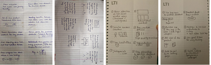
🧠 Brainstorming: Crazy 8
Zoom cameras on, game faces ready. The challenge: sketch eight wild, wonderful ideas in eight minutes flat. No judgments, just pure brainstorming energy.
There was two crazy 8 sessions. For first one the the statement was “How might we motivate Mira to buy a high quality trekking bag for her upcoming trek?” and for second the statement was “How might we design friendly, attractive and minimalistic landing page to ensure intuitive experience for Mira?”
The timer started. Ideas exploded-
“Use of AR for product display.”
“Bonus points for purchasing products, discount timers”
“Size guide and photo with a person using it.”
“Bundle deals like bag pack+ wallet OR Family trolley bag set”
“Content creation on social media. Use of influencers to gain website traction.”
👉 Watch the timelapse video of our crazy 8 brainstorming session :
👉 Figjam File: Click Here
📍 Information Architecture:
Okay, so we peeked into the F Gear website’s navigation. Let’s just say, it wasn’t exactly a smooth ride for shoppers. Sure, the basics were there, but finding the backpack you actually wanted felt like navigating a maze blindfolded.
Categories and subcategories were all over the place, making it difficult to browse. Basically, the whole system needed a serious overhaul.
But why❓
See, the research was loud and clear: This app needs to feel tailored to each person using it. But its whole structure was fighting against that! Small tweaks wouldn’t cut it. It was time to start fresh.

✍🏼 Sketching
Listen, I get a thrill from seeing my ideas come to life on paper. There’s something raw and powerful about that first messy sketch. Sure, there’s the irresistible pull of digital tools, but nothing beats the freedom of a blank page and a trusty pencil.


STAGE 5: Wireframes
Low Fidelity Wireframes
With plenty of ideas in mind, it was time to start building the structure of the new design. I created mid-fidelity wireframes in Figma, laying the groundwork for the next phase.


👉 For more screens : Lo-Fi Wireframes

STAGE 6: Visual Design
🎨 UI Kit
Okay, after all that feedback, it was time to make it look and feel like F Gear. You know how their whole brand is this cool mix of practicality and adventure? Our color palette had to match.
I started with a mood board bursting with bolder colors that shout “let’s get out there!”
Think rich brown as the base layer, that’s the F Gear foundation, reliable and ready for anything. Then, for a pop of energy and that adventurous spirit, I threw in some tangy orange accents. It’s like the perfect travel companion — keeps things grounded while adding a touch of excitement.

Introducing: The New F Gear Experience!
Drumroll, please! After all that research and strategizing, the redesigned FGear website is finally ready for its close-up.


👉 Screens Link : Hi-Fi Screens

STAGE 7: Usability Testing
Putting the Design to the Test
To see how the prototype work in the real world, I ran usability tests on a mobile phone. I recruited people who matched our user persona and created a test plan with specific tasks based on our design goals. As they used the prototype, I asked them to “think aloud” and share their honest feedback.

🤞🏼Okay, folks, turns out users are liking some of the changes! Especially the way we tried to make the experience feel more authentic. It sounds like those little touches are making a big difference.

Overall, the revamped onboarding and how we guide users through finding the right bag seems like a win. But hey, there’s always room for improvement:
- Navigation Reimagined:
Before: Users struggled to locate key features due to a cluttered menu structure.
Change: Implemented a simplified, hierarchical navigation system making it easier to find essential tools and actions.
- Whitespace as a Design Element
Before: The content felt cramped and overwhelming.
Change: Strategically increased whitespace throughout the interface, improving readability and creating a more balanced layout.
- Prioritizing User Needs
Before: Some secondary features were given too much prominence.
Change: Reorganized the layout based on user feedback, emphasizing frequently used features while making less common options easily accessible when needed.
These feedbacks are goldmine! It shows us how much these tiny tweaks can make a giant leap.
It’s about F Gear understanding its customers, and shoppers feeling understood in return. Let me know what you think! Does this capture the essence of our new approach?

📱 Quick Comparison
Let’s do a side-by-side throwdown of the old F Gear website screens against the glorious revamp and see this F Gear facelift in action.


Let’s revisit that tricky question that started this whole journey:
How can we make shopping for F Gear bags online just as satisfying as owning one?
Here’s how we tackled it:
- Personality: I injected their energetic, adventurous spirit into the design. From bold visuals to helpful product descriptions, the site now mirrors the actual experience of using their gear.
- Navigation: The old site’s organization was about as clear as a muddy puddle. I revamped everything, creating clear categories, intuitive search, and helpful filters. Now it’s easy to find exactly what you’re looking for, whether it’s a laptop-friendly backpack or a rugged hiking companion.
🚀 Prototype
💯 The Road to F Gear Future
This case study showed me the power of digging deep. User research was key, unlocking the secrets that guided the redesign. With those insights, I’ve given the F Gear website a major personality boost, and smoothed out the whole shopping experience. Next up? Even more customization!
Think of it like this:
- Exploring your Gear: Finding the right bag is way easier. Now let’s add some fun ‘discovery features’. Maybe it’s a quiz to match your lifestyle with specific backpack styles, or a curated ‘Just Landed’ section for the newest F Gear releases.
- User Profiles: User profiles would be next level! Imagine saving your favorite bags, getting alerts for sales on stuff you’ve been eyeing, and even earning rewards for being a loyal FGear fan. It’s about building a real relationship with shoppers.

🙌🏼 Big Takeaways
Redesigning FGear has taught me a ton. It takes more than just a pretty website to connect with shoppers.
It’s about understanding what users need, practicality and style that makes them feel adventurous, and ready to tackle anything.
Empathy is everything! Without putting myself in the customer’s shoes (or backpack, in this case), these designs would have fallen flat.
😙💨 Phew, that was a deep dive! High fives for making it this far!

Please give 👏🏻 claps if you enjoyed this article.
💡 Check out my other case studies. And hey, if you’re passionate about travel and adventure, I’m always up for a conversation. Let’s connect! http://www.linkedin.com/in/vallabh-ravan
🙏 Special Thanks to my mentor Shardul Vichare
References:
[2] — https://www.ibef.org/industry/ecommerce-presentation
[3] — https://brizfeel.com/consumer-online-retail-shopping-behavior/
[4] — https://www.openpr.com/news/2878667/india-luggage-and-bags-market-size-analysis-trends-by-market

