Exploring the World of Colors
Colors are a powerful tool that can significantly impact user experience. They have the ability to enhance emotional connections within a design, influencing users’ feelings and behaviors. In this article, we will explore the fundamental principles of color theory and delve into the importance of colors in the realm of user experience.

What is Color Theory?
Color theory is a discipline that examines how colors are perceived, interact, and are used. It allows us to understand the power of colors in visual communication and enables us to use colors consciously in the design process.
At its core, color theory consists of three main components:
- Colors Wheel: Color theory utilizes a color wheel to visualize the diversity and relationships between colors. The color wheel represents primary colors (red, blue, yellow) and the secondary and intermediate colors that result from their mixing.
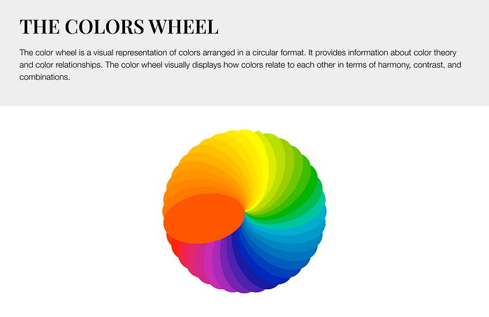
- Color Harmony and Contrast: Color theory explores principles for creating harmonious color palettes and establishing contrast between colors. Color harmony involves selecting colors that work well together, while color contrast refers to the visual impact created by using different colors side by side.
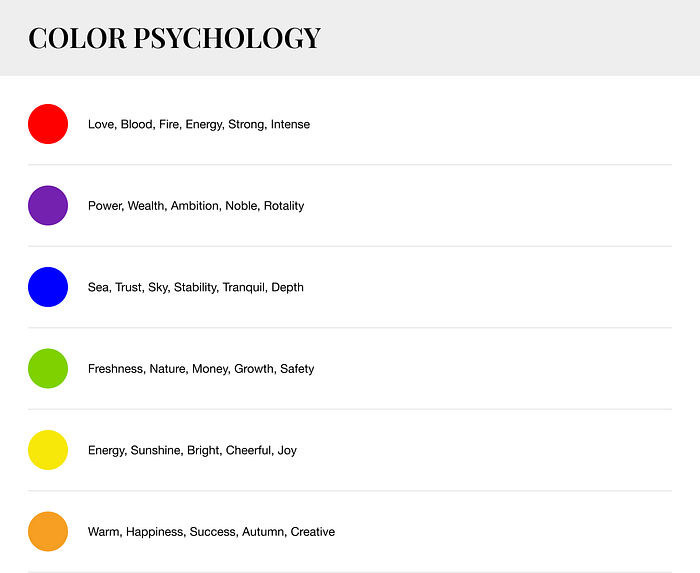
- Color Psychology: Color theory also encompasses color psychology, which examines how colors can affect human emotions and perceptions. Each color can evoke different emotional responses and associations. For example, red may symbolize energy and passion, while blue may convey calmness and tranquility.
Newton’s Color Pyramid: Understanding Color Separation and Combination
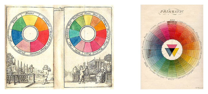
Isaac Newton made a significant discovery in the 17th century regarding the separation and combination of colors, which is often referred to as Newton’s color pyramid. Newton’s color wheel represents the hierarchical arrangement of colors that result from the dispersion of white light.
According to Newton, when white light passes through a prism, it separates into different frequencies of light waves, creating a spectrum. This spectrum consists of the colors red, orange, yellow, green, blue, indigo, and violet. Newton organized these colors in a circular fashion to form the color wheel.
In the color wheel, red and violet are positioned adjacent to each other, with transitional colors in between. By combining red and violet, we can obtain white light, indicating that colors can merge to create white light.
Newton’s color pyramid represents the fundamental understanding of color separation and combination. It illustrates the relationships between color frequencies and wavelengths and demonstrates how colors interact with each other. This pyramid serves as a fundamental reference point for designers and artists working with color theory and color combinations.
Analog Colors: Creating Harmony and Cohesion in Design
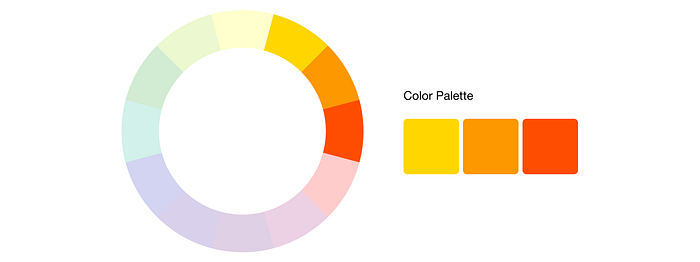
Analog colors, also known as analogous colors, are colors that are adjacent to each other on the color wheel. These colors are typically in the same color family and share similar undertones. Analog colors create a sense of harmony and cohesion due to their close relationship on the color wheel.
Analog colors are often used in design and art to create color palettes. By choosing colors that are adjacent to each other on the color wheel, designers can achieve a sense of balance, unity, and visual interest. Utilizing analogous colors allows for smooth transitions between colors in a design.
Complementary Colors: Creating Contrast and Harmony in Design
Complementary colors are colors that are directly opposite each other on the color wheel. They represent the contrasting pairs of primary and secondary colors. When combined, complementary colors create a visually strong impact.
Here are some basic pairs of complementary colors:
- Red and Green: Red and green are complementary colors. When these colors are combined, they create a high-contrast and attention-grabbing effect. For example, the red and green combination is commonly used during the Christmas season.
- Blue and Orange: Blue and orange are also complementary colors. When these colors are paired together, they create an energetic and vibrant effect. This color combination is frequently used in sports team logos and promotional materials to create a striking and impactful visual.
- Yellow and Purple: Yellow and purple are complementary colors as well. When these colors are combined, they create liveliness and contrast. This color combination is often used in fashion designs and interior decoration to create an eye-catching effect.
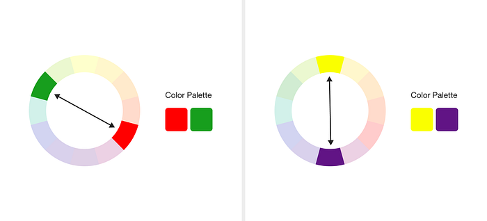
Complementary colors, when used together in a design or artwork, create a harmonious and striking contrast. The use of complementary colors can be an effective strategy to highlight specific elements or enhance visual appeal.

Triadic Color Harmony: Creating Balance and Variety in Design
Triadic color harmony refers to a color combination in a design that uses three different colors. This combination is achieved by selecting colors that are evenly spaced on the color wheel. Triadic color harmony is an effective strategy for creating balance, diversity, and visual interest in designs.

Triadic color harmony allows designers to use colors in a balanced and cohesive manner. Designers who work with color theory and color combinations can utilize triadic color harmony to create visually captivating and impactful designs.
Cross-Complementary Colors: Achieving Balance and Contrast in Design
Cross-complementary colors, also known as split-complementary colors, refer to a color scheme where a base color is paired with the two colors adjacent to its complementary color on the color wheel. This combination creates a balanced and harmonious palette with a high level of contrast.
The use of cross-complementary colors provides a visually appealing and dynamic effect in design. The contrast between the base color and the two adjacent hues adds interest and vibrancy to the overall composition. This color scheme is commonly used in various design fields, including graphic design, interior design, and fashion, to create visually striking and well-balanced outcomes.

The Essence of Monochromatic Colors: Harmony and Aesthetics in Single Color Tones
Monochromatic colors refer to a color scheme that uses different shades, tints, and tones of a single base color. In this color scheme, variations are created by adjusting the brightness, saturation, or darkness of the base color. Monochromatic color schemes are often used in design to create a harmonious and cohesive look. They offer simplicity and elegance while allowing for subtle variations within a single color family. The use of monochromatic colors can create a sense of balance and unity in a design, making it visually appealing and pleasing to the eye.

If you are looking for a detailed article on monochromatic colors in English, I recommend searching on reputable design websites, blogs, or online resources that specialize in color theory and design principles.
Top 5 Websites for Creating Color Palettes
Color palettes play a crucial role in design projects. Finding the right color combinations is essential for adding harmony and aesthetics to your designs. Thankfully, creating color palettes has become easier and more enjoyable. Here are the top 5 websites where you can create color palettes:
Coolors (https://coolors.co/)
Coolors is an interactive color palette generator. With its user-friendly interface, this website allows you to generate random color palettes, customize existing ones, and explore different color combinations.
Adobe Color (https://color.adobe.com/)
Adobe Color provides powerful tools for creating color palettes. Drawing inspiration from the color wheel, you can create palettes with harmonious color combinations and browse palettes shared by users.
Paletton (https://paletton.com/)
Paletton is a color palette generator based on color theory. Using a selected base color, you can generate complementary and harmonious color variations, visualize color combinations, and save your palettes.
Color Hunt (https://colorhunt.co/)
Color Hunt is a platform where you can discover thousands of color palettes. You can search for palettes based on different themes, trends, and categories, and find inspiration. You can also share your own palettes on the platform.
Canva Color Palette Generator (https://www.canva.com/colors/color-palette-generator/)
Canva offers a color palette generator tool that assists designers. You can generate color palettes from starter colors or from an image, and then download your palettes for use.
These websites serve as valuable resources for designers and creative professionals looking to create color palettes. With their user-friendly interfaces, wide range of color options, and inspiring features, they simplify the process of generating color palettes. Now, you can have eye-catching color combinations for your design projects!
The 60–30–10 Rule: Achieving Balanced and Harmonious Designs
The 60–30–10 rule is a guideline used to achieve balance and aesthetics in design by allocating proportions to different design elements. Here is an explanation based on the principles of this rule:
- 60% Dominant Element: Select a dominant element that will occupy the largest area (60%) in your design. This element is typically chosen as the main text or image and serves as the focal point of the design.
- 30% Supporting Elements: Allocate 30% of the space for supporting elements in your design. These elements are used to complement the design, provide visual variety, or support the dominant element. For example, you can use a side image or accompanying text.
- 10% Accent Elements: Reserve 10% of the space for accent elements in your design. These elements help make the design visually striking and captivating. Accent elements can be created using different colors, larger headlines, or stunning visuals to add vibrancy to the design.

And finally;
In conclusion, color theory plays a vital role in UX/UI design, and with the recommended five popular color palette websites, you have the tools to create stunning visual experiences.
Join me to stay updated on the latest design trends and discover more design tips!

