Enhancing the home eye checkup booking experience on the Lenskart app - An evaluative UX case study

Overview
As a part of my UX design career this is the first project I did try to solve real world problem. In this case study I focused on evaluating “booking a home eye checkup” flow of the Lenskart app to identifying the problems and redesign the experience.
Plan of Action
- Understand the Business
- Understanding the Users
- Understanding their Needs
- Understanding the User Flow
- Heuristics Evaluation
- Wireframes
- UI Prototype
- Usability Testing
Problem Statement
Evaluate the “booking a home eye check up” flow of the Lenskart app. Which includes booking a appointment, adding address and details, make payment and redesigning the experience while identifying opportunities to make usability better for the family with kids which will lead to decrease bounce rate and increase conversion.
Reason for choosing the problem statement
Peoples are struggling to booking Lenskart home eye checkup appointment. Improving the experience will helps to impact the daily users and business.
Understanding the problem statement
To understand in depth of their business, its users, the outcome of solving this problem and what part of the business needs to be impacted.
Understanding the business:
- Lenskart is an India’s leading eyewear brand and retailer that primarily operates online, although it also has a presence in physical retail stores.
- One of Lenskart key strategies is its home eye testing service. They offer customers the convenience of scheduling eye tests at home, eliminating the need for a physical visit to a store.
- Lenskart offers a wide range of eyewear products, including Prescription eyeglasses, Sunglasses, Contact lenses, Eyeglass frames, Lens solutions and accessories
Understanding the Users:
For the users is family with kids. Take a home eye checkup service saves their time.
Understanding their Needs:
Helping users to booking a appointment and ensuring they have a good experience which eventually makes them loyal customers.
What would be the outcome of solving this problem statement?
- Upon solving this problem we can decrease the bounce rate.
- A better experience and an improved flow for users to book an appointment.
- We can see the conversion rate of the business going up as the good experience will increase the customer retention rate.
Understanding the User Flow
To start, I need to understand what flow I was working on, so I mapped the flows within the app.
Home page → Program Selection → Add address & details → Checkout Process

Heuristics Evaluation
After understanding the flow I did the Heuristic Evaluation. It’s a method of identify the usability problems in the product’s user interface design, I tested each heuristics against every screenshot & repeated the same for all the screens.


Wireframes
After the ideation, I was quickly draw paper wireframes to understand the ideas from ambiguity to clarity.


Before I started making your UI design, I looked for inspiration for UI elements from different platforms so that I could get exposure to how people use different elements!

UI Prototype
After the wireframing. I designed the UI screens and make the prototype with the help of figma.

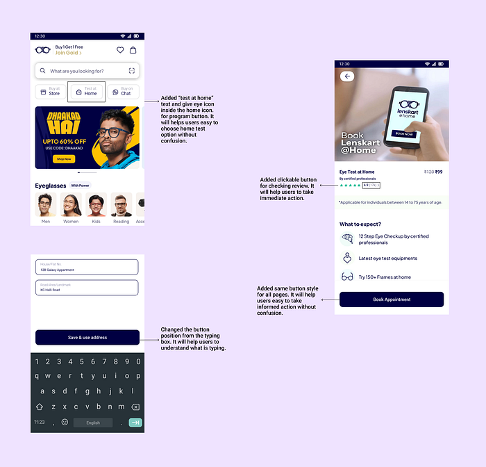
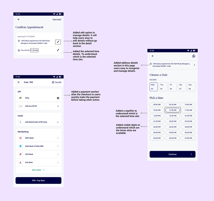
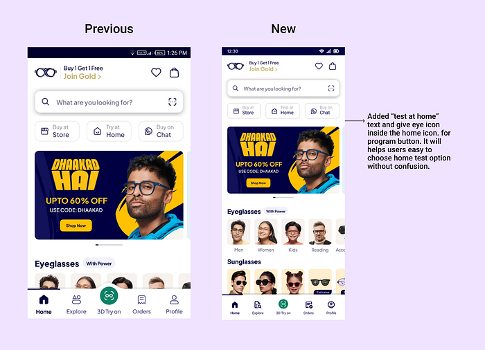
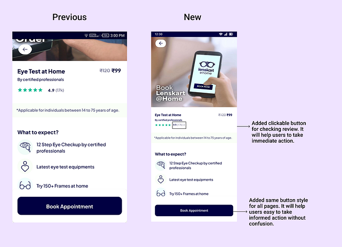
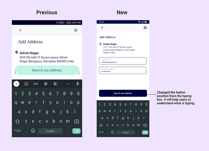
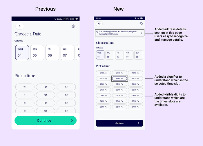
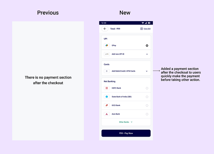
Explanation of the UI
Revised User flow
A new user flow was created which was made keeping in mind all our ideation and research, this user flow we followed during our wireframing and UI screens.
You can try the prototype it here:
Revamped Experience Usability Testing
Finally! the time has come to put the design out in front of the users and run usability testing. Since I had made flows and clickable prototypes, I first conducted task-based usability testing.
As this whole design process is a never-ending iterative procedure.
Revised Iterated UI
Below is the final iteration I made after the usability testing.
Key Learnings from the Project
- I learned how to approach a product problems in a broader manner.
- I learned how much learnings and understanding will happened while build a product solution from ambiguity to clarity.
- During this project journey there are lot of new learnings were happened.
- I learned how to manage time while doing each tasks of this project.
Also, read my other project
- Design Thinking Case Study - (Click Here)
Thanks for reading this case study! Feel free to drop in your feedback! LinkedIn | imthiyasroshanem@gmail.com

