Enhancing meaning through strong visual imagery

The importance of Visual imagery
Design is thinking made visual -Saul Bass
Design is filled with visual imagery. It is not just about aesthetics but more so about enhancing meaning and providing balance to the content. Balance is one of the key principles in design, with that in mind, designers are able to create a blend of visual imagery and text resulting in great UI. Images can speak 1000 words; however, accompanying text can enhance content and make designs more cohesive. Interfaces filled with paragraphs of text are load-barring and affect users’ experience negatively.

Images are intended to evoke emotions but also amplify the meaning and clarify the content.
Humans respond far quicker to visuals than they do to text which is primarily why it is used so frequently across all designs. The corresponding text helps give context to visuals that otherwise would have less meaning.
The role of visual imagery

Visuals help people remember things. That’s why all companies have a small image to represent their brand, commonly known as a logo. It’s instant recognition. Images have the ability to capture the brand, the associated emotions, and sometimes their values. The logo and a simple phrase further inform users about a brand. A great example is Target, a fitting logo of a bullseye with a simple tagline “expect more, pay less” implying their quality yet affordable products. Both the logo and catchphrase go hand-in-hand and enhance each other’s meaning.
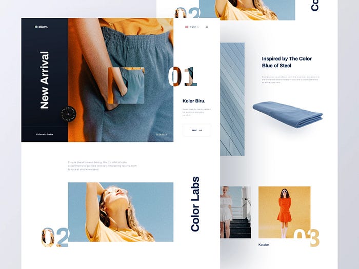
The number one goal of product design is to make products usable. When it comes to interfaces, designers have the ability to create a focal point by experimenting with text, color, images, and the use of negative space. A hierarchy of images can pleasantly support and encourage eye movement. All these cooperate in moving the user’s eyes around the page.
Design is about storytelling; imagery helps visualize the story and gives users a better understanding of the product as a whole.
Great ways to use visuals
As we have established, visuals are great. However, too many images with limited text to support, can suppress the intended meaning and sometimes alter it.
Billboards located beside the highways are bright, colorful images with minimal supporting text. This explains the weight visuals have in design and our ability to easily retain information in such little time.
Important things to note when using visuals
1. Distribute the imagery
Evenly spread the visuals throughout the UI to make the content enjoyable. Limit areas that have only text as it can be a heavy cognitive load on users. Using visual imagery will not only help balance out the content, but the meaning will be an added benefit.
2. Keep the eyes moving
Images should be anchor points that encourage eye movement across the interface. It’s a great way to direct users to a particular location and entice them to scroll down.
Nike uses visuals to do precisely that. Nike’s design team overlays their CTA’s onto bold, eye-catching visuals leading the users exactly where the designers intended.
Designing a playful layout can help the users retain the information later, making the content stand out.
3. Shine light on the interesting content
Whether it is a quote, a fact, or important content, it should be visually highlighted. This could mean graphics surrounding the information, bullet points, or text simply indented. We read what catches our eye; users will be thankful if the important/useful information is already highlighted for them.
Speaking of important information, data or statistics can be helpful to understand particular things and prove certain statements. These forms of information should be visualized in the form of charts and graphs allowing users to gain a quick understanding of the content. Too many numbers are not only hard to read but are also require much more effort to process.
4. Visuals should enhance meaning not contradict it
When picking the right visuals, ensure the text and visuals complement each other and do not create confusion. Images can give clear context to text; however, designers need to identify if the visuals are the hero or the supporting act. This decision can alter the meaning and intent of designs.
Design is a visual means to communicate

To reiterate what Saul bass beautifully said “Design is thinking made visual.” Visual imagery and text go hand-in-hand in making UX/UI user-friendly, functional and aesthetic, however; it is easy to go overboard. Balance is a key principle in design as its implications of not achieving it can result in an overall unpleasing UI.
Canvs Editorial regularly brings you insightful reads on design and anything related. Check out the work we do at Canvs Club.
The Canvs Editorial team comprises of Editorial Writer and Researcher — Anjali Baliga, the Editor’s Desk- Aalhad Joshi and Debprotim Roy, and Content Operations- Abin Rajan
Follow Canvs on Instagram and Medium as well for more design-related content.

