Case study: Redesigning a church app to enable community building and note-taking

Introduction
The Elevation App is a mobile app created for Elevation Church to add to their digital experience. The app provides its users with the ability to watch past sermons on-demand, as well as live worship experience broadcasts.
The population of viewers who engage with Elevation’s content includes people from 114 countries. Elevation understands that the church might look different in the near future, which is why they have invested ample time and resources into their digital presence. Although this may not have been what they had in mind, their readiness has been evident and crucial during the ongoing COVID-19 pandemic. The Elevation app serves the purpose of allowing people to be part of a global community from wherever they are in the world.
Understanding the Problem
As a keen user of the Elevation app, I have noticed that although it provides easy and convenient access to sermons, there is no way of connecting and interacting with other users — an element that would truly reinforce their global digital community. As a result, I decided to take a look at the current version of the app to see how the user experience could be improved to provide an ideal solution to user needs.
Disclaimer: This is a passion project. I am not affiliated with Elevation Church in any way. I do not have access to the organisation’s internal business priorities or operational constraints which may have influenced their app’s current core functions and user interface.
My Role: UX/UI Designer.
Project Duration: 16 weeks.
Tools: Adobe XD, Photoshop & InDesign, Google Sheets, Miro, and Zoom.
To produce this case study, I followed the following process:
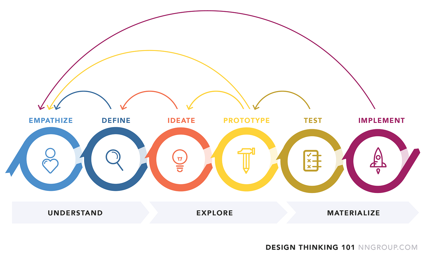
— Empathise
My research began with conducting a series of 1:1 interviews with five people aged 23–33 years, to help me gain a deeper understanding of how they interact with the app, what their pain points might be and how their experience could be improved.
INTERVIEW QUESTIONS:
- What do you think of the current Elevation App?
- What do you like about it?
- What additional features would you like to see in the Elevation App?
- Would you use a notes section that enabled you to take notes while you watch a sermon?
- Would you be interested in creating a user profile?
- Would you use the app to build a community by connecting with other users?
- Was there anything that frustrated you whilst using the app?
AFFINITY MAP:
The Affinity Map below was created to help me analyse the data gathered from each individual during the user interviews.


Insights
KEY FINDING 1:
The general consensus amongst participants regarding the appearance of the app was that they are very happy with its current visual aesthetic. They added that the simplicity of the app allows for easy navigation.
“The app is visually well organised.”
“The app is clean and easy to navigate.”
KEY FINDING 2:
The participants find it frustrating that there is no option to log into existing accounts except during live broadcasts, but appreciate the convenience of not having to log in each time they want to use the app. They also expressed that they would like to be presented with the option to create a user profile that would enable them to have a more personalised experience.
“I appreciate that the app doesn’t force you to register an account before you can use it.”
“I’d like to be able to log in and stay logged in unless I log out.”
“There’s no login feature.”
KEY FINDING 3:
While one participant declared their preference for handwritten notes, the majority of participants stated that they would love an integrated Notes feature that would be available to all users with a registered profile, unlike the current system on which the notes are only available during a live broadcast and are therefore inaccessible at any other time.
“A place to make notes would be nice, especially when following a series.”
“The notes feature is only available during live broadcasts.”
KEY FINDING 4:
Despite the fact that the participants as a whole explicitly expressed their desire to be able to connect and interact with other users of the app, with private messages being the main focus, one participant stated that they would only be interested in connecting with people that they already knew personally. In addition, some indicated that they would use the app more frequently if it was more engaging.
“I’d like to be able to share sermons privately and be able to have a Bible study session with a friend.”
“I would use the app more if it was more engaging.”
— Define
In response to the user interview findings, I created three user personas for typical Elevation App users.


Competitor Analysis
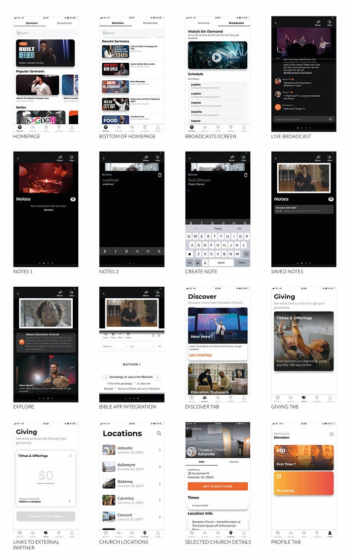
Next, I conducted an analysis of two other church apps to see how their features compare to the Elevation App.
ELEVATION CHURCH STL

WHY IS THEIR APP SUCCESSFUL?
- Upon launching the app, you’re presented with two options — to either sign up or continue using the app without signing up.
- The featured item on the homepage is a Call To Action encouraging people to connect with others. This implies the significance of building a community.
- All their available eGroups are listed, with details of when they take place.
- The homepage is tidy and clearly displays thumbnails to indicate that you can either watch or listen to the sermons like podcasts.
- There is an embedded Notes feature that allows users to make notes, whether they have an account or not. These notes are saved on the page of the specific sermon on which you entered them.
- There is a bookmark feature that allows you to save specific videos for later.
- The Watch tab allows you to watch all available series that have been neatly grouped.
- The Guide tab consists of the various ways in which you can connect with the Church whether as a regular goer or as a first-time guest.
- You can easily submit prayer requests.
WHAT ARE THE SHORTCOMINGS?
- Clicking on the Giving tab redirects the user to an external site. However, the interface is self-explanatory, which allows the user to identify the purpose of that page and navigate it with ease.
- The user has to scroll all the way down to the bottom of the screen in order to find the physical location of the church.
THE POTTER’S HOUSE — DALLAS
WHY IS THEIR APP SUCCESSFUL?
- The first link on the homepage leads to a screen that contains the church’s physical address and contact information.
- Suggests sermons that you might like based on the one you’re currently viewing.
- You’re able to either create a profile or use the app without registering.
- The Events tab contains a calendar that allows you to see previous and upcoming events.
WHAT ARE THE SHORTCOMINGS?
- There is no option to simply listen to sermons like podcasts.
- The sermon descriptions only include a title with no additional insight.
- There is no Notes feature available.
- The videos do not offer the option of closed captions.
— Ideate
THE SOLUTION
In response to the user research that I conducted, I was able to establish the following design solutions:
User Goals
- Provide users with the ability to easily create and sign in to a personal account, bookmark their favourite sermons to their profile, and register notes whilst watching a sermon.
- Ensure the interface preserves its clarity and ease of use.
- Provide users with the opportunity to add and interact with other users.
Business Goals
Maintain Elevation App’s visual aesthetic and ease of use alongside creating an opportunity for the organisation to build a more engaged digital community within its own app.
Information Architecture
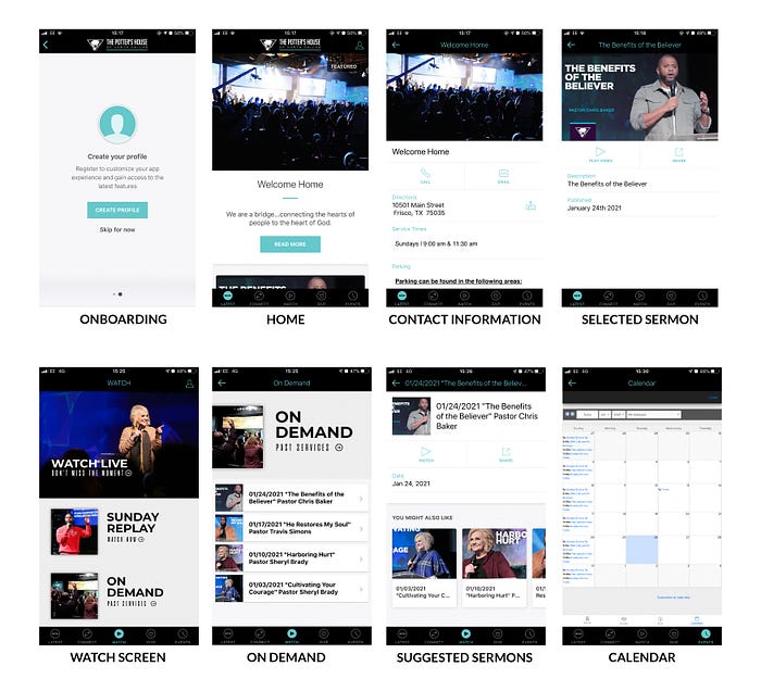
To begin the design process, I started by looking at the current interface of the Elevation app to gain a better understanding of the user’s journey within the app.
Based on the images above and my personal experience with it, I think that the current Elevation App has been generally very well designed. There are just a few components that I felt needed to be rearranged. For example, I don’t think that the notes should only be accessible during live broadcasts. Instead, they should also be available when viewing sermons on-demand.
Next, I created new information architecture to help me figure out the various functions required within the app.

The changes that I made to the information architecture is as follows:
- Added a splash screen.
- Onboarding options to either sign up, log in or skip.
- Changed the “Giving” tab to “Give” — I thought using a verb might work better here.
- Changed the “Locations” tab to “Connect” — a place where the user can find different ways to communicate with the Elevation online community.
- Merged location and contact information with information about the church, their outreach programs, and eGroups into the “Discover” and “Connect” tabs.
- The “Profile” tab is now home to the user’s personal profile that they could either keep private or make public to make them reachable by other premium users. From here, the user can also access their direct messages and view their saved bookmarks and notes.
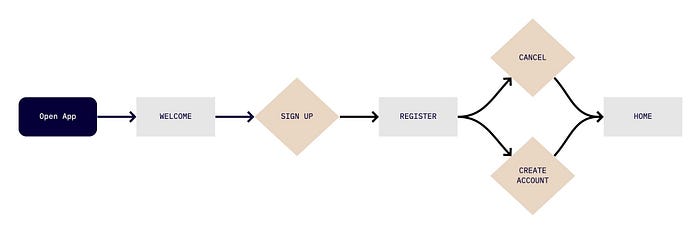
User Flows
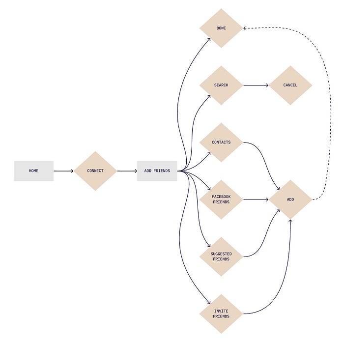
In order to explore the information architecture further, I created user flows for three ideal journeys that would allow users to complete their desired tasks in the least number of clicks.
ONBOARDING
ADDING FRIENDS
CREATE NOTES

Low Fidelity Sketches
Below are my initial ideas for additional features that I think would improve the current user experience within the Elevation App. The key features that I focused on were the Bookmarks, Notes, User Profile, and Interactivity features. My research findings showed that it is essential for me to maintain the current app’s aesthetic quality.


Mid-Fidelity Wireframes

I shared an interactive prototype with the participants of my user interviews for usability testing and the following are some of the responses that they had.
“I like that there is an option for me to have a private or public profile.”
“I love that I can use the app as a guest.”
“I like the option to create a profile and make it private should you wish to.”
“There is no prompt to verify my account.”
I also shared the mid-fidelity wireframes with my mentor who aside from the positive feedback that he provided regarding the overall quality of the design of the wireframes, gave the following suggestions:
- Account verification.
- Include a personalised greeting for Premium users.
- Consolidation of the Bookmarks and Saved Notes libraries.
- A greater distinction between Standard and Premium features.
- Prompts to encourage/entice guests to create a user profile in order to access the premium features.
Below are my design iterations based on this feedback.


For the purpose of clarity, I decided to create new user flows with my revised designs.
Guest User Flow
The user flow below illustrates the journey of a guest user. In contains prompts to encourage/entice the user to sign up if they wish to gain access to the new features.

Premium User Flow
The wireframes below illustrate the user flow of a premium user who opted to register an account, and as a result, now has access to the following features:
- User profile
- Global online community — add and communicate with friends near and far
- Make notes directly underneath the sermon you’re currently watching/listening to
- Personalised library containing saved bookmarks and notes
- Create notes independent of sermons with the option to link to an existing sermon and add tags that can be used to search through your library
- Direct messaging

— Usability Testing
Before moving on to high-fidelity wireframes, I wanted to make sure that my design was functional and met users' needs. I tested the same five people that I interviewed during the discovery phase.
Analysis of the test results showed that:
- Navigation of the app was easy and straightforward
- All participants were generally pleased with the design of the app
- Two participants stated that a feature that displayed their recently viewed sermons would make their experience of using the app that much more personal
- The option to make the user profile private was a glaring success
— Prototype
Shortly after conducting the usability tests, I applied minor changes to my final design. Below are some of the key moments that I designed.


View The Interactive Prototype
As you can see from the prototype, I placed great emphasis on user onboarding. The purpose of these tooltips is to educate users on the benefits of using the app and guiding them through the app’s new features and functions. This strategic communication aids in the facilitation of a positive user experience.
User Feedback
Upon completion of prototyping my high-fidelity wireframes, I asked my test participants to navigate through the app and share their honest thoughts on their individual experiences. The purpose of this exercise was to determine whether or not there are any areas of improvement within my design.
“The layout is straightforward and not complicated.”
“Liking the new features!”
“I like that the orange pop ups give you the chance to explore further if you choose to do so.”
“I like all the functions within the user profile.”
“It’s so easy to navigate and you don’t spend too much time searching for the items you need. It feels more user-friendly.”
Conclusion
I am really amazed by what I have been able to achieve on this project. As this was my first UX case study, I intentionally explored and documented each step of the design process in detail to help with my understanding. The knowledge that I have acquired has given me the confidence to assign myself further projects in order to continue nurturing my developing UX design skills.

