Elevating user experience of Booking.com — a UI/UX Case Study
Redefining travel booking for a more user-friendly journey
Hey designers! I’m sure you’re familiar with booking.com. It’s highly likely that most people are familiar with the website and have even checked out prices for their dream destinations or hotels. Considering the popularity of Booking.com, I decided to delve into its UI/UX and conduct a case study.
So, what do you think about the UI/UX of booking.com? Okay let’s hold that thought for a while.
To begin with it’s one of the largest travel companies in the world. It’s an Online Travel Agency (OTA) platform that allows users to search and book accommodations, flights, and other travel-related services. Expedia group and Booking holdings dominates the OTA world with majority of market share. Airbnb is one of the main competitor but it comes in P2P business model not OTA.

First we must consider the user personas. I came across this MECE framework (Mutually exclusive collectively exhaustive) for grouping the users. I found this interesting and more apt to group the persona than choosing one particular user case so, I’ll consider my user persona by MECE framework here.

Here I’m considering the user flow for holiday leisure travel.
First flight booking process, followed by attractions and stay bookings.
When we search for flight timings and prices on booking.com or any flight booking site, the screen may take a moment to load. Have you wondered why? This delay occurs because these sites need to retrieve information about available flights from a central repository called Global Distribution Systems (GDS), such as Amadeus. The booking.com website, like others, relies on these repositories to gather flight availability data, which is then presented to users along with the corresponding prices. So, the loading time you experience is due to the system retrieving and processing the data before displaying it to you.
I saw an opportunity to re-create a loading screen. I tried few animations for this loading screen and ended up choosing this one. The loading screen animation plays a crucial role in setting the tone and building anticipation for users as they wait for their flight search results to load.
These are key feature I considered for this animation concept I designed:
1. Smooth Transitions: I focused on creating seamless transitions between the loading states.
2. Branding Consistency: Booking.com has a strong brand presence, and it was essential to maintain consistency throughout the animation. I incorporated the brand colors and typography to enhance their overall experience.
3. Playful Elements: To add an element of fun, I introduced subtle animations like bouncing flight icons. These playful touches help engage users during a mundane waiting period.

CTA Button:
Before users can take action, they have to scan the screen. The screen content informs their decision on which action to take. As soon as they finish scanning, the call to action should present itself. Where do their eyes end up when they finish? It turns out they start at the top left corner and finish in the bottom right, moving their eyes in a zig-zag. Renown newspaper designer Edmund Arnold called this natural scanning pattern the Gutenberg Principle. The principle illustrates how the eye moves from left to right along an axis of orientation until it reaches the bottom right corner. It forms a prominent scanning path called reading gravity. Design elements that lie along the diagonal get the most attention. Elements that lie outside it receive less.
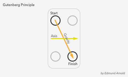
Based on this principle, I’ve enhanced the flight search page of the Booking.com app. To browse through an array of flight offers, then book destination or continue searching for the perfect flight. Also, have modified the navigation bar with micro interaction to blend with the splash screen idea.
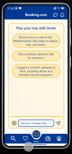
AI Booking Assistant:
When Voice assistants have come a long way since their initial introduction. The breakthrough came with the launch of Apple’s Siri in 2011, which opened the door to a new era of human-device interaction. Today, voice assistants like Amazon’s Alexa, Google Assistant, and Microsoft’s Cortana have become household names, transforming the way we interact with technology. One of the primary reasons for the widespread adoption of voice assistants is their ability to simplify daily tasks. Like setting reminders, sending messages, or controlling smart home devices, voice commands enable users to accomplish tasks hands-free and with remarkable efficiency.
Now we see the growth of generative AI like ChatGPT & Bard and how fascinating it is to see what it can help us achieve in no time. People are experimenting various features using AI. Can we make use of this evolving feature in our booking app?
After some brainstorming, I settled in with genie chat. What- The idea is to introduce a chat bot where customers can discuss the elaborate tour packages and customize it with flights and hotel stays. Why- Oftentimes when we plan our holiday, we wish there was someone who could understand our needs, budget and constraints to help plan the prefect itinerary. That’s where an AI powered booking assistant with all the knowledge of available flights, attractions and hotel comes handy. Customers will have multiple options to customize as per needs. This saves more time and gets the best available option.
The future of product interaction undoubtedly revolves around AI. As technology advances, this will become even more sophisticated, offering enhanced context-aware responses. This evolution might lead to a more personalized and human-like interaction.
Conclusion
Booking.com shows us that design is not just about aesthetics — it’s about the user, their needs, and their experiences. As we step into the future of design, it’ll be interesting to see how they can continue to innovate and create a platform that’s even more user-friendly, inclusive, and enjoyable.
Thank you for reading. Hope you enjoyed this case study!


