Do’s and Don’t for UI Design
Top 7 do’s and don’t that will help you create better user experience.

User Interface is what a user see when interacting with any product, application or platform. Engaging user experiences are built on a foundation of solid interface design. As a beginner, we all get fascinated by designs of different website and wonder how to create such design by our own.
There are a few things to consider as fundamental design concepts for building clean, efficient interfaces for a broad set of users.
So let’s begin to understand how to create amazing, clean and professional interfaces!
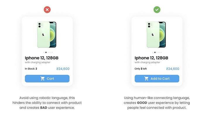
1. Human-like Language:
Using an empathetic language helps engaging user and gives a sense of good user experience through your design.
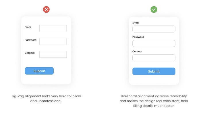
2. Horizontal Alignment:
By keeping the alignment to the mark, it enhances the readability of the content. Good alignment on a screen makes it easier for the eyes to scan through.
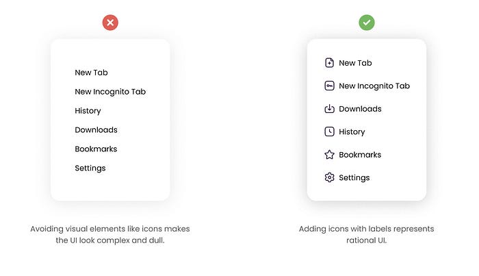
3. Icon-Label Representation:
Use of icons, animation along with label, helps connecting with the content much more easier. It makes the interface look rational and rich, instantly catches the eye.
4. Breaking Up Content:
Use of long sentences and paragraphs make it difficult to read. To have good UX and UI, one should focus on highlighting only the key point using bullets or breaking the content into smaller chunks. Specially while stating “Terms & Conditions” or any declaration, bullet point help easy scanning of the content. The information is less likely to be left unconsumed.

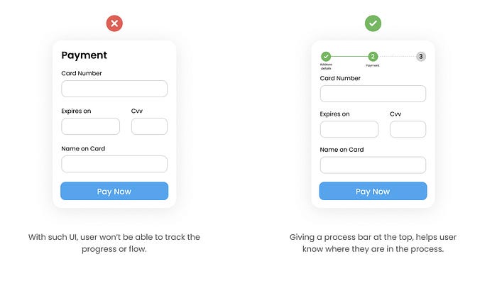
5. Process Bar:
Process bar helps to track the flow, also it gives ease of moving too and forth. Scenarios like online shopping, form filling, KYC application, etc uses this format to ease the process tracking.
6. Guiding Error:
Any invalid or error states should be clearly mentioned to initiate an action. Without understanding what went wrong on the screen, user will feel disappointed and might give up on the flow. While designing interfaces, it is very important to indicate the right thing at the right place, to avoid ambiguity.

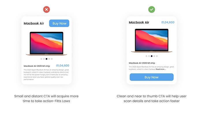
7. Ease to Reach CTA:
According to Fitt’s Law, distance and appearance of the target area is proportional to the action taken. So to keep the focus on the action, CTA should be placed accurately. Also the size of the button should be easily clickable to avoid inconvenience while trying to achieve target.
So guys these are the 7 basic Do’s and Don’t that one should follow along while designing experience on digital products. Hope this help you to understand the fundamentals of UI designs!
If you want more such tips, support this article by hitting that clap button and would surely come up with more such Do’s and Don’t for UI!
Links to the other articles from the series, so you don’t miss out on anything😃
Do’s and Don’t Part-3
Do’s and Don’t Part-2I’m always up for a chat 😃, that’s to say.
Instagram: https://www.instagram.com/ayushithisside.ux/
My Linkedin profile: https://www.linkedin.com/in/ayushiverma13/
Behance: https://www.behance.net/ayushiverma713
Twitter: https://twitter.com/Ayushiv713

