Don’t be afraid to create your own icons: The beginner’s guide
From the beginnings of operating systems, icons have been an integral part of users’ journey, helping them navigate the depths of the complex systems that surround them.
If you would have asked me five years ago if I could draw even the simplest icon, the answer would probably be NO. It’s not that I couldn’t, I was just too afraid to try. Designers tend to think that drawing an icon requires a lot of effort, experience, and knowledge, but doing so is a lot simpler than they think.
If you are asking yourself why you should put your time into it, the short answer is because you can, and the long one is that icons make a big impact even though they are small. Not only do icons bridge over a language barrier, but they can also grab users' attention when needed, help users navigate your product, and make better decisions. They also contribute to the overall look and feel. You wouldn’t want other designers to set the tone for your designs, so why let anyone else set the tone for your icons?
Besides, product designers nowadays need to enlarge their toolbox constantly, and drawing icons is definitely a great tool.
This guide will walk you through the basics of icon drawing and teach you how to draw your own icons in just five steps. You are more than welcome to follow along step by step and create your own icon by the end of this article. (Yay 🎉)
So, what exactly do I mean when I say icons? An icon is a graphic symbol in the digital world that represents an object or a function.
When people refer to icons, they can be referring to any of the multiple types of icons; In this article, I will focus on system icons, even though a lot of what I’m explaining here is true for different types of icons as well.
And why are system icons so important to us?
Icons add character and style to the product and make it easier for users to navigate and complete tasks. Sometimes platforms can be cluttered with text, actions, images, etc. This visual overload tends to confuse users, and replacing some words with icons can reduce that problem drastically.
With that being said, it is still recommended to use icons with a label next to them or when you interact with them (e.g., tooltip) to avoid confusion, especially when you are not sure how clear the intention of your icon is.
Now that we are on the same page, I think it’s time to move forward to ‘How the hell should I get started?’
Step 1: Getting to know icon styles
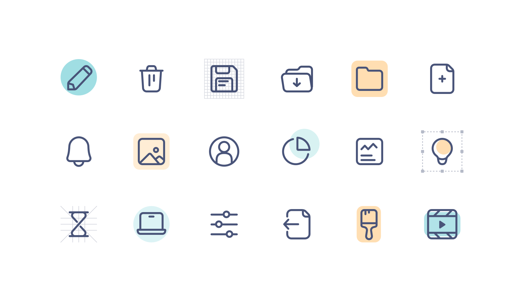
The first step in creating your icons is understanding the main icon styles that are being used today. System icons are usually simple and minimal as they need to be visible in small sizes and on screens full of details.
There are lots of ways to draw icons, but I'm going to focus on the three most common styles:
Outline Icons
Also known as line icons, they are simple, clean and modern, and often go with smooth thick lines. This style is highly associated with Apple OS.
Glyph Icons
Monochromatic icons, made of simple shapes, and are easily recognizable. Google uses glyph icon style as their primary icon style in Material Design.
Colored Icon
Also known as filled icons; basically, it’s a take on the outlined icon, with a little bit of color inside.
After understanding the main styles used today in digital products and choosing the right style for us, we can move forward to setting up the icon grid.

Step 2: choose icon size
When it comes to choosing a default size for your icon pack, there isn’t so much of a right and wrong way to go about it; it mainly depends on the overall style of your product and the size of key components in your system (buttons, inputs, etc.) Icons will usually need to be aligned to other components or be a part of them, inside a button, for example, so the size of the icon should match.
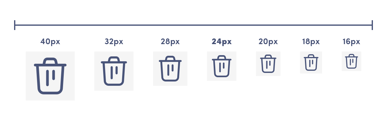
The most common icon size is 24px, this is pretty much the default in all big design systems, and this size works perfectly regardless of whether you’re designing for web or mobile. This is usually my go-to size. To help you make a better decision, I’ve created this cheat sheet that should give you a sense of the ideal icon size based on the components you’ve already established.
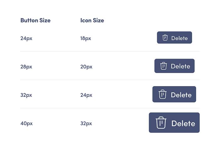
Just because you’re setting a default size, doesn’t mean you will have to use this size solely across your product; it is very common to create more than one size for your icons pack. I recommend starting with a default size, and if necessary, you can add one smaller size and one bigger size.
Step 3: Setting up your Grid
In order to create icons that look sharp, aligned, and cohesive, it’s recommended to use an icon grid. There are a few types of grids, and mine is based on Google Material Design.
I could write a complete article just about this grid but I won’t dive too deep here, I just want to highlight its main elements and how to use them effectively, as they help us make sure we are creating a pixel-perfect icon.
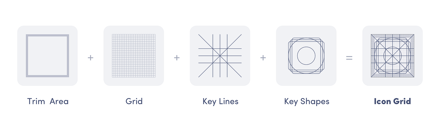
- Pixel Grid — The industry standard is usually 1px. This helps perfectly align the shapes onto a single pixel and correctly measure the spacing between lines and shapes. By doing that, we make sure the icon won’t be pixelated and is perfectly aligned.
- Trim Area — The trim area, is the area where you’re not supposed to put any content; the spacing that’s left inside is called the safe area.
- Keyline Shapes — Blueprints of three main shapes: rectangle, square, and circle. Those are the main geometric shapes we will use to create the icons, and those blueprints help us align all icons to the same position and size on the grid.
- Orthogonal — The orthogonal lines are another tool that helps us align icons at different angles, for example, on a 45* or 90*.
The grid usage is pretty straightforward, download the template I’ve created, and use it as the base for your artboard each time you’re drawing a new icon. Follow the next steps to see how I align different icons on the grid to create visual harmony.
Step 4: Find your metaphor
Icons are a great tool to enhance your designs, but they can also harm usability when used in the wrong way. To understand what impacts icon usability, we need to be familiar with the two main categories from which inspiration can be drawn for an icon:
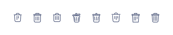
- Resemblance Icons — when you copy the icon shape from a real-life object, for example, a trash can for Delete.
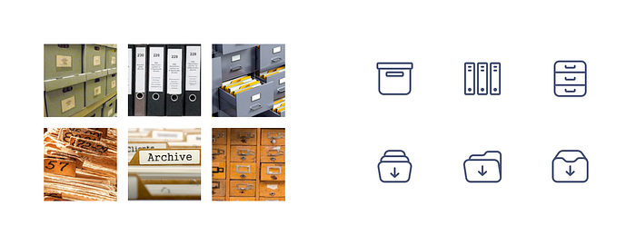
- Reference Icons — those icons are inspired by reference or analogy to physical items or processes, for example, a gift icon for coupon code.
It’s pretty much safe to say that resemblance icons have better usability since they take their inspiration from a familiar object that the user is probably familiar with. Still, obviously, it’s not always possible, especially when designing products that aren't physical.
There is no need to reinvent yourself each time around; with icons, it’s actually advisable to follow the familiar and obvious instead of the ambiguous. Let the users see what they are familiar with.
Rather set your tone and uniqueness in style and details, than in the overall shapes. For example, you can see below how to draw a trash icon in eight different styles. The meaning and metaphor are the same; the only thing that changed is the details.
So how to find inspiration after all?
First, think about the meaning you are looking to convey, then search for the item you are trying to resemble. Save a few pictures that resonated with your idea, and we will use them shortly.
Next, think about the message you want to convey with your icons. Are they rounded and cozy? Are they sharp and edgy? Try to understand what characters should symbolize your icons. It’s recommended to choose the style based on the overall look and feel of your product.
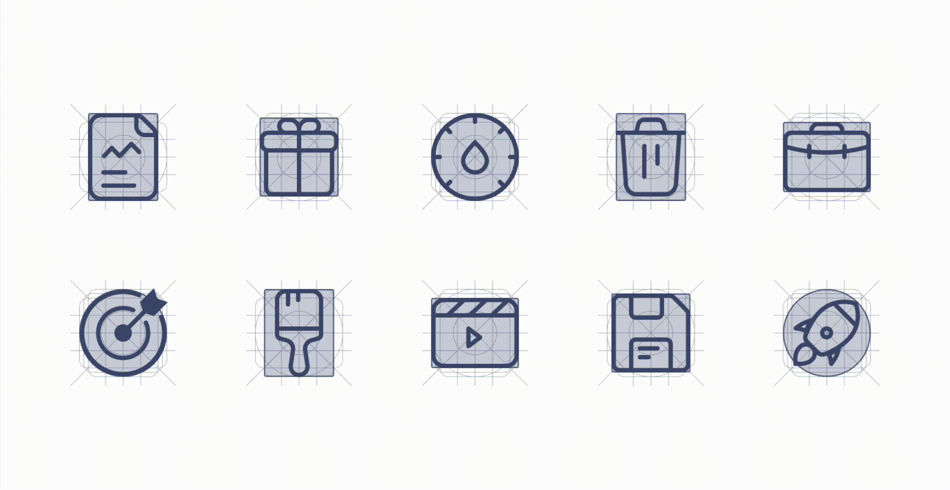
Step 5: Build your icon with geometric shapes
We all know that everything that surrounds us can be simplified into geometric shapes, and that’s exactly what we are going to do. Please take a second to look around you, look at objects you use daily, focus on one item, and describe its different parts as geometric shapes. This quick exercise will help you simplify the objects you want to draw next.
When creating icons, the main shapes we’re working with are squares, rectangles, triangles, ovals, and lines. Now I’ll walk you through creating an icon, and you are more than welcome to follow the steps along with me.
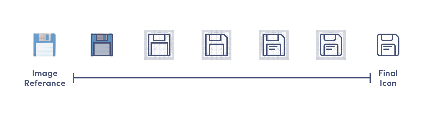
Let’s draw a floppy disk together!
Following our previous steps, at this point I’ve already chosen the style for my icons (outline), I’ve defined the baseline size (24px, as usual 🤷♀️), my grid is all set, and I’ve googled and saved a few images for the resemblance, now I'm ready to start drawing.
- Simplifying — I’m doing the simplification exercise I’ve mentioned before in my head — I see that once simplified, the floppy is made of one big square and two rectangles.
- Experimenting — Next, I’m drawing the shapes I want freely; I don't focus on details because first I want to get the overall idea of things and experiment quickly with different structures and ideas.
- Aligning — Once I’ve made peace with what I got, I align the icon to the grid and make sure it’s pixel perfect with the key shapes; if not, I adjust accordingly.
- Fine Tuning — Adding small details to give more character, smoothing things if needed, and checking out my result without the grid and on a small scale to make sure it works in its normal size.
Wo-ho! If you made it this far and followed all the instructions, I can probably say congrats on drawing your first icon! 👏👏👏
So let's see how simple it is to draw icons:
- First things, find your icon voice and style, think about what story you want your icons to tell.
- Decide on the default size for your icons based on the components you already have in your system.
- Set up your artboard for success using the grid system.
- Find your metaphor — think, draw or save images of the item you‘re looking to draw.
- Use geometric shapes to reconstruct the visual, and then finetune it — play with border radius, positioning, and alignment until you find the right balance.
Now that we’ve seen that it’s not that complicated, it’s time to start drawing those icons! I’ll be more than happy to hear from you if you enjoyed this article and if I encouraged you to expand your toolbox.
Thank you for reading ❤️

