
Designing Seamless Mobile App Navigation: Best Practices for Intuitive UX
Smooth and intuitive navigation is a cornerstone of a successful mobile app user experience. As a UI/UX designer, it’s crucial to prioritize seamless navigation to ensure users can easily explore and interact with the app’s features. In this article, we will delve into the best practices for designing intuitive mobile app navigation, accompanied by relevant examples to illustrate their application.
1. Clear and Consistent Navigation Patterns:
Establishing a clear and consistent navigation pattern throughout the app helps users build familiarity and navigate with ease. Utilize common navigation elements, such as bottom tabs, hamburger menus, or swipe gestures, to create a predictable and intuitive experience.
Example: A social media app can employ a bottom tab bar with icons representing core features like the feed, notifications, add post, search, and profile. Users can expect to find these essential functions in the same location across screens, ensuring consistent navigation.

2. Minimal and Contextual Navigation:
Mobile app screens have limited space, so it’s crucial to prioritize minimal and contextual navigation. Only display necessary navigation elements relevant to the current screen or context to avoid overwhelming users with too many options.
Example: In an e-commerce app, the product detail screen can feature a floating action button (FAB) with an icon representing “Add to Cart” for quick access to the primary action. This contextual navigation element reduces clutter and provides a focused experience.

3. Gesture-Based Navigation:
Gestures can provide a natural and intuitive way for users to navigate within an app. Leverage familiar gestures like swiping, pinching, or dragging to perform actions such as navigating back, switching screens, or accessing additional options.
Example: Sure! Here’s an easy example of gesture-based navigation:
Imagine you are using a smartphone with a touchscreen interface. Here are a few gestures and their corresponding actions:
1. Swipe Left/Right: By swiping your finger horizontally across the screen, you can navigate between different screens or pages. For example, swiping left can move you to the next photo in a gallery or switch between tabs in a web browser.
2. Pinch In/Out: Placing two fingers on the screen and bringing them closer together (pinch in) or spreading them apart (pinch out) allows you to zoom in or out. This gesture is commonly used to zoom in on images or web content, making them larger or smaller.
3. Tap: Tapping on the screen with your finger activates or selects an element. For instance, tapping on an app icon opens the app, or tapping on a button triggers a specific action.
4. Swipe Down: A downward swipe from the top of the screen can reveal a notification panel or settings menu. This gesture is frequently used to access quick settings or view incoming notifications.
5. Swipe Up: Swiping up from the bottom of the screen can trigger actions such as returning to the home screen or accessing the app switcher. It allows you to navigate back to the main interface or switch between recently used apps.
These are just a few basic examples, but there are many other gestures that can be used in gesture-based navigation, depending on the specific device or application. The goal is to provide users with intuitive ways to interact with the interface and perform common actions by leveraging familiar gestures.

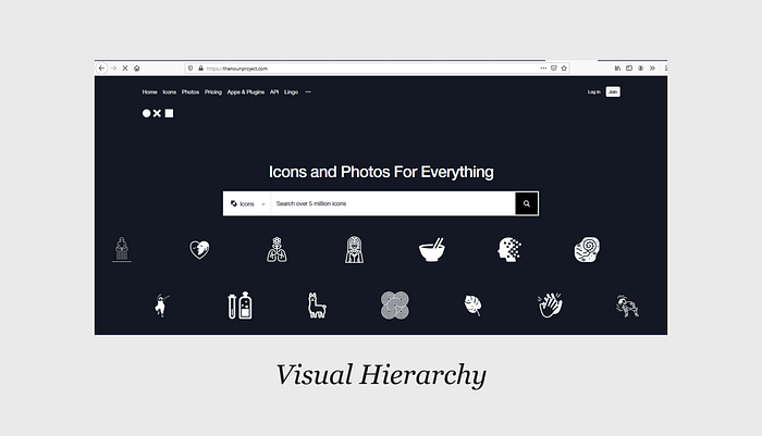
4. Visual Hierarchy:
In the realm of 2D displays such as webpages, graphics, and print materials, the concept of visual hierarchy encompasses the strategic arrangement of design elements to effectively guide the viewer’s attention and prioritize their consumption based on intended importance.
To craft a distinct visual hierarchy, various techniques can be employed:
1. Harmonious Color and Striking Contrast: Through careful selection and combination of colors, designers can create visual contrasts that attract the eye and direct attention to specific elements. The skillful interplay of hues enhances the overall visual appeal while emphasizing the significance of certain design components.
2. Thoughtful Scaling: By manipulating the size and proportion of design elements, the visual hierarchy can be reinforced. Enlarging or shrinking certain elements can convey their relative importance and influence the viewer’s perception of their significance within the composition.
3. Purposeful Grouping: Grouping elements based on their proximity or shared regions enhances visual organization. Placing related design elements together can help establish logical connections and facilitate the viewer’s understanding of the overall content. This technique streamlines the consumption process, guiding the eye smoothly from one group to another.
By employing these distinctive approaches, designers can craft captivating visual hierarchies that engage viewers, communicate effectively, and deliver a unique and memorable user experience.
Example: On TheNounProject.com, the search field immediately catches your attention with its large size and stark white color against the black background. Its prominent position urges users to begin their search. Below the search field, a series of white icons captures your gaze, offering a tantalizing preview of the potential results.
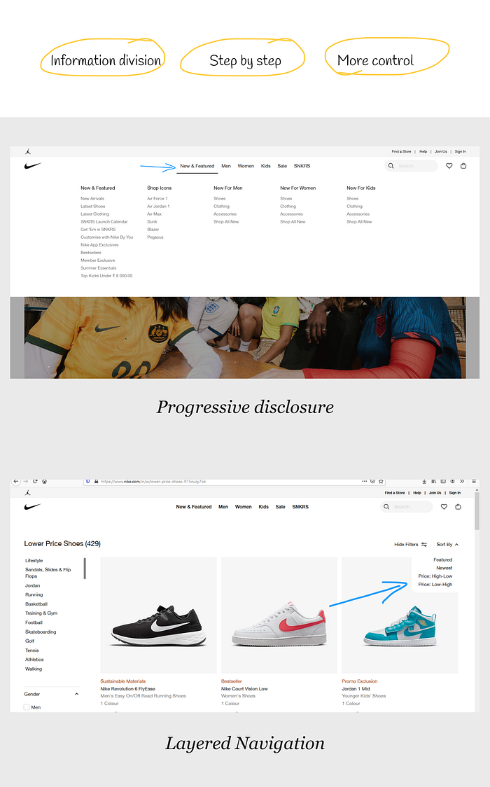
5. Progressive Disclosure and Layered Navigation:
Progressive Disclosure: Progressive disclosure reveals information gradually based on user needs, preventing information overload and simplifying the user interface.
Layered Navigation: Layered navigation organizes information into multiple layers or categories, allowing users to refine their search or exploration by applying filters or criteria.
These design techniques help manage complexity and improve the user experience by presenting information or options in a more manageable and structured way.
Example: Mega menus on websites like Nike exemplify progressive disclosure. By initially hiding options, they save space for essential elements like the search bar. This user-centric approach gradually reveals information based on user needs, streamlining navigation and optimizing screen space.
Nike.com utilizes a clear and visible categorization system, dynamic filters, visual representations, and a wide range of options to enhance the user experience through its layered navigation. The responsive design ensures a consistent browsing experience across devices.
Conclusion:
Designing intuitive mobile app navigation is key to providing a seamless and engaging user experience. By employing clear and consistent navigation patterns, utilizing minimal and contextual navigation elements, incorporating gesture-based interactions, emphasizing visual hierarchy and affordance, and implementing progressive disclosure and layered navigation, designers can create mobile apps that users can effortlessly navigate and enjoy. Prioritizing intuitive navigation enhances usability, satisfaction, and encourages users to explore and utilize the full potential of the app.

