Designing profile, account, and setting pages for better UX
As a UX/UI Designer, I often encounter challenges when designing pages such as account, settings, preferences, and profile. Perhaps you’ve experienced the same. You might have asked yourself, “Is setting a part of the account page? Or is the profile editing page a part of the settings? What content should be included on the account page?”

I’ve seen many apps using different structure. For example, if you’ve created an account on any app and later you decided to change your personal name, you may wonder where to find the editing page. Here are some common UX patterns:
1. Settings-> Account settings -> Profile setting -> Edit form -> Save
2. My account -> Profile setting -> Edit name -> Save
3. My profile -> Edit profile -> Edit name -> Save
4. My account -> Settings -> Profile settings -> Edit icon -> Save
5. Profile icon -> Profile settings -> Personal info -> Edit name -> Save
6. Settings -> Personal details -> Edit form -> Save
There are also many other patterns used by different apps.
How about changing password? Where do you search it?
1. Settings -> Account settings -> Security and privacy -> Edit password
2. Account -> Login & Security -> Edit password -> Save
3. Settings -> Profile settings -> Login & Security -> Edit password
Unfortunately, there isn’t any standard way of structuring those settings and user profile pages.
Some apps use the term “Settings,” while others prefer “Preferences,” or “Account settings”. Another pain point is how to structure navigation more effectively when a user wants to change their password or avatar image.
I decided to share best practices based on my research
Even big tech companies make mistakes
There’s a banking app called “Wise.” When I first started using it, I saw a title “Account.”, that referred to my bank account, which confused me. Then, I found a circle icon with my avatar, which led me to “My account” (Not bank account). I’d suggest them consider naming it “Profile” or “Settings” instead of “Account.”
Have you ever attempted to change your password on Facebook? It’s incredibly difficult to locate the page dedicated to password and security settings.
Here, I compared Amazon and eBay. They both have different navigation for accessing your account and settings.

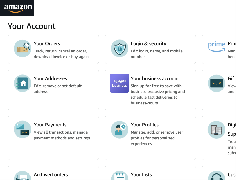
Still, there isn’t any standardized method for it. You can see that eBay’s account page is quite limited, but Amazon’s account page has everything related to a person and his/her purchases.
“My account” or “Your account” or “Account” ???
How do you write? “My profile” or “Your profile” or just “Profile”?
I’d recommend always using the words “You” and “Your,” for example: “Your account,” “Your favorites,” “Your orders,” “Your profile.” This is more safer. Additionally, consider the overall brand voice and user experience you wish to create. If your app aims for a friendly tone, “My profile” might be a better fit. On the other hand, “Your profile” may be more suitable for a professional or formal tone.
“Account” or “Profile”? what’s the difference?
Account is similar to the private space or room of the user on the platform. On the other hand, profile contains information about the user, including his/her full name, birthday, achievements, photos, and more. Many apps also use the word “Profile” to refer to “Account.” However, the best practice is to use the word “Account” or “Your account,” or simply display an avatar image (which also represents the account or profile).
But don’t confuse the “Account” page with the “Account Settings” page. The “Account Settings” page is a configuration page. It is where you can change your username, password, security information, and in some cases, your name and avatar. Many apps don’t have a special page for the account because once you’ve logged in, the entire app functions as your account, meaning you are already within your account.
There are two type of apps
- Apps that require you to create an account before use. For example, banking apps require creating an account to use the service. Once you’ve created or signed into your account, the entire app serves as your account. Therefore, it doesn’t make sense to have an “account” menu because you’re already inside it. If you need to exit the account, you must log out.
- Apps that you can use as a guest, but also have the option to create an account. These apps allow you to browse without creating an account initially, but having an account offers additional benefits. For example, the homepage of an online shop is not part of your account. Instead, you can visit the account page to view your saved wishlists, orders, or history.
Another example is YouTube, where you can watch videos as a guest. But, having an account enables you to access features such as viewing history or saved lists. In such cases, having a special menu or icon for the Account page makes sense.
There is NO one-size-fits-all UX pattern.
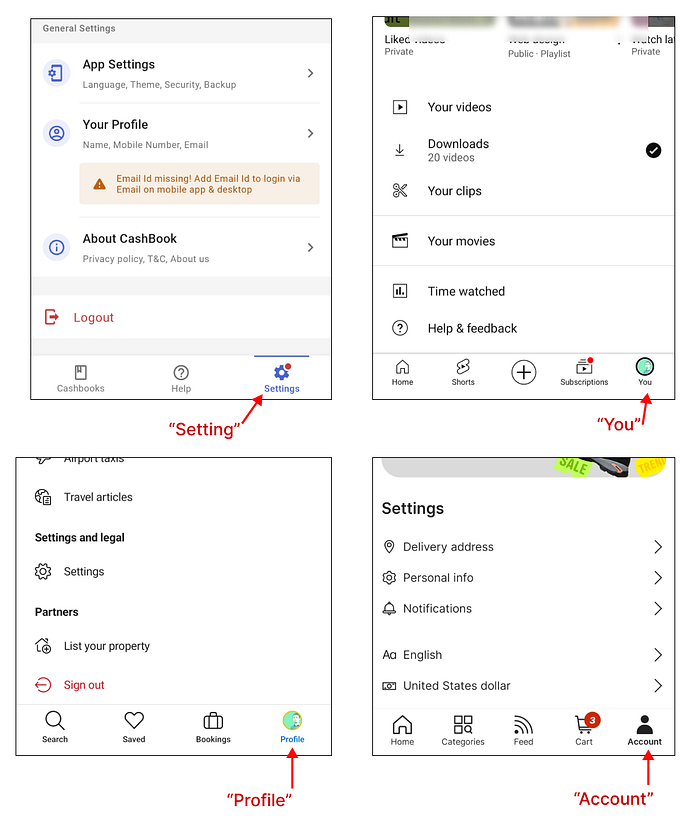
Here are examples from Cashbook (top right), Youtube (top left), Booking.com (bottom left), Aliexpress (bottom right).
What does “Account” page include?
Many e-commerce apps use name “Account” (or Avatar image ) as high level of navigation for all configuration and settings.
“Account” may include following actions and pages:
- Profile info (Name, contacts, avatar)
- Login and security (username, password, pin)
- Language and currency settings
- Notification setting (enable or disable notifications)
- Appearance (light/dark theme, accessibility, font size)
- Your orders (or purchases)
- Saved items (this could be also outside of an account page)
- Your activity (search history, recently viewed items)
- Transactions (your payments history)
- Credit card info (Your saved cards)
- Other settings
- Log out
Some apps categorize similar configurations under the “Settings” menu.
Here is how the AliExpress app structured their user flow for account and settings pages:

Using “account” as high-level navigation is not only done by ecommerce apps; many other apps use this approach. For example, when you open the Dropbox app, you may see “Account” in the bottom menu. This typically refers to “Account settings” or “Account configuration”.
I understand if you’re feeling confused — many designers not using the term “Account configuration” and simply stick with “Account”.
In e-commerce apps, the “Account” page generally encompasses all information related to the user and their products, including wishlists. However, in other cases such as file-sharing apps, “Account” typically pertains to “Account configuration”.
What is “Profile” then?
Some of apps also use “Profile” (or an avatar icon) as the high level menu to access all settings and personal details. For ex. Booking.com, Airbnb, and others follow this pattern. Why is that? Because once you’re logged in, the entire app becomes your account. You can navigate through sections like “Saved,” “Bookings,” and access features like “Messages” from the bottom navigation or top bar. So, the entire screen functions as your account. That’s why there is no need to add an “Account” page. It doesn’t make sense.

Profile is not only about user.
I've explained what "Profile" means.
Additionally, a profile may include a user’s achievements and statuses. It’s important to note that a profile is not limited to individuals; it can also represent organizations or businesses. For example, a company’s profile may contain its products and related documents.
On social media and messenger apps, the profile page is more important. Users often update their avatar pictures frequently. For example, on LinkedIn, your profile contains your work history, personal information, and achievements. Another example is Chess.com, where you can view a user’s profile, including their achievements, wins and losses, badges, and more.
The profile page can be either private or public. If a user’s profile is publicly available, it should have easy access for making changes. Editing profile info should be accessible from the same page, not through settings.
Using “Settings” as high-level action
You can use a gear icon or “Settings” menu as high level navigation, housing all other settings inside it, including profile settings.
For example, when a user clicks the “gear icon” or clicks the settings menu, it will contain the following:
- Profile setting (personal info, name, bio, contacts, avatar)
- Account setting (login or username, password, pin, deactivation)
- Language of app
- Notification setting (enable or disable notifications)
- Appearance (light/dark theme, accessibility, font size)
- … and other settings
Here is an example from the app “Any do”

Another example is the ChatGPT mobile app. You open the sidebar menu and select the avatar icon with name. This action leads to the opening of the “Settings” page, where you can manage account settings, app settings, speech settings, and more.

“Settings” generally refer to the configuration options related to a user’s overall account, such as account security, privacy settings, notification preferences.
“Account settings” (sometimes simply labeled “Account” if it is within the “Setting” page) refers to the configuration of your login and password, security settings, account deletion, subscription plan, and similar options.
“Profile settings” (or just Profile) is all about personal information and preferences specific to an individual user’s profile within the app. This may include things like profile picture, bio, contact information, and other details that are specific to the user’s personal identity and online presence. It can be private or public.
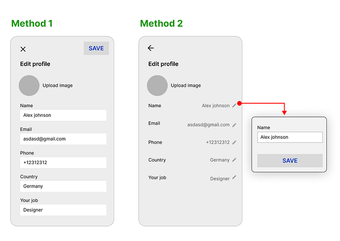
Editing and saving your account or profile information.
- Bulk edit and save. Some apps immediately open editable inputs when you visit any setting page.
- Editing one field at a time. Some apps present read-only information initially, requiring you to click a certain button to edit each field individually.
Here’s my approach to organizing the user flow structure of setting, profile, and account setting pages to enhance UX
(below picture)

The image above demonstrates that before editing your password or any information, you must confirm by typing your password. This is for security purposes.
Another approach suitable for apps where the user’s profile is private.
For ex. ecommerce, banking, or productivity apps.

Settings should include all configurations of the app and your account-related settings. However, you can include shortcut links to some of the most frequently used settings to improve usability.
Conclusion
Everything should be intuitive for the user, but it varies depending on the specific app or website. For instance, when designing an e-commerce app, consider using the term “Account” (some countries use the term “Cabinet”).
All settings can be divided into the following groups:
- Personal Details (or Profile Info) — an editable form containing full name, date of birth, address, contacts, avatar image, etc. This information can be set as either public or private.
- Login and Security (or Privacy Settings) — a list of configurations to access your account, including username (or email), password change, PIN, two-step verification, connected devices, and deactivating the account.
- App Settings (or Settings) — a list of configurations determining how the app should operate and its appearance. This includes notification settings, dark/light mode, language selection, etc.
- Integrations — a configuration page for integrating with other apps.
- Payment Settings — management of credit cards, billing information, or payout details.
Additional actions to consider adding include:
- Sign out
- Support/Contact
- About the App
- Terms and Conditions
However, these may vary depending on your specific case. I strongly recommend researching what your competitors are doing. Try to design something more better and accessible.
I’ve made a new design system that enables you to create better UI for account page, settings and profile pages
Check it out here: 👉 finalui.com

Follow me and press “clap” icon to read my next articles on UX Design
Let’s connect on linkedin Linkedin.com/in/vosidiy/

