Designing in the Shadows: How to Use Shadows to Enhance Your UI

Introduction
In user interface (UI) design, the use of shadows can make a big impact on the overall user experience (UX). Shadows can be used to create depth, dimension, and interest in a design, and can guide the user’s eye to important elements. From subtle drop shadows to bold inner shadows, the use of shadows can greatly enhance the aesthetic and usability of a design.
In this post, we’ll explore the powerful design technique of shadows and how they can be used to enhance the user interface. We’ll cover the basics of shadows in UI design, best practices for using them effectively, and common mistakes to avoid, provide tips and tricks for incorporating them into your own projects. Whether you’re a designer looking to add some visual interest to your interface or a developer looking to improve the usability of your app, this post is for you.
Importance of shadows in UI design
Shadows can play an important role in user interface (UI) design by creating a sense of depth, dimension and interest. They can be used to create a sense of hierarchy, to guide the user’s eye to important elements, and to add visual interest to a design. Shadows can be used in a variety of ways, from subtle drop shadows to bold inner shadows. They can be used to create a sense of depth between elements, to separate elements from one another and to create a sense of movement. Shadows can also be used to create a sense of weight and dimensionality, making elements appear to be floating or pressed into the surface. Shadows can also be used to create a sense of light and shadow, adding depth and realism to a design.
Types of Shadows
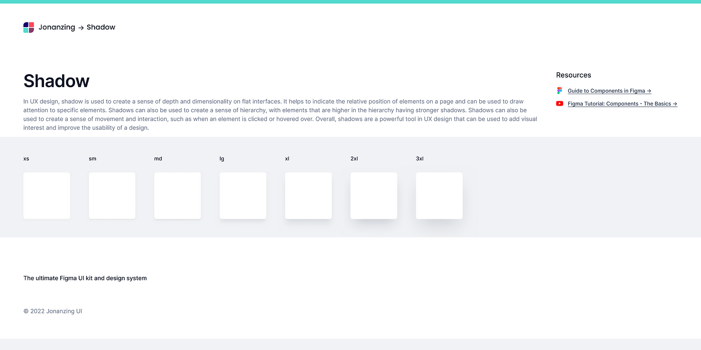
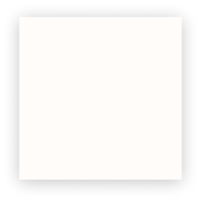
- Drop Shadows: Drop shadows are the most common type of shadow used in UI design. They create the illusion of an object floating above the surface by casting a shadow below and to the right of the object.

2. Inner Shadows: Inner shadows are used to create the illusion of an object being pressed into the surface. They are created by casting a shadow inside the object, rather than outside of it.

3. Bevel and Emboss: Bevel and emboss is a technique that combines both drop and inner shadows to create a more realistic 3D effect on an element.

4. Box Shadows: Box shadows are used to create a shadow around an element.
5. Text Shadows: Text shadows are used to create a shadow around text.

6. Layer Shadows: Layer shadows are used to create a shadow between two layers.

Best Practices for Using Shadows Effectively
- Keep them subtle: Shadows should be used sparingly, as too many shadows can make a design appear cluttered.
- Use them to create depth and hierarchy: Shadows can be used to indicate the importance of different elements and to guide the user’s eye through the design.
- Use them to create movement: Shadows can be used to create the illusion of movement and to indicate that an element is interactive.
- Pay attention to the light source: The direction of the light source should be consistent throughout the design.
- Test the design with different backgrounds: Shadows can look different on different backgrounds, so it’s important to test the design with a variety of background colors and patterns.
Common Mistakes to Avoid
- Not being consistent with the light source: Inconsistent light sources can make a design appear disjointed and confusing.
- Using too many shadows: Too many shadows can make a design appear cluttered and overwhelming.
- Ignoring accessibility: Shadows can make text difficult to read for users with low vision, so it’s important to consider accessibility when using shadows.
- Not testing the design with different backgrounds: Shadows can look different on different backgrounds, so it’s important to test the design with a variety of background colors and patterns.
Analysis of how Shadows are Used to Enhance the Overall User Experience
Shadows are a powerful tool for enhancing the overall user experience in UI design. They can be used to create a sense of depth and hierarchy, to indicate interactivity and action, and to add visual interest to a design.
- Sense of depth and hierarchy: Shadows are often used to create the illusion of depth and hierarchy between elements on a page. This can make a design feel more intuitive and natural, allowing users to easily navigate and understand the layout. By creating a sense of depth, shadows also make it clear which elements are more important and which are less important, which helps users focus on the most important information.
- Indicating interactivity and action: Shadows can be used to indicate that an element is interactive, such as a button or a link. This makes it clear to the user that the element can be clicked or tapped, making the design more intuitive and easy to use. Shadows can also be used to indicate that an action has taken place, such as a button press or a link being followed.
- Adding visual interest: Shadows can also be used to add visual interest to a design. They can be used to create a sense of depth and hierarchy, to indicate that an element is interactive, and to add visual interest to a design. Shadows can be used to create a sense of depth and hierarchy, to indicate that an element is interactive, and to add visual interest to a design.
Inspiration for Incorporating Shadows into Your Own Designs
Incorporating shadows into your own designs can be a great way to enhance the overall user experience. Here are a few inspiration sources to help you get started:
- Nature: Shadows in nature can be a great source of inspiration when it comes to incorporating shadows into your own designs. Observing the way shadows fall in natural environments can help you understand how to create a sense of depth and hierarchy in your own designs.
- Photography: Shadows in photography can also be a great source of inspiration. Photographers use shadows to create interesting compositions and to add depth to their shots. By observing the way shadows are used in photography, you can learn how to create a sense of depth and hierarchy in your own designs.
- Material Design: Material Design is a design language developed by Google that focuses on creating a sense of depth and hierarchy in designs. By studying Material Design, you can learn how to use shadows to create a sense of depth and hierarchy in your own designs.
- Other designers: Study the work of other designers that you admire and take inspiration from their use of shadows. Notice the way they use shadows to create a sense of depth and hierarchy, indicate interactivity and action, and add visual interest to a design.
By incorporating inspiration from nature, photography, Material Design, and other designers, you can learn how to use shadows to create a sense of depth, hierarchy, interactivity, and visual interest in your own designs. This can help you create more intuitive and visually appealing designs that are easy for users to navigate and understand.
Tips and Tricks for Using Shadows in UI Design
- Use shadows to create a sense of depth and hierarchy: Shadows can be used to create a sense of depth and hierarchy in a design. By applying shadows to elements in the foreground, and lessening or removing shadows from elements in the background, designers can create a sense of depth and hierarchy, making it easier for users to navigate and understand the design.
- Use shadows to indicate interactivity and action: Shadows can be used to indicate interactivity and action in a design. By applying shadows to elements that can be interacted with, such as buttons and links, designers can make it clear to users that these elements are interactive, and can be clicked or tapped.
- Use shadows to add visual interest: Shadows can be used to add visual interest to a design. By using different types of shadows, such as soft and hard shadows, designers can create a sense of depth and dimensionality, making a design feel more interesting and dynamic.
- Be consistent with your use of shadows: Consistency is key when it comes to using shadows in UI design. By being consistent with the way shadows are used throughout a design, designers can create a sense of cohesiveness and unity, making it easier for users to navigate and understand the design.
- Use shadows to create contrast: Shadows can be used to create contrast in a design. By applying shadows to elements in the foreground, and removing shadows from elements in the background, designers can create contrast and make it easier for users to focus on important information and elements in the design.
Tips for Implementing Shadows in Web and Mobile Design
- Use CSS for web design: When implementing shadows in web design, it’s best to use CSS. This allows for greater control and flexibility when applying shadows, and makes it easy to make changes and adjustments to the shadows as needed.
- Use design systems: When designing for web and mobile, using a design system can help ensure consistency in the use of shadows throughout the design. This can make it easier to implement shadows, and ensure that they are used in a consistent and effective way.
- Use platform-specific guidelines: When designing for web and mobile, it’s important to follow platform-specific guidelines. For example, iOS and Android have different guidelines for the use of shadows, so it’s important to follow these guidelines to ensure that the design will look and function as expected on each platform.
- Test on different devices: When implementing shadows in web and mobile design, it’s important to test the design on different devices to ensure that the shadows look and function as expected. This can help identify any issues that may arise when the design is viewed on different devices.
- Keep it simple: When implementing shadows in web and mobile design, it’s important to keep it simple. This means using simple, subtle shadows that don’t overpower the design, and that help to enhance the overall user experience.
Conclusion
In conclusion, shadows play a crucial role in UX design, they can enhance the overall user experience by providing visual cues that help guide the user and make the interface more intuitive. They can also be used to add depth and dimension to the design, making it more visually interesting and engaging. By understanding the principles of using shadows in design, designers can create more effective and user-friendly interfaces that are optimized for different devices and platforms. It’s important to use shadows in a subtle and consistent way and to test the design on different devices to ensure that it looks and functions as expected.

