Designing A Website Using Framer Under 90 Minutes

If you’ve been reading my articles for a while, you’d know that I’m practicing web design a lot more now.
But the thing is, I really would love to see my designs live on the web than just sit around as static images.
And a good middle ground for me with all this has been no-code tools, specifically in this case, Framer.
Webflow is sort of bleeding out its lower-end users to Framer, and it absolutely deserved it.
You can’t look me straight in the eye, and tell me that Webflow’s interface and learning curve motivates you to keep coming back daily and create something.
Well, Framer does that for me and thousands of other designers.
So last week to test this out, I designed a working website in less than 90 mins (yes, no cap) and published it on Framer.
Okay, I did use Figma which is sort of cheating but I needed to finish it quickly and work on client projects.
Conceptualization
I didn’t have much time or energy on my hand so I just wanted to design something quick.
I wanted to play around more with Framer’s components — so had the idea of designing a circle navigation thingie that will scroll you down to different sections on the site.
For the website, I wanted to create 4 sections — but what would I put in there ?
I did think for like 40 seconds on it and went ahead to copy-paste data about the 4 major cities of India.
The basic idea here is — a website to learn more about the 4 major cities of India while scrolling via a circular compass-like nav bar.
Preparing Assets
Since this was a site about India, I also wanted to use typography created by an Indian.
And who better than Rajesh Rajput — the creator of famous typefaces like Thunder, Humane, Moniqa etc.

I chose to go ahead with Humane for the display & header texts, and Gilroy for the body & smaller texts.

The color combinations were very random, taken from my own older illustrations that I hate to look at now.
For the content of the site, I went for a layout like this —
- City name, is very huge and takes the main attention
- Compass like nav bar on the left
- List of places to visit
- Small description of the city’s history
Wireframing & Designing
Now onto the real deal and my favorite part of designing any interface.

This is what I came up with, in like 30 minutes.
The Delhi screen looks odd for some reason, maybe because it had lesser letters than the other 3 cities.
As for the list of places & descriptions are concerned, I slapped them around wherever they looked balanced.
But the general rule of thumb being — one on the top right and one on top of the header.
This is a bit rare but I really liked the first draft itself (I was running out of time) and went ahead with it.

The directions are in NEWS directions — which is N for Delhi, E for Kolkata, W for Mumbai and S for Chennai.
I used red for Delhi to denote the red fort & the overall aesthetics, green for Kolkata to denote deforestation, blue for Mumbai because of sealink and BnW for Chennai to show their old linguistic heritage.
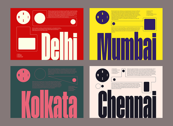
The design still looked a bit empty, hence I added a couple of shapes for filling in the white space. They look a bit weird but meh.
Did it make sense to you ? yeah, not to me either. But we proceed anyways.
Importing In Framer

Framer has their plugin to quickly import designs from Figma, and I used it.
I know a lot of people are fuming because I didn’t design it from scratch on Framer but hey, just a fun exploration & I was low on time.
I fixed the alignment on Framer after importing, for some reason the layout was way off compared to what I made initially.
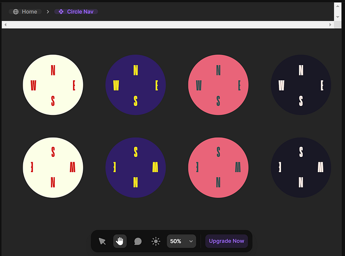
After this, I turned the circular navigation into a component and added a hover state and animations emulating a compass’s movements.
The site was done, and yes I also didn’t make a tablet or phone version, this is very half baked but time to launch!
Final Website

With all that done, now I hit publish and look at my creation in awe.
Okay, I’m kidding it isn’t the best work I have done, but it’s a starting point. And that matters more.
I already have various ideas popping in my head right now, but to act on them I need to get a couple of weeks of break from freelancing first :3
Check the final site here (I’ll take the site down soon though)
Check the design on Dribbble as well if you want, and oh it got me like 70 likes and 30 new followers on Twitter as well!
Hi there 👋🏻 I’m Sharanya — a freelance UI/UX designer writing about design here.
Check my free digital products over on my Gumroad.
You can find me on Twitter, Dribbble & LinkedIn or reach out directly via email for freelance projects!

