Case study: Designing a salon booking application
Case study of how I designed an application to view and book appointments in nearby salons.

It’s no secret that we all have been pissed off by the tiring long queues and delays at the salons. Well, at least I have. 😀
This idea of creating an application where a user can view and book appointments at their nearby locations was pitched to me by one of my friends while I was at college. We did basic research about the possibility of this project. We asked around several salons in Kerala (my locality) but unfortunately, we found out that this could not be implemented here due to some other problems. So we had to ditch this project. 🙁
Recently, while I was surfing through my old files, I found this project material, which made me think why not create this as a mock project where I could hone my skills. I started working on this project from scratch and created screens for both mobile and web.
Research
As an initial process, the problems faced by customers were taken into consideration. A general inquiry about problems faced by people at salons was conducted among my friends, who come from different parts of Kerala (So we could get a general idea from the different areas).
The Problem
After an initial idea was collected, the problem was identified. According to a study conducted by professors from Coimbatore, India, Health and Beauty salon industry is growing exponentially. But with the rapid growth in this industry, customers face many problems, such as:
- Customers cannot find or may not be aware of nearby salons.
- The services each salon provides may be different. There is no way to know them.
- The pricing of each service may vary according to the salon. The customer cannot find or know them before reaching the salon.
- The customer has to wait in line for their turn, which may lead to wastage of time.
The Solution
Addressing all the problems, solutions were found for them.
- Based on the location selected, the customer can find the list of salons near them. This solves the problem where the user is unaware of their nearby salons.
- Each salon lists the service they provide, along with details of the service and time by each of them. This allows users to choose their preferred service. Since the time required by each service is provided, they can find an approximate time taken by the services.
- The pricing is also displayed along with each service, which solves the problem. This avoids any unnecessary surprises at the last minute.
- Booking a slot for the desired salon will solve the problem where customers have to wait in line. Overcrowding can be avoided, and also the user can save a lot of time.
About the User
The targeted age group of customers for Salone is between 20 and 40. They can be defined as people who hate to waste time, loves technology, the internet, and have the opportunity to explore and discover new things.
Knowing the user can help in fine-tuning the product, while also making the product accessible to all.
User Goal
From the data received, the user goal is identified. The user’s goal is to find and schedule appointments in salons near them without any difficulty. They want a smooth process from finding to booking the appointment with ease.
Value of this project for User
When creating a product, we should always consider the value of that product to whom we are creating. In this case, the value for the user is:
- The user can find nearby salons with ease.
- Sometimes, we want to try some variations from our regulars. This will reduce the time spent searching for something new.
- Eliminating the waiting period at a salon can improve the experience of the user.
- Users can always find the best deals available near them.
Value of this project for Salone
While creating a product for the public which can drastically improve their life, the business of the product should also be considered. Salone can generate a small profit as a commission from each booking. Additionally, while listing salons, they can promote themselves for a small price. This will generate an income for Salone and the promoted salons can have a hike in customers, which will, in turn, improve their business.
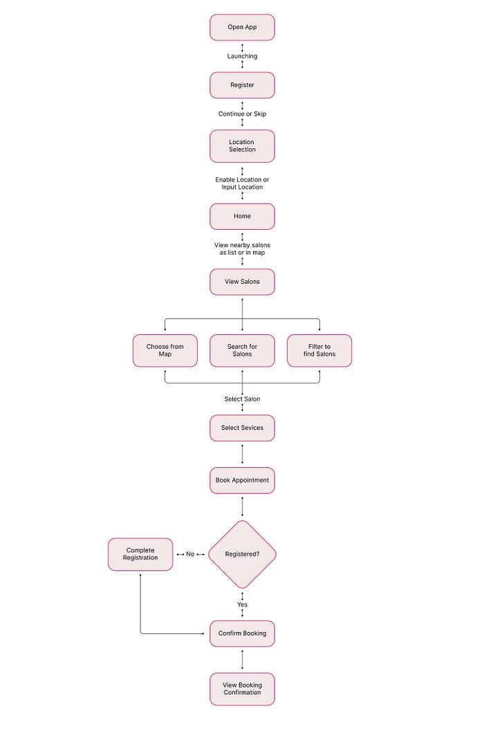
User Flow
The next step was to create a User Flow. Creating user flow helps us to determine the correct flow and need of the user. In this case, I focused on creating the user flow mainly on selecting a service and booking an appointment at a salon, since that is the major function of Salone.
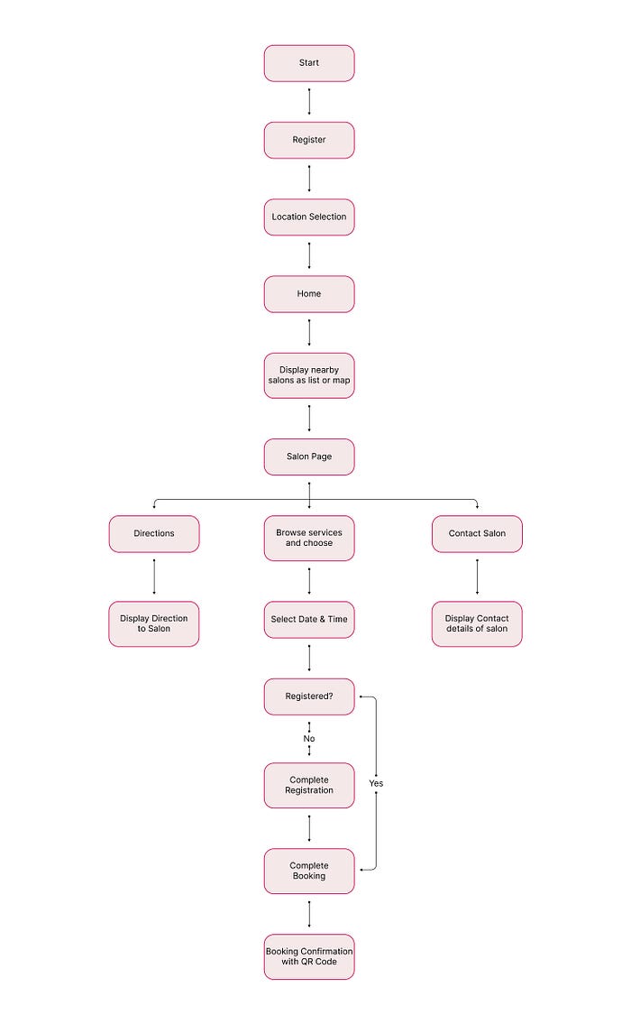
Information Architecture
Apart from creating user flow, information architecture was also created. A Good information architecture ensures that the user gets a great experience from the product.
Grid System
Using a grid system to create a design will ensure that the design is consistent and clean. In this case, as a responsive layout grid, a 12 column layout grid is used for web screens and a 4 column layout grid is used for mobile screens. On top of that, a 4pt grid system is also used. Initially, I thought about using an 8pt grid, but using a 4pt grid ensures much flexibility.

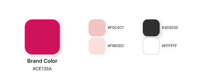
Colors
Yes, colors matter. Choosing the correct color can invoke emotions and allow users to connect. For Salone, I decided to use a variation of red as the primary color, which can invoke emotions such as youthfulness, boldness, and energy.
The primary color is used as the brand color and variations of that are used along with monochrome colors as secondary colors.
Typography
Personally, I prefer not to use more than 2 typefaces. In this case, I used only one typeface for the entire project with different fonts. We really can bring hierarchy to our design just with a single typeface using different fonts of size.
For this entire project, I used the typeface named Inter. Bold, SemiBold, Regular, and Light fonts helped to create a hierarchy in the design.

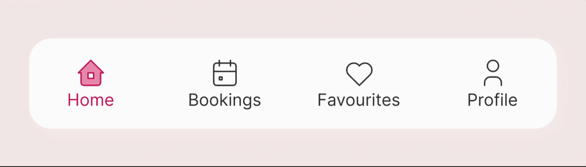
Navigation Bar
Navigation bars are really helpful for smooth navigation. Since navbars are at the bottom of the screen, they can be reached easily even with one hand. That can contribute to a smooth experience for users while using the application.
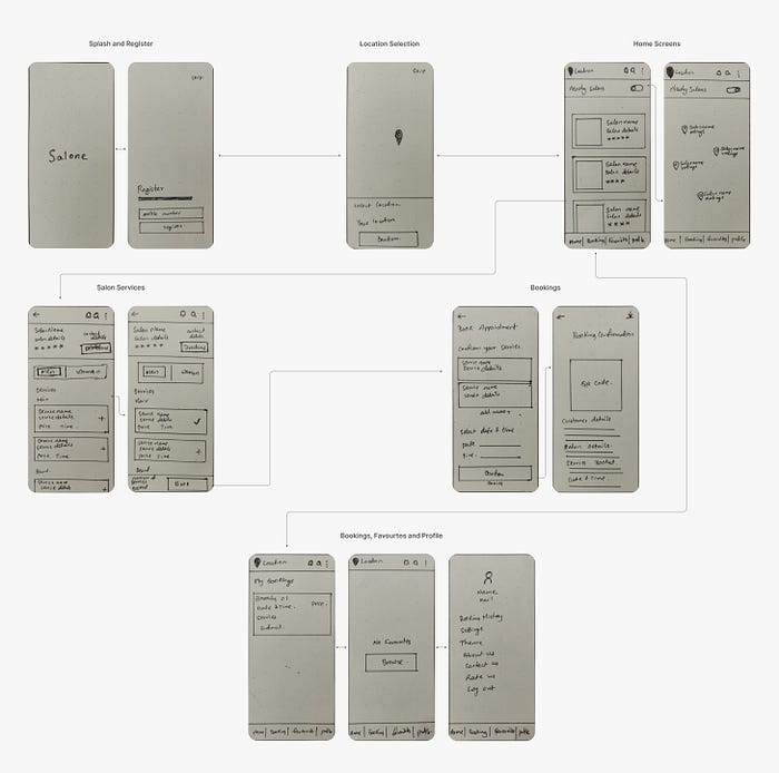
Wireframes
Creating wireframes can help us to decide the layout before starting visual design. There are various tools to create wireframes, but I still prefer to sketch out ideas using pen and paper. It gives us flexibility while ideating. After the initial layout is set, I converted those sketches to high-fidelity wireframes. Sorry for the messy handwriting.🙈
Visual Design
Since the layout and flow are sorted, it's time to create the visual design. I followed the grid system for the entire design and followed the wireframe.
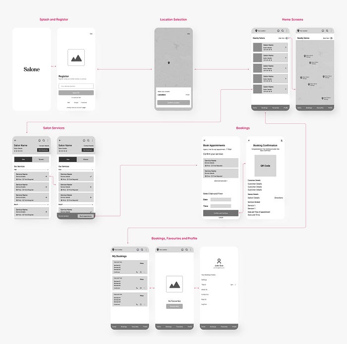
Splash and Register Screens
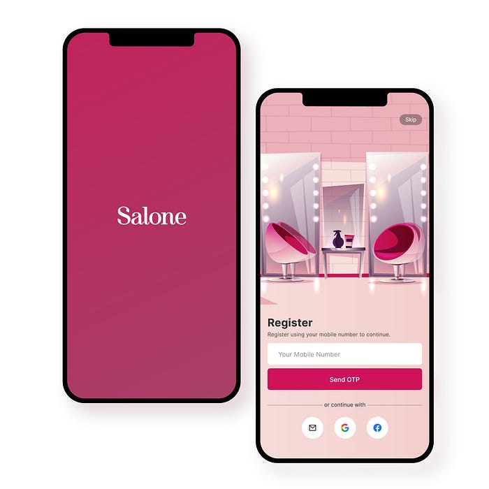
Initially, I created the splash screen and the register screens. Splash screens consist of Salone branding on a gradient of primary color variations.
Registration is done using OTP verification from a mobile number. Since the mobile number is important in the process, it is the only field input at registration. User can complete their profile from the profile section. The illustration used on the registration page is from Freepik and designed by vectorpouch.
Users can also continue registration using social sign-ins. Social sign-ins are one of the most used registration processes, so it is placed at the bottom where users can reach them easily.
Location Selection Screen
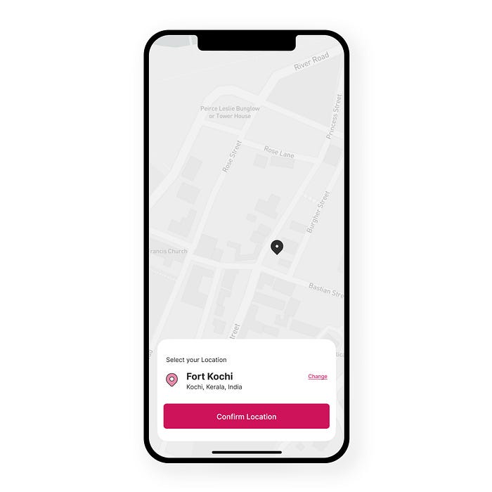
After the registration, the user is prompted to select their location, since their location is used to find the nearest salons available to them. Users can choose the location from the map provided to pinpoint their location, or they could manually input their location.
Home Screens
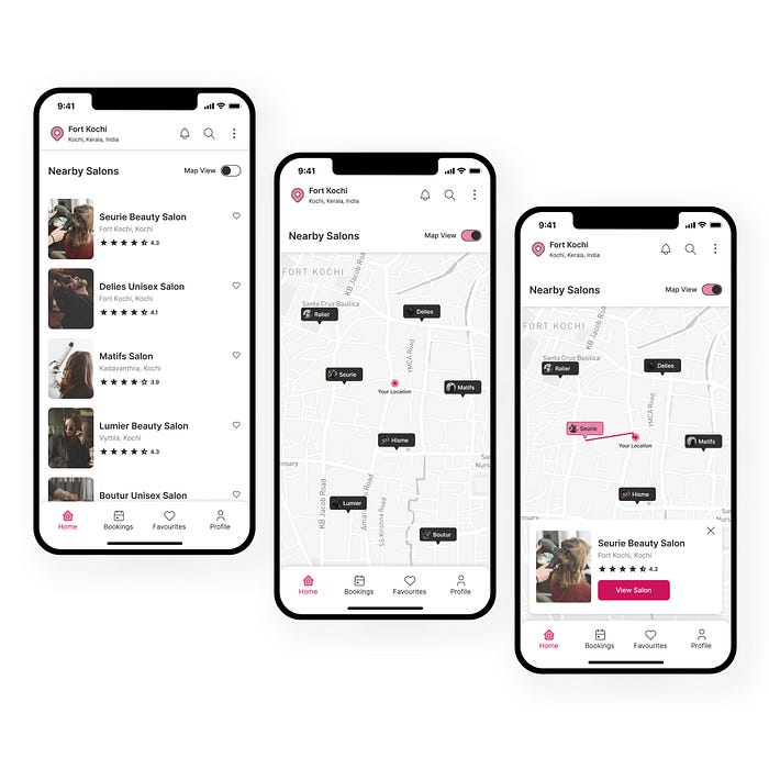
Home Screens lists all the available salons near the location selected by the user. They can view the salons as a list or on a map. The map view will display all the available salons near them. Users can choose any salon and can view the direction from them. The location of the user is always displayed at the top so that they can just tap on it to change the location at any time.
Services Listing Screens
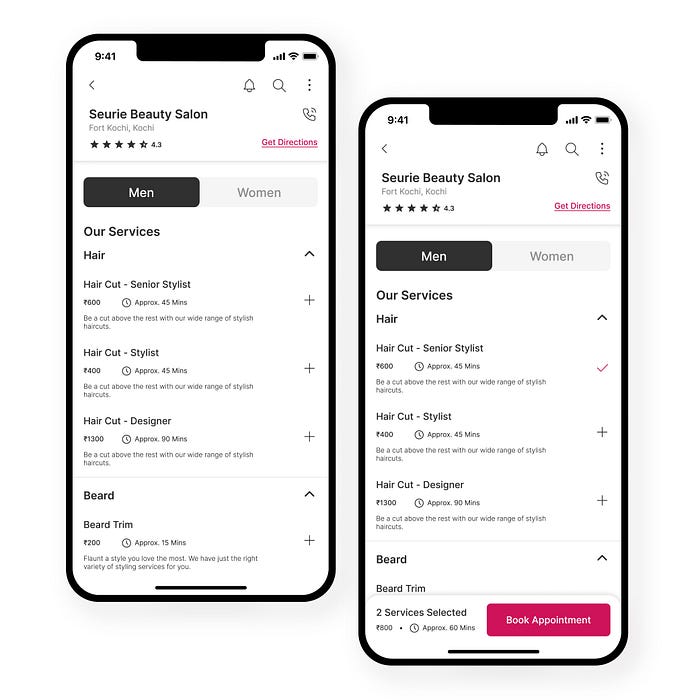
When choosing a salon, users can find all the available services they provide. Using the toggle, they can easily switch between services for men and women. The rate, description of service, and approximate time required for each are also mentioned, which can be helpful for users to find the appropriate service for them.
Including the approximate time of service is not only useful for users but to service providers too. When a user books an appointment at a time slot, the time taken by an individual is unknown. Since the time taken by an individual is unknown, we don’t know when to add or open the next time slot.
By providing the approximate time taken by each selected service, the salon could know how much time should be kept aside for that specific user.
Checkout and Confirmation
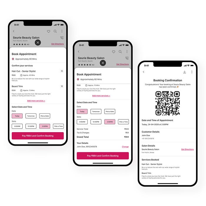
After the services are selected by the user, they can tap on the book appointment button at the bottom, which will open up the detailed page where the details of services, payment details, and the date and time selection. Users can either confirm the selected services or add/remove services. After verifying their services and payment details, they can choose their preferred date and time, and confirm their booking.
After the booking is confirmed, the user receives a receipt with a unique QR code, which can be scanned at the salon. They get all the details of their booking, along with directions to the salon from their location.
Bookings, Favourites, and Profile Screens

The three other menus in the navigation bar are bookings, favorites, and profile. In bookings, users can find their current bookings. A simple card design, where users can find the summary of their appointment. They can simply tap on it to get the booking details.
Favorites display all the salons favorited by the user. They can favorite multiple salons, which will be displayed here, so they can access them easily from here.
Profile menu contains all the other options including settings. Users can update their information under the profile menu. They can also switch themes according to their preference.
Web Screens
In addition to the mobile app, Salone also has web screens. Users can either use the web or mobile interfaces, as long as both of them are logged in as the same user, which will be synched.
Web Home Screen

The home page of Salone is a simple screen with an illustration and a salon search component. Users can choose their location and find the list of available salons or can search for specific salons to find them. The available salons are displayed, from which users can select them.
Services Page
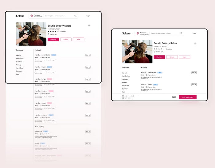
When the user selects a salon, the services are listed. Apart from the toggle switch used in the mobile app, colored badges titled men and women are used to distinguish the services. Users can select services and proceed to book to continue the appointment booking.
Checkout and Confirmation Pages
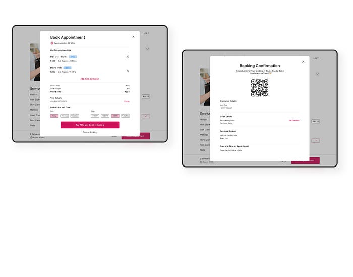
After the service selection, the user can proceed to checkout. A modal popup displays all the details such as services selected, payment details, and selection of date and time.
After checkout is complete, the booking confirmation is displayed, with a QR code and other details. Users can download the confirmation as a PDF. The same will be available under the bookings menu in the mobile app if both web and mobile are logged in as the same user.
Dark Mode
A survey conducted by Android Authority states that almost 90% of users use dark mode on their devices. Dark mode can be very useful since it is power efficient as well as good for the eyes. An option to switch to dark mode is a necessary feature today to improve the UX. Hence, Salone supports dark mode. Users can switch themes as their preference from the profile.

Conclusion
Working on this project was fun, even if I know it was a dummy project. The reason I approached this project as a real one is that I felt this is a solution for a majority of people. I think this was a problem worth solving so that people could save their time as well as resources.

