
Edit 2023: This is one of my very early works, probably where it all started. I look back at it and see a lot of room for improvement, it is also a reminder of how far I have come as a designer and hence why I don’t think of archiving it and shying away from my old works.
I was part of design bootcamp and this landing page is an assignment project as part of the bootcamp. The task was to follow a design process and apply the visual design principles to create a functional landing page for a fictional event in the given niche. The niche I picked was Music. The primary goal of this landing page would be to bring in more attendees to the event.
Here’s a video of the landing page I came up with:
Project Overview:
The current landing page is designed for a hypothetical event with Music as the niche. You would be lying if you say you don’t love music. Most of us love music events, considering I also didn’t want it to be just another music event, thus I came up with the idea of having a fusion. This music event is organized by “Connect”. Connect is a dating application (hypothetical) that brings people together over their similar interests in music. The offline event is a collaboration of music and dating hence the name “Chords by connect”.
Let’s get started
Before getting started I decided to break down the whole process into small non-linear process. Here is the design process that I followed:
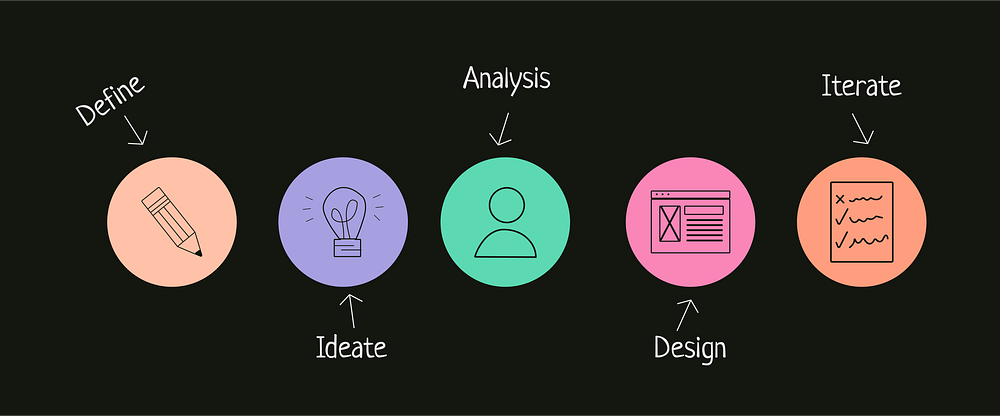

The goal was already defined to design a landing page, the next step was to ideate, mood boarding, wireframing and visual aspects. Some of the basic questions were — Who would this event be organized for? Why would a company organize a music event? How would the company benefit from such an event?
- I listen to music quite a lot, and finding new music is something I enjoy, and hence thinking around this I came with the name Connect as the fictional organizer of the event.
- This event could be organized by most of the music companies in collaboration with dating apps, here it’s for a similar organization called connect.
- How would the company benefit from it? While I primarily approached this as a fun assignment, not all aspects of design are solely focused on problem-solving. However, it is worth noting that companies can still derive benefits from such events, as they help generate awareness and expand their existing user base.
Research
- First thing first, being aware on modes of event. Hybrid events are those that are organized in both online and offline mode. Offline mode allows real-world interaction between attendees and a rustic event experience with easier maintenance of covid-safety measures. Online mode allows reaching a much larger audience that is not bound by demographics.
- I started with primary research of looking up internet for different offline music event, although I found a lot of music event but there weren’t many dating events by a dating app.
- This was a visual-based project, and doing some basic research was helpful to proceed further. Some insight from the research was that an average user’s attention span on a website is less than a minute. Considering this information my idea was to design a landing page that is not text-heavy and easily conveys details of the event.
- Moving ahead I asked people around me what were their thoughts on an event like this, along with follow up questions on ticket pricing, artist line-up, venue and etc.
Information Architecture
I decided to follow the AIDA model popularized by E. St. Elmo Lewis, the information on the landing page was classified considering the same.
[AIDA stands for Attention, Interest, Desire, and Action]
- Attention → Hero Section.
- Interest → About us.
- Desire → Singers/Artists performing and Sneak-peak (Video)
- Action → Tickets.
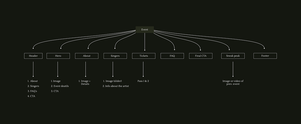
Kicking off the design

- Once the primary things were in place I next worked on wireframe. Honestly a lot of it was just watching lot of videos and refering articles because considering it to be my first project a lot of learning happened on the go.
- I started with the paper and pen wireframe, after couple of scribblings later I quickly made more iterations of it on Figma. The final iteration was quite different from the initial one, but I liked how it was with some tweaks I moved ahead to the visuals.
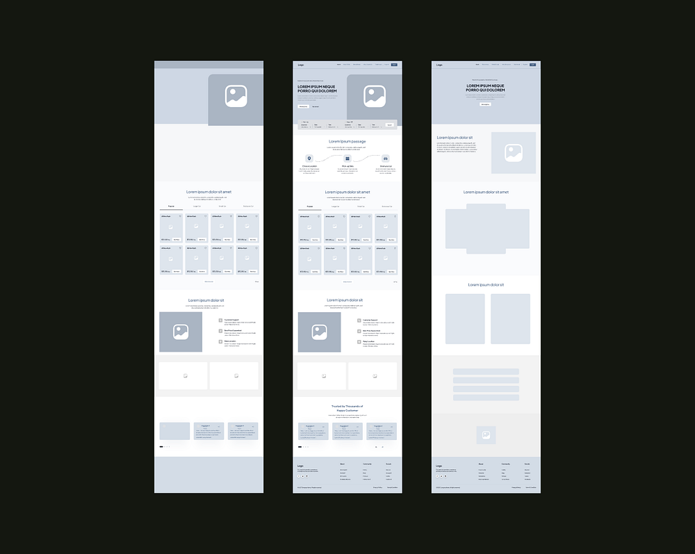
Feedback, iterations and visual design
- Once I received feedback on my initial ideation the next step was on visuals. I started with light theme since I was considering it to be an invite style design but with the iterations the theme got changed.
- Well, visuals aren’t my strong point hence I considered that since it’s an offline music event a dark theme that resonates would be a good exploration space.
- Other than that, the target audience for the event contains people from the group of 19–30. These would be the people who would best recognize the lineup of artists and enjoy the music festival experience.
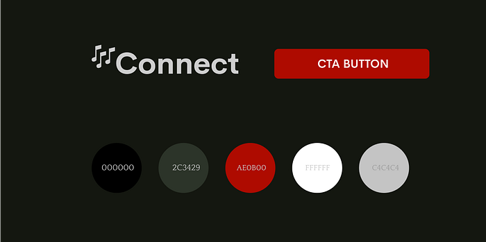
- The name connect was descriptive. Red and black are the primary colors used which is a very visually striking combination. The logo was added with a clef that indicated music.
Iterations
- The initial design for the landing page was selected as minimal and visuals in the light theme, but the theme did not give the vibes of the event. Using visuals is something I am working on and thus experimenting with some more colors made me switch to a dark theme which set the tone of the landing page right.
- I also worked on the copy along with getting done with the final version.
Following are a couple of iterations I worked on before getting to the final solution.
Hero section
- The initial design was light-themed and did not really give the aesthetic vibes of a music event.
- It was also text-heavy and did not provide the most required information. So, I decided to shift to a dark theme along with keeping the information clear and specific.
- I also wanted to add the event and venue details in the hero rather than the about section. One reason being the user would know about it on the preview and the other being that the event is been organised by a dating app one might already know about it via app.

About section
- The about section was meant to create a hook for users to scroll further along with providing some glimpse of the past event, I wanted the section to have a balance of images as well as text since the hero just had the event detail information.
- Started with the most basic carousel view, the images were grabing a lot of attention and I didn’t wanted it to just be text heavy hence aligning it neutral helped in conveying about the event right way.

Singer’s section / Line up
- This is an important section for the event, since it highlights the artists playing at the event.
- The elements of the singer’s section did take a tad bit of time, I wanted some sections from the landing page to stand out and considering it to be a music event the focus should certainly be on the singer’s section.
- The most important learning for the iteration of this section was to keep the scalability of elements.
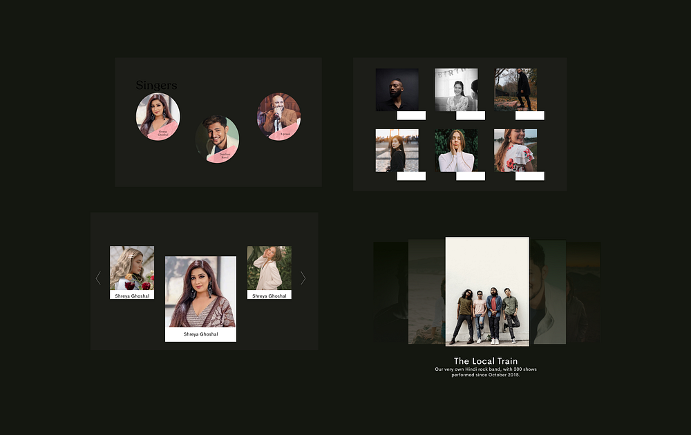
Tickets and final sneak peak
- A simple pricing section that highlights the different options available in pricing and their features for the event.
- And a sneak peak video of what to expect from the event.

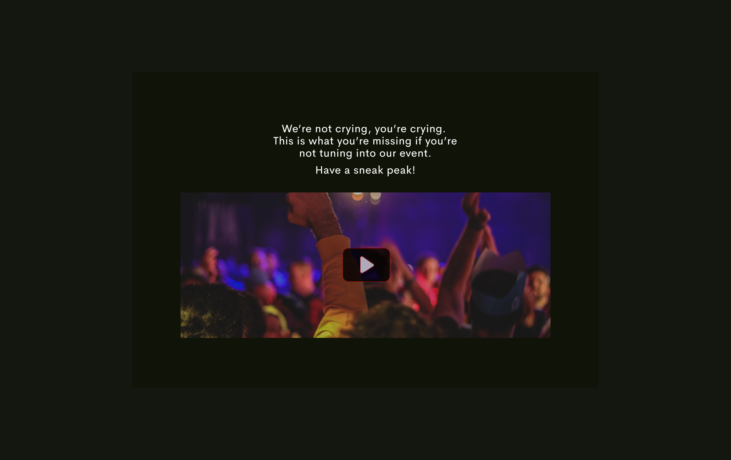
Breakdown of the design
Hero Section:
The content on the hero section had to be precise as it is the first section on the landing page that would grab a user’s most attention.
- The image was added to give the feel of the music event without even explicitly having to dig in more details or go through the entire page.
- CTAs are added upfront for easy registrations.
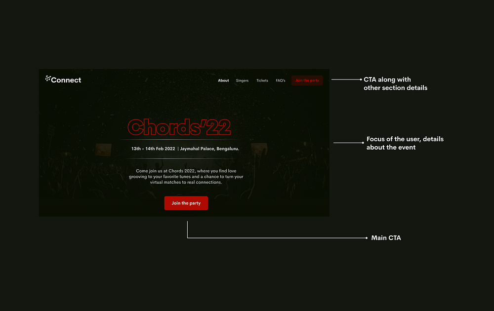
About Section:
This section sets the context of the event and hints to the user on what they can expect from the event.
- It consists of details about the event along with photographs from previous events.

FAQS
- Each event has a set of FAQs (frequently asked questions).
- In this section, the most asked general questions have been added.
- Along with details of helpline numbers to reach out in case of any further queries.

Sneak Peak
A video showing the glimpse of the previous event is embedded to help users know what to expect from the current event (a.k.a to check what they might be missing in case they don’t join the event)

Outcome
- A couple of tweaks later, here is how the final landing page looks like both for a desktop and mobile version.
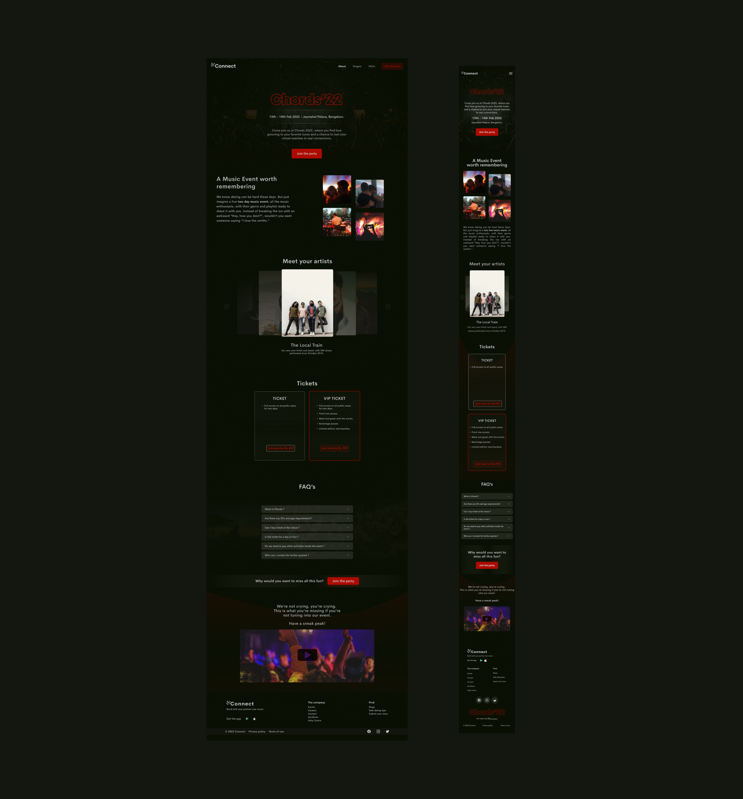
Learnings
It has been a good experience considering this was my first landing page design, here are some of my learnings -
- Have a clear idea of what exactly you want your landing page to help you with. How to seek inspiration and what section to pick from references that go well with your theme.
- Mention details accurately without making it text heavy. Taking feedback will only make the design better.
- Learning to use the right type of font (because the font does decide the look and feel of your site and can bring a lot of differences to the entire design). Defining style and elements along with an understanding of using auto layout.
- Your first draft is never your final draft and double-checks on all your border-radius.
That’s a wrap!
This case study was part of a design bootcamp, special thanks to Suraj Tarani whose previous work was a point of reference for my work.
Thanks for reading this article so far. As always, feedback is appreciated. If you’d like to connect, please reach out! in/whoshivaniii

