Designing a Feature For Our pets — a Case Study
Maybe one day, we’ll be able to book seats for our pets through a car-sharing app.

Sometimes, we travel by fun. Some other times, we do it by need. And among all those, our pets might need to travel too.
It happened several times that I need to travel with my dog, but I find no means of transport, for specific dates and conditions, which accept an animal in the ride.
I didn’t find any Carpool app which provides this service.
If we say our loved pets are our family, why don’t we include them in the services and products we use in our daily lives too?
As a regular user of Blablacar — a carpooling platform that connects people so that they can share the cost, time, and route of their trips by car — one day, it happened that I truly missed something in their product.
I decided to ideate a possible (dream) feature to their service to book a seat for our pets.
For those that are not familiar with BlaBlaCar, here there is a short 2 minutes video I fell in love with, made of illustrations that pictures perfectly their identity, purpose, and origins.
The starting point
I was not able to interview any pet. Still, I could talk to many people who have been in the situation of need to travel with their animals and actually couldn’t, so they felt forced to change plans; or needed safe and comfortable transportation for their pets to go alone.
The main insights I got from the users were that:
- They would trust the service if it provides reviews and data transparency: People must feel comfortable trusting the driver and the Pet-sitter, so they want to see both users’’ reviews.
- 100% of them would pay for the service.
- They share a collective insight: the cancellations last minute shouldn’t be allowed by the platform when a pet is traveling. Some proposed to charge a significant fee in those cases since a last-minute cancellation implies many complications when an animal is involved.
Talking to the users was determinant to find out more scenarios where people need transport for animals:
- Sometimes, when traveling, people need to combine different kinds of transports (train, bus, train) to reach their destination, and one of the means doesn’t allow animals.
- When a person wants to adopt an animal, sometimes they aren’t in the same city or country, and he can’t travel all the way to pick it up.
- Someone needs to receive an adopted animal but doesn’t want him to travel in the traditional transport animal companies.
- Some couples decide to share the custody of their pet when they separate, and they don’t live in the same city.
- Someone wants his pet to be in a city for specific dates (for any personal or medical reason), and he can’t bring it himself.
Agents, features, and user flows
By starting to define the different agents which play a role in this new feature and I came up with four of them:
- The driver
- The regular traveler
- The traveler “pet-sitter.”
- The animal
I organized the ideas I have in mind, which roles they affect and who participates in each of them, to figure out and order mentally how many features I was talking about:
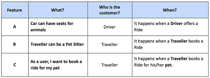
Features Prioritization
I considered C being the main functionality, which I observed that depends on the features A and B.
That’s why I needed to decide if either:
- I would assume features A and B exist: the driver has already set up a car to accept animals (the driver already offers a ride that takes animals onboard).
- I would implement the 3 of them.
Since I could only work on one feature for this project, I decided to focus on feature C, assuming A exists, and I moved B in my project planning for a future release.
And the winner was FEATURE C!
“As a user, I want to book a ride for my pet.”
The connection between the Driver and Pet Owner
From the ideation sketches, I moved into breaking up the feature into all steps the user will go through to generate my user flow.
I observed the two agents involved in my feature: the driver, the pet owner, and the animal.
- Animal: its owner will determine its user flow
- Pet owner: will book a seat for his pet (feature C)
- Driver: will set his car as a pet sitting car (feature A, which I assume exists)
I decided it would be handy to create both user-flows for both the driver and the pet owner to analyze how they match and spot if they conflict at any point.
User flow for the DRIVER — “My car has seats for animals.”

User flow for the TRAVELER — “I want to book a ride for my pet.”

After covering both flows for pet owner and driver, only the animal was missing in the picture, so I drew a storyboard of its journey:

First wireframes and prototype
Let’s remember the feature I was working on:
“I want to book a ride for my pet”
I based myself on the user flow to create the first wireframes and a Low fidelity prototype with a paper, pen, brush markers, scissors, and post-its.
I put all together in this interactive prototype in marvel.

Testing a product is the most significant learning
After running a few tests on the low-fi prototype, these were the main pain-points I came up with:
Main pain point: The checkbox (“Pet Sitting Car”) behaviors were confusing.
Behavior 1.1 — The checkbox triggered a new screen, which is not coherent with the standard response of a checkbox element.
Solution 1.1 — The app will check the checkbox automatically when the user selects an animal as the passenger of the ride — and we keep it in the same position, as is relevant information for the user.
Behavior 1.2 — Only after checking the checkbox was the user able to select the number of animals traveling. After the selection, the “ number of animals” replaces the “ number of travelers” in the main search screen.
Solution 1.2 — as follows:
- The link for choosing the number of travelers should not only give the option to select the number of humans, but it should provide the opportunity to add the two kinds of passengers: people or animals.
- If the passengers are animals, the app should trigger a popup telling you that the list of results of your search will include only Pet Sitting Cars.
- There should also be an About Page about Pet Sitting Cars, containing all explanations about it.
To summarize, the testers love the idea, functionality, and outcome of the new feature. But the prototype has low points. Some of the interactions are not user-friendly, and it creates confusion for the user.
In the next iteration, I re-designed the flow for a better user experience.
Iteration on High fidelity prototype
I created an Invision Hi-Fi prototype working within Sketch and the Craft plugin from InVision.
I used “fontface.ninja” (in love with this plugin) for the font, and I discovered the fantastic GT Eesti. I searched for it and learned about it, and eventually emailed them to get a free trial version for my project.
Read here all about the font! ❤
You can also check the interactive prototype directly in InVision here!
Iteration and comparison between Lo-fi and Hi-fi
As follows, I want to share the difference between the flows in both prototypes; you can see the effect of the testing and iterations from one to another.
When the user wanted to book a seat for both travelers and animals, these are the steps the user had to go through in both prototypes, first is shown the lo-fi prototype and afterward the hi-fi prototype:


As we can see, the user had to go through more steps in the first flow when he wanted to book a seat for both a human and an animal.
It is good news that the second flow looked rather more understandable, user-friendly, and straight forward. But we are not the user, so it was time to test all this with real users and see their behaviors and opinions.
Last iteration Iteration over the Hi-fi prototype
It’s interesting to see how, from working in a new feature like Blablapet, I came up with some improvements in the general user flow of the app, which I’m thrilled to share here. A lot of learning and insights resulted from testing with users.
I selected the four main aspects and iterated over my hi-fi prototype, applying the user’s feedback and learning.
1. Users don’t know how many passengers are in the car during the booking of the ride
Some of them were recurrent users of the app, and they didn’t like the fact that it’s’s just after they finish their booking process when they could see the complete ride information and, therefore, how full the car is.
The idea of improvement:
- Now that we can add animals to the ride, it would be good to know how many humans and animals are in the car.
2. The icons green and orange in the list of results of rides:
- They seem not to be understandable; no one knew what they mean.
- 100% of the users understood Grenn as available and orange as “car almost full, we recommend you to book soon” by 100% of the users. While the meaning behind those colors and icons is how far the driver is picking you up or dropping you at regarding your wished meeting point.
- They only made sense for the users in the next screens: only when the user enters the profile page of the driver, there is an explanatory sentence for the icon and color. (This created a back and forth for the user resulting in bad user experience).
The idea of improvement:
- To move the sentence (which tells about the distance between you and the meeting point) to the previous screen: the search results.
- Showing in the search results page (the previous screen) how many people and animals are traveling in the car — this way, we solve problems 1 and 2 at once.
See the idea of improvements for points 1 and 2 visually. On the left, current design, on the right, my proposal:


3. The label in the user profile which says “3/3 good driver skills”, confused most of the users
The overall rating is scored on a scale of 5, while the driver’s skills are rated on a scale of 3. That’s not very clear.
Also, a numeric rating doesn’t give the users the feeling of knowing enough about the real opinion of the users.
The idea of improvement:
- When the rating is not the principal one, we could use different naming for it, also a more positive one written more semantically.
- For example, “5 people say she is a good driver.”

4. In the driver profile’s page, the users want to see how other users rated the driver as a pet sitter
The current ratings on the prototype do not show the opinion of other users regarding the driver’s pet-sitting skills. Based on the user research, this is an essential point that should stand out to the eyes of the pet owner.
The idea of improvement:
- Applying the previous point and improving it, we could show the opinions of the users regarding the driver’s pet sitting skills, also positively and semantically.
- For example, “10 people say she is a good pet-sitter.”

Future steps
I truly enjoyed working on this. I wish there were a carpooling company that decided to develop this feature!
If I were able to continue working on this, these are the next steps I would take and the features I’d like to work on from a business point of view:
- The car driver (person A) can set his car as a Pet sitting car.
- One of the travelers (person B) can offer themselves as a pet-sitter for the trip.
- Person C needs transportation for his dog from origin X to destination Y to search for “Pet sitting cars” with pet sitters available. If he doesn’t find it, he can request the service.
- A regular traveler who is a pet sitter (person B) pays for the ride to the driver (person A) but, at the same time, he also gets paid as a pet sitter from the pet owner who booked the ride for the animal (person C).
- In any case, and to provide a source of trust for the users, I would also offer the option of setting up a meeting to get to know the car-pet-sitter.
All that, of course, implies a commitment of civics and responsibility from every part. We assume no one will kidnap an animal, abandon it, or behave against animal rights.

