Designing a customer feedback survey and a dashboard based on Net promoter score
I will explain how I designed an NPS survey form for collecting feedback from customers and a dashboard for presenting the collected data.

📌 Context
This project was chosen by me as a part of the 10Kdesigners capstone assignment. The assignment brief was provided by Swapnil Borkar from CleverTap. Clevertap offers a unique omnichannel user engagement platform to the worlds’ leading digital brands.
📅Project Duration: 4 weeks
The Problem Brief
Part 1: Design an NPS Popup for Web and Mobile Web that will be configured by a consumer brand through the CleverTap product and will be available to interact with end-users.
Part 2: Design an NPS Dashboard for Web that will be used by a Product Manager or Marketer to understand how well their campaign is performing.
Let’s get started on this exciting and insightful journey with me.🚁
When I first read about the problem brief, my first reaction was what is this NPS? I only knew about NPS as National Pension System. When google answered my question about NPS, I had a twinkle in my eyes that now it is going to be exciting to work on this assignment.
What is NPS?
Before we dive into details let me clear some air about this NPS aka Net Promoter score. You must have encountered the similar surveys shown below while browsing a website or a mobile app.

🔍 Desk Research
I planned to complete the project in two parts beginning with the NPS popup and then the dashboard.

- I read about the NPS on the internet to find answers to questions looming in my mind.
- I conducted desk research to understand the overall idea behind the NPS.
- After gaining some basic understanding of NPS, I had some more deep questions in my head.
- I read whatever I got from the internet and slowly I got answers to all my questions.

💡 Desk Research Insights
- NPS (Net Promoter Score) was developed by Fred Reichheld in 2003.
- Net Promoter Score (NPS) is a metric used by many companies around the world to measure the loyalty of their customers.
- During NPS surveys, companies ask a simple question to their customers after they receive a service or complete a task on the digital product.
- Over time, the term NPS has evolved into a Net Promoter System which is a management system that helps to create a company culture that is focused on winning the loyalty of customers and company employees to accelerate the growth of the company.
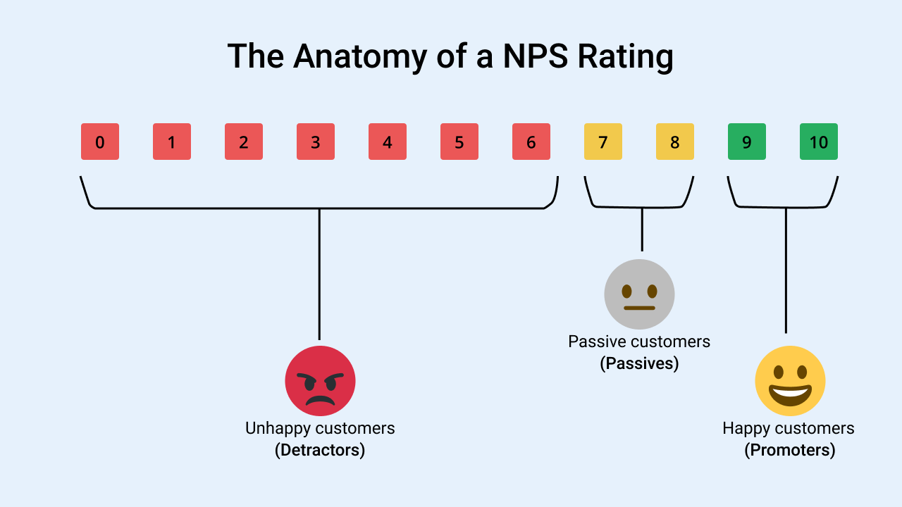
- Most NPS surveys ask the following question to their customers
How likely are you to recommend our product/service to a friend or colleague?
- The companies calculate the NPS score based on the responses or ratings received ranging from 0–10.
- NPS is a quantitive metric that helps the company understand how well they are performing in the market compared to their competitors.
The NPS score does not provide any qualitative data about why the customer is providing that particular rating.
- The follow-up question that is asked after the main NPS question helps the company get qualitative feedback that eventually helps the company identify areas of improvement.
- The follow-up questions can be different based on the rating provided by the customers.
- The customers who rate 9 or 10 (Promoters) should be asked a different question from people who rate 5 or 6 (Detractors).
🧐 Understanding Project requirements
My next step was understanding the requirements for the NPS popup. The list of requirements to be fulfilled for the design of the NPS form is shown below. One significant requirement was that the NPS form should have three formats with rating values for 3,5 and 10 rating points.

You can check the detailed requirements.
This led to more complexity in design decisions I had to make as now it meant that I had to design 3 types of NPS forms.

- Another significant aspect related to the NPS form was that the form was to be used by another company (client of clever tap) for administering the NPS survey to their end-users.
- It meant that the solution I was going to design was a B2B offering but the NPS form needed to be designed for the end-users.
- So I did more research on the Clevertap website to understand their offering and what type of clients they served. I found that Clevertap was serving many industries ranging from Fintech to Foodtech.
- I zeroed in on a Travel Portal “ixigo.com” as the company had a presence across the web and mobile. I choose the flight booking operation of the portal for my research.

🔍 More Research
The challenge ahead was to figure out how the popup will look and what information it will ask the users?
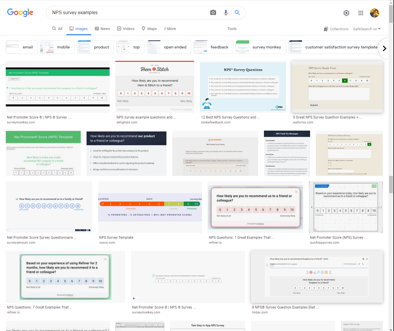
- To tackle this challenge, I decided to take help from google and find out how companies were conducting NPS surveys on the web.
- I collected many NPS samples and tried to find a common pattern existing in all the designs.

Some common patterns found through research
1. Most NPS forms asked the basic question about product or service recommendations.
2. The rating scale with 0–10 rating was more common than the 5 points or 3 point scale.
3. The NPS surveys asked follow-up questions asking about why the consumer has given a particular rating.
✏ Ideation and Wireframing
Now it was time to put everything in my head onto the paper.
I defined the objectives for the survey to focus my thinking on the problem.
- The survey needs to get a rating from users.
- The NPS survey needs to get written feedback about rating.
I had two options for structuring the form.
- Asking the user everything on a single screen.
- Asking for the information in multiple steps.
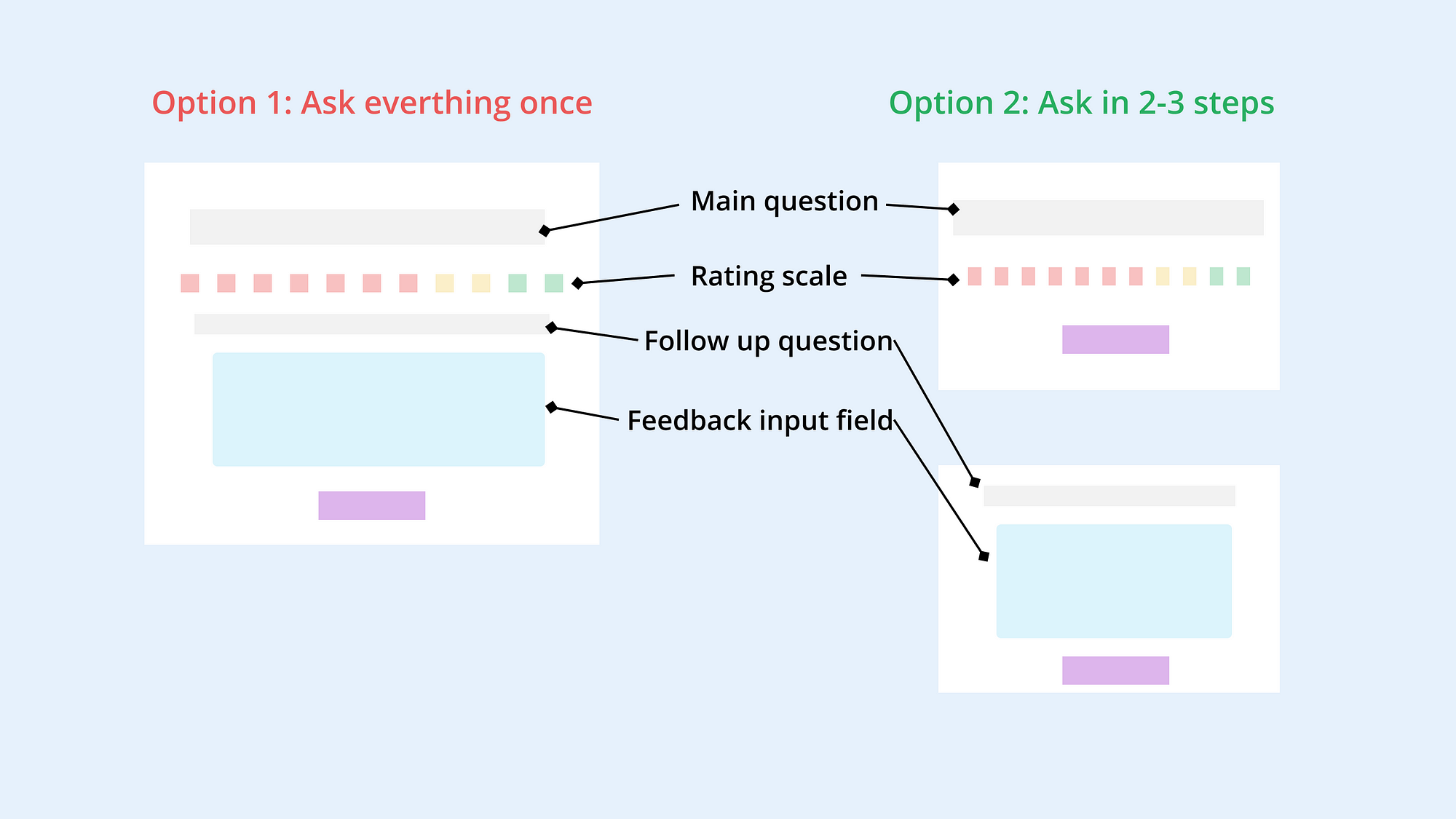
I choose the second option as it is expected to reduce the cognitive load on the user by displaying information in a series of steps.
Also, I wanted to ensure that the NPS survey length is not too long to cause survey bloat leading to fewer responses.
🚶♂️User flow for NPS popup
After figuring out the possible steps to be followed by the user, I had the information flow ready for the NPS popup.

✏ Sketches
While I was walking on the terrace, pondering over the NPS popup, I had an idea to make a 3 step form. I quickly got to my desk and sketched the wireframes.

📝Writing the Microcopy
While working on the wireframes, I thought about the microscopy for the pop-up.
- I did spend some time thinking about what will be the first question for the form.
- After thinking over several alternatives, I decided to stick with the fundamental question mostly asked in NPS surveys.
How likely are you to recommend IXIGO to a friend or colleague?
It was challenging for me to write the microcopy of the next follow-up question.
- The main idea behind asking the follow-up question was to get some actionable insights about user problems or delights about the experience.
- So I started asking myself what kind of problems are faced by ixigo users?
I got my answer from google play store reviews.

As I analyzed the user reviews provided by IXIGO users, I found some common problems and some good features experienced by people.
I incorporated these findings into the copy of the second question (for detractors) which sounded like this.

I thought about providing some options related to common problems faced by the majority of users.
My intention behind offering multiple options was to reduce the effort for the user while answering the feedback question.
A similar approach was used to write the copy for follow-up questions for Promoters and Passives.


🎨Visual Design
This was an interesting part of my design journey and here I spent most of my time iterating and fussing over designs not looking aesthetically pleasing.
A challenge I encountered during visual design was the selection of rating icons for different rating scales.

It was really fun playing with different ideas. I made several designs involving various rating elements.

Finally, I followed the concept of mental models to choose the design element for each type of rating scale.
For the 10 point rating form, I choose the 0–10 rating model as it is the most widely used rating system.
A google image search for the NPS survey examples will prove this by showing almost all examples involving numbers.
The 5 point rating system was modeled on the lines of review system used by many e-commerce companies and most mobile applications for asking feedback from the users.

Emojis were the undisputed choice for the 3 point rating scale as no other option seemed better.
The concept of 3 stars or hearts was not possible as mostly these are associated with 5-point ratings. Also, the use of numbers for the 3-point rating scale did not make sense.
An initial version of NPS Pop-up for detractors looked like this.

After getting feedback about the designs from my mentor, I improved the design with many iterations.
Latest version for 10 point NPS rating system for users who choose rating 1–6 (Detractors)

Latest version for 10 point NPS rating system for users who choose rating 9–10 (Promoters)

Latest version for 10 point NPS rating system for users who choose rating 7–8 (Passives)


🔍Primary Research
I tried to conduct primary research for the NPS popup and dashboard but could not find any success.😟 I found some people on LinkedIn and asked people in my network whether they knew someone who was using NPS in their jobs.
I found two people who could help me with my research but both of them were not able to devote time for an interview. As I was under a deadline to submit the project, I submitted the project without any usability review.
As I tried to improve the designs based on feedback, I got a message from one of the product managers whom I contacted earlier for the interview.
So I got on a call with the product manager and showed my designs.
Finally, I had some real feedback as the manager was tracking NPS in their company.😁
- One important insight from the manager was that there were different options to be selected by users in follow-up questions for detractors, passives, and promoters.
- The manager pointed out that it would be difficult to analyze the user responses with so many options.

Based on feedback, I reduced the number of options that were presented to the user in the follow-up question.
Also, I made all the options common for every rating whether it was 2 or 9.
NPS survey for Mobile Web
I also designed NPS surveys for mobile web with 5 point and 3 point rating systems. In this case, I designed a full-screen NPS form for mobile instead of a Pop-up.

Check out the Prototype for the 5-point rating.
The design of 3 point rating system for getting feedback on user experiences was similar to 5 point rating system except for the ratings.


Check out the Prototype for the 3-Point rating
📊NPS Dashboard Design
Once I made some sound progress in the design of NPS Popup, I shifted my attention toward the dashboard design that seemed trickier to me.
🔍Secondary Research
I did the following things to get an understanding of what information should be contained in an NPS dashboard.
- I read blogs and articles about how to conduct NPS surveys and what metrics are important to track in an NPS survey.
- I signed up with 2–3 survey companies that allowed building and sending surveys for free.
- I then made a dummy NPS survey and answered them many times to generate fake data.
- Then I saw how the survey website was representing data.
After this research, I made some notes and sketches in my notebook.

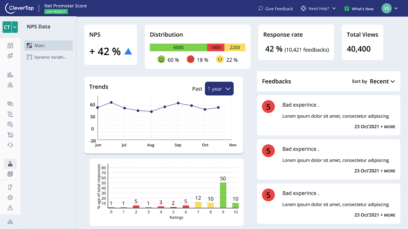
I listed the information that was needed to be shown on the dashboard.
- Net Promoter Score
- Percentage values of Detractors, Passives, and Promoters
- The response rate for the survey (%age of people who completed the survey out of total people who opened the survey)
- Total number of feedbacks
- NPS Rating breakdown
- NPS rating based on demographics
- NPS history over last 3,6,9 and 12 months
- Feedbacks received from users
✏ Wireframes and Ideation — Dashboard
Next, I made some wireframes for the dashboard to explore the various types of graphs and information to be shown on the dashboard.

- Soon I realized that I had too much data to fit into a single dashboard screen.
- I decided to prioritize the information so that I could choose the most important stuff to be shown on the dashboard.
- I used the Moscow framework to prioritize the data points to be shown on the dashboard.

Next, I made some dashboard wireframes and played with different shapes for displaying information.
The most important questions while designing the dashboard were :
- Which chart type to choose for showing a particular set of data?
- How do I arrange the charts and graphs into the dashboard?
For the first question, I did research on the data visualization techniques to understand the science and art behind the presentation of data.
I understood from my research that :
- Data need to be represented in a manner that is easy to consume.
- The charts should make it easy to compare different values.
🎨Visual Design
I started with simpler bar graphs and pie charts for representing the information collected from the NPS survey.

I struggled a bit to fit different charts into the limited space available to me.
Finally, I changed my approach and allocated space for each set of data on the screen.

- I placed a rectangle representing each data section on the dashboard.
- I followed the predominant reading and scanning pattern of people which is the F-shaped reading pattern for arranging data on the dashboard.
👉While most people think that people read and scan a webpage according to F-pattern. Studies suggest that a similar pattern is also followed by people while reading a dashboard.
I arranged the Net Promoter score on the Top left corner of the dashboard. I kept the most important parameters in the top row and with the less significant information below.
Now it was time to fit the information into areas allocated on the dashboard screen. This time I had to again question my selection of charts as the existing charts seemed misfit for the limited space.

It is clearly evident from the above image, how the choice of different graphical representations in Figures A and B led to space optimization and reduced space requirement.
Next, I made changes to other graphical representations as well to ensure maximum space utilization. This led to another set of iteration to refine the design.
The first version of the dashboard looked like this.
Next, I made a series of iterations to improve the design of the dashboard.

The final version of the dashboard submitted for review to Swapnil Borkar looked like this.
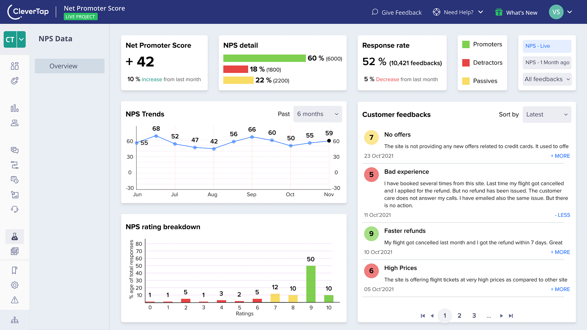
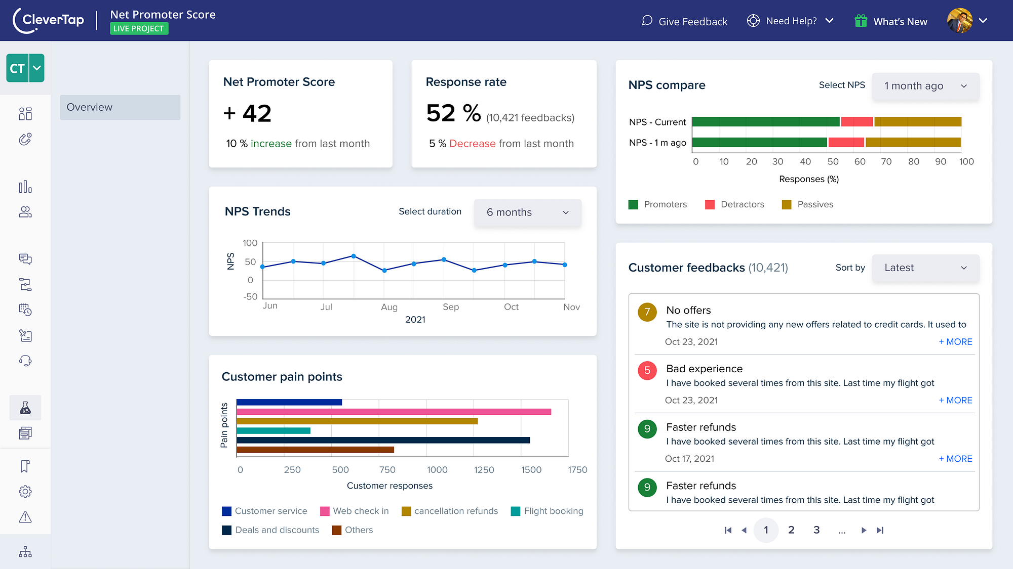
With feedback from my mentor, I improved the design of the dashboard further.

User feedback
The feedback session with the user offered useful insights on the NPS dashboard.

I also considered the design guidelines mentioned in the Carbon Design system to improve the visual design of the dashboard during the final iterations.
This is the latest dashboard made after incorporating the feedback from the user.
Check out the Dashboard prototype in action.
Key Takeaways and learning
- Limit desk Research: I tend to spend a lot of time reading about things before starting on the actual design project. This may seem obvious but it can also waste your time if you want to achieve something within the deadline. Coming up with new ideas and trying different things need more effort than just reading blogs and articles about the thing you want to design. For next time, I am going to limit my desk research time so that I can spend more time on ideation and brainstorming new ideas.
- Design fewer screens and seek feedback: During the initial phases of the project, I tried to design all screens that were needed for the project at once. I realized this when I sought feedback from my mentor. As I got feedback on one type of form design, I realized that I had done a similar design for other NPS forms also. That meant, now I had to change all the screens where I needed to implement the feedback.
- Conduct Primary research early: I failed to conduct primary research in the initial stages of the project and ended up making designs that were not relevant to end-users. This was partly due to poor planning and lack of resources at my end to conduct primary research.
- Iteration leads to better visuals: When I started the visual design for the project, it looked very bad to me. I observed that every iteration led to some improvement in the overall appeal of the design.
Acknowledgments
I would like to thank 10k designers for the opportunity to work on this project. Huge thanks to my project mentor Swapnil Borkar for giving me valuable feedback on the designs.
Huge shoutout to my mentor Chethan KVS for supporting me during the project.

