Unveiling the Magic of Heat Maps in UX Design
Heatmaps: Illuminating User Pathways in UX Design
Imagine you’re designing a digital space — a website or an app. You want to make sure people can use it easily and find what they’re looking for. This is where heat maps come into play, like a treasure map for designers to understand user behavior.

What is a Heat Map?
A heat map is a graphical representation of data where values are depicted using a color spectrum, typically ranging from cooler to warmer hues. In the context of UX design, heat maps visualize user interaction patterns on a digital interface, revealing areas of high and low engagement. They offer an at-a-glance overview of where users focus their attention, where they click, scroll, or hover, and where they might encounter issues.
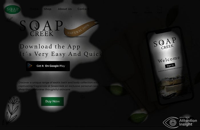
In the image above, the vivid red and warm yellow shades of the heat map unmistakably highlight the spots where user attention is most likely to be captured. Specifically, these areas encompass the focal points of the brand’s purpose, the prominent login feature, and the compelling ‘Buy’ call-to-action (CTA).
Types of Heat Maps
- Click Heat Maps: These maps display where users click or tap on a web page or application. They help identify which elements attract the most attention, such as buttons, links, images, or specific sections of content. Click heat maps can reveal user intentions and guide decisions about placement and priority of elements.
- Scroll Heat Maps: Scroll maps show how far users scroll down a page before dropping off. This information is invaluable for determining the optimal placement of important content. If users frequently don’t reach key information or calls to action, it might be necessary to reposition them higher on the page.
- Move Heat Maps: Move maps track the movement of users’ cursors or pointers. This type of heat map can help uncover confusion or hesitation as users navigate through the interface. Identifying areas where users move back and forth can indicate problematic UI elements or unclear navigation paths.
- Attention Heat Maps: These maps are generated using eye-tracking technology and showcase where users’ gaze is focused on the screen. While not as commonly used as other types of heat maps due to the required equipment, attention heat maps provide incredibly detailed insights into visual engagement and can be particularly useful for optimizing layouts and advertisements
How Do Heat Maps Work?
Heat maps are typically created using tracking tools that record user interactions in real-time. These interactions are then aggregated and visualized using color gradients. The intensity of color represents the frequency and density of interactions in a particular area. Cooler colors like blue or green indicate lower interaction, while warmer colors like red or orange indicate higher interaction.
To create accurate heat maps, user interactions are anonymized and aggregated to ensure privacy.
Modern heat map tools often come with additional features like segmentation, allowing designers to compare interactions based on different user segments, such as new users versus returning users.
Benefits of Heat Maps in UX Design
- Visual Clarity: Heat maps offer a quick and easy-to-understand visual representation of user interactions. Designers can immediately spot trends and anomalies without diving deep into raw data.
- Data-Driven Decisions: Heat maps provide evidence-based insights, guiding design decisions. By identifying which elements are most engaging, designers can enhance the user experience by optimizing layout and content placement.
- Usability Assessment: Heat maps reveal usability issues, such as areas where users click on non-clickable elements or fail to notice important content. This information is essential for refining the interface’s functionality.
- A/B Testing Validation: Heat maps can be used to validate the results of A/B tests. If a design change leads to a significant shift in user behavior, heat maps can help visualize the impact and provide context.
- Improved Conversion Rates: By analyzing heat maps, designers can identify friction points in the user journey that might be inhibiting conversions. Optimizing these areas can lead to higher conversion rates.
Enhancing Design Precision Through Heatmap Analysis and ‘Attention Insight’ Plugin in Figma:-
In my design process, I’ve used something cool called heatmaps, and I’ve teamed up with Figma’s ‘Attention Insight’ plugin for extra insight. This combo has given me a cool way to figure out if my design parts are in the right spots.

Unlocking User-Centric Design: Harnessing the Potential of Heatmaps
1.Seeing What People Do: Heatmaps show me where people look and click in my designs. It’s like a map that highlights where they’re most interested. This helps me decide if my design pieces catch their eye and guide them where I want.
2. Making Smart Choices: With the ‘Attention Insight’ plugin, I’m making design choices based on real data, not just guesses. I’ve got solid info on how real users behave, so my decisions are backed by proof.
3. Perfecting Design Spots: By using heatmaps and the plugin, I’m like a puzzle master placing pieces where they fit best. I make sure important parts go where users naturally pay attention. This makes everything smoother and easier for them.
4. Trying, Testing, Tweaking: Heatmaps and the plugin help me fine-tune my designs again and again. If something needs fixing, I can quickly experiment and see what works best for user engagement and happiness.
5. Meeting User Expectations: Heatmaps and the plugin team up to match how things look with how users act. This way, I create designs that guide users without any confusion.
6. Teamwork and Sharing: With Figma’s help, heatmaps, and the plugin, working together is a breeze. I can share what I’ve found and how I’m improving designs, so we all chip in to make things better.
The plugin generated Heat Maps and Focus Maps, which definitely made me understand the correct perspective towards psychology and placement of design components.
While numbers from heatmaps and plugins are useful, I also pay attention to what users say. Talking to them and seeing how they react adds another layer to my design insights.
In a nutshell, my blend of heatmaps and Figma’s tools shouts out my dedication to making designs users love. I’m on a mission to merge how things look with how people use them, creating a cool connection between design and users.
Limitations and Considerations
While heat maps provide valuable insights, they also have limitations. Heat maps don’t provide explanations for user behavior, so they should be used in conjunction with other qualitative research methods. Additionally, the accuracy of heat maps depends on the quality of tracking data and the representativeness of the sample.
Conclusion
In conclusion, heat maps are a powerful tool in the UX designer’s toolkit, offering a visual snapshot of user behavior and interaction patterns. They help bridge the gap between quantitative and qualitative data, enabling designers to make informed decisions that enhance the user experience. By utilizing heat maps alongside other research methods, UX designers can create interfaces that are not only visually appealing but also functional and user-centric.

