Design Tokens for better Design Systems
A tour around the essence and greatest strengths of Design Tokens.
We all have heard about design systems. Some of us have built, others used, and others have just seen one.

They help teams with consistency, scalability, and communication.
Design Systems do not obey a specific method, recipe, or structure. Instead, they adapt to the needs of the products, teams, and company.
Something I always felt a bit disconnected though, was how design choices and decisions were documented and maintained.
In “traditional” design systems (AKA non-tokenized* design systems) you will commonly find lists of specifications and guidelines — the backbone of all atoms, molecules, and organisms — that teams must follow in order to achieve consistency. These guidelines and specifications are often dense and hard to keep updated.
Colors, font families, spacing increments, and border-radius are some of the specifications and patterns you can find there.
*will come back to this ASAP

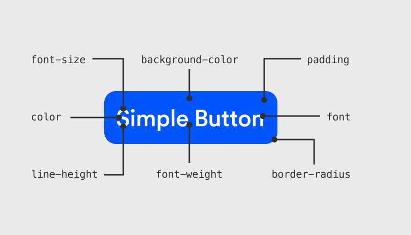
For example, a single button must consider things like background color, on-background color (for label and icon), border-radius, drop-shadow, padding, and all typographic attributes.
All these guidelines are well documented and “carved in stone”.
But what about some of these attributes that are consistently used across the system? For example:
- The dropdown uses the same border radius as the button.
- The pill uses the same padding as the dropdown.
So, how am I storing, organizing, and sharing these values? In the same way that I am consistently using my set of 10 shades of grey (and not even one more), why am I not standardizing border-radius or padding values across the system?
Also, wouldn’t it be easier if I could name these values, instead of constantly describing HEXAs and Pixels that are always changing, when I talk to a programmer or other designer?
When I pick “4” as a border radius value, I am making a Design choice. The same way as when I choose color #ff0010, 20px of padding or 2px of border width.
But then, I’m storing and managing all these values independently and ad-hoc, rather than accessing a library of Design choices to commit them to decisions like “dropdown fields ALSO use THIS shared CHOICE.

And that’s what the tokens solve, fundamentally. Design tokens store all these indivisible choices and reusable decisions — referred to as IONS in atomic design philosophy — making them the missing piece in “traditional” approaches.
They are like variables sitting at the top of good logic.
At Fintama, an agency offering products and services for the
Asset and Wealth Management industry, we use and evangelize the power of Design Tokens to all our products and customer projects.
So, with Design Tokens now I can:
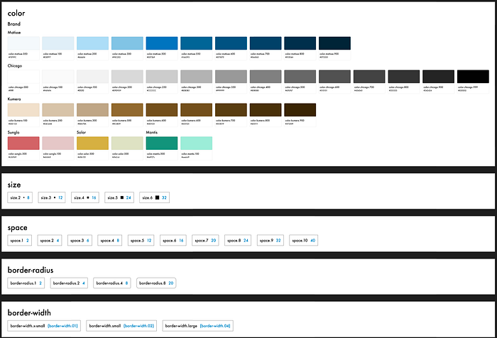
- Create 3 different sizes of border-radius that I will use in my system. These are the first-level tokens called Reference Tokens (RT). I will call these three: “rt.border-radius.100, rt.border-radius.200, rt.border-radius.300”. This value-agnostic naming approach will allow me in the future, if necessary, to freely update the values of the tokens without harming the semantics. Think “variables”.
- Then, the second level of Design Tokens comes into play: The System Tokens (ST). These reflect decisions and describe intention/usage/quality. So I can create a System Token called “st.border-radius.base or st.border-radius.medium” and connect it to the Reference Token “rt.border-radius.200”. Or I can create a System Token “st.color.tertiary” and associate it to the Reference Token “rt.color.planet.500”.
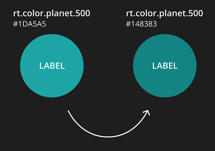
- Then, if I discover that my “color.planet.500” is not WCAG AA compliant, I can always come back to my tokens and, either change the Reference Token HSL/RGB/HEXA value (which will affect all dependencies) or update the “st.color.tertiary” token to simply target a different but complying Reference Token. By doing this, every element (button, card, icon, …) targeting my tertiary color will get updated.
Bonus 1:
There is a third level of tokens, called Component Tokens (CT).
These are component-specific and usually point at a System Token.
Having these 3 levels allow enormous flexibility.
In example:
Level 1: Reference Tokens
I discovered that my “rt.color.planet.500”, used in primary buttons, is not WCAG AA compliant and so I have to darken it a notch.
Action: Change the HSL/RGB/HEXA for “rt.color.planet.500”.
Level 2: System Tokens
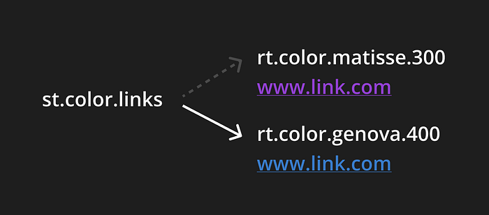
The customer wants blue instead of purple for “st.color.links”.
Action: We redirect “st.color.links” to target a blue Reference Token color.
Level 3: Component Tokens
Checkboxes have “st.color.primary” as their background color. User tests showed us that users aren’t identifying them as such, so we want to tweak their color. All other form elements are fine.
Action: We go to “ct.color.checkboxes” and retarget it to “st.color.accent”.
Bonus 2:
Figma Tokens Component is a powerful plugin that automates the work with Design Tokens. It's free with extra perks for pro users.
It allows us to edit and apply tokens and have them automatically update our designs. I also allow us to maintain our documentation tidy and updated as you can see in this demo:
It allows us to export a JSON file that can easily be converted to CSS, SASS, SWIFT, etc., due to the technology agnosticism of Design Tokens.
Conclusion:
Tokens are time-consuming to build. The higher the level, the more time you will spend on creating and managing them. That’s why most companies like Google or IBM are so far only supporting level 2 Design Tokens.
The plugin is great to use, but the larger and more complex the file, the slower it will become. Still, without the plugin, half of the power of Design Tokens is gone.
Finding the right moment in the design process of a product to shift to Design Tokens can be challenging. If too early, you will throw away time not only from experimenting with solutions and testing but also handling the design tokens. If it is too late, we will have too many screens to go through and replace styles with tokens.
That said, Figma Tokens enable a “perfect” design-dev workflow, let’s see:
1 — Design Tokens are created and applied through the plugin in Figma.
2 — At any time, a change in the tokens will reflect immediate changes to all screens, wherever tokens are applied/connected. I.E. If I change my primary color on the plugin, all elements used on my layouts being served by the primary color will be instantaneously updated. Creating a dark or high-contrast theme is a breeze.
3 — I can connect the plugin to a repository and automate it into the dev deployment processes. For I.E. I make a color change and push it to the repo, the file is automatically converted to CSS and pushed live. In a matter of minutes, my Figma change is live online.
Follow me for what’s to come!

