Design Tokens 2.0 — The Ultimate Guide.
A complete guide on creating Design Tokens in the most efficient, scalable, and consistent way. You have to use the Tokens Studio plugin to use your Design Tokens inside Figma, in your Designs, otherwise only developers can have fun with them.
So far, Design Tokens were ONLY stored in a JSON file and handed to developers to convert to CSS, SASS, SCSS, SWIFT, etc.
Tokens Studio allows, for the first time, Design Tokens to be properly managed and used INSIDE Figma, allowing us to be more efficient, fast, and consistent.
The unofficial Design Tokens 2.0 term was born after having experimented extensively with tokens and finding a better balance between the desired flexibility they offer and the complexity of managing them.

1. Design Tokens can be organized by their TIER and PROFILE.
TIER
Design Tokens can be of the Primitive, System, or Component Tiers.
- Component Tokens should reference System Tokens.
- System Tokens should reference Primitive Tokens or other System Tokens (alias).
- Primitive Tokens reference RAW values (Eg. #942d3a, 50% or 22px).
Component Tokens are also referred to as:
- Scoped
- Override
System Tokens are also referred to as:
- Alias
- Common
- Application
- Semantic
- Purpose
- Decision
- Applied
Primitive Tokens are also referred to as:
- Base
- Global
- Core
- Basic
- Choice
- Option
- Palette
PROFILE
Design Tokens can be of the profile SIMPLE or COMPOSITE.
Simple Design Tokens are 1 on 1. This means 1 Token reference 1 other Token or RAW value, depending on the TIER.
font-size.10 = 16px
color.primary = #942D3A
border-radius.20 = 4px
Composite Design Tokens are 1+ on 1. This means that a Token needs to reference multiple Tokens to be created. One good example is Typography.
typography.title.md = font-size.10, line-height.20, font-weight.30Tier 1: Primitive Tokens
After having a developer complaining that it was hard to say “You must REFERENCE the REFERENCE token” I had to fall back to my second favorite name for Tier 1 Tokens: Primitive Tokens.
Primitive Tokens hold choices. I choose my toolbox, my pallets, my lego pieces, my ingredients…
Primitive tokens, in short, are pretty MASKS for ugly CODES.
A MASK can be “color.primary” or “font-size.10”.
A CODE can be "#423425" or "16px".
Rules:
- Primitive Tokens must reference RAW values.
- Names should be simple, short, and scalable.
- I often use names like font-size.10 and font-size.20. This allows me to later create, if necessary, a font-size.15 for an intermediate-size font.
Tier 2: System Tokens
System Tokens hold decisions. I decide how my hero title will look like, or what is my action, background, or surface colors, I.e.
By connecting System Tokens to Primitive Tokens, I am flexible either to update my color.primary at TIER 1 or just reference another Primitive Token at TIER 2.
With all these levels, what we are trying to do is to achieve a good balance between future flexibility and maintainability and present upfront effort.
Although some changes may never be needed, if they ever ARE needed, then you will regret not having done these 3 levels of tokens. It is exactly like insurance!
Tier 3: Component Tokens
Well, this is pretty self-explanatory. Component Tokens are component-specific tokens, used to tailor their individual styles. The benefits are that if you need to tweak the border-color of a checkbox, you can fine-tune it in isolation from the other form elements.
They should reference System Tokens so that when the “color.action.background” is overridden by, I.E., a dark-theme color, all components referencing it will change accordingly.
In Resume:
The TIER 1 says:
- If someone decides to white-label this product, he just needs to come here to TIER 1 and change all values in RGB, HEX, pixels, percentages, etc… Since the names are agnostic, they can hold any value. Since the TIER 2 references are connected to TIER 1 names and not to values, everything will just update naturally and a fully new theme will emerge.
The TIER 2 says:
- If you want to adjust your primary and on-primary colors, I.e., for accessibility reasons, do it in two System Tokens and see it echoing to all component tokens referencing those primary and on-primary tokens. If you realized that your border-width.sm should be of 2px and not 1px, do it in one place and see all secondary buttons, text-fields, text-areas, select-boxes, etc…, being all updated at the same time.
The TIER 3 says:
- So your client told you that your Modal border-radius should be smaller and you have now 100 screens to update on Figma… No worries, since you created a Component Token dedicated to Modals, you can tweak modal.border-radius and assign to it a different System Token border.radius token.
Types of Tokens
Primitive Tokens
Here are the types of Design Tokens you can create in the Tokens Studio plugin:
sizing
spacing
border-radius
border-width
border
box-shadow
typography
color
opacity
font-family
font-weight
line-height
font-size
letter-spacing
paragraph-spacing
text-case
text-decoration
dimension
assets
Now, here are the ones I usually create as Primitive Tokens:
s̵i̵z̵i̵n̵g̵
̵s̵p̵a̵c̵i̵n̵g̵
̵b̵o̵r̵d̵e̵r̵-̵r̵a̵d̵i̵u̵s̵
̵b̵o̵r̵d̵e̵r̵-̵w̵i̵d̵t̵h̵
̵b̵o̵r̵d̵e̵r̵
̵b̵o̵x̵-̵s̵h̵a̵d̵o̵w̵
̵t̵y̵p̵o̵g̵r̵a̵p̵h̵y̵
color
opacity
font-family
font-weight
line-height
font-size
letter-spacing
paragraph-spacing
text-case
text-decoration
dimension
assets
The key advantage of Design Tokens is reusability and so what I always try to do is to create flexible Primitive Tokens and then reuse them as much as possible in the System Tokens.
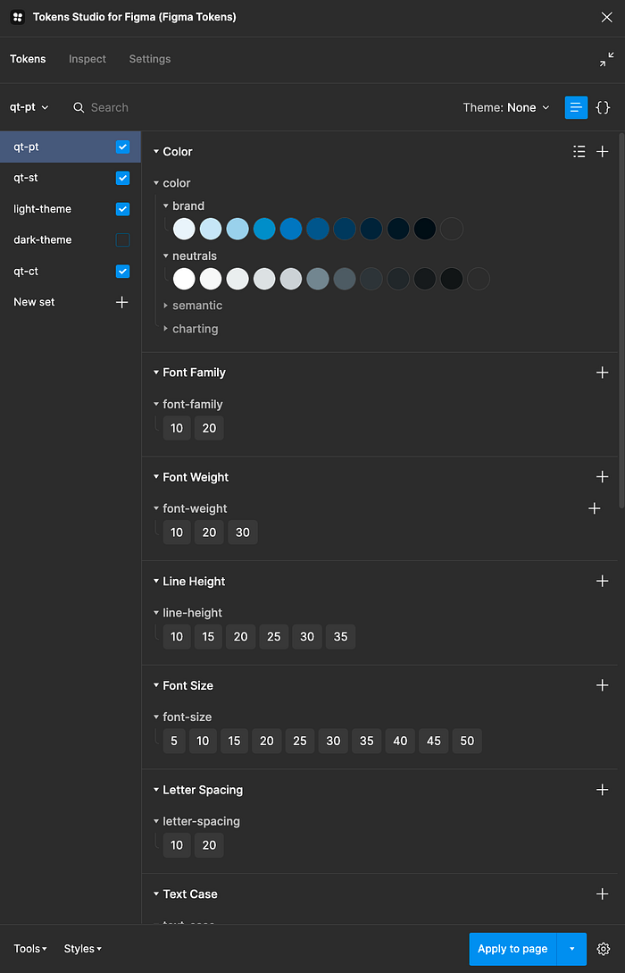
For example, a dimension can be created as a Primitive Token and then referenced in Sizing, Spacing, Border-radius, or box-shadow in System Tokens.
Primitive Tokens may end up looking something like this in the Tokens Studio Figma plugin:
System Tokens
In the Design Token types that were left out of the Primitive Tokens, there are Simple and Composite profiles to consider.
Reminder: Simple Tokens are the ones that require a single reference while Composite Tokens require multiple references in order to be established (E.g. Typography).
There are 3 Composite profiles, mainly:
border: Requires a color, a width, and a style.
box-shadow: Requires a type, x, y, blur, spread, and color.
typography: Requires font-size, font-weight, line-height, etc…
All remaining just require one single value to be created.
sizing (simple)
spacing(simple)
border-radius(simple)
border-width(simple)
color (simple)
opacity (simple)
font-family(simple)
font-weight(simple)
line-height(simple)
font-size(simple)
letter-spacing(simple)
paragraph-spacing(simple)
text-case(simple)
text-decoration(simple)
dimension(simple)
opacity(simple)
Now, for the System Tokens, I will need to understand how my Design System works. Do I have surfaces, containers, and backgrounds? Do I have an accent color? Do I have weak, base, and strong variants for my messaging colors? With these answers in place, I can start defining roles and referencing Primitive Token.
It may look something like this:
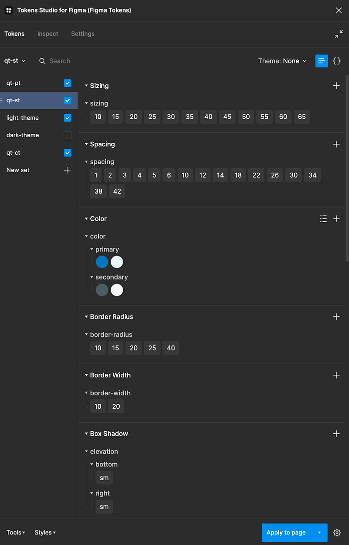
So, for example, sizing.10 is referencing dimension.6.
In the same way, spacing.3 is also referencing dimension.6.
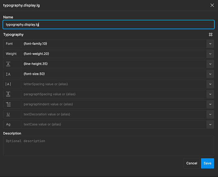
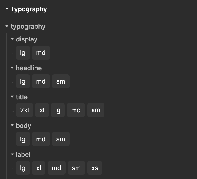
Typography has a Composite profile. Here’s what a typographic style looks like:
Component Tokens
We finally get to Component Tokens and I usually start, of course, with our beloved Button component. Let’s look at the default (enabled) state of the primary button.
It is this simple:
- button.color.bg references my system token color.accent.default.base
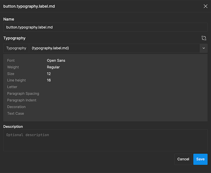
- button.typography.label references my system token typography.label.md
- button.spacing.y references my system token spacing.4
- button.spacing.x references my system token spacing.5
- button.border-radius references my system token border-radius.15
Naming Design Tokens
Here I present you a naming convention I was testing in a recent project. I wouldn’t suggest a copy/paste since the values might be way too specific to the project. Still, the table headers might give you a nice starting point.
Primitive Tokens
We want these names to be simple and short. They are human-friendly names, masking horrifying values, hard to memorize.
I use the columns like a name-creating checklist. I walk through each column and tick the categories I need for my new name. This is true for all TYPES of Design Tokens.
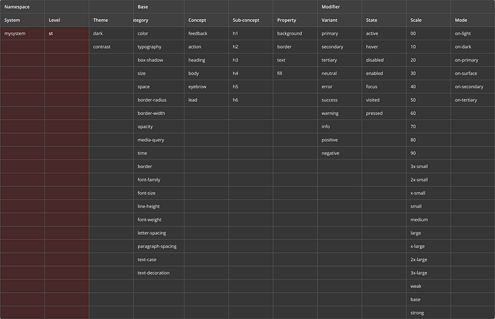
- System: the design system name.
- Level: Same as TIER. PT stands for Primitive Token.
- Theme: Sets the theme context.
- Category: What is the property we are masking?
- Family: What is the “family name” for this token? Chances are it will get siblings. I.e. color.primary.10 and color.primary.20.
- Scale: Well, I could have just said from 1 to 99. You can have other scales if they make sense to you. For me, this keeps everything consistent and abstract enough. Chances are I won’t be making daily use of Primitive tokens anyway since once System Tokens are in place it ill be just about components and them.
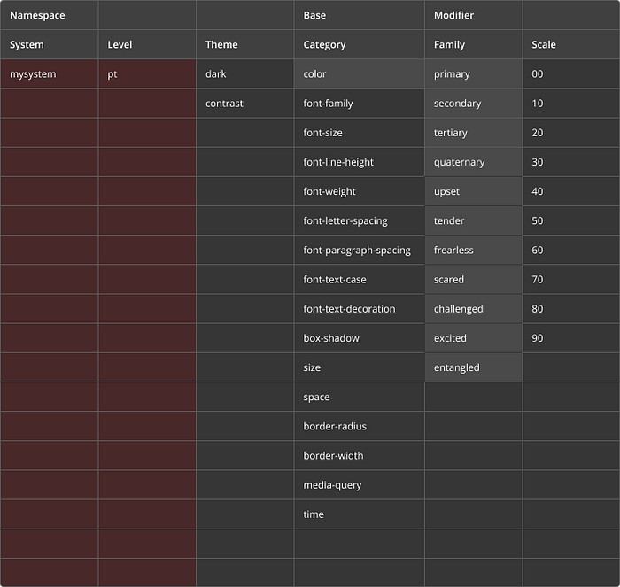
System Tokens
Here we want to describe the purpose of each token. So names are a bit more comprehensive. But don’t be fooled, we don’t use all these columns at all times. Again, they are a checklist and they ask “Do you need this in your name? What about this?”
Let’s talk about the new ones:
- Concept: You may be creating something that belongs to a context or, a concept. I.e.: color.action.fill
- Sub-concept: Here’s room for fine-tuning, if needed. I.e.: typography.heading.h1
- Property: Is it specific to the border or fill? Then it could be color.feedback.background.error
- Family was replaced by Variant in System Tokens.
- State describes the available interaction options of an item.
- Scale is now including a bit more variety. Weak, base and strong are great for controlled variations. I use it a lot for error.weak, error.base and error.strong. Then, in the component tokens, I may reference error.weak as toast.color.surface, I.e.
- Mode describes a condition: I.e.: This token is to be used only for items sitting on top of the primary color.
Component Tokens
- Group: It organizes items together. I.e. We could group Toast, Top-hat, and Banner in the “Feedback” or “Messaging” group.
- Component: The component itself.
- Element: Maybe the target is an icon in a button.
- Position X and Y: Maybe there are two icons and you want to reference the icon-left.
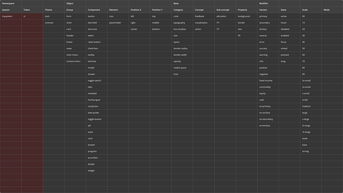
If you notice, there is a slight change in strategy from System to Component tokens.
This is due to the fact that while working on components, we want to ensure our top-level name is the actual component’s name. While with the System Tokens, we are mainly describing roles for our styles, here we can be very specific and make our lives easier.
So instead of starting with color.messaging.error… we start with the name of the component group, if any, and then the component: messaging.error.color…
In this article, you can find a few different details about this table:
From Abstract to Concrete
While with the Primitive Tokens, we tried to be as abstract as possible, in the System Tokens we described roles and semantic connotations, with Component Tokens we want to be as specific as possible.
This is where we take control over how developers will implement our styles. If we do a JSON that is 1 to 1 with, let’s say, CSS, the error margin is minimum.
So the rule is simple, each component should have its OWN set of tokens.
For example, if the padding of a button is bigger to the sides than to the top and bottom, then: button.primary.padding.x, button.primary.padding.y and button.primary.padding.gap in the case you have an icon and you need to declare the space between label and icon.
With the PRO version of Tokens Studio, you can create what is called a COMPOSITION which allows you to, in simple terms, use all your tokens as you create CSS.
This means that you can say:
For my button component, I need the following System Tokens:
Typography: typography.label.md
Border-radius: border-radius.md
Background-color: color.interactive.primary.default
Foreground-color: color.primary.foreground
Padding-top: spacing.md
Padding-bottom: spacing.md
Padding-left: spacing.lg
Padding-right: spacing.lg
The key difference for the FREE version is that we have a bit more work while creating more tokens to isolate the difference, e.g, from the padding top and bottom to the left and right. Like showed before: button.primary.padding.x and button.primary.padding.y
Creating Tokens
1. Drop-Shadow
Drop-shadow is mostly used to build Elevation.
Elevation has semantic value and describes a role.
Drop-shadow has a Composite profile since it requires multiple values (X, Y, Color, Spread, and Blur ) in order to be created.
So I reuse my pt.dimensions for the X,Y, Spread and Blur.
Tokens studio allows me to alias dimensions as positive or negative like this:
{pt.dimension10}
-{pt.dimension10}
Then, for the color, I build a slightly more complex operation since I want to reuse my opacity.sm, and thus I need to use something like HSLA where I can detail ALPHA:
hsla({color.neutrals.hue}, 10%, 8%, {opacity.sm})Result:
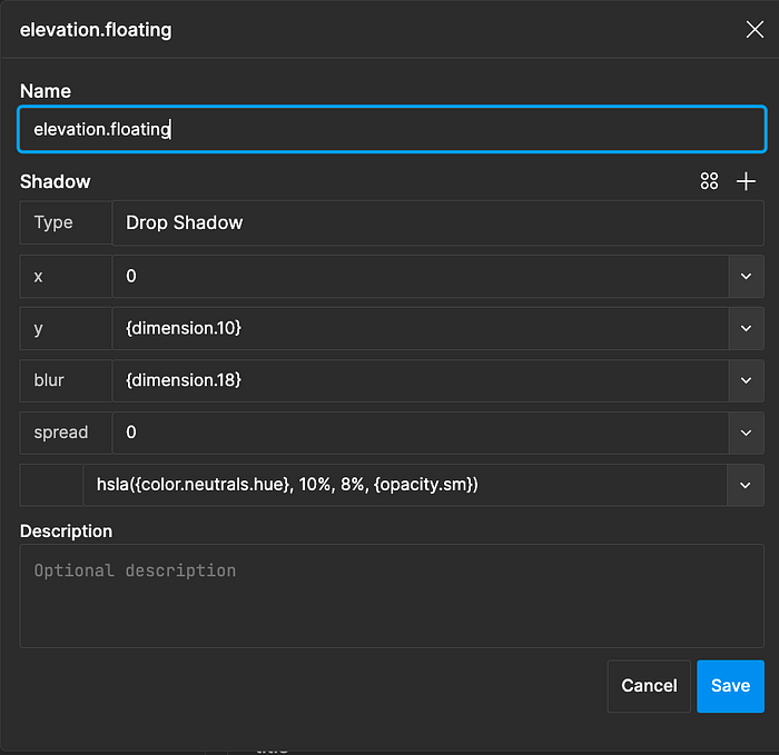
With this elevation.floating as a ST, I have the base I need for building floating components such as Modals, Toasts or Panels, like that:
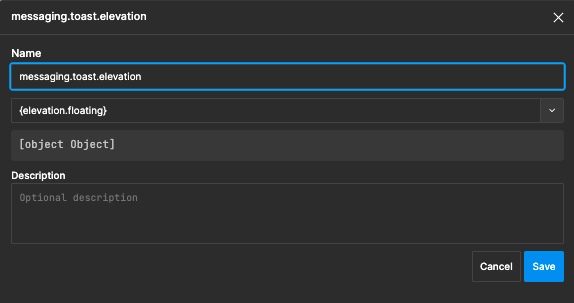
Guidelines: Every single detail on a component should get a token. Every token should reference a System Token.
Dimensions
Dimensions are new and a great thing! Love them.
They are the pinnacle of abstraction. They reference a universal all-might number that can be later reused in half of your tokens.
Dimensions should pair your grid and scaling systems. Most of the time, depending on the type of project, I use either 4X or 8X for my scaling system. To get the most out of dimensions, I also consider 1px, 2px, 4px, 6px, and 8px. Then it follows the 4X or 8X.
Dimensions can be in PX or REM. Size can be a dimension. Font-size can be a dimension. Font-weight can be a dimension.
2. Typography
Typography has a composite profile.
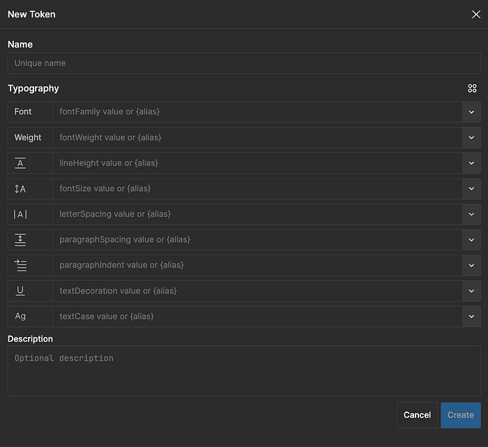
As we can see in each placeholder, we can make use of an alias to serve all those values. Most commonly, we use:
- Font-family
- Font-weight
- Line-height
- Font-size
- Letter-Spacing
- Text-Case
Primitive Tokens
We start by defining our 2 or 3 font-families. Since we won't be playing much with the primitives, anything abstract will work. You can do:
- font-family.01
- font-family.10
- font-family.a
- font-family.primary
- …
For the font-weight, I will reuse my established Dimensions.
For the line-height, I can’t use Dimensions, so I will create a few variants myself, by always keeping my 4X in mind. If I have a 16px font-size, I can use a 20px or 24px line-height. This will ensure consistency in the alignment of elements in my grid.
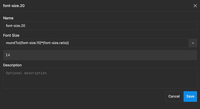
Font-sizes are built systematically. I pick a base font-size of 16 and a ratio of 1.22. I commonly define that font-size.20 (remember that the value is not 20 but 16, the name is abstract) as equal to the base font-size. Then, I use an expression similar to:
roundTo({font-size.20}*{font-size.ratio})This expression will calculate the font-size for font-size.25. Next, I will use font-size.25 for my font-size.30 calculations and so on and so forth.
In the example below you can see that the calculation is resulting in a 14px font-size. My base font-size.10 is 12px and my ratio 1.15. RoundTo is rounding the resulting 13.8 to 14.
Will all these Primitives in place I can now move to Typography.
This is how a Typography style might look like:
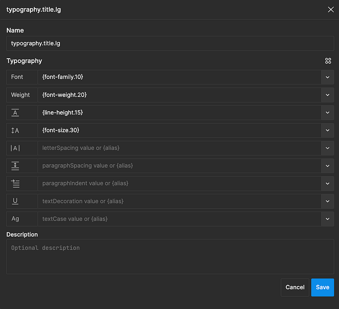
The styles presented in the image below can be either used, directly, on a title or paragraph OR referenced from a Component Token (e.g. “button.label”). The rule is, if it's not inside a component, then feel free to use these system tokens directly on your text.
Imagine I am defining the text for my button.md component.
I open my typography styles and here’s what I see:
Now, at first sight, it seems that my only chance is to define each and single alias by hand again… Though, if we look closely we see a little hidden icon that hold tremendous power:
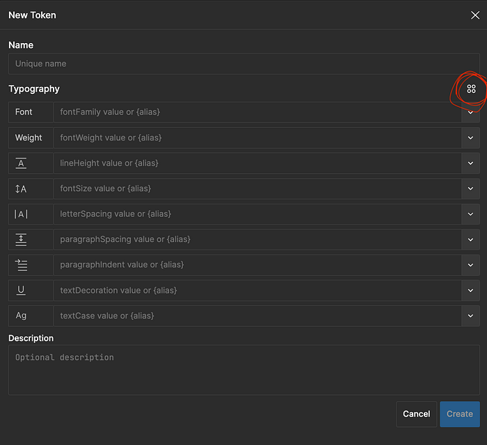
With it, I am able to reference one of my System Tokens Typography in one click. Ufffff!!
3. Colors
Primitive Tokens
Well, colors are a tricky one…
We know the good practices… Keep 80% in neutrals, and 20% colored. Pick your primary (ies), secondary (ies), and semantics, and call it a day.
Well, it’s not that simple…
We may start by having a list of colors we want to include in our Primitives palette, our choices:
- brand (primary, secondary, tertiary)
- neutrals
- semantic (negative, positive, notice, and informative)
- charting (well, shorter than data visualization…)
Good. Now we need shades. We can do this manually, shade by shade, or in a more systematic and automatic way, based on a HUE value, for example.
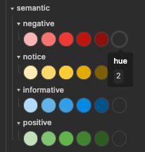
Here’s a bit more detail on the topic:
In summary, I use HSL where H(hue) becomes a token(e.g. “primary.hue” = “200”). Then I create a sequence of gradual Saturation / Lightness tokens (primary.10, primary.20, primary.30, …). Each of these shades are using the “primary.hue” as foundation. Changing the Hue, would change the entire shades set. This means that if I duplicate this set and change the HUE, I have a completely new set of shades in seconds.
Primitives are that easy. The challenging bit comes now…
System Tokens
With my shades in place, I am now moving to System Tokens.
Imagine you are painting your huge house with your partner and kids. You agreed that you will use a light blue for any room that should have a relaxing vibe.
By doing that you defined a ROLE for that color. Rooms intended to have a relaxing vibe should reference light blue. The rooms represent the components, a relaxing vibe a role-based System Token, and light blue a Primitive Token.
For example, we can create the token “action.default.color” (System Token) and use it as a reference for link.default.color (System Token) and button.color.primary.default (Component Token).
System Tokens also have a tremendous impact on Theming.
For making Theming easy, on the free version of the Tokens Studio plugin, I split the System Tokens’ colors from the remaining System Tokens.
This leads to two separate sets: System Tokens (typography, sizing, spacing, etc.) and Light-Theme (colors).
The reason is simple, in the case I need to develop a dark-theme e.g., it’s much easier to DUPLICATE the Light-theme set and adjust the overrides I need. E.g. global.background is black and not white in the dark-theme.
Now, what can I create as System Tokens? I like to establish a few global foundational colors such as a background, foreground, and surface colors.
From it, I move to denotative with positive, negative, notice, and informative.
I get my primaries, secondaries, etc., in place.
I then may create, depending on the needs of the project, some interactive patterns such as the primary action color and all its states (default, hover, active, focus, and disabled). With it, I am allowed to reference these states, individually and as needed, in different components (buttons, toggle switches, buttons group, tabs, …) or in other System Tokens (e.g. Links).
Going back to the previous metaphor of the relaxing paint in my house, if the paint I used was magic and I had changed my mind about the light blue, I could add or subtract colors from the mix and thus modify the HUE of all the “Relax” areas of my house.
In the same way, if I edit the HUE for the ROLE interaction.default, any component using it will benefit from a consistent change.
4. Dimensions
Dimensions are one of my top 3 favorites.
If you aren’t doing it yet, you should start immediately working with specified increments for defining your grid, spacings, sizings, etc.
In product design, some of the most used increments are 4px and 8px, and choosing between them is highly connected to how dense your system is.
So if you pick 4px increments, you will get 4, 8, 12, 16, etc., for spacing, E.g.
But dimensions are not about spacing or sizing, it is about.. well.. dimensions. They are the pinnacle of Design Tokens in regard to reusability and when used right, they serve a bunch of other tokens.
Here’s what you can feed with Dimensions:
- Sizing
- Spacing
- Border-radius
- Border-width
- Border
- Box-Shadow
Since I often need 1px for border width, I will add a dimension of 1px.
In the end, here’s what I often end up in Dimensions:
1, 2, 4, 6, 8, 10, 12
16, 20, 24, 28, 32, 36, 40, 44, 48, 52, 56, 60
I create dimensions as Primitive Tokens.
From that, anything referencing a Dimension will be a System Token, since they alias a Primitive Token (or since they don’t reference a RAW value, see it as it best serves you).
TO BE CONTINUED IN THE NEXT DAYS…
Conclusion
- Design Tokens can be organized by their PROFILE and TIER.
- They can be of TYPE Primitive, System, and Component.
- Each TYPE has a specific way of being named and of referencing RAW values or other tokens.
- Token names should not describe the values they hold. Instead, they should be role-based names.
- The 3 TYPES of Design Tokens allow the best scalability, consistency, and flexibility.
- Working with color is the most challenging part. Finding the right balance between being too specific and too generic is tricky. Naming these colors in a way that they can carry semantic value, but at the same time remain generic enough to be reused, is complex.
I will be making constant updates and additions to this article.
I don’t know how you can do this, but if you are interested in Design Tokens, I will be further detailing the exact strategy, Token Type by Token Type, Tier by Tier, I am using in Design Tokens 2.0 with Tokens Studio.
Subscribe, Follow, or whatever works for you to get updated!

