Design system is all you need

Historical moments
In the 1960s, computer technology began outpacing the speed of software programming. Computers became faster and cheaper, but software development remained slow, difficult to maintain, and prone to errors. This gap, and the dilemma of what to do about it, became known as the “software crisis.”
In 1968, at the NATO conference on software engineering, Douglas McIlroy presented component-based development as a possible solution to the dilemma. This lowered the effort and increased the speed of software development, allowing software to better utilize the power of modern computers.
Now, 54 years later, we’re experiencing a similar challenge, but this time in design. Design is struggling to scale with the applications it supports because the design is still bespoke — tailor-made solutions for individual problems.
What actually Design Language System(DLS) is?
There is no standard definition of “design language system” within the web community and as in most cases when talking about new terms and digital things, people use the term in different ways.
Some people are defining this as “a set of rules or guidelines that heightens the level of harmony in a digital ecosystem.”
Other designers consider the DLS “a collection of reusable functional elements (button, form, header, etc.)” or a “set of connected patterns and shared practices, coherently organized to serve the purposes of a digital product”.
However, everybody agrees that the same as a brand book, this is a tool we can access whenever we need to design a new layout for a certain brand.
This way, rather than focusing on pixels, developers can focus on application logic, while designers can focus on user experience, interactions, and flows.
Why do companies need design systems?
- Standards
Understanding not only the what, but the why, behind the design of a system is critical to creating an exceptional user experience. Standards encompass both design and development. Standardizing things like naming conventions, accessibility requirements, and file structure will help teams work consistently and prevent errors. Without standards, decisions become arbitrary and difficult to critique. Not only does this not scale, but it also creates an inconsistent and frustrating user experience.
2. Components
Components are portions of reusable code within your system and they serve as the building blocks of your application’s interface. Components range in complexity. Reducing components to a single function, like a button or a drop-down increases flexibility, making them more reusable. More complex components, like tables for specific types of data, can serve their use cases well, but this complexity limits the number of applicable scenarios. The more reusable your components are, the less you need to maintain them, and the easier scale becomes.
3. Concentrate on the flow and logic of a new feature
Designers and the rest of the product team can concentrate on the flow and logic of a new feature or screen rather than the visual design.
The value of the Design Systems
- Scalable design
- Managing doubts
- Design consistency
- Quick iterations
- Improving usability

Myths about design systems
Myth 1: too limiting
Reality: Designers often end up creating custom solutions to improve discrete areas of the app, adding to design and technical debt. With a design system, new solutions can be created and fed back into the system.
Myth 2: loss of creativity
Reality: The components of a design system are interdependent. This means when a change is made in one location, the change will be inherited throughout the whole system. This makes style updates within a system trivial in effort but much greater in impact. What once was weeks — if not months — of work, can now be accomplished in an afternoon.
Myth 3: one and done
Reality: A design system is living, meaning it will require ongoing maintenance and improvements as needs arise. Because your application is powered by the reusable components of your system, however, the application automatically inherits improvements to the system, lowering the effort to maintain the application. This is the power of scaling that a design system offers.
Why you don’t need to use the Design System?
- Creating and maintaining a design system is a time-intensive activity that requires a dedicated team.
Design systems, unfortunately, are not a one-and-done solution. At their best, they are constantly evolving as teams gather feedback from those who use them.
2. Teaching others how to use the design system takes time.
Any design system, even if it were adapted from an existing one, needs instructions for use — otherwise, there is a risk that it may be applied inconsistently or incorrectly across screens or teams.
3. There may be a perception that projects are static, one-off creations, which generally don’t require reusable components.
Whether true or not, this perception may signal a lack of unified strategy across projects and a missed opportunity to increase efficiency.
Understanding not only the what, but the why, behind the design of a system is critical to creating an exceptional user experience. Defining and adhering to standards is how we create that understanding.
Marco Suarez. InVision Product Designer
Creating a Visual Design Language: step by step
- Define sizing and spacing
- Create the color palette
- Build the typography system
- Set images’ format
- Add iconography
- Create shadows
- Build components
- Turn all of it into pages

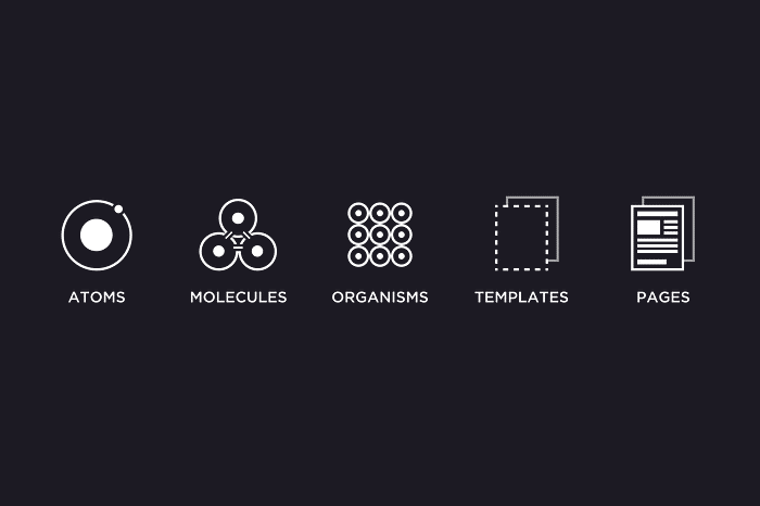
Atomic design
Atomic Design is a methodology created by Brad Frost seeking to provide direction on building interface design systems more deliberately and with explicit order and hierarchy.
This methodology is called Atomic Design because its very idea is founded in that of Chemistry, and the study of the composition of matter.
The atomic design could be divided into 5 parts: Atoms, Molecules, Organisms, Templates, and Pages.
- Atoms remain as the foundational building blocks, also known as components. Examples: buttons, text input, labels
- Molecules are a combination of two or more atoms. Examples: pagination, dialog box
- Organisms are when complexity begins. We could see organisms as modules, features, or even as widgets and simple applications. Examples: Cards, navigation bars, date picker
- Templates group different organisms (sections) into layouts or wireframes. Examples: Homepage template, Search page template
- Pages are then the instances where we apply those templates. Examples: User Interface, App, Web
Learn from the best Design Systems
Here are some design system examples that many designers and developers often look up to!
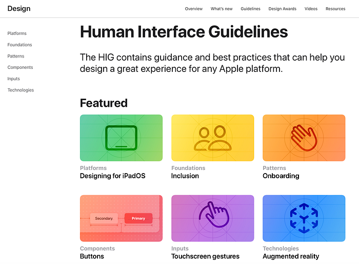
- Apple — Human Interface Guidelines
Human Interface Guidelines is a collection of in-depth information and UI resources for designing apps that integrate seamlessly with Apple platforms. This design system follows Steve Jobs’s 5 design principles — simplicity, friendliness, minimalism, precision, and focus. It also offers numerous practical resources, guidelines, and style guides for both designers and developers for iOS, macOS, vOS, and watchOS.
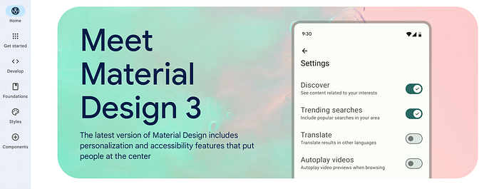
2. Google — Material Design System
We all know about Google, and I believe that you’ve also already heard about Material Design System. Google created Material.io and publicly shared all of its components so that everyone can easily use and get valuable information about each component and its use. Some of the features of the Material Design system are color, typography, layout, components, starter kits, components, design source files, and many others.
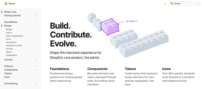
3. Shopify — Polaris Design System
Polaris provides an easy-to-follow and practical style guide for building a great experience for all of Shopify’s merchants. This design system offers UI components, visual elements, content, design language, and many other free resources for creating a better product experience, such as React components, Figma UI Kit, and GraphQL API.
Design System vs UI Kit
UI Kit is typically a set of pages. They are mockups for web or mobile solutions in a particular category (finance, commerce, music, etc.).
Design System is a source of truth for the whole team. This means UI Component Library for Designers, Ready to use UI Elements in a code for Developers, and the Principles described in the documentation.

UI Kits — ✅ Pros & ➖Cons
✅ UI Kits often look nice right out of the box.
✅ They are an excellent source of inspiration.
✅ If the UI Kit has good quality, you may learn good practices with it.
➖ UI Kits may look nice only in one type of configuration.
➖ They may not have all the necessary UI elements.
➖ Some UI Kits have got poor quality — weak layer naming, no symbols, and styles.
➖ They are not universal — usually, you can use them in just one project or category.
Design System — ✅ Pros & ➖ Cons
✅ They are designed for universal purposes — do once, use everywhere.
✅ Design System Kits are usually designed with good quality.
✅ Learn best practices for using styles and symbols.
✅ Design Systems are time-savers.
✅ Quick customization.
✅ Design System Kits are ready to be used as a UI Library for real living Design Systems.
✅ Some of them include a sample UI Kit
➖ They may not look so pretty right out of the box.
➖ Time-consuming to create and maintain.
Conclusion
Design systems are made of many components, patterns, styles, and guidelines, which can help operationalize and optimize your design efforts. However, they are designed, managed, and implemented by people.
The main factors to consider when creating a design system are the scale and replicability of your projects the resources and time available.
When poorly implemented and maintained, design systems can become unwieldy collections of components and code; but, when implemented well, they can educate team members, streamline work, and enable designers to tackle complex UX problems.
If you’ve stuck with me to the end, thank you for reading 🙏🏻. I hope you got something out of it!
Follow me for more stories that untangle the complexity of the design. Love you and appreciate your support ❤️

