Design documentation: Starting our DesignOps journey
The digital product function at The Very Group was in transition. We were transforming from a traditional delivery function to an autonomous, product led squad structure (Spotify model light) — and this meant big changes for the design team.
Along with the introduction of new designers, the team structure and ways of working needed to adapt in new ways to reflect squad and tribe culture. Amongst many other things, one of the biggest aspects we needed to nail strategically was our design documentation and handover processes.
Documentation was a theme that had long needed attention, but it had now become critical to make improvements as the team transitioned and scaled. As the Covid-19 pandemic compelled the team to adopt remote working with no DesignOps function in place, we began to explore ways to ensure that we continued serving our users and helping our stakeholders deliver best in class experiences.
The risks of a dispersed and scaled design team
It’s a given that each designer rightly has their own flair, tools and methods when it comes to how they deliver projects — and having that freedom and individuality is a fundamental aspect of creativity. The reality is that as a design team scales, so do the ways of working and this is where issues can start to occur. When we talk about design documentation, we’re not just talking about UI specs and style guides — the growing stack of designer responsibilities results in a rising complexity of design deliverables.

As our designers became more isolated into product teams, it had become clear that risks were starting to develop in vital areas throughout the delivery process:
01 Visibility and collaboration
Lines of communication naturally start to become less frequent between the design team and wider department with less opportunity to have work peer reviewed. The increased amount of projects could also lead to work becoming lost or inaccessible to other members of the team.
02 Empathy
Without context, design work loses all meaning. In product teams where work is frequently churned out, there was a degree of risk that designers would not capture the “why” part of the process, which is vital in helping stakeholders empathise with users.
03 Consistency
In product teams, the risk of inconsistent deliverables increases and could lead to differing levels of expectation from product stakeholders and engineers. It was clear that this could negatively impact the end product.
04 Velocity
The increased velocity of work that is expected of designers within product teams could leave little time for effective documentation. Ideally, we did not want designers having to rush or have it become an afterthought.
Obtain the right feedback from the right people
We were working with lots of assumptions, yet it was clear there were some surefire improvements to be made based on the current state of play. To get some validation on the problems we faced, we talked with product teams to understand the biggest pain points.
As designers, what we produce is often required to be accessible to a wide range of stakeholders and business areas. To capture a broad representation, I set up a series of workshops with product teams whilst running sessions in parallel with design and engineering to obtain a balanced view of pain points.
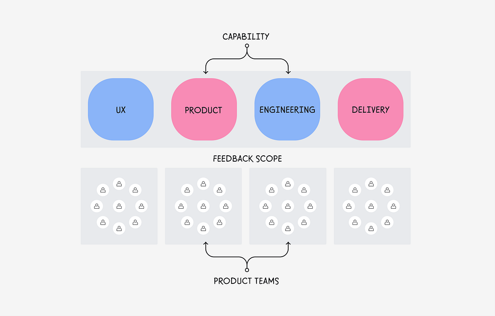
Wanting to bring our stakeholders and teams on our journey, we hoped to uncover insight that revealed…
- What aspects are we getting right?
- What are the key pain points of the current process?
- What are the expectations of the department from design?
- What does good look like? (Who’s doing it well, what are good examples?)
Clear themes started to emerge after the first couple of sessions. The interesting thing was that there was plenty of crossover of the needs from each discipline.

Solidifying the key themes
After a succession of workshops, I spent some time prioritising our top themes and split an amalgamated version into groups; “Pain Points” and “Expectations”. This defined the issues that needed addressing quickly to make the process viable whilst calling out improvements that would match the expectations of our stakeholders.

Mapping themes to our process
With themes consolidated, we wanted to visualise where they would sit in relation to our design process. We mapped and attached themes to each relevant stage to help us understand how we might make the most impact.

Documentation principles
To help guide future decisions, it was important that we translated our learnings from our stakeholder sessions into guiding principles and missions. Framed at a department level, we believed that the expectation of design collateral should be…
01 Story driven
We should strive to always set the context of our design work, strongly referencing insight and sell the value of what we are doing. Mission: To bring anyone and everyone along for the ride.
02 Accessible
Designs should be easy to find quickly whenever, by whoever and be easily digestible when accessed. Mission: To make design accessible to everyone.
03 Inclusive
As designers, we should proactively showcase our work as collaborative, allow space for feedback and share it early and often to all relevant parties. Mission: To be transparent about every decision we make.
04 Detailed
Design documentation should articulate a broad spectrum of detail and enable the audience to self serve as required. Mission: Encourage a self serve culture for design.
Turning insight into action
With established themes and principles fresh in our minds, we reviewed the output from the sessions as a design team. It was clear that the focus needed to be working towards introducing three elements that would make improvements to our process:
- Docs framework resource(s)
Look to curate a comprehensive framework that would help designers finalise and prepare their work for developer hand off, stakeholder presentations, sharing with peers and story telling. - Design quality assurance
Without introducing too much red tape, it is important to have a stage that focused on getting design work reviewed by peers to breed consistency and ensure other designers are aware of what is in build. - Cloud folder structure
To ensure the accessibility of design work across the team, a cloud folder structure that was accessible across the department would need to be curated and instated.
With these new features and stages introduced, a three-part manifesto was proposed to showcase how documenting design work would be integrated into the existing product development process.

01 Design it
Once alignment of the goal and vision of the project has been achieved, this stage is for designers to go about their usual design and discovery processes to achieve the desired outcomes. This isn’t about trying to constrain the designer, but more about bringing consistency and encourage a “document as you go” culture.

02 Contextualise
This is where the tangible benefits really start to take shape! Based on best practices, we started to shape a resource framework that would help designers add context to their design work. The resource exists as a file (Adobe XD) and is designed to function similar to that of a design system containing templates and tools that can be used to document different stages of the product process.

The document can be duplicated and used as a starting place when designing or they can use it as a resource to cherry pick the elements they require. You can view a full breakdown of document contents here.
Designers can use a series of story telling templates to help articulate and frame the problem their design is solving for scenarios like stakeholder sessions, presentations and design reviews…

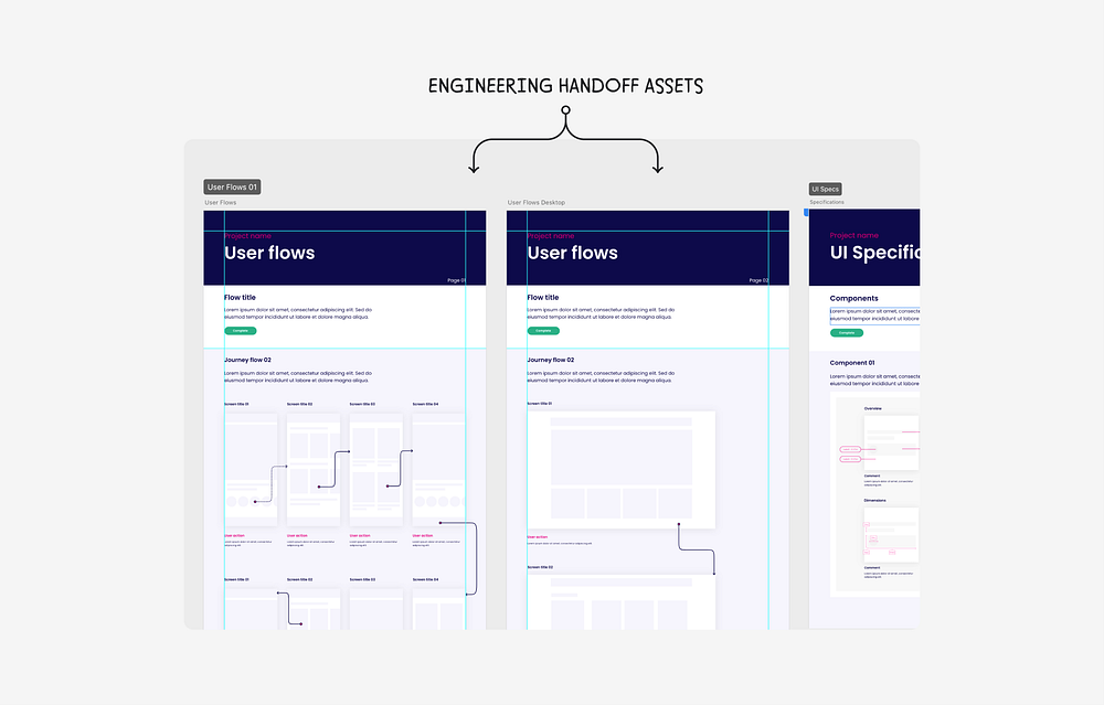
…and utilise placeholders to help bring to life hand off assets such as user flows, UI specs and interaction patterns. These sections will come in handy for design teams like us who are always creating new components for our design system.
03 Store it
The next part is all about how the design team stores their design files in a consistent and accessible way. We created three entry points for design work:
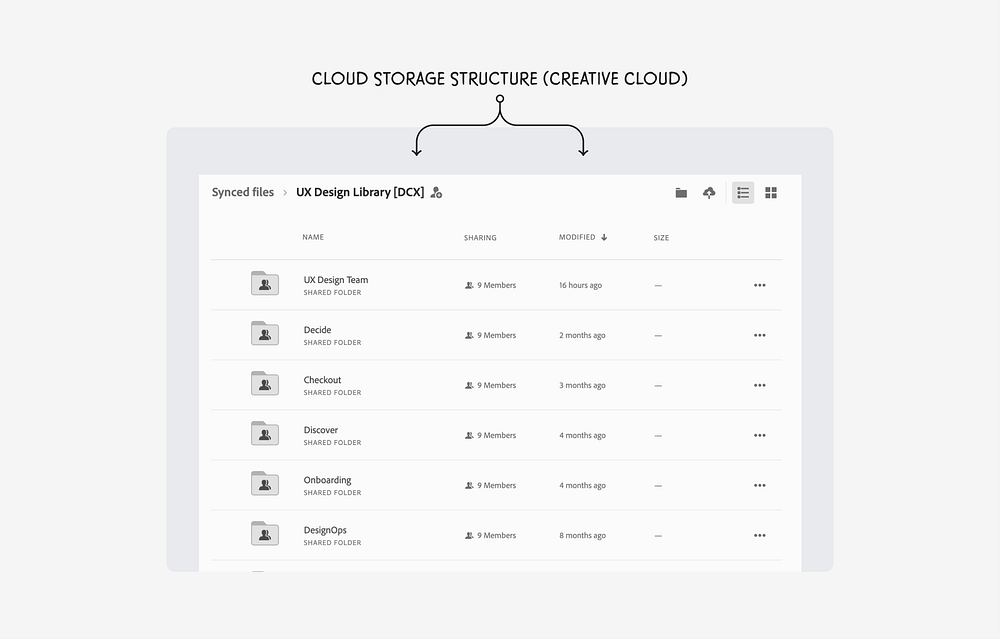
Shared cloud folder
It may sound really basic, but having an accessible folder that contains all of the team’s design work was something we had toyed with in the past, but had not been properly put into practice with any real governance. Our folder would contain a space for each product team with room to highlight project status.
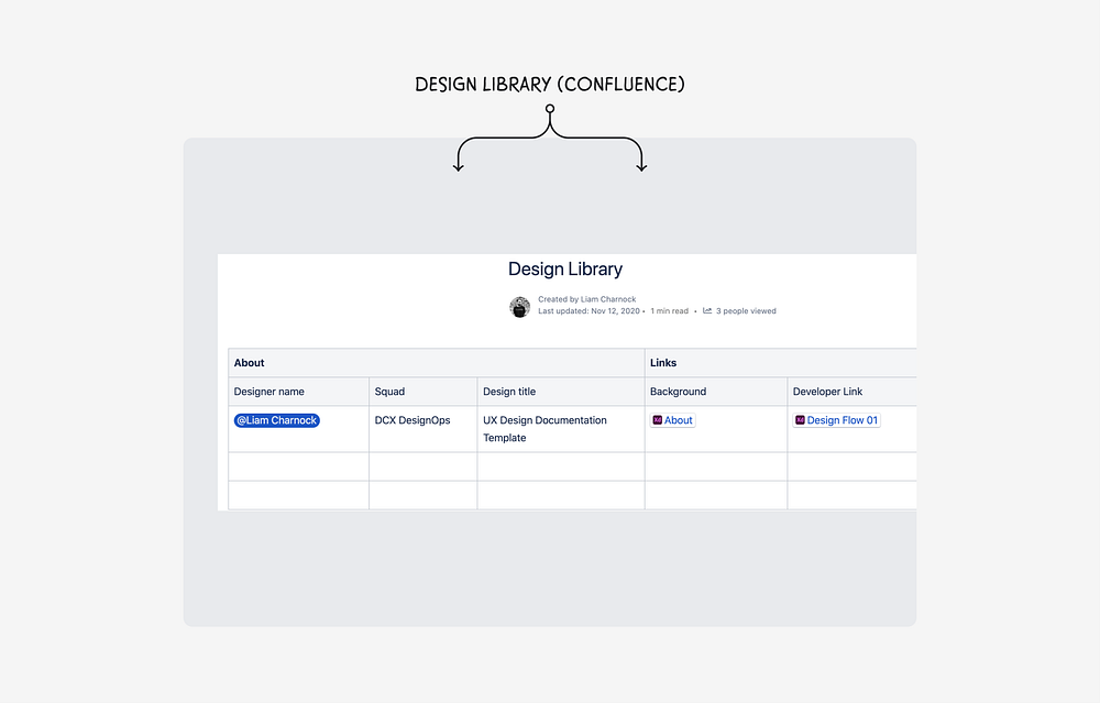
Confluence library
To maintain access and visibility to design work at squad and department level, we wanted to create an organised archive of design links and files. It was natural for us to set this up within Confluence as this was our department wide tool of choice. The archive would be presented as a table and include links to the project background, stakeholders involved and the final designs.
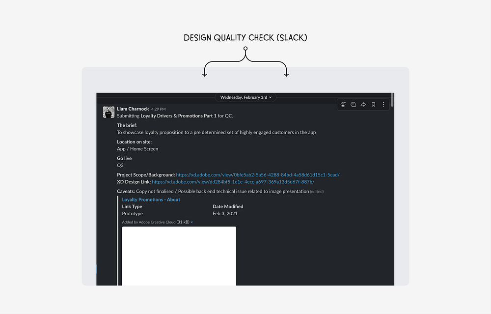
Design Quality Check (QC)
The Design QC process was a separate initiative that was maturing, but it felt natural to include it as part of our new documentation flow. Design QC exists as a channel within Slack and is used as a space for designers to get a final sense check from peers before a piece of work goes into build.
Taking an iterative approach
There was only one thing left to do — test and learn! The designers were free to start using our new tools and ways of working at the earliest opportunity. We didn’t expect a full scale adoption overnight, but as the weeks progressed designers started to gradually explore ways of using the new framework to suit their individual needs. It’s key to understand the impact and value that was unlocked via a range of feedback loops from both designers (users) and stakeholders (consumers).
The biggest challenge will be how we effectively manage our feedback loops and new processes as a whole and will only become more difficult as the team grows. We’ll be looking to quantify the impact of our changes as frequently as possible against measures like design efficiency, quality, principles and the overall team performance.
Key Takeaways & final thoughts
Starting a journey into the world of Ops is tough, but it’s a fundamental part of any expanding team. Like us at the time of writing, most companies simply won’t be at the right level of design maturity to dedicate time and resource to the cause. Democratisation and advocation is a realistic short-term goal and my advice would be to take it upon yourself to drive something forward, no matter how small, that improves your teams’ processes, drives consistency and the overall health of your team. Remember:
Talk to your stakeholders & teams
Find out what’s working and not working and suss out their expectations from design work and uncover what good looks like. You’ll be able to get an idea of what your goal should be.
Define principles & process
Set some clear principles and work with your team to asses what is required to make improvements. This is your chance to create and pitch something that you feel will streamline your team in some way.
Test, test, test
Treat your team like users and be mindful that you’re never going to get there right away. It’s going to take time and lots of trial and error before you get to something that works for everyone.
We’re looking forward to measuring the value of what we’ve implemented so far and hopefully this is just the start of taking Design at The Very Group to the next level.
Tell me your experiences
Thank you for reading and making it this far! It’s been great to reflect. If you would like more detail on anything mentioned in this article, please reach out and we’ll grab a coffee over Zoom. How are your team managing the consistency of design work? What did your journey towards DesignOps utopia look like? I would love to hear from you.

