Member-only story
Design better charts in PowerPoint
Six rules to improve data visualization in your presentations
The shift towards more analytical and data-driven business has resulted in data visualization becoming extremely prevalent in today’s communications. Audiences are more comfortable and fluent with an increasing number of types of charts, maps, and other visualizations. To communicate effectively, knowing how to successfully visualize data is more important than ever before. Here are some easy techniques and resources you can use to make your presentation charts more attractive and easier to understand.
“An effective data visualization can mean the difference between success and failure when it comes to communicating the findings of your study, raising money for your non-profit, presenting to your board, or simply getting your point across to your audience.” — Cole Nussbaumer Knaflic, Storytelling With Data

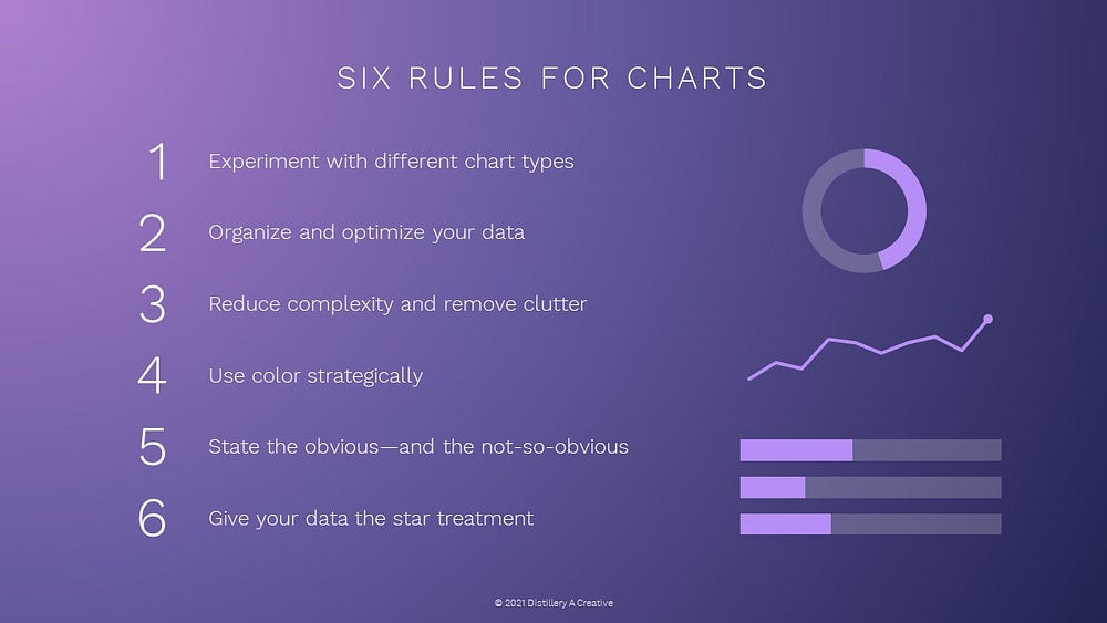
1. Experiment with different chart types
2. Organize and optimize your data
3. Reduce complexity and remove clutter
4. Use color strategically
5. State the obvious — and the not-so-obvious
6. Give your data the star treatment
Let’s dive into each of these six rules in deeper detail…
1. Experiment with different chart types
There are many chart types ranging from simple to complex (see Fig. 2 above.) Some are easy to create in presentation software like PowerPoint and some are more complex and data-driven and may require coding or more advanced data visualization tools.
Take a look at your data to determine an appropriate chart type.
- Show change over time? Try a line chart or area chart.
- Compare sizes/proportion of different categories? Try…


