Depth and Elevation Beyond Drop Shadows
It’s not only backgrounds that benefit from a structured approach to depth and elevation

Thousands of years have shaped the human mind to make geospatial orientation its primary way of exploring the world. Digital screens haven’t changed that ancient hardware. Unsurprisingly, the desktop metaphor was so compelling when PCs became popular. Signifiers like drop shadows, gradients, and inner shadows were often used to facilitate users’ understanding of the new digital landscape.
Although shadows are the most obvious option for communicating elevation, one more dimension can be explored in user interfaces. Real-life once again provides an excellent example. The closer an object is to us, the more it shares the same light source. Meaning it tends to be lighter. The inverse is also true. Things that are more far apart from us are expected to be darker.
Starting Elevation with Color
I never felt that relying solely on drop shadows was a natural way of communicating depth. Although it’s common to see user interfaces with a greyish background, it’s usually a way of creating visual separation between elements and not a dimensional feature. What if those greyish shades could be the deepest level in a comprehensive depth system?
That’s what Atlassian did with its sunken background. Pinterest did something similar, although, in light mode, it feels a bit inversed. Shopify’s Polaris even explores color changes as visual cues for state changes.
Elevating to New Depths
At some point, I started combining colors and shadows to communicate how the product is dimensionally structured. Soul Design System provides a clear picture of what that means.

However, instead of calling those levels 0–5, I go with something more tangible to show what goes on top of what. “Ground” is the default, but things start deeper with “Basement.” Then, levels on top of “Ground” follow the sequence: “1st floor”, “2nd floor”, and so on. I tend to use different colors to distinguish between “Basement” and “Ground,” and sometimes, “1st floor,” too. At some point, depending on the project, I’ll start adding shadows with distinct properties that elevate the element more as it moves up in the stack.

Backgrounds are the most obvious places to adopt such a system. But they also work well with other elements.
A System of Elevation and Intent
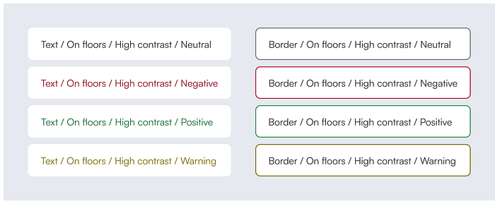
In practice, any UI element lives on top of something. That means the same system works for text and borders. In this case, contrast is the another aspect to be considered, relying heavily on color lightness. If “Basement” has a different color than “Ground,” I should have text colors suited for both.

However, medium and high contrast usually involve different hues for communicating states to the user. That’s why another dimension is needed. Intent provides the options for that kind of signifier.
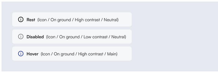
Something similar happens with icons. It’s all about adjusting proper contrast and hue, and considering the need to communicate state change.
Why is it more scalable?
Humans are especially skilled at perceiving depth. Building a system that applies a similar logic facilitates product usage and gives teams predefined options for designing complex but structured interfaces. Once elevation and vibrancy are structured into a single system, designers and developers eliminate the need to make constant component-oriented design decisions that are actually part of a much broader system.

