Demystifying the material design expand and cross-fade effect

Material Design is and has been getting a lot of attention, and rightfully so. It’s beautiful, and it brings unity to a lot of user interfaces. Not only does it please users visually, but it also gives you a lot of sound UX and accessibility straight out of the box. It might not be the design system for every occasion. Sometimes you want your UI to stand out from the crowd. However, it’s a good option for the cases where you want to prioritize utility over looks. One example where it comes to good use is in your typical dashboards and admin UIs. These types of interfaces should above all be functional.
Expandable elements in a web page
Material Design comes with a lot of great visual guidelines. There is, though, one detail that I think is worth highlighting a bit extra. I call it, for lack of a better name, the Material Design Expand and Cross-fade effect. This effect is not unique to Material Design, but it truly shines in Google’s design system.
The technique allows users to expand certain parts of the page. That could be a FAB (floating action button), an image, a more complex element, e.g., a container with several combined HTML elements, and so on. Think of it as an advanced expand/collapse effect.

Whenever a user initiates the effect, the element scales up and cross-fades from a more elementary form to a more detailed, zoomed-in version. The collapsed state will contain just enough condensed information and visual cues to inform the user that there’s more to explore. The expanded state, on the other hand, will very much resemble the collapsed version. Some parts are the same or merely enhanced. The point is for the user not to lose their context.
This effect is an example of how you can allow your users to deep-dive into certain parts of your web page. Sometimes, you want your users to have the opportunity to bring forward specific elements to the foreground. A landing page, for instance, should cater to a wide range of users. It doesn’t make sense to show all information all at once to all users. There has to be some form of information hierarchy on a web page.
Examples of the Expand and Cross-fade effect
The Material Design documentation only implicitly outlines the effect. It has not a section nor a name of its own. However, it appears in several places and demos in the documentation. Most notably, it appears in the motion chapter. Here you find the effect, e.g., under the container transform and under exists and closing sections.
Examples:

or

Note how the expanded state gives the user more options to explore the expanded state further. Play a song or send an email are two examples of actions that we see in the examples above.
Doing it yourself
It might feel daunting and especially when looking through the documentation to create the effect yourself. One is easily discouraged by all the details and intricate examples in the documentation. Yet, you can quite easily create the expand and x-fade animation yourself. Or, at least, a simplified version, which still gives you enough value for your efforts. You don’t need all the specifics to make it look good. All you need are the three following things to create the most basic version of the effect:
- The collapsed state/container
- The expanded state/container
- A scale transition with an opacity transition in the middle
Scaling up
First of all, let’s look at the transition that scales up both the containers. The first thing to notice is the easing. We’re using the Material Design ease-in-out easing to get the exact right punch to the effect. With the right kind of easing, your transform transitions will look a lot better. You can find the Material Design CSS easing values in the documentation under Motion → Speed → Easing.
With the transform rule, we can manipulate the element’s scale value. I.e., the object’s zoom level. A good value for the animation duration is 300 milliseconds. It’s a value that makes the transition quick and snappy. You don’t want your transitions to be too long. Your audience quickly grows impatient. Here’s what the whole thing looks like in CSS:
.collapsed, .expanded {
  transition: transform 300ms cubic-bezier(0.4, 0, 0.2, 1);
}
X-fade
The CSS rule above sets the transform transition. It enables the zoom effect, where the element will animate whenever its transform value changes. The second part of the animation is the cross-fade. One neat way to handle the opacity fade in/out is to place it precisely in the middle of the transition. I.e., we divide the whole effect into 3 phases
- 0–100ms, the first third of scaling up both containers, the expanded container is transparent during this phase.
- 100–200ms, scaling and cross-fading both containers
- 200–300ms, finalizing the animation with completing the expanded state transition
Unlike zooming, we want the x-fade part to have linear easing. Generally speaking, rules that animate the element’s position (scale, translate, rotate, etc.) should, for the most part, come with in-, out-easing, or both. Rules that don’t affect the elements’ positioning, e.g., color and opacity, can very well have linear easing.
.collapsed, .expanded {
  transition: transform 300ms cubic-bezier(0.4, 0, 0.2, 1),
    opacity 100ms 100ms linear;
}
Another benefit of placing the opacity fade in the middle is that the effect becomes reversible. When defining the animation symmetrically, the x-fade part will work the same way regardless of whether the transition is going forward or backward.
Triggering state
The little line of code below is probably the one I use the most in many of my demos. It quickly gives me a way to toggle the state to test out different CSS when exploring. In this case, we need something to trigger the transition, going back and forth between the two states.
<body onclick="this.classList.toggle('active');">With the toggle in place, we can quickly test the effect. Next up is defining the active states. With all the transitions in place, we need to define the start values and the final values to make things moving.
.collapsed {
  ... // no specific default values are needed, implicitly opacity: 1 and transform: scale(1);
}.active .collapsed {
  opacity: 0; // fully transparent
  transform: scale(1.5); // scaled up
}
And the expanded container:
.expanded {
  ...
  opacity: 0; // default transparent
  ...
  transform: scale(.67); // default scaled down
  ...
}.active .expanded {
  opacity: 1; // fully visible
  transform: scale(1); // full size
}
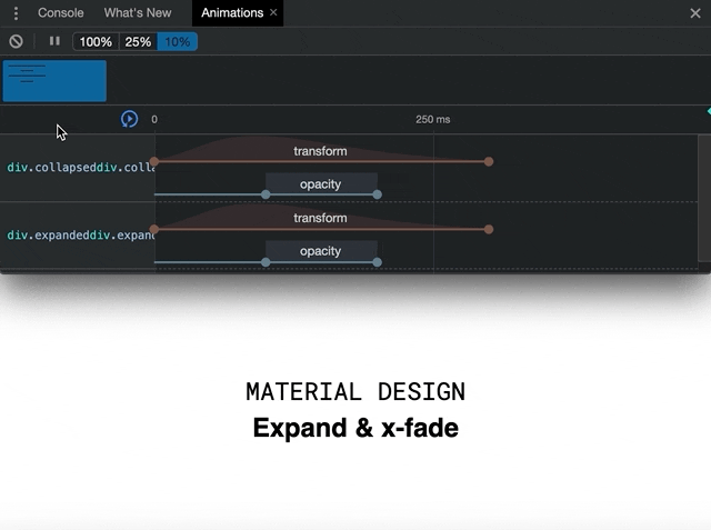
The Chrome animation tab inside the inspector is the perfect tool to examine the animation. It dissects the whole thing and allows us to break down the animation in the different elements discussed above. Below is a GIF animation of the entire effect run at 10% speed. It clearly illustrates what the three distinct phases look like in theory and practice.
The code
Below is the simple example above in code in pen on Codepen.
More advanced example
Let’s look at a more detailed example. The demo below better exemplifies the concept of expanding certain parts of the page. It’s a book reading app demo where users can expand book covers to get contextual information about a particular book. This demo, too, uses the simplified version of the effect.
Next steps
To take the animation even further, Material Design adds another dimension, the container transform. It’s a more advanced version of the effect where the outer container, containing the collapsed and the expanded containers, also transforms its shape. An example of this more advanced version of the animation is the iconic FAB transformation. The version where the FAB (the button) transforms into a menu with a selection of options. Its perfectly round shape changes into a rectangular menu. Besides using the Expand and Cross-fade, previously discussed, this version also makes use of two other CSS tricks. They are animating the CSS property border-radius and specifying the CSS rule overflow: hidden. The former makes the rounded corners turn rectangular while the latter prevents contents from overflowing.
Wrap up
TLDR;
- The Material Design Expand and Cross-fade is a good UX pattern for users to deep-dive into certain parts of web pages
- Even a simple version of the Expand and Cross-fade effect looks good
- Use Material Design CSS easing
- The effect is easily recreated with CSS transform and opacity transitions
Thanks for reading, cheers!


