15-Day UX Writing Challenge — Day 5

When error messages are displayed, they can provoke the release of cortisol, a widely recognized biomarker of psychological stress, in users. Cortisol is a hormone produced by the adrenal glands in response to perceived threats, and its accumulation can lead to feelings of anxiety and ultimately discourage a user from continuing.

As a UX writer, my responsibility is to help reduce stress for my users by better designing error messages. And how do I do this? Reduce stress thinking through my copies. In fact, research has shown that negative thinking can raise cortisol levels and decrease oxytocin, which is a hormone and neurotransmitter known for its relaxing properties that soothe the nervous system.
In that regard, my challenge for today goes thus;
Scenario: The user works in graphic design. While critiquing a design in a mobile app, their phone abruptly turns off. When they restart the phone, they reopen the app.
Challenge: Write a message that the user will read immediately upon opening the app. What do they need to know? What steps (if any) do they need to take to recover their content? What if they can’t recover the content?
Headline: 40 characters max
Body: 140 characters max
Button(s): 20 characters max

Let’s get into it!
Ideation process
Imagine you are a graphic designer critiquing a new design in a mobile app. Unfortunately, the mobile phone abruptly turns off after leaving several comments and making edits in the middle of the editing session. You’ll probably be frightened or upset about the shutdown.
What is the first thing you would want to know as soon as you open the app?
If you are like most people, you would most likely want to know the status of your work. Was your progress saved? Do you have to start again from scratch? What caused the phone to go off?
I would therefore address this feeling of frustration and expectations in the headline, body, and buttons of this task. According to Kinneret Yifrah in her book “Microcopy The Complete Guide,” error messages need to fulfill three goals:
1. Explain simply and clearly that there is a problem and what that problem is.
2. Provide a solution so that users can return and complete the process immediately.
3. Turn the delay into an experience that is as pleasant as possible.
My goal is to comfort the user, build and sustain the trust of the user in the app, and direct them on their next steps.
Voice and tone
- Apologetic
- Reassuring
- Solution-provider
- Comforting
Solution
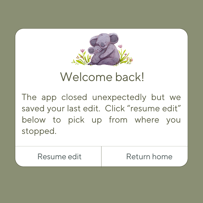
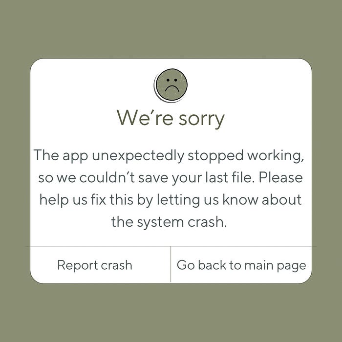
I designed two scenarios — auto-saved and lost file. Take a look at them below:
That’s all for day 5! What do you think? Let me know in the comment section below. You can check out my previous UX writing challenge entries here.

