Case study: E-commerce mobile and website rebranding
This is a case study based on the work that has been done during my internship, I will talk about how I contributed to the team during the rebranding of the application on the following scenarios which will be discussed below.
About the Company and Project Scope
DailyObjects is a design-driven lifestyle brand based in Delhi, India which introduces innovative and original products since 2012 by curating high-quality designs.
The scope of the project was to shift from company oriented to a brand-oriented entity providing the best of mobile accessories and lifestyle products which led to a complete rebranding of the product.

Disclaimer
Being an intern the time period was short, many of the decisions were derived from the past before joining,
I understood the requirements and objectives of the product being at the initial stage and improvised accordingly with discussions.
The app and website have not been released it is in continuous iteration and development.
The Basic Process
- I kept myself engaged in two types of tasks throughout the day where one was to work on the assigned task other was to keep checking the needs and flaws in the User Journey Map which can be revised and improvised, mapping on the roadmap through a User-centric approach answered all the questions one can ask, okay not all but most of them which eventually helped to keep a track of missing or required elements/information needed to interact with the UI and service.
User Journey Map allowed me to view the step tracks of the user with a learning of whole environment I was working in, a clear picture to be on point.
2. It became my favorite part to look into the flow and find problems to provide a smooth customer experience without any interruptions which becomes an important part of the user experience.
I addressed the problem to the product manager, according to the priority it became a task and was executed accordingly.
3. With every task the process to solve was in the same circle of :
i.) Understanding the problem: Finding the I/O, requirements, how the system works for different scenarios, and the essentials which are subjective.
I did not hesitated to ask questions to the product manager which resulted in empathizing better with the users for scenarios it became efficient to connect between services of the brand business and user needs.
ii.) Defining components and structure: With studying of old application and its component, I decided to list them and cleared the clutter with keeping the components which are required focusing on the digital touchpoints with the context of simplicity and usability.
iii.) Competitive analysis: Keeping an eye on the competitors can be beneficial to understand the market with respect to the services in different niches. I preferred to check out on different platforms for the inspiration of executing a problem that can be subjective as per the requirements.
It helped me to understand the information architecture in-depth with the use of terms connected to the business needs.
I kept the context of keeping a standard base of the product under the market with used practices for completing a task, following Jakob’s Law.
According to Jakob’s law User’s prefer your application to work as same as they have been using over the time and are familiar with which enhances the usability and by not introducing something really new reduces the confusion.
iv.) Brainstorming and Sketching: From having different devices to perform different tasks we are now in the era of everything being capable of doing on our 15' inch bag sized laptop screens but still a pen and paper seem like a best friend to me for brainstorming sessions, trying new ideas, combining, finding pros and cons and coming to a conclusion down the lane.
v.) Designing and approval: I then come to the desired results which are working in the scope, definitions, and requirements I start to design variations of screens for the same and getting them approved by the product manager.
Well getting approved by the product manager was a big task every time but it begins to make you self conscious about what you are about to say, I learnt to prepare well before pitching an idea combining examples making the points, from gaining knowledge through different sources to finding pros and cons it became a habit to know well about the problem and the solution you are about to discuss with future scopes if possible.
Let’s Start With The Cases
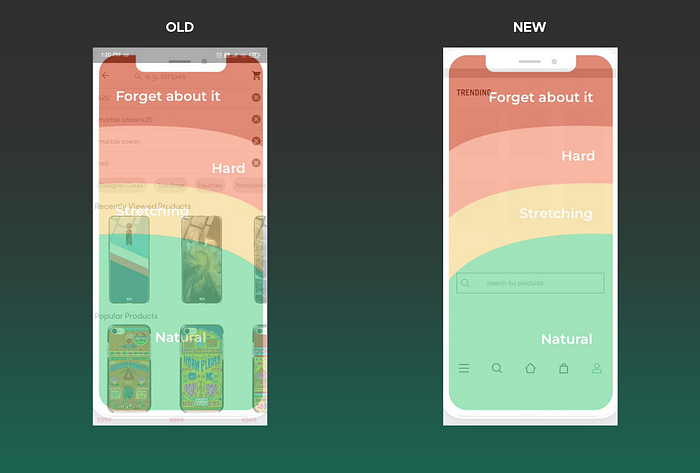
Search Section


Problems with the older version:
1. Popular products being at the end of the screen is as same as the next button on the page of a google search and the products will become the second page of the search for sure which no one gets to see.
Popular products being at a position that is less prioritize as the scanning starts from the top part of the screens becomes another point.
Popular products do get overshadowed when a person starts to type as the keyboard opens up over it or the recent searches are more than a number of 5 or more.
I started to find a better solution for the placement of popular items I asked the PM for the data on which these products are shown which showed these are a combination of new/analytically ranked products.
I started competitive analysis for the search section by defining where of what is placed and why on different products(W5H) which helped to understand the wide audiences and motives these products have.
I found out while using different search sections on products that
1.) They clearly show the search bar.
2.) But, with a motive of keeping the user engaged in the circle of keeping them use the product.
3.) Some of the most powerful search examples are which justify the above statement are the Twitter trending section in the search,
Instagram’s Explore section, and Spotify’s genre game.
After competitive analysis decided to give the search a different way of use as from observing other products provided search a pre-search screen with popular products in the number of 6 followed by the search bar.
Why 6?
More the number of choices and visuals, less the chances of remembering the products which decreases the chances of making the user return to the app.
The pre-search screen provided a supermassive breathing visual change with the proper placing of popular products in the scope according to the necessity followed by the search bar.
2.) Search feasibility was out of thumb reach which made it very hard for a person to start searching for the old one vs the new one comes with the search bar in the perfect feasible position which enhances the speed to reach the search without a sudden change in the decision before it reaches the bar as well as lets the user have a pleasant search than ever before with showcasing of popular products.
3.) Another problem seems to be the type of products available under different subcategories which did not meet the search cases every time,
Taking an example of a user who found a good leather wallet on the homepage one time but did not want at that time say a month ago but after a month he finds out he needs that a new wallet and remembered he saw a walled on the homepage of DO and started to search for the same wallet on the search bar with a memory of leather on it and here is the problem as the different categories to have leather products which result in changing the way of showing search results.
As shown in the screens above when the user searches subcategorized results are shown to bring the desired results in reduced time confusion.
Conclusion of the solution:
1.) Providing a search bar in the feasible thumb area.
2.) Giving trending products at the top as the user approaches a screen from Top-left to bottom.
3.) Instead of showing grid wise results, category wise results are being shown
which can further be expanded in the grid columns by showing the category
wise glimpse of the searched keyword product.
The Address Book

DO is an e-commerce platform for which addresses are extremely important for delivering happy packages with their orders, the address book is the titled focus for this with address information of the user.
In the older version addresses are present but without giving complete information about the type of address which is Default and the Saved addresses.
Adding a new address after having more than a number of 5 was a problem as it was hidden under and the user has to scroll in order to add a new one.
Of course I’m not saying that the person will keep on changing/adding such number of addresses but keeping the user in mind, a person can add these number of addresses taking a real-life example of myself I use a food delivery app and order food online at my friend’s places most of the time and at which friend’s that is indefinite so here is the answer.
Reducing the number of taps for changes such as edit and delete for addresses was needed which was before done with the help of a button on the top-right corner and needed an extra tap to complete the task.
The solution can be seen in the new version in which a sticky CTA adds a new address and no more scrolling will be needed also edit and delete buttons are added to complete such tasks easily in less number of taps.
The address has been differentiated into two types, default and saved address.
Error State

We often use different digital products every day but the guidance when something goes wrong is given with the help of error states.
I started to move along the app as a user and tried to found every instance where a problem or error can occur which are stated above.
Empty State

Loading State

I decided to use skeleton screens for loading but why?
Because of the trend which began in the year 2018, well NO the reason was:
It makes the user familiar with the screen as the resemblance of which what is about to load giving an indication of loading at the same time.
It also provides the sense to the user that their page has almost been loaded and will not take long anymore which becomes the perception of a user and enhances the user experience in terms of speed.
Success State

To every story, there comes an end and here it is the placing of the order which provides satisfaction and excitement at the same time of task completion and order which will be delivered soon of their choice.
Coming to the screen V1 first I found out the basic information needed to the user at the order completion and the options further required in the scenario of completion with CTA being the continue shopping.
Another version V2 is the improvised result as the visual hierarchy is maintained with the other screens also provides the user with some chunks of data instead of the usual way which provides better readability and screen scanning.
Prototyping and Interactions
I also worked on basic prototyping of the app which is how the components, screens will show transitions with the help of material design motion content.
I made a document with the declaration of the motion that will be used in the future scope that has not been implemented yet, I also used dribble shots for articulating the examples of what the motion will look like to the developer.

You must be thinking that this is not prototyping Yes definitely it is not but with this process I understood how motion is used in making the product more informative and how interaction can be used to give a final touch.
I also learned about different transition patterns, speed, and selection of patterns.
Learnings and Outcomes
- It was my first ever interference with the corporate world although it was a remote internship (all credit goes to COVID) I got to know how everything works and accelerate gradually.
- Never be afraid to ask questions, it brings clarification to any discussion also helps in letting people know that you are willing to understand.
- Take criticism and reviews positively as they help in personal growth and encourages healthy competition with self to do better.
That’s all for this case study
Hope it was not a long one and was insightful please reach out if you have any questions regarding anything for which I can help.

