Curating a Landing Page for Sadia Badiei, a Plant-Based Lifestyle Blogger, on her upcoming Workshop
Niche: Health & Nutrition | Plant-Based Lifestyle
If you want to skip through the reading, you can check out my:

As a part of the 10K Designers Cohort Curriculum, I was assigned to create a landing page for an Internet Content Creator of my choice (Youtuber/Podcaster/Author, etc).
The goal of this assignment was to practice Visual Design in Figma by following a simple design process.
Top Design Brief
“Design a website for X to do Y”
Deciding My X: A Dietician-turned-YouTuber from Canada, Sadia Badeie, runs her channel called PICK UP LIMES and makes content around nourishing plant-based lifestyle. I have been following her content for 4 years (binge-watched several times) and is one of my favorite YouTubers. So I picked her channel as my X.
Figuring out my Y: After spending several hours thinking about what to make the landing page about, I finally fabricated a fictitious 2-day Workshop, called PUL Fest. This event aims to promote, teach and make a Plant-Based Lifestyle accessible to everybody.
My Problem Statement
Curating a Landing Page for Sadia Badiei, a Plant-Based Dietician, on her upcoming offline weekend workshop.
About Sadia Badiei
Sadia Badiei is the founder of Pick up Limes and her YouTube channel has a whopping 4 million subscribers! Sadia is a formerly registered dietician who worked in some hospitals in Canada. She quit her job, moved on to the Netherlands to pursue her passion, and started Pick Up Limes in 2017.
Sadia creates high-quality content about Travel, Minimalism, Vegan Recipes, Nutrition tips, Health & Wellness, etc. The viewers of her YouTube Channel stick to the channel because of the positive vibes that she projects through her Speech & Expressions.

📋Adding Structure to the Event
Pick Up Limes Fest is a fictitious 2 day-event that I made up, involving a ton of activities about nutrition and wellness. This event is limited to 450 spots paving an opportunity to meet famous nutritionists and plant-based bloggers etc. Activities include workshops, a boot camp, and activities centered around healthy and sustainable plant-based living.
Who can attend this Event?
• Average health-conscious enthusiasts
• GenZ adults & millennials
• Professional athletes, semi-pros
• Younger working parents
• Vegan enthusiasts
• Vegetarians & flexitarians
• Nature/plant-based food advocates
• Those who want to explore conscious cooking/conscious eating
Why attend this event?
• Workshops on meal prepping, learning to develop a deeper connection with food, hacking into the mindset of mindful eating
• Several workshops, hosted by popular guest speakers in the Plant-based cooking industry.
• An opportunity to meet and collaborate with the key and guest speakers
• Connect over 400+ like-minded individuals striving to lead healthier lives
🚀Primary Goals
- Talk about her offline PUL Fest that will happen in Amsterdam, Netherlands
- Convey the benefits of attending the event
- Stating the Agenda of the event
- Urge users/audience to register for the event
- Mention her exclusive private PUL community
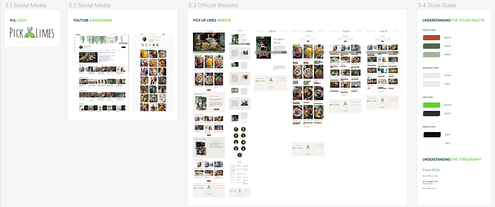
🔬Understanding the Brand Visuals
I took screenshots of the channel’s social media, and website and laid them out to better understand the visual hierarchy. I identified the color palette and fonts used in the website and created a quick style guide for the brand to gain more perspective.
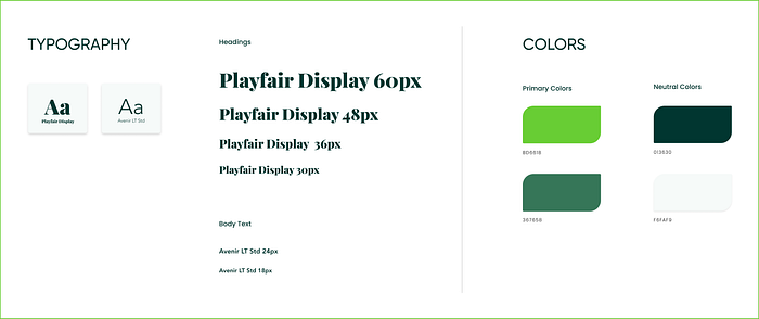
💫Creating a simple Style Guide
To define the overall look and feel of the event, I made slight changes in the style guide so it can suit the intentions of the landing page. Creating a much bolder and grander visual was the key, yet maintaining a similar mood to the official website. A brand style guide outlined here includes typography, and a color palette aligning with PUL’s tone of voice.
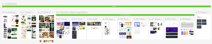
🌻Taking Inspiration
After gathering inspiration from different sources (Pinterest, Dribbble, etc.), I categorized them into sections so it's easy to refer to them once I start working on the UI.
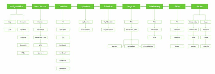
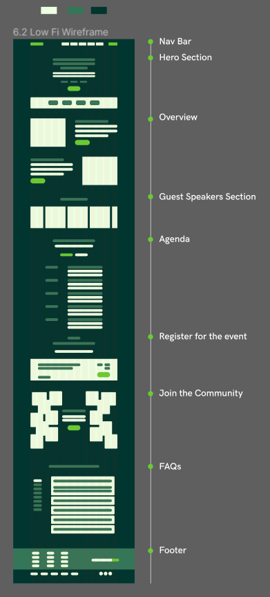
🏛️Creating the Information Architecture
IA forms the skeleton of the site. Visual elements, functionality, and navigation are built according to the information architecture principles.
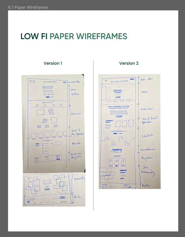
📰Low-Fidelity Wireframing
I created rough sketches on paper and figma to help serve as a checkpoint for the beginning of the design process.
✨Visual Design
Once the wireframe was in place, I started working on the visuals and made several iterations.
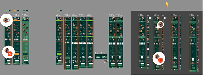
Some major iteration pointers while receiving mentor feedback:
- A few sections were quite content-heavy
- CTA issues: had low priority, low frequency, color contrast issues, and copy issues
- Visual hierarchy and spacing issues
- Pricing, Schedule & Community sections needed better visuals
I continued fine-tuning it and making improvements both large and small until…
Finally when the deadline and my mental capacity wore me out 👀, I ended up with the following screens:
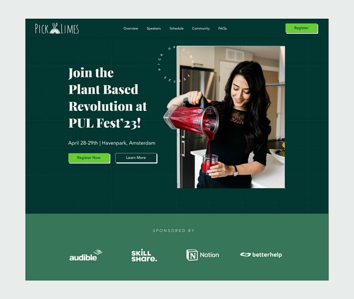
Hero Section
The hero section was the one that took the most iterations. Initially, it started off very content-heavy. And finding the right image took plenty of time as well. Making the copy easy to understand was the key here. So I limited it to a short title with the event details and to two important CTAs.
I added the sponsors' section right after the hero section which would help add credibility.
Overview Section
The overview would form the backbone of the landing page since all the information about the event would need to be explained here. I divided it into four parts, each of them covering the main categories of the event. Workshops for learning different practices, a BootCamp, scrumptious food, and the Social Hour.
I also made sure I was repeating the ‘register’ CTA after every section since it will guide users toward the goal conversion.

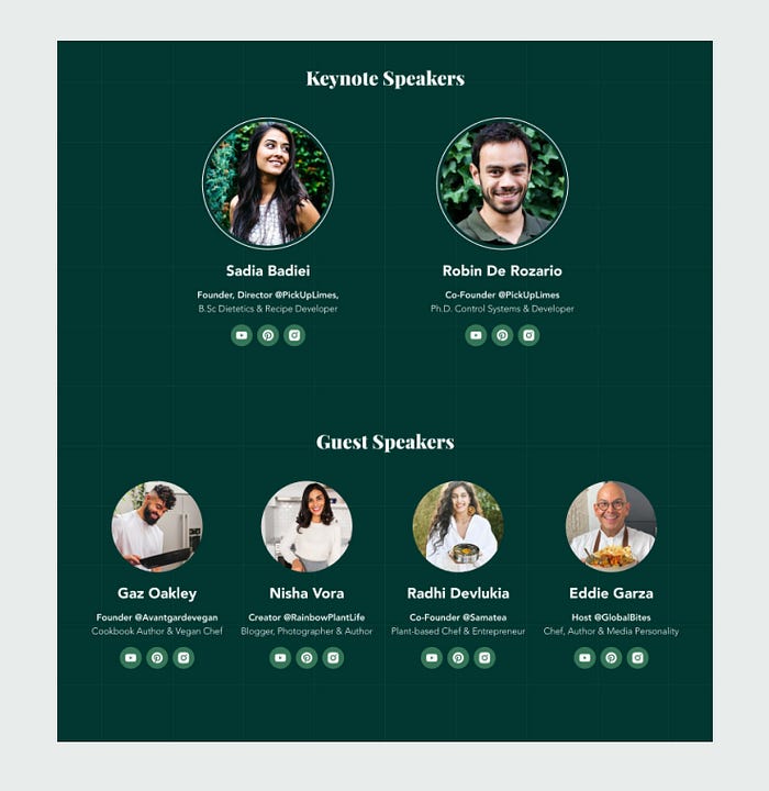
Speakers Section
This part was probably the easiest to think of. I categorized it into two sub-parts, Keynote and Guest speakers. I added social media links for each in case the user wants to explore their backgrounds more.
Schedule Section
This section of the page took me the most number of iterations. Initially, each event on the Agenda had lengthy descriptions which I later decided to remove. Instead, I provided an additional CTA urging the user to view (and download) the full schedule if need be.

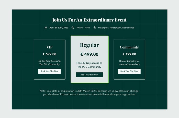
Register Section
It was quite challenging and tricky to design this part since this was the main element of the landing page. Almost every CTA on the entire page leads to this section and it was essential to making it simple and easier for the user to register for the event.
Note: Community passes are discounted but the actual access to the community is through a paid membership. It is also a minuscule attempt to drive users to join the PUL Community.
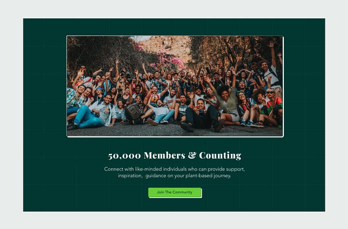
Community Section
Talking about the community section and providing a way for the user to join the community was one of the primary goals. Also wanted to keep this section simple and concise. Adding a statistic (50,000+) would be one of the convenient ways to grab one’s attention, so I went ahead with it.
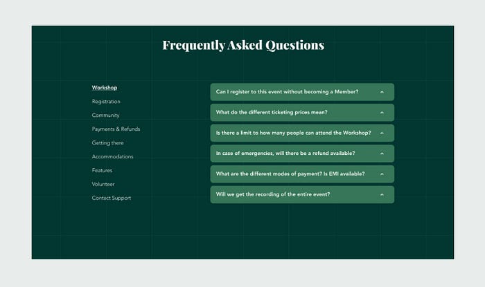
FAQs Section
FAQs solve common concerns, questions, and objections that users can think of. It’s the go-to destination for answering specific questions about the event. I categorized them to help bring together similar pieces of content.
Footer
For the Footer, I compiled a list of quick go-to links that I wasn't able to include on the main content of the landing page. I incorporated essential links relevant to the event and to the channel. An email subscription CTA was also added for regular future updates of the channel.

🏗️ Bringing them all together
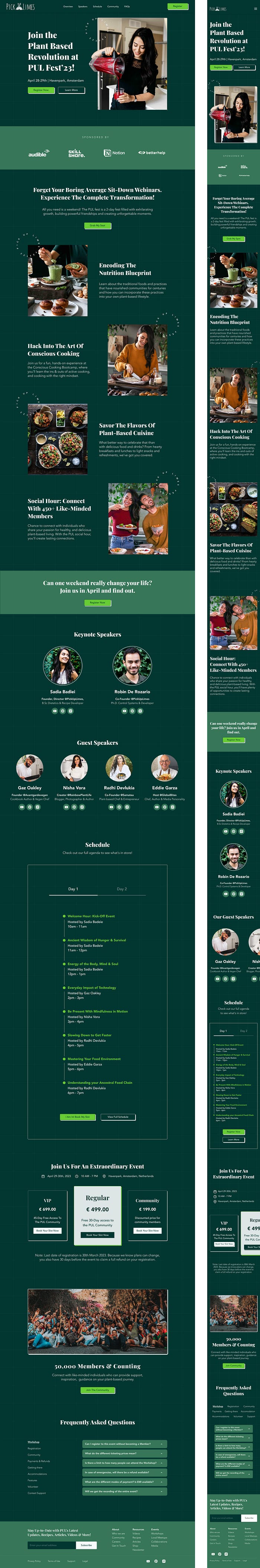
Once this was set, I quickly created a version for the mobile as well. This is what both the final versions looked like.
🎬 The Final Prototype
To view the Prototype of the Web Version, click here.
To view the Prototype of the Mobile Version, click here.
💡Key Learnings
- Beating the Imposter Syndrome: I found working on the initial draft rather challenging. Seeing my peers creating stunning visuals was supremely overwhelming, and mine was not nearly as decent. It took a lot of courage to let myself out of the perfection block, and reach out to the mentors without holding myself back.
- Getting the right feedback helps you be a better designer: I realized that it’s not about one’s opinion, it’s rather about solving the problem most simply and conveniently within a deadline. Taking feedback helped me with solving problems better each time.
- The Power of Practice: When starting, I took nearly two weeks to get my first draft done. In the process, I spent hours learning the basics of figma (auto layout, building components, adding simple interactions, etc.). But showing up consistently and iterating daily gave me more confidence that it's all about taking one thing at a time.
Special thanks to the 10kdesigners mentors, Tanvi Rusia, and Sri Harsha for their guidance and feedback on this mini case study. ✨
If you’ve reached this far, I appreciate your time and thank you for your patience. Even though the case study is a closed loop, feel free to leave your feedback in the comments below which will help me progress as a designer in future projects.
Surabhi Siddaiah, signing off.
Until next time 🖖
__________

