Creating intuitive and efficient navigation for websites [with examples]

Creating intuitive and efficient navigation is crucial for any website’s user experience. It allows users to quickly find the information they need and move between different pages and sections, leading to a smoother and more enjoyable experience. Here are some tips for creating intuitive and efficient navigation:
Keep it simple:
A navigation menu with too many options can be overwhelming for users. Instead, focus on the most important pages and categories and use clear, concise labels for each option.
Below are a few examples which are excellent examples of the simple menu:
Hubspot:

In Hubspot’s example above, there are multiple user personas they need to cater to. For example, the new user/visitor will check for their offerings such as Software, Pricing, etc.
The existing user will look for the login link or customer support placed on the right top.
The primary call to action is highlighted with their brand color with a secondary button is used to generate leads.
The top left corner menu items focus on accessibility options, such as choosing the language and improving engagement and actions.
Mailchimp:

Mailchimp, unlike Hubspot, has utilized a complete horizontal grid to cover all the items.
Further, they have divided the grid into two halves: one for the product menu and the other for lead generation and login buttons for existing customers. The company logo stays in the middle.
The primary call to action is shown in their brand color with 100% contrast colors for all other navigational items, which makes a lasting impact.
Now, let’s look at a few corporate websites.
Thoughtworks:

Thoughtworks, despite being a big technology company and a lot of content to showcase on its website, its UI/UX, and content strategists managed to place all their content under a simplified navigation system.
This perfect example of thorough research, mind mapping exercise across different stakeholders, and UX/UI iterations.
The menu names are self-explanatory, making users click further to explore. Additionally, except menu items Investors and Contact, all other items have a click which opens the mega menu.
All these have a consistent structure, starting with a link to Overview and then other menu items.
Their consistency and keeping it simple despite being such significant content to arrange makes them my favorite navigation examples [by the way, I am a big fan of their website and UX, too 🤩]
The Software House [TSH]:

I came across this company and its website a couple of years ago. And I have seen tremendous improvements over this period.
Like Thoughworks, they also have a mega menu; however, they have explained the meaning of every menu item with good headlines and subheadings, which helps users to take action.
Use familiar patterns
People are used to seeing certain types of navigation, such as a top horizontal menu or a side menu. Using familiar patterns, you can make your website easier to understand and use.
Here are a few examples that describe such patterns and their impact.
McKinsey and Company:

As you are aware, McKinsey is a reputed consultancy company globally; they have a vast team that keeps coming up with content divided into various industries and segments.
Understanding their target audience, they have created two types of menus: one is horizontal, and the other is vertical.
Ideally, both types hold similar content overall. However, the vertical menu uses complete page width and height to showcase some featured content.
This is helping them to push important content pieces they are looking for traction and increase clicks and visitors.
In other ways, the horizontal menu can be used for quick skimming of items listed, whereas the vertical ones can be used to dig in dipper into the content listed.
T-Systems:
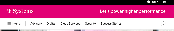
Like McKinsey, T-systems also have horizontal and vertical menus both. However, their implementation method is very different and exciting.
The horizontal menu shows their service offerings/ the areas of their expertise, and clicking on those items opens up the vertical menu, which showcases more items from the parent menu.
The vertical menu has the advantage of height [thanks to the infinite scroll people are well acquainted with due to social media], which they have used to share and allocate more menu items.
You can choose this example when you have multiple top-level menu items and not all fit in horizontal width.
Make it easy to scan
Use headings and subheadings to break up long lists of options and make it easier for users to find what they’re looking for.
Avaya
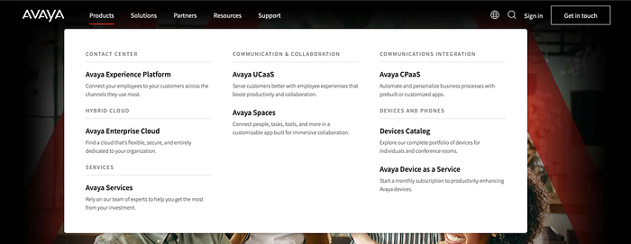
Headings and subheadings help in two ways: one, they allow users to click on the correct link since there is little more information available to read, and second, it makes the whole menu and user experience clutter-free.
Avaya’s current menu shown above is one of the examples of such a case. Like the products dropdown, the other menu items have clean and simple-to-use items.
Sendgrid
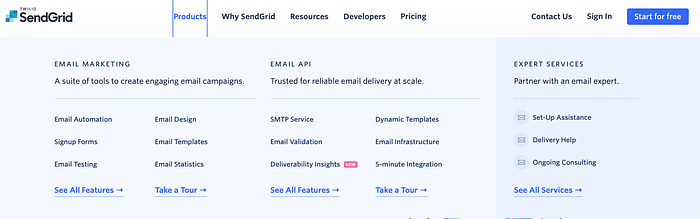
Another excellent example of this case is Sendgrid. Their Product dropdown is divided into three sections Email Marketing, Email API, and Expert Services. Each is nicely separated with the help of minimal UI and subheadings.
Since Sendgrid is a SaaS product company, they have opted to highlight the Expert Services section separately using a simple color separator.
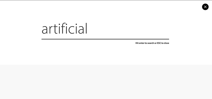
Use search
A search bar can be a helpful feature for users looking for specific information on your website.
The search function is helpful for websites with a lot of content.McKinsey and Company
McKinsey and Company
Again, I would like to give you an example of McKinsey, as they have a tremendous amount of content on their website.
Infosys
Like McKinsey, Infosys also has search; however, they have occupied a complete page width.
That’s it, folks, on this topic.
By following these tips, you can create a navigation system that is intuitive and efficient for users, leading to a better overall user experience.
If you want to know more about how you can improvise or have any project in mind, you can read more about our UI/UX Design Service.
Until then, happy reading!
