Creating Components on Figma
A step-by-step guide on components, instances, variants, and component behaviours

In this post I will cover the basics on:
- How to create components
- Component variants
- How to set interaction behaviours in components.
How to create a component
Step 1
To create a master component and save it for repeated use in your assets library, right-click a component and select ‘Create component’

Step 2
‘Publish’ your library from the assets panel to use the saved components in other design files.
Every time you update a library (for example if you add or modify a component), make sure to publish it again. Changes made to your library will not be applied if you do not publish it.
For a visual guide on how to do so, please refer to the image below:

Creating component variants
There are 2 ways to create variants. I will share both methods, and you can use either depending on your situation and what conveniences you.
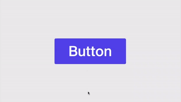
In the example to come, I will create component variants for a button, defining properties for the Default, Hover, and Disabled state.
Method #1 : Create a component, then add variants
Step 1
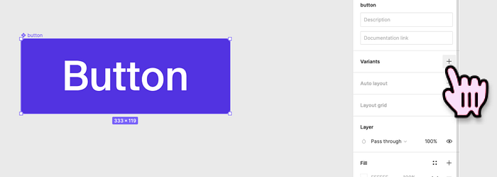
Create the component design. Design a button and right-click within the area of the button and select ‘Create component’

Step 2
Add Variant. Select the component. Under Variants, click the ‘plus’ icon.
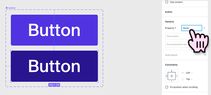
Step 3
Name and define the Property of the variant. In the example below I created a hover state and named the property ‘Hover’
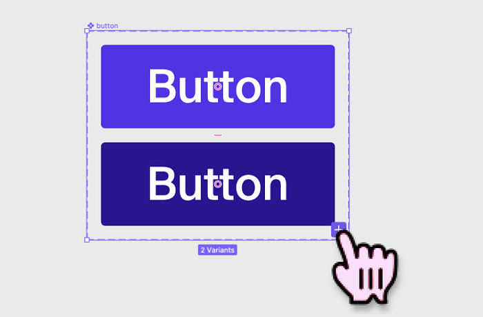
Step 4
Add more variants by clicking the plus icon on the bottom right corner of the variants grid.
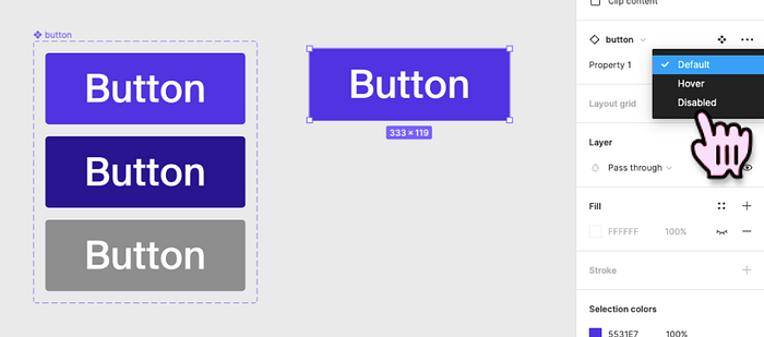
Step 5
- Test the component by creating an instance, and checking if you can toggle between variants on the design panel.
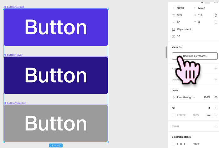
Method #2 : Create variants by grouping master components
- Create each component variant separately as master components. Name them with a forward slash in categorical order e.g. button/default, button/hover, button/disabled
- Select all the components you would like to group
- Click on the ‘Combine as variants’ button in the design panel.
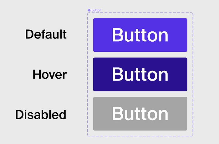
Depending on the complexity of your design system, you may need to add more Properties to your component.
For example, if you have several different button styles, for example Primary and Secondary button styles, your naming conventions could look something like Button/Primary/Default, Button/Secondary/Default etc.
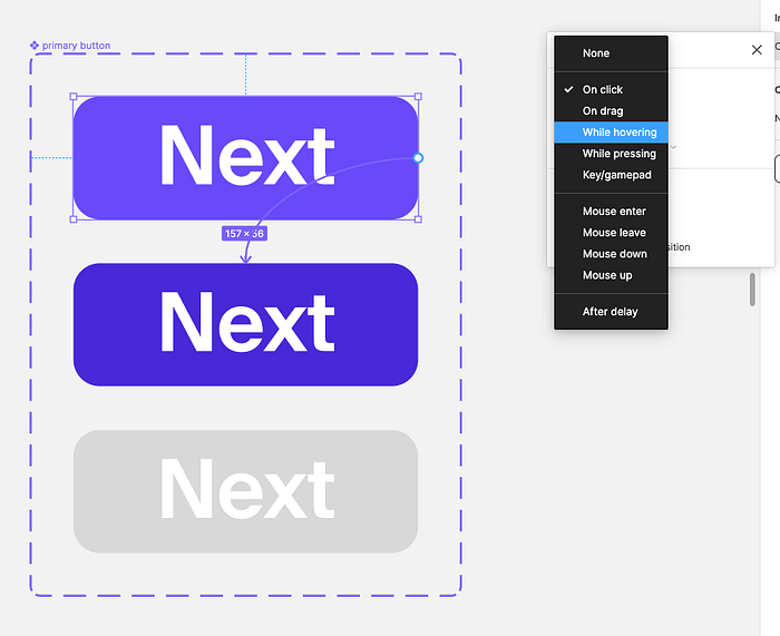
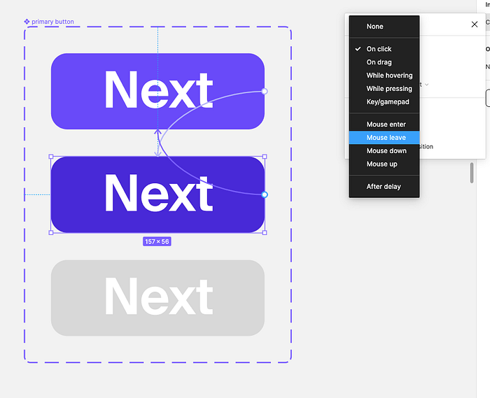
How to set default interaction behaviours in components
- Go to the Prototype panel.
- Select the component and connect it to a variant.
- Configure the interaction details.
The Final Result
Why is it important to pre-define variants and behaviours in each component?
Consistent UI
Defining styles that are unique to certain use case to helps keep your designs consistent early on, resulting in a more streamlined UI.
Save time on prototyping
Defining component behaviours saves you time on prototyping these behaviours in the long run, e.g. hover states as demonstrated above.
Think of components as Lego blocks. With your “Lego blocks” created, it is easy to drag and drop components from the assets panel and assemble them into a working flow in mere seconds, complete with the micro-interactions of individual components.
Better quality work
A good quality working prototype should consist mostly, if not entirely, of instances.
In a case where a design outcome deviates from default behaviours within a design system, it should ideally be reviewed and researched extensively before being added to the design system rulebook.
Careful consideration on how component behaviours impact user experience is important, as it helps your team develop a consistent and powerful design system over time.
Tip: Hit Command-Y on a prototype. You will be able to identify component instances by their purple outlines.
You made it till the end! 🎉 I hope you found this useful. For more design-related content and Figma tutorials, follow me on Medium.


