Creating app icons for macOS 11 and up
With macOS Big Sur, Apple introduced a new, more streamlined way of doing app icons that comes with some caveats. In this article, I briefly want to share my learnings.
There are a lot of app icon templates, especially in the Figma community, that look beautiful but lack some basic understanding of how those new app icons should be used.
At first glimpse, this article might seem pointless to you. Since Xcode tells us in detail what icon sizes are required, it should be pretty straightforward, right? — Wrong!

When sticking to the artboard dimensions shown in Xcode and filling those edge-to-edge, you’ll notice that your new icon will be significantly bigger than all other icons in your dock after compiling the app. That might make your service stand out from the rest but isn’t really the desired behavior. In general, you want to respect the system’s constraints and fit in nicely with the other applications. So, what went wrong? In order to fix it, we first have to understand how app icons on Big Sur work.

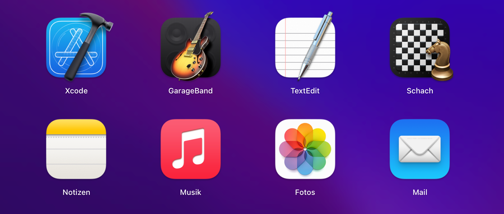
There are two kinds of icons:
- Boxed: All elements are contained within a rounded rectangle, much like it’s been on IOS since the very beginning.
- Floating Tool: The rounded rectangle is used as a background, with a floating tool in the foreground. That Tool can break the boundaries of the rounded rectangle, which makes it seem to be floating above the background. This can be observed in the Xcode or Garage Band icons, for instance. The guitar, as well as the hammer, break the borders of the icon.
In order to allow both types of icons, boxed and floating tool, the artboard has to be a bit bigger than the rounded rectangle in the background. In contrast to an iOS app icon, we have to have some padding of transparent pixels surrounding the app icon. This is something most macOS icon templates in the Figma community don’t seem to care about. This brings me to the conclusion that non of those designers actually used their own template to create an icon for a real-life application… barely good enough for Dribbble.

It took me a while to figure this out, but in the end, I stumbled upon Apple’s official guidelines and templates (Unfortunately, those are only available for Photoshop, XD, and Sketch, not Figma). I linked everything you need to know below. In this case, you probably should stick to the official templates rather than using the ones created by the community.
XOXO,
Christian 👨🏻💻
Human Interface Guidelines: https://developer.apple.com/design/human-interface-guidelines/macos/icons-and-images/app-icon/
Official app icon templates: https://developer.apple.com/design/resources/#macos-apps

